 Mid-Ohio Con!!
I will be a guest of the Mid Ohio Con!! I'm really excited about doing this show. I have never been there, but heard wonderful things about it. They were kind enough to do a nice write up about me coming on their blog
In addition I have also added a few shows that have not made their way on to the 'appearances' section of my websites. Julia and I have also started booking shows for 2009, and should have an appearance list together shortly. Until then here is the schedule for the rest of '08!
Tutorial:
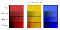
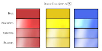
I have been asked several times to elaborate on my coloring techniques. While I'm not ready to give up my secrets, I did want to do a little swatch-visual aid to discuss the tools Dodge & Burn.
 Quite simply, Dodge makes colors lighter, Burn makes them darker. They are tools that I use to render and shade after I have established basic colors. You can use any of the dynamic brush settings when using either tool (scattering, texture, shape, etc) but for purposes of demonstration, I used a simple round brush. There are 3 range settings for each tool as well as an 'exposure' % setting (which I like to think of as a 'how-heavy-handed' % setting). The three ranges are Highlights, Midtones, and Shadows. While these dictate which range of tones are MOST effected by the tools, it also dictates how the colors are lightened and darkened.
 When using the Burn tool, 'Highlights' tends to desaturate as it darkens. 'Midtones' keeps a similar saturation of color, and 'Shadows' increases the saturation.
 When using the Dodge tool, the results are almost reversed. Highlights saturates as it lightens, 'Midtones' keeps it roughly the same, and 'Highlights' desaturates. In this example of my base colors though, it was almost impossible to tell the difference between the 'Midtone' and 'Shadows' settings in terms of how they altered the colors as they lightened.
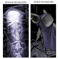
 I find that using the destauration or over saturation of each setting can be to your advantage. In the current issues of Mouse Guard, some of the mice are stuck in a cavernous kingdom with little to no light. When I use the Burn tool on those pages, I have it set for 'Highlights' so that it mutes my shadows. In extreme light or snow settings, I use the 'Highlights setting on the Dodge tool so that the lighter areas get very intense and blinding.
I hope to do a few more of these types of tutorials. I am a fan of James Gurney's blog for all that it has to offer and teach on a daily basis, and while I'm no James Gurney, I'd like to share more about the theories of creative work. I have a few topics in mind for the future: Greyscale vs Bitmap and modelmaking.
This one was sent to the ASP site and then forwarded on to me. It's a painting with 3D-panel-breaking-detail by Pam Burton. Thanks Pam!!!


