Tuesday, May 28, 2013

Game illustrations:
For a recent freelance job I was asked to do artwork for Mayfair Games on an upcoming game of theirs. I don't know if I'm allowed to say the title of the game (based on internet searches, it has yet to be announced) so I'll hold off on that. *UPDATE: The game is called Asgard's Chosen* I did check with my editor and he said I could share the process images of the artwork.

Roughs: The assignment was to illustrate (and perhaps visually design in some of the cases) three woodland mythological fantasy creatures/races: Elf, Fairy, & Huldra. The Elf I was told to come up with something between Tolkien elves and Rackham elves. The Fairy I was given free reign on except to not make them too 'princessey'. And for the Huldra, a naked female with a tree-hollow of a pack and an ox tail, I was given the leway to make her more of a creature than a woman with some odd features. Below are the roughs I sent off to the Editor. They are pencil sketches with quick digital colors. Each creature was also to get two designs, one of them normal, and one of them 'powerd up'...though I thought of them more as the 'royal' versions.


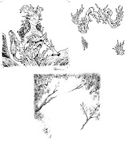
Inks: After the editor made some notes on the roughs, I printed them out and taped them to the back of some Strathmore 300 series bristol board to ink them on the lightbox. The art of these measure about 6" x 6", so I switched from my normal pen size of 0.7 down to a 0.25. I worked to add detail and texture, especially on the Elf and Huldra. For the 'royal' additions, I inked those on separate bristol sheets that I laid on top of my finished inks (for registration purposes). That way I could isolate those elements when coloring the final images. For the Huldra's background, I drew a scene in pencil to help me with digitally painting the more detailed foliage.


Colors: Unline my work on Mouse Guard, I used a Wacom tablet to digitally paint these illustrations. I used paintbrushes in photoshop more than falling back on my standard dodge and burn tools for the renderings. All of the linework received a color hold, so none of it will print 100% black....but more of a dark sepia. Below are the final Elf, Fairy, & Huldra.


Watercolor Wednesday: 
Last week's watercolor piece was highly influenced by the delightful, charming, and beautifully rendered work of Jean Baptise Monge.


Baltimore Comic Con: September 7-8
New York Comic Con: October 10-13

Tuesday, May 21, 2013

Questions and Answers:
A few of the same questions hit my email on a regular basis and today I thought I'd address a few of them here for everyone to read.I figure that if a question is being asked by a few, it's something that may interest the many.  If you would like to submit a question for a future Q&A blogpost, email me through the mouseguard.net site or Twitter or Facebook.


Q: How you handle just a bad day artistically? What has worked & what hasn't?

A: I don't handle them well, that's for sure. I have two basic approaches 1) Walk Away or 2) Push Through. Depending on the situation I may try either or both of those. To walk away doesn't mean necessarily to give up. It can mean to take a break. In that break I may take a hot shower (something that almost always clears my head and improves my mood) play a game, watch TV or a movie, read a book, go for a bike ride, or it very well might mean quit for the day. The break can serve to purposefully inspire you or it may just be the mental distraction you need to clear your head and get back into a good place. Other times it's just coming back tomorrow and seeing where you stand...but more than a few of those days and you are in serious trouble.

Pushing through can be a tricky one. It means that you are going to force yourself to do bad drawings and work that makes you perhaps madder than you are when considering 'how do I get past this bad artistic day'. It's a "darkest before the dawn" scenario. And it doesn't always work. Trying to draw the character on a new sheet of paper can help (put away the bad drawings) focusing on a new part of the drawing, or if working on a layout, change the camera angle or panel size to something drastically different and see what happens...even if you hate it, by seeing what you hate about it, you may find what you like and need to focus on for a better layout

The only surefire's for me to kick the bad art days (or at least the most reliable) include keeping in touch with other creatives (even if just to verbalize your issues with the work you are unhappy with, if not to also share jpgs of process work), the hot shower mentioned above, and staying fed & rested on a schedule.


Q: What are your thoughts on college or art school for a future in illustration/comics. Are there classes you recommend?

A: First off, to get a job working in illustration or comics (which can sometimes just mean producing work and self-publishing it) no one will ever check to see if you have a degree and if so, what kind. The gates to art employment won't be barred to you because you didn't go to college. The chief criteria for getting work is: can you do the work well...which is to say, can you draw, illustrate, & tell stories well....AND can you prove it. That being said, college and art schools can help you become a better artist. Their programs are designed to do so.

Then you get into the debate of structured educational learning of art vs self exploration & study. Both have benefits and detriments. School gives structure, a social web of like-minded creatives to bounce ideas off of, and a forced schedule for getting work done...however, it can also be as good or flawed as the professors who have tenure and it costs a great deal of money. Self study focuses on what you want to learn, costs little, and leaves you more artistic freedom ..but can be tricky to stick with & push yourself hard enough and won't expose you to as much artistic diversity as school.

I started at a community college for two years, and then transferred to a university. At the time of the transfer, I also considered an art school, but decided I wanted to experience the college campus life and not leave all my non artistic studies behind (science, literature, etc.). The two most important classes I took were 2D design (which I've posted about before) and Printmaking (which I've posted on a few times A, B, C) The artistic education was sturdy, and certainly forced me outside of my comfort zone, but I found the lack of illustration classes at my school and the desire of professors to re-mold you into their artistic image a step backwards. So do you need a college degree for this line of work? I think the question needs to be What do you think you need to get your work ready for this line of work?.


Q: What materials do you use?

A: Paper: Strathmore sketchbooks & 300 series bristol

Drawing: A 0.5mm mechanical pencil with HB lead & a kneaded eraser

Inking: Copic Multiliners (the 0.7 nib mainly) Dr. Martin's Bombay Black ink and a #1 brush for fills or brushwork

Watercolor: I have a few Sakura portable trays and an assortment of Windsor Newton tubes (especially their Payne's Grey)

Digital Coloring: Photoshop 7.0

Watercolor Wednesday: 
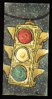
Last week's watercolor pieces were of inanimate objects. First up is a traffic signal. Mr. Rogers had one in his house, and when I was a kid I thought it would be a cool item to have in your home...not one of those novelty ones, but a real, weathered, street-used traffic signal. Of the three pieces from last week, I painted this last asking myself "what other object that we all see every day would be interesting enough to paint" and my mind flashed to that childhood desire to own one of these.
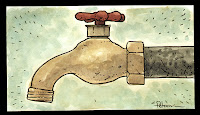
The spigot came first in the order of these being painted. I was in my basement laundry room and saw the shut-off valve in the floor joists for the outside spigot and thought the valve looked cool and would be interesting to paint. But when I sat down to draw it, I thought showing a spigot would be more interesting for someone to own than just a valve.
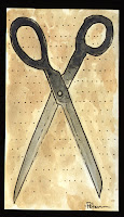
Last up from last week's pieces is a pair of scissors. My friend Mike Davis (who is the inspiration for Rand) did a lot of college sketchbooks themed around him drawing every day objects over and over: utensils, eyelash curlers, drafting implements, simple hand tools...and I think he did a page on scissors too. Anyhow, that flashed to mind after the spigot painting and I aped his idea to do this pair of scissors.


2013 Appearances: 

Heroes Con: June 7-9
San Diego Comic Con: July 17-21
*more 2013 dates coming*


Tuesday, May 14, 2013

he best laid schemes of mice and men:
Today's blogpost was scheduled to be the process of making a new and oversized print for my appearance at Spectrum Fantastic Art Live 2 this weekend...unfortunately due to illness, I was never able to start on the art for the piece, so it left me with no file to send to the printer and no blogpost to share. Instead I'm going to share the false start on the print as well as this post.

The plan was do do something larger than our standard 11x17 prints. Ever since seeing my Brave print in person, I wanted to offer Mouse Guard fans a piece with that impact. We settled on 18x24 and had quotes from the printer for that scale. The next trick was to figure out what proportions to draw the art. If I was going to ever re-use the image in a Mouse Guard book, the art had to be twice as wide as tall (the tan area in the diagram) but that left a lot of unused area (red area) on the 18 x 24 paper. I was going to solve this by centering the artwork and using some of the space above and below the print for hand inked lettering, perhaps to look like it was debossed into tilework or carved into stone.


For the main imagery I knew I wanted to flood the background with detail, the mice to be non-violent, and the moment to feel ceremonial:

I looked to the Shorestone Archive Room panels from Black Axe issue #6 for the type of background I wanted to draw, something where the architecture is secondary to the overflowing amount of books and bottles and papers and scrolls and boxes that clutters it.

For the mice, I decided to go with a knighting ceremony vibe...but instead of the kneeling mouse being tapped about the head and neck with a scepter or sword, it would be with an overly large writing quill (a feather), and the mouse would perhaps even be surrendering the weapon. I sketched the two characters and scanned & tinted them to get ready for the final laoyout.


The last step before drawing the piece was to figure out the background. Uninspired by drawing something up, I wanted a framework that was already interesting I could cram full of books and scrolls and artifacts. I built a model using bristol board, basswood, and cardboard. It was while finishing up the model that my already annoying sinus infection and fever got the better of me.


So that is where this piece and blogpost are left. As I type this late Monday night, I am on the mend, but certainly not back to 100%. The deadline to have anything at the printer that could be turned around for Spectrum is long past. I hope to resurrect this piece soon...though I may not do it as a print, but rather as a cover...or perhaps draw it and use it for both. I apologize for not having this ready for Spectrum, I apologize for not having a more insightful blogpost for this week...but I'm glad I was able to share the honest information about plans going awry. 


Watercolor Wednesday: 
The watercolor pieces from last week were a fun family portrait idea. It started with the simple joy of wanting to paint animals in clothes...which I always enjoy. But after I painted the 'father' figure, I didn't want to paint a Rhino for the 'mother'. And in reaction to the editorial info I got when doing my Snowy Valentine children's book, I decided to make an animal family that made no sense. I was told when doing that book that I couldn't have different species in love because it brought up too many questions for kids...the editorial staff seemed very concerned about what the offspring would be like and how a kid's brain could/would process that idea.


So the alligator mum seemed both a bad match for the rhino, and also a counter-intuitive choice for a motherly figure. Once I had the two adults in the relationship painted...it was time to give them a son.

The snake seems a little too close in species to the mother figure for me to have made the best example I was trying to make (This is all fun-time pretend stories, animals don't wear clothes, so we can pretend that any species loves another and somehow has a very different species they call 'son') but it was fun to paint a snake as a little boy (if he had a back pocket, I'd have given him a slingshot)


2013 Appearances: 
Spectrum Live: May 17-19
Heroes Con: June 7-9
San Diego Comic Con: July 17-21
*more 2013 dates coming*

Tuesday, May 7, 2013

Legends of the Guard Vol.2 #2 Cover Process


Back again with another look at the process for creating the cover for a Legends of the Guard Volume 2 issue. For this cover, I wanted to feature a lot of species of animal and one mouse. Originally the concept was for the mouse to be a musician...but I saved that idea for a different cover...

So instead of the mouse being a musician, I decided the should be a great speaker...such a great speaker, that with only words they can keep predatory animals at bay. I turned to the Mouse Guard RPG again for a list of animals that are in the mouse territories, but that I may not have drawn before. My final grouping consisted of a coyote, a badger, a bullfrog and a kestral (though I'd also toyed with a drawing of an opossum before scrapping it).

Scanning the several pages & pieces of paper I drew roughs on, I assembled this digital composite of the cover. The ease of digital process to allow me to scoot and shrink and bump each drawing a bit until I have the composition just the way that works (with the animals in proportion to one another). I tinted each animal to help me as I was making adjustments (and also later for inking) so that I could see where one animal began and the next ended.

For the inks, I printed out the digital layout on standard copy paper, but taped that to the back of a sheet of 300 series Strathmore bristol. On a lightbox I was able to see the guide printout through the bristol and then ink on the surface of the bristol with Copic Multi-Liner pens (I like the 0.7 nib best). I tried to play a bit with line weight sand line texture to make each area or critter a bit different, but without overly relying on the inks to tell the story so I had some open space to color.

The colors started with flatting the areas out with base colors. Most of the color choices for each animal were fairly straight forward, except for the coyote, who I made a little more yellow-brown than normal...but did so to avoid the confusion that it was a wolf. The colors for the mouse's attire were meant to echo some of the tones in the animals he was addressing.


Here is another look at the final rendered cover for issue 2 sans-text & logo:
Issue 2 will feature stories from Rick Geary, Christian Slade, & Jemma Salume


Watercolor Wednesday: 
Last week's watercolor pieces were D&D style elementals. I started with the tree-guy, but then decided some of the branches looked more like roots...and thought it would be fun to do a series of elementals.


2013 Appearances: 

Spectrum Live: May 17-19
Heroes Con: June 7-9
San Diego Comic Con: July 17-21
*more 2013 dates coming*


Saturday, May 4, 2013

Free Comic Book Day 2013!!
Today was Free Comic Book Day. In case you were not able to get out and pick up the Archaia offering with a Mouse Guard/Rust cover, here is a video of me reading the story to you.

 
Mouse Guard: The Tale of Thane & Ilsa from David Petersen on Vimeo.

I've done videos like these for the last two FCBDs and can still be viewed online:
The Tale of the Wise Weaver: https://vimeo.com/34828777
The Tale of Baldwin the Brave: https://vimeo.com/34828956


The Tale of the Thane & Ilsa Story details:
For this year's story I wanted to continue the tradition of a younger version of a Mouse Guard character being told a morality story. This time around, it's Sadie. I'd drawn Sadie's father Thane once before for a commission, which was later included in a sketchbook. Sadie's Mother I had only listed in the RPG, but I had a real person in mind for what kind of person I'd imagine Sadie's mother to be. A family friend named Bonnie Venn  is a renaissance woman. I've known her my whole life and think of her as an unofficial Aunt who I'd see each summer (at their cottage on an inland island lake here in MI). Bonnie can do some of everything, she's a potter, a painter, a mechanic, a business woman, a welder, a decorator, a cook...you name it, and Bonnie is probably good at it, and a really lovely person to boot. That's the kind of woman (mouse) who would have raised Sadie...and taught her to do well at some of everything as well.

So now that I've explained the Isle of Venn & the character of Ilsa, I need only tell you where the story and visuals came from. I had originally thought of a story where Sadie is taught to get in there and play just as hard and well as the boys, but I thought that message was too obvious and predictable. Instead went in the direction of parents trying to explain a better path for what to value in love...I could also make the 'just as good or better than the boys' as a part of explaining Ilsa's (and in turn Sadie's as well) character in the story. I was also inspired by the part in the part in the 6th Harry Potter book where Fleur Delacour, upon seeing her future husband's scars and disfigurement says "What do I care how he looks? I am good-looking enough for both of us...All these scars show is zat my husband is brave!" I thought I'd borrow that sentiment from JK, to examine what the woman who 'has everything' will use as a litmus test for quality of love.

For the visuals, I wanted to do illuminated manuscript illustrations, but stay away from the style of the book of Kells and similar real world examples, since I'd already used those in Mouse Guard for other stories and documents. I looked at Moorish & Islamic illuminations and thought the stylization would give a clear distinction to this story and also make it a bit more of a fairy-tale quality over a historical-document quality.

The original pages are available for sale in my online store: http://mouseguard.bigcartel.com/category/original-pages

Hope you all enjoyed the day, tried new books, encouraged non-comic readers to try something new, and had fun with the new Mouse Guard story: The Tale of Thane & Ilsa!

Green Brain Free Comic Book Day shirt:
Today in the Headspace Gallery at Green Brain Comics tee shirt artwork was featured & could be purchased as a shirt printed on-demand. The gallery exhibition will be up through August 31st and shirts can be printed on-demand by visiting* Green Brain Comics in Dearborn, MI. For my design, I went with a Mr. Toad style animal character reading not just comics, but graphic novels as well.

*These will not be available by mail-order, but only by purchasing in person at the Dearborn, MI location.