Tuesday, November 26, 2013

Torchbearer Beasts

As I mentioned a few weeks ago, Luke Crane (game designer of the Mouse Guard RPG) has put out a new RPG book called Torchbearer. It's his game-design-love-letter to original Dungeons and Dragons. While I was traveling in early October, I did a few monster drawings for myself, but also shared them with Luke. He & his team have constructed a mini-supplement with them where they came up with descriptions and stats for each to be used with the game (but may be equally interesting for non-gamers to read).
Luke is calling the supplement the Petersen Beastiary

The original inked pieces are up for sale in my online store.
Here is a look at each of the finished illustrations. *EDIT-I've added background info on each piece*
"Devil Boar"
I started this piece on a very slow day at a convention. I felt like drawing a monster. A booth nearby was doing makeup special effect demos and had several images of their monster work. One of them was a pig-man-creature..and I thought, I could have fun with that. Because I didn't plan this piece out before I started drawing, it end abruptly on the right..and the horns are wildly not semetrical if you looked at this guy from any other angle.It was after drawing this beast that Luke suggested he could use him for Torchbearer and we started this project.


"Gruxu"
The second monster I drew of the series was without guidance. Well, I should say, Luke didn't give me guidance, and I only used an existing monster's description as a springboard: a Kobold. I looked at crocodile skin and some turtles for texture design ideas. And while not intentional I think the neck bend and the beard/spine extremities owe a lot to the design of Sebulba from Episode 1. I submitted this to Luke as something like an advanced Kobold...the Uruk-hai of Kobolds...but someone on Luke's team created an entirely new species for him.

"Sprikken"
These guys started out as Goblins and also were going to mimic an Alvin, Simon, Theodore personality/shape design...but somewhere along the sketch, I had just drawn ugly little monsters with their own spirits. In Luke's camp, they decided to make these guys not goblin-kin, but the punk-breed of fay.


"Disturbed Spirit"
Started as a Barrow Wight, but then became more Mum-Ra than Tolkien homage. I tired to fix the inadequacies and simplicity of design with a lot of texture (my normal MO)

"Owlbear"
My first illustration for Torchbearer featured a pack of Owlbears and I thought it would be fun to round out the group with a larger take on that bizarre hybrid. In my board game Tower, Jesse Glenn drew a rather funny Owlbear (we call it the Owlbear at Pooh-Corner because he's so friendly looking) and since then I've rather like owlbears as an underused RPG species....one that could even have major physical variations...like some with functional wings...or some that are used more as beasts of burden or war-mounts

And it looks like I'll be doing more pieces for the "Petersen Beastiary" down the line. And like these, I'll offer up the originals for sale the day the .PDF is released.

UPDATE: Part 2 of the Petersen Bestiary Monsters Blogpost: http://davidpetersen.blogspot.com/2014/01/more-torchbearer-beasts.html


2014 Appearances:
MSU Comics Forum: February 22
C2E2: April 25-27
Comicpalooza: May 23-25
Heroes Con: June 20-22
San Diego Comic Con: July 23-27
Boston Comic Con: August 8-10
NY Comic Con: Oct. 9-12

Tuesday, November 19, 2013

Animal Avengers Cover Process

 Steven Wacker asked me back to do another Marvel cover! A "second cover!?!" you say..."where was the first?". The first Marvel cover I did has yet to be reveled or announced, so I can't talk about it yet. This time the subject was Avengers as animals, and Steve thought of me. To the left, you can see the final cover artwork (which was revealed by Marvel yesterday) but in today's blogpost, I'm going to run through the process of making the artwork.

First up, Steve gave me open permission to use any animals I wanted for Captain America, Thor, & the Hulk. He'd said I could even do all-mouse versions if I'd like, but I thought it would be more fun to go outside of the mouse world on this one...

I'd already decided on Cap being a bald eagle (patriotic symbolism and all) when Steve emailed me back (about some deadline detail stuff) offering up "Thor as an elk?"...once I saw that, I couldn't un-think of Elk-Thor. And the last was Hulk who I decided would be like a massive angry grizzly bear. I sketched each of the animals as avengers out on separate pieces of paper and modified their costumes (except Bear-Hulk) to fit the animal frames. The sketches were all assembled in photoshop into the layout you see to the right. I tinted each character so I could easily see where one character ended and the next began. The yellow and orange borders are guides for where the image cuts off, and the logo was a drop-in so that I didn't put anything too important there.

I printed out that digitally composited layout and taped it to the back of a sheet of Strathmore 300 series bristol. On a lightbox I was able to see through the bristol and use the printout as a guide for inking. I used Copic Multiliners (0.35 & 0.7 nibs) to ink this piece. There is a lot of varying textures in this piece...with a lot of repetition of form. These textures not only establish certain greys and materials, but also help differentiate the characters. The hair details on the bear are inked more heavy-handedly than on the elk. The shapes of the eagle's armor is different than the elk's armored leggings...etc.

The inks are scanned and I start dropping in flat colors. I tried to stick with established colors for these characters and/or their real animal counterparts. I could see already at this stage, I needed to focus on getting Eagle-Cap to come forward since he was getting lost in Bear-Hulk.

Rendering the characters using the dodge and burn tools, I pushed the texture and the shadows so the characters each could be read apart from one another.

Here is the final art again. This will be featured on the cover of Avengers #24 NOW.  I do not yet have a in-store date, but keep checking with Marvel on Twitter for news.


2014 Appearances:
MSU Comics Forum: February 22
C2E2: April 25-27
Comicpalooza: May 23-25
Heroes Con: June 20-22
San Diego Comic Con: July 23-27
Boston Comic Con: August 8-10
NY Comic Con: Oct. 9-12

Tuesday, November 12, 2013

Skyward Cover Process

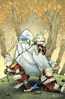
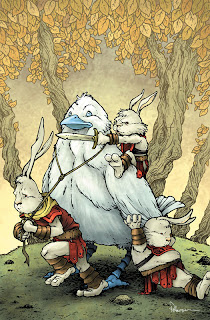
Jeremy Dale asked me to do a variant cover for his fantasy comic Skyward. It's an all-ages adventure story with a boy and his dog as the main protagonists. In this blogpost I'll discuss the process and steps of making the cover. The final color art can be seen to the left, but read on for more info.


My first step was to figure out what characters to feature. Jeremy and Kelly gave me to restrictions of the cover's subject, so I was open to do whatever I felt would be most interesting to me. Since I know I'm better at animal characters (and better known for them as well) rather than humans, I opted for the large bird character and three of the Rabites


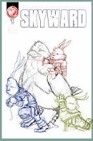
I sketched each of the Rabites separately as well as the bird in my sketchbook. Kelly had told me the Rabites would not be very likely to ever ride the bird, so I though it would be fun for the bird to remain planted while the three Rabites tried encouraging him to go. I scanned the sketches and assembled them in Photoshop. This allowed me to adjust scale, rotate figures (or just heads or arms) and get the positioning just right with the character's relation to one another as well as the borders of the cover. I also dropped in the logo to make sure I wasn't drawing anything important up there that may be covered up. The figures were each tinted to help me with the next step.

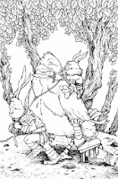
I printed out the digital layout above at full-size on regular printer paper (I had to print it in 2 parts and tape it together). I then used a low-tack masking tape to secure the printout to the back of a sheet of Strathmore 300 series bristol (my final working surface). On my lightbox I was able to see through the bristol and use the printout as a guide to ink on the bristol surface. Having each character tinted makes figuring out where one character ends and the next one starts all the easier. I inked this with a Copic Multiliner (nibs 0.7 & 0.35). I penciled the tree shapes and the ground's edge on the back of the cover (still on the lightbox) and then inked those in after the figures were completed.

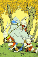
After the inks were done, I scanned those back into Photoshop and started the coloring process. The longest and most tedious part of coloring anything digitally is establishing flats. Because you are painting in flat colors, this step is called flatting. The color choices aren't as important as staying within the lines. In fact, you can use any colors at this stage, just so long as you are setting up that the Rabite fur is one color, and their tunics are another, and their arm & leg wraps yet another. I tend to not use my final colors while flatting because it helps me check if something isn't supposed to be as well as gets me less focused on selecting the right overall palette off the top rather than the work at hand of getting all the areas/color types isolated

I render the flat colors (after I adjust them closer to what is my final idea of the color scheme) using the dodge & burn tools. These tools lighten and darken the base colors. In addition to using a brush with a texture so the work doesn't appear so digital, there are other controls for these tools like the range & exposure. Exposure controls how much lightening and darkening is one at once, but the range does a bit more than it would let on in title alone. The range can be set to 'highlights' 'midtones' or 'shadows' and while that controls which range of color tones will be most affected by the tool, it also sets how the color lightens or darkens ex:.if it saturates or desaturates on it's way to becoming lighter or darker.


Here again is the final cover art. The Dale's tell me it will be appearing on a future issue, and to keep up with them via Jeremy's site or his Twitter


2014 Appearances:
MSU Comics Forum: February 22
C2E2: April 25-27
Comicpalooza: May 23-25
Heroes Con: June 20-22
San Diego Comic Con: July 23-27
Boston Comic Con: August 8-10
NY Comic Con: Oct. 9-12

Tuesday, November 5, 2013

Locke & Key Head Games limited ed. originals

Locke & Key is a comic I was late to the game with but have been trumpeting as one of my favorite books ever since I discovered it. The folks over at IDW asked me to do artwork for their special limited editions of Head Games (the 2nd collection in the series). I was given 3 blank cover plates and 10 empty-head Bodies to fill with my take on imagery from the series (and not just limited to Head Games). An original (along with originals by Jim Mafood, Langdon Foss, Alan Robinson, & Tonya Harris) will be inserted in each book (Bodie Heads in the "Black Label books, Covers in the Black Label ones).

Below these final art images are sketches and in-progress shots as I worked on the project...

Black Label:

Beyond the Black Door

Keys

Tears & Fears

Toys

Undertree Key & Squirrel

Benjamin Locke

Open the Moon

Dodge & Ellie

The Crown of Black Currants

Animal Key

The Tempest

Open Mind

Keyhouse

Process:


It was a pleasure and honor to get to do these, and I hope I get to play in and around Keyhouse again someday.

Upcoming Appearances:
North Carolina Comic Con: November 9-10