 With the 2nd Edition of the Mouse Guard RPG coming, I created new art not only for the Hardcover Rulebook, but also for the new Boxed Set. This boxed set (like the last one) will contain the rulebook in softcover, a GM screen, Dice, Cards, Character Sheets, a map, and a supplement book.
For this week's blogpost I'm showing my process for creating the artwork for the 2nd Edition Boxed Set box.
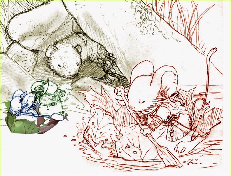
 I wanted this new art to catch up with the three mice show on the original boxed set artwork. Having them only watched by a predator as they do some non-fighting task seemed like a fun way to offset the new heat-of-battle themed hardcover art. I opted for the fan-favorite leaf-boat (below I describe more about the boat model I made and used for this piece) I sketched the different mice and the weasel separately in my sketchbook and then scanned them, tinted them, and reassembled them into this composite composition.
 Because I needed a leaf boat that was more detailed than the one Sadie paddles in to Calogero (Fall 1152), I made a model. I found two leaf images online and printed them out, then mirrored them and did it again. I glued the mirrored leaves together so each were 2 paper layers thick and printed on both sides. Using little toothpick sized scraps of wood, I pinned together a leaf boat shape that looked plausible and aesthetically pleasing.
 I inked the art on Strathmore 300 series bristol with Copic Multiliners (the 0.3 & 0.7 nibs) and a bit of ink and brush for the water. Inking on a light table I was able to use a printout of my digital composite above as a guide instead of re-penciling the piece on bristol. I left a lot of the water open for color and pushed the texture back to the background. Creating groupings of texture like this causes contrast which can help push the foreground away from the background.
 I scanned the inked artwork and started flatting the shapes in with really awful colors. Other than using the original boxed set art as a color guide for the mice, I had no idea what my overall palate would be for this piece, but when flatting, you don't really need to know...you just establish that the fur is a different color than the cloak, which is different from the leaf boat, etc. I also created several color holds at this stage (areas where I want the inkwork to be a color instead of black) some of these were for details or water, but others were used to push the background and the foreground even further apart.
Here again is the final rendered colors for the piece.
Swords and Strongholds:
And a reminder that the Kickstarter for the Mouse Guard board game Swords & Strongholds designed by Luke Crane & I is still going here: https://www.kickstarter.com/projects/burningwheel/mouse-guard-swords-and-strongholds
2014 Appearances:
Boston Comic Con: August 8-10
Baltimore Comic Con: Sept. 5-7
NY Comic Con: Oct. 9-12


