Tuesday, April 26, 2016

Sadie 5x7 print

Last year I introduced a matted Saxon print to my convention and online store offerings. This year, I'll be adding more 5x7 character prints. The first of which I'll reveal this week is Sadie with a bee companion. Below I'll show the full process of the new Sadie print. (finished image to the left)

The print debut at C2E2 2016, and I'll have it in my online store as well as my other convention appearances.
http://mouseguard.bigcartel.com/product/sadie-bee-print-matted-8x10


To start with I sketched out Sadie on copy paper. Sadie is a guardmouse who spent a great deal of time alone in the open country. She's self-sufficient and a frontier mouse who can pathfind and star-navigate her way around the territories better than any of the other mice in Fall or Winter 1152. For this image, I decided to give Sadie a bee companion, like a ranger might have a hawk as an animal companion. It was the inclusion of the bee that led me to using clover as the background and ground cover for this image.

I scanned in my drawing so that I could resize it and make some corrections. The inked piece needed to be a certain size, so I scaled the drawing to fit inside that space and made some crops to the surroundings so that Sadie had a nice presence in the image. I also adjusted the bee's angle and scale. I like using Photoshop for this. I'm not at the point where I want to sketch digitally, I like paper and pencil too much, but making digital adjustments is a great way to speed up productivity, but also allow you to experiment and improve your composition without re-drawing or erasing.

Once I had the above layout set, I printed it out on my home printer and taped it to the back of a sheet of Strathmore 300 series bristol. On my Huion light pad I could see through the surface of the bristol to the printout to use as a guide as I inked without needing to re-pencil the drawing. I inked it with Copic Multiliner pens (the 0.7, 0.5, & 0.3 nibs). Readers of my blog know I like those pens. Even though they are felt tipped (like Microns) they stand up to all my stippling and never break or get fatter as a result.

I tweeted this photo I took in-process with my phone as I worked on the piece. I try and establish the major outlines to the character before going in and doing much rendering on any area (though here I did do the cross-hatching in her ear). Before I used Multiliners, I used Uniball Vision office pens. One of the things I think improved when I switched tools is that I became more concerned with varying my line weight. And not just the heavier lines for the outer contour vs the thinner inner lines, but also the change in a given line like the fur around the face or the wrinkles in the cloak.

After the piece is inked, it's time to scan and start the coloring process known as 'flatting'. By laying in flat colors to establish the different areas of the image (the fur color is different than the cloak is different from the sky, is different from the clover, etc.) it makes it easier to isolate and render each part in the next step. You don't always need to be placing down the right colors in this step, though here I did try to establish my final palate. I went with a yellow sky to be the natural complimentary color to Sadie's purple cloak 9something I'd already thought about when drawing the bee)


Here again is the final image after I rendered the colors using the Dodge and Burn tools in Photoshop with a textured brush.

Again, I'll have this print in my online store as well as at my other convention appearances.
http://mouseguard.bigcartel.com/product/sadie-bee-print-matted-8x10


2016 Appearances:

Tuesday, April 19, 2016

Re-Run Usagi Yojimbo pinup for the Sakai Project.


With nine years of blogposts, I will continue to Re-Run past posts for the new fans or folks who may have missed a post the first time around.

Part of the reasoning is also that for various reasons (The health of my Mother, convention travel, behind on deadlines, and projects I'm not able to share yet) I see the need to revisit an old post once a month or so.
You can also go back and see any past posts using the Blog index: http://davidpetersen.blogspot.com/2013/12/blog-index.html)

This week:

In 2014 Usagi Yojimbo creator Stan Sakai was in need of assistance due to his wife Sharon's health at the time. I did this two pinups to help celebrate the Usagi and Stan and raise some money with the original art for Sharon's care. Below is the link where I break down the full process from concept to colors for the pinup.


Full Usagi Yojimbo Process Post:
http://davidpetersen.blogspot.com/2014/02/usagi-caps-auction-piece-process.html


Tuesday, April 12, 2016

Gotham Academy Short


In issue 17 of Gotham Academy, I have a 3 page short story. Rebecca 'Tay' Taylor, a former Mouse Guard editor =, now is in the Bat office at DC and knowing I was a fan of Gotham Academy, asked if I'd like to contribute a short story to the Yearbook arc (where students at GA are telling tales of past & present exploits at the school...those stories are drawn by guests, like I do with Legends of the Guard).

While still thinking about doing it (I really really wanted to, but schedule was an issue) somehow my name was announced as a contributor on a panel at New York Comic Con before I'd committed fully. I took that honest mistake (plus my desire to be a part of it) as a sign that I needed to find space to do the story.

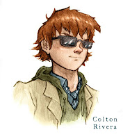
The only reservation I had (other than time, which did play a big part in the shorter nature of the story) was that I'm not fond of the way I draw people....or I at least struggle to draw them in a way I like. The Hogwarts RPG portraits I'd done not too long ago were examples of human drawings I was pleased with, so I set to draw the story that way. And as a test, did a sample character study of Gotham Academy Student Colton Rivera.


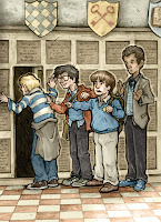
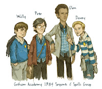
For my story though, I decided I didn't want to use any of the existing Gotham Academy cast, and thought I'd introduce four students from the school's past. I based the quartet on myself and three close friends from my younger days. These are the guys I first started making up stories with, making home movies with, and roleplaying with. Nicholas Kowalcyk became 'Wally Adams', David Petersen became 'Peter Erikson', Jesse Glenn became 'Glen Thomas', and Mike Davis became 'Davey Kurtz'. These four would be playing GA's answer to D&D 'Serpents & Spells' at the school in 1984.

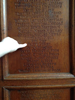
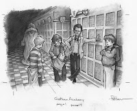
Last year I visited a private academy in New Hampshire to speak to their art students (You can go back and see a whole blogpost about that trip here). It was the practical place I envisioned when I tried making up a story at Gotham Academy. And the tradition of the graduates' names being carved into the wood paneling of the hallways (which you swipe with your finger if you pass a relative's name) was something I had to incorporate into my drawn version of Gotham Academy. (Here I'm pointing at a 'Harry Potter' from a turn of the 20th century list of graduates).

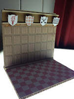
To make life a bit easier, I made a little model section of the hallway at Gotham Academy (c.1984) where we first meet our four S&S playing students. It looks rather complicated of a model, but it's really just two pieces of cardboard glued together with printed out images glued to them. The printouts were stock photos of tudor wood paneling, and a checkerboard, and I added tome text for the carved names and cut out some little shields to glue on along with some thin wood stock for trim.


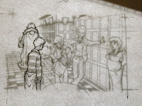
Tay, of course, needed to see what my pages would look like, so I roughed out my story with something more detailed than thumbnails, but rougher than I'd pencil a Mouse Guard page. I won't share any full page's thumbnails, because with only 3 pages, I don't want to share too much of anything. I also wrote the script as I roughed out my story beats and panel shapes. To the right is a few panels from page 2.

Rendered pencil can be messy, and if you make a mistake, erasing can be tricky. Because of this, I opted to draw each panel separately. This is a technique suggested to me by Cory Godbey. Cory also sometimes draws the characters apart from the background, but I only did that on two of my panels and didn't take to it as much. On the left is an example of me tightening up the pencil outlines on bristol, while my rough/layout is underneath as a guide on my Huion light pad.

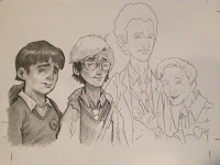
After I have solid outlines, I can start adding all the subtlety of tone and texture. I re-used the first character designs when drawing this panel of the four S&S players (who've given themselves the nickname 'The Gilkey Warlocks'). I tended to render from left to right so that my hand wouldn't smudge the finished parts as I worked, but sometimes I'd lay down a sheet of paper just under my hand to protect the drawing as I worked anyhow or when I couldn't just move L-R.

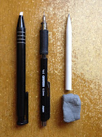
Tool-wise, I'm not using anything fancy. Knolled here are my (L-R) Stick Eraser, Mechanical Pencil (0.5 w/ HB lead), a Tortillon (fancy word for a smudging stick), and a kneaded eraser. At times I did break out a softer lead pencil to make some really dark areas quickly, but most of the 3 pages was drawn and rendered with what you see here. It's also of note that I went through 3-4 Tortillons doing these pages.


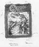
I had to call Tay and ask if there was an official Serpents and Spells rulebook cover or logo. She said that no one had tackled it yet. So I went about designing my best old D&D player's handbook homage  and logo (making the S & S interlink as the focus instead of the ampersand). The book's cover is a full panel in the story and here to the right you can see it uncropped along with notes to myself for where the panel ends and where to make sure the lighter details go.


Here is one more finished rendered pencil panel of the characters in the hallway. I scanned all these panel pieces made some adjustments to get the right light/dark balance and then re-assembled them all in Photoshop according to my layouts. For the panel borders, I drew those in with the line tools in Photoshop.


Color! Just like the Hogwarts drawings, these are colored in a way different from my usual method for Mouse Guard work. Here the color layer(s) all go on top of the rendered pencil and each of those is set to layer mode 'color'. This means that the brightness and darkness is determined by the rendered pencil layer, but the hue and saturation are determined by what I pain on the color layers set to 'color' mode.


Below are a few more spoiler-free panel samples from my story:


Gotham Academy #17 goes on sale TOMORROW:
It’s the final chapter of “Yearbook”! Maps and Olive now have the entire gang involved in putting together the perfect yearbook—but which story will come out on top? With art and story by Eisner Award winners Faith Erin Hicks (Adventures of Superhero Girl), David Petersen (Mouse Guard), and Michael Dialynas (The Woods)!

Cover by Mingjue Helen Chen.


EDIT: UPDATE:
Jesse Glenn and I cosplayed as Peter Erikson & Glen Thomas (our Gotham Academy alter-egos) 
at Heroes Con this year:


2016 Appearances:

Tuesday, April 5, 2016

Digital Sketchbook Cover Process

At the very end of last year, I released a 288 page Digital Sketchbook collection with eleven of my past sketchbooks and 30 pieces added in to the collection. (You can purchase MOUSE GUARD DIGITAL SKETCHBOOK COLLECTION 2004-2015 here: http://mouseguard.bigcartel.com). The collection needed a new cover, which can be seen to the left, and for today's blogpost I'll break down the process I used to create the artwork.

I began with the idea of doing a Mouse Guard St. George and the Dragon homage. Instead of the saint, it would be an armored Guardmouse, instead of his horse, a sparrow, and instead of the dragon, a snake. On copy paper, I drew the snake and bird, but had a false start with the mouse. So on another sheet of paper, I drew the armored mouse and his lance at approximately the right posture & scale.

I scanned these sheets in to Photoshop and composited them back together. The snake & bird drawing I tinted red, the mouse blue. This helps me keep track of design elements instead of seeing the drawing as a mass of black pencil lines. I framed the piece with the appropriate square border, and then added some 7 pointed stars and a holy halo around the mouse's head. The name Jorgen is a Danish version of George, which I thought was an interesting way to nod at the source inspiration and break up the star pattern a bit.


The above layout was then printed out on copy paper and taped to the back of a sheet of Strathmore 300 bristol. I ink on a light box or Huion light pad. With the light coming through, I can see the layout under the bristol as I ink. I used Copic Multiliner SP pens (0.7 & 0.3 nibs).  To the right you can see the finished inks. These were fairly straight forward from my pencils...the only real amount of texture/tone I added was the lines on the floor.

After I finished the inks, I scanned them into Photoshop, cleaned up the scan, and started flatting the colors. This step of digital coloring is basically just coloring inside the lines and establishing the elements that are different colors. It's called flatting, because you aren't worried about rendering or effects or texture at this stage, you are just blocking out areas of flat color. At this stage I also added color holds, which are the areas where I painted the inkwork a color instead of black (the text, stars, & halo)


The final coloring was achieved by suing Photoshop tools with a textured brush. For adding the shadows I use the burn tool (at its lowest exposure) and for the highlights I use the dodge tool (also at its lowest exposure). The brush is a stock Photoshop brush. I think its called 'drybrush'. To the right is the finished product (sans-logo & title)


BONUS!
I liked this image enough that I've made it into my most recent tee shirt design. A two color silk screened image on Gildan Soft Style Heather Royal Blue tees. S, M, L, XL, 2X, & 3X.
They are available for purchase here: http://mouseguard.bigcartel.com


2016 Appearances: