 Stan & Co. approved the inks and I was able to scan them and begin the coloring process. That first step in coloring is known as 'flatting' which is a professional version of coloring-in-the-lines with flat color (no texture, no shading).
Tuesday, December 26, 2023
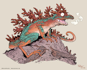
Usagi Yojimbo: Ice & Snow #4 Cover
 Stan & Co. approved the inks and I was able to scan them and begin the coloring process. That first step in coloring is known as 'flatting' which is a professional version of coloring-in-the-lines with flat color (no texture, no shading).
Tuesday, December 19, 2023
Animal Pound Variant Cover
I was asked to contribute a retailer exclusive variant cover for Cards, Comics, & Collectibles in Baltimore, which is the only location that will be selling it (though also through their online store I believe).
To the left you can see my finished cover artwork, but below I'll go through the steps to creating the artwork.
My focus for the art was a dog and a cat looking in opposite directions (A local vet has a sign that looks like this and it came to mind) with the shadows of the pound's bars like flag stripes across their bodies and a tally of voting behind them on the wall.
I used some reference of a cat I found online and a photo of my sister's dog (RIP Angus) that had the perfect side eye...
Unfortunately I didn't check to make sure using a dog not featured in the reference packet from BOOM! so visually closely tied to the voting didn't work for the editors and I was asked to change the dog to the Doberman/Pit mix character from the series.
I had to find some reference of that breed and do my best to get the expression back in there. In some ways, I think the untrustworthy glance is better in this drawing than my original.
The voting and the scale of the dog icons to the cat icons does play into the story too. All of the drawings were done on copy paper, scanned into Photoshop, and then assembled together with some color blocking added to help explain light/dark forms.
Getting the character's linework clean and with some nice lineweights was my main goal, and then to make sure as I hand inked each 'vote' they all had individual flaws. On the back of the bristol (not pictured) I drew and inked the lines for the bar shadows.
When all of that was done I could start flatting in the base colors for the wall, dog, and cat. Most of those color decisions were already made in my rough layout, but I did need to alter them a bit.
Animal Pound #1 is out tomorrow in comic shops everywhere and my cover is available exclusively at Cards, Comics, & Collectibles in Baltimore.
Tuesday, December 12, 2023
Goose At Dawn Tavern
Below in this blogpost I'll walk through the process of creating the artwork
On my Huion Lightpapd I was able to see through the surface of the bristol down to the printout and use it as my 'pencils' as I worked. I used Copic Multiliner SP pens (the 0.3 & 0.7 nibs).
I inked this piece focused mainly on making very compact scene readable even without color by changing density and variety of textures.
Here I also established color holds (areas where I want the ink lines to be a color other than black) the stairway as it bends around into the distance, the trees even further back, and the sign details.
The final step was to render the piece. I used the Dodge and Burn tools in Photoshop while using a stock textured brush.
This piece took a lot of playing back and forth with different values and intensities of light to get the final art to work. I'm still not convinced I got there in the end, but I'm happy enough with it to include it in the calendar for 2024.
Tuesday, December 5, 2023
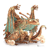
Copper Frog Dragon
I worked on my piece live on my Twitch stream while viewers worked at home and then on Monday we shared our finished pieces.
Here is my finished colored Dragon. And below are my steps to create it as well as the community submissions.
For #DiscoveringDragons, I post two or three prompt words for everyone to make into a dragon. It's a nice framework for artists of any skill level to focus some time on an 'assignment' to shake the rust off or get the pencil moving again––all while also being loose enough that there's plenty of room for individual expression and interpretation.
This month the prompt was two words: Frog & Copper.
I opened several tabs of google image searches of frogs, copper ore, dragon wings, and eventually frogspawn.
Because I'd run out of room on the copy paper for wings, I placed my original pencil drawing on a light pad and with a fresh piece of paper overtop of it, I drew the wing shapes. These were all then scanned into Photoshop and assembled with a quick blocking in of forms to help me see the silhouette of the character as well as the different parts (like the ing folds and hard scales vs the main body)
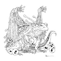
I printed out the above design and taped that onto the back of a sheet of Strathmore 300 series bristol. Using a lightpad, I was able to see through the surface of the bristol as I inked the dragon. I used Copic Multiliner 0.7 and 0.5 SP pen to ink the art.
Before I started inking, I used a circle template on the printout to layout where I wanted eggs with little tadpole babies. The inking on this piece was about trying to use line wight to get the subtle wrinkles and hard textures without overwhelming the piece with too much texture.
Later that night I finished the color flatting process––basically professional coloring-in-the-lines. Some of this is just to make it easy to re-isolate various parts when doing later painting & rendering. So, I established the main skin color, something slightly darker for the spines, a dark color for the scales, a verdigris green for the belly & wing membranes, and lightest for the eyes, teeth, and eggs.
For the final colors I did most of the highlights, shading, and texture with the dodge and burn tools and a stock photoshop texture brush. But, I did use the paintbrush to help add in some color variance as well as a 'tarnish' layer on top (set to mode 'color') to spread and erode the green across the whole dragon. Below you can again see the final..


