Tuesday, April 30, 2024
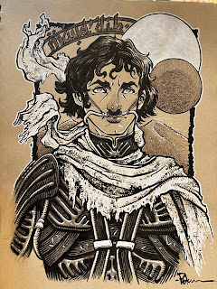
Recent Toned Commissions
Tuesday, April 23, 2024
1149 Shield Heraldry
Well recently on a whim an idea came to me to create heraldry for each one that I could eventually use in Mouse Guard some day. To the left you can see the final art for those heraldic shields, and below I'll go into the creation of the art.
The hare was a farmer, so I gave him wheat and a scythe. The duck had been a butcher turned fighter, and he used his cleavers. The fox, while a ranger, was in many more ways a bard/thief who would steal from royalty he duped into believing he was a dignitary from another land, the opossum got a book with stars to represent magic. The tiger had a spiked mace and I made the background stripes to echo the tiger's fur. And the ferret used daggers, so I filled his shield with small but deadly weapons.
I have an idea for how to incorporate these designs as well as the spirit of the original characters into a real Mouse Guard story...
The color choices were mostly all determined from the characters original designs from high-school.
Even though these are just simplified heraldic designs, re-drawing these characters I made up over 30 years ago was an instant time travel device that took me back to my earliest comic characters and the ideas Jesse Glenn, Mike Davis, Nick Kowalcyk and I were coming up with (stuff we'd later categorize as 'Plotmasters')
Tuesday, April 16, 2024
Pirate, Spaceman, Cowboy, Knight
 A Pirate, a Spaceman, a Cowboy, and a Knight all walk into a bar...or into some new designs. In a Plotmasters type exercise, I took an old drawing and tried to improve on both the artwork & the concept as a whole. I have no intention of developing this beyond a nostalgia trip and re-design exercise. You can see the results to the left, but in this post I'll explore where they came from and the process in revamping them.In 1999 or 2000 I drew the piece on the right as well as a list of characters for the idea. In true Plotmasters fashion, the characters were clearly myself, Jesse Glenn, and the others would be based on the usual friends of mine that provided inspiration. I was clearly in my 'emulate Mignola' phase when I drew the Pirate and the Spaceman.The overall idea was for a group of mis-matched characters to go on adventures together––and when I say mismatched, I mean in the same way a kid might team up action figures and toys from very different toy lines and in very different genres and scales. Sound Familiar? Toy Story, right? Well––it does match that franchise, and I did draw the original two as well as my list well after the first movie was out. But, instead I was influenced by an episode of The Twilight Zone called "Five Characters in Search of an Exit" where archetypal characters are stuck in a cylinder with no memory of how they got there only to find out they are toys in a Christmas donation barrel. And instead of a Soldier, a Hobo, a Bagpiper, a Clown, and a Dancer, I went with toy genres that were popular when I was a kid, but also seemed timeless.
And I have to admit, even in the re-designs, I couldn't get away from Toy Story, and so I leaned into it. My first step for the re-design was to draw the characters that had already been visualized, but this time to play with proportions to make them more stylized and toy-like.
I pushed the horizontal of the Pirate, making him low and squat, with the only vertical height being given by the ostentatiousness of his feather and sword. The Spaceman I wanted to push into a shape beyond what a human could wear as a costume and embrace a design of something more futuristic...though I think the design borrows a lot from Lego Space sets and Gizmo Duck.
I remember being torn at this point in the process about the characters as toys vs characters inspired by toys Toy Story/Twilight Zone issue. And I wish I'd included a base plate (like on plastic army men) on the Pirate's foot & peg to make him much more obviously a toy.
For this process each character is colored with flat base colors. Then a layer is placed above that set to 'multiply' and a pale purple is used to paint in flat shadows––same process but a layer set to 'screen' to create highlights. The last steps were to add color holds to the Spaceman's logo and face and a crinkled paper background to the duo to project the feel of this being part of a kid's imagination.
The Knight I decided could be a material opposite to armor and made him a knitted plush. The cowboy design is based on my college friend Seyth––the Knight I don't know––perhaps Nick (see Cats Trio, Dragons, or R-Wars).
I did worry that I was going to have to do more detail on these compared to the others just to get the materials of the yarn & rope across. Being aware of that helped me me better about not going down a rabbit hole of texture and detail and to just limit it to define basic forms and imply materials.
I think it's fun to imagine that while the previous two characters were store bought, these two toys were hand-made for the child, or that the cowboy especially was an older broken toy with knotted rope used to replace missing pieces.
I know Seyth's favorite color is green, but how to make that work as Cowboy attire (when I so dearly wanted that bandanna to be red) took some subtle adjustments until I got something that worked. For the knight I just used Yellow & Orange to round out a Primary + Green scheme. I like that it makes the Knight look even a little more cautious and timid rather than the association of bravery with a knight.
Here again are the quartet together––just drawn for fun as an exercise.
Another idea of how to use these characters/designs would be in a co-operative video game set in a house (bedrooms, bathrooms, kitchen, etc) where each player can control one of the toys. They can pair up to accomplish special moves (the pirate can be hooked on to the cowboy's lasso and be thrown up to a higher location, the knight can ride the spaceman to joust objects out of the way, etc) each character would have their own pros and cons (the pirate walks slow, but has good reach with the sword, the spaceman is fast but makes the most noise, the knight is squishy and can fall without taking damage, etc.
Tuesday, April 9, 2024
Cosmic Jellyfish Dragon
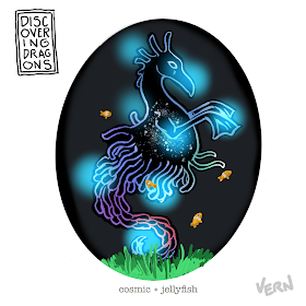
Here is my finished colored Dragon. And below are my steps to create it as well as the community submissions.
For #DiscoveringDragons, I post two or three prompt words for everyone to make into a dragon. It's a nice framework for artists of any skill level to focus some time on an 'assignment' to shake the rust off or get the pencil moving again––all while also being loose enough that there's plenty of room for individual expression and interpretation.
This month the prompt was two words: Cosmic & Jellyfish
I opened several tabs of google image searches of Jellyfish, the Cosmos, and a few images drawn by Nate Pride: Blight Drone 001 & 'The Darkness Consumes All'
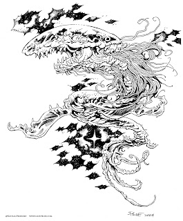
So, I did a lighbox draw over on a clean sheet of copy paper to formalize those elements (seen here after scanning in a purple/magenta tone).
I printed out the above design and taped that onto the back of a sheet of Strathmore 300 series bristol. Using a lightpad, I was able to see through the surface of the bristol as I inked the dragon. I used Copic Multiliner 0.7 pen to ink the art.
The inking on this piece was all about managing those black areas that make the creature look transparent while also conveying that it is made up of galaxies. The Jellyfish bell and tendrils were something I tried to use a different texture for and practice more restraint with. I was unable to finish the inks on-stream, but returned to them later that night off-stream.
Then it was time to start the color flatting process––basically professional coloring-in-the-lines. Some of this is just to make it easy to re-isolate various parts when doing later painting & rendering. I went with a medium blue (darker than in my rough) for the base body, and a similar purple for the Bell & tendrils. For the spots on the bell, I used a very pale yellow as a contrast to the violets.
For the final colors I used a paintbrush to give some subtle color transitions in the body before using the dodge and burn tools to create the highlights and shadows. Each little star and planet and moon had to be carefully gone over with the dodge tool to make it brighter and a appear to shine inside this dragon's body. To make the bell seem more cosmic I painted white stipples all over it like a field of stars.
Below you can again see the final Dragon...
Tuesday, April 2, 2024
Grandparent Mice
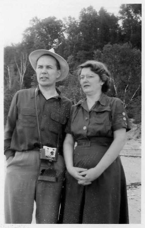
Unfortunately, these did not stand the test of time and I'd repaired them so many times with super glue and epoxy that they were a mess and still crumbling apart. I took a few photos of them before they fell to ruin.
As fans of Mouse Guard know, I based the very idea of having the Guard run by a Matriarch on my Grandmother's role in our family. More recently, I've made her part of the Mouse Guard with a Matriarch named Dorys who is depicted in the stained glass of the Matriarch Chamber as well as a piece in the 2024 Callendar: https://davidpetersen.blogspot.com/2023/09/dorys-matriarch-cook.html


