Tuesday, December 3, 2013

Spotlight on Legends of the Guard contributor Dirk Shearer:

Both Issue #4 and the Hardcover of Legends of the Guard come out tomorrow (Archaia, BOOM!, & I apologize for this odd release, due to a printing issue it was unavoidable). Dirk Shearer contributed the epilogue story for the Legends Hardcover. A bit of background before the interview though. I had already planned the focus of the epilogue story to be about June's printmaker husband Alistair (Alley) to tell a story through prints. When thinking of who could draw a story that looked like woodblock prints, I immediately thought of the scratchboard art of Dirk Shearer. He was the perfect fit. Like the epilogue from volume 1, I did a framing piece at the beginning to lead into the story. But enough of that info...on with the interview:

David: Dirk, Thank you for doing this interview and for contributing such a great epilogue to the Legends Volume 2 Hardcover! Let’s start with your background in art. Did you start showing an interest in art early? Any formal training?

Dirk: Dave, it's absolutely my pleasure! I've been a fan of yours for a while, and was stoked to do this. 

I'm one of those "drawing back when tricycles were cool" types, and, being raised by wonderful grandparents who fostered my growth, having a half-sister 4 years older with a more consistent drawing style, along with other family and friends, I was often challenged to do more, which all just kept me interested, growing, and producing. Outside of the people who influenced me, cartoons, animated films, superhero comics, illustrated books, and my interest in the natural world all had quite the influence on my growth as a young artist. For the latter half of my public education, I was friends with another artist who was also big into comics, and simply put, was better than me, which pushed me to spend time on my work to create equally good art.

David: You are known for your scratchboard work- what drew you to this media for many of your illustrations?

Dirk: Jokingly, but perhaps not, I'd say my fear of painting and strength in value, focusing on the lights and darks. Although I love to view good artwork in color or black and white, my forté has leaned toward drawing than color. I'm improving that with myself, and maybe I'm not as bad at it as I think I am, but it's something I'm always conscious of. 


In middle school I discovered how, in my opinion, good black and white art can be just as relevant and aesthetic as color. Black and white art often carries the stigma of existing due to being a cheaper vehicle over colored work, but when you place Wrightson's artwork from his Frankenstein book next to a Jeffrey Catherine Jones cover piece, Barry Moser's wood engravings or Stephen Gammell's art up to Eric Carle, or Franklin Booth next to Howard Pyle, they stand up! All four of those artists I'd been exposed to by middle school. Heck, Gammell's Scary Stories, which everyone is obligated to love, (I mean it), possibly initiated that interest at a younger age as my cousins and I incessantly stared at his illustrations while reading those stories. It's an honest, damned shame HC removed his illustrations for the 30th anniversary print of Scary Stories.


Unfortunately, I didn't really jump into executing true black and white until college, when I brought those influences back toward the front of my conscious, Barry Moser's work being the obvious beacon. At the same time, both he and Jae Lee were affecting my view of black and white art like no other artists during those years. I began to cut down on the abstract, cartoony, or ultra-muscled, double-bicep'ed characters, and began digging into mood and atmosphere, often more solemn and introspective. I had a black and white illustration class taught by illustrator/ writer Brian Kane, and this was the one class that I really had the chance to experiment with the scratchboard style. The first two pieces stank, but by the third, I knew I was capable of producing professional work. After graduation, I waited a couple of years before I did anything more with the medium, until I decided to create a little niche for myself at comic conventions. I created a series of Justice League portraits in scratchboard, which led to my first freelance projects with the medium.

David: This isn’t your first panel by panel comic work, but is this the first time doing a comic all in scratchboard?

Dirk: Multiple editors, publishers, and my own curiosity have been pushing me to do a comic in scratchboard, but I would often get sidetracked with other projects or freelance. When you approached me to do the story in the medium, it was an opportunity to finally jump at trying it out, no matter what size or restrictions the project might give.

David: For the epilogue story, I gave you a seed of it being about a printer who changes the course of mouse events with his humble trade, but you took it from there and put shape to the story with narration & images. How did you approach the writing portion?

Dirk: Ha, the high school kid who sucked at conceptual writing in me would respond with "um... in English, with paper, and a mechanical pencil."

But seriously, since these panels were done to imitate block printing, I wanted the story to be mostly void of dialogue. For much of block printing's history, and illustration in general, there wasn't dialogue placed over top of the image. I wanted to maintain some of that antiquity in my own way, (unique from say, the too-awesome for words Jeremy Bastian), so I focused my story on a narrative text, with emphasis on the visuals telling the story apart from the text. I've allowed the popular instruction that the art should be able to tell the general story without need of text to sink into my thought process for long enough now that I like to go and prove it sometimes.

David: For your script, you broke down the panels with descriptions and narration for each. Were you just visualizing the pages as you typed? or did you do some thumbnailing to figure out panel shapes or the number of panels per-page?

Dirk: For my own work, I jump into ideas akin to Kurtzman's style. I allow plot, script, and thumbnail sketches to work organically with one another to create the story- both the artist and storyteller inside work together to complete the work. If I get stuck with a sketch, I move onto writing in an attempt to fill the gap. Eventually, both thumbnails and rough script are finished almost simultaneously. Otherwise, my thumbnail sketches might be too messy to comprehend later, or the images in my head may disappear before I can record them in writing.

Once that script was written, what is your process for developing your roughs/pencils? And how do you transfer that work onto the scratchboard? Is each panel its own piece of scratchboard?

I might create a couple more thumbs to secure my confidence with the page layout. Once I'm satisfied, I'll create a larger sketch, often at print size. Or, I may skip that and go straight to final work size, which in the case of my scratchboards, is a hair larger than print- I don't want to work much larger than print size, lest I lose my smallest line detail.

I have a couple methods for transferring, depending what seems to be more convenient per image. I start out by drawing my panels on the board with either a tech pen or black colored pencil, and all the straight lines get ruled out. To transfer the drawing, I either 1.) draw it on with those same tools, 2.) trace the drawing onto the board with a ballpoint pen to leave a slight impression, or 3.) my favorite method- I take a little bit of Xylene (paint stripper that one can purchase at hardware stores), and with paper toweldipped in the xylene, lightly rub the back of a black and white laser copy, (reversed), onto the board. The Xylene melts the toner from the copy onto the board, leaving an image that's blacker than the ink of the scratchboard. This is preferred when I'm lazy and don't want to draw everything again onto the board. Watch it, though- too much Xylene and you begin to affect the scratchboard's ink; not enough, and you simply don't transfer the drawing, and it may affect the paper. It's fun, regardless, like silly putty for adults, but with more vapors entering the sinuses. I should probably caution about that part, but I won't.

I had large enough boards to design each page onto one board, with panels for the most part laid out as they were sequentially in the story.

David: What tools do you use to clear away the black of the scratchboard? 

Dirk: I use the two standard scratchboard tools that you can get from Ampersand- their diamond blade and wide blade. They may have different names than what I just gave, but basically, there's one for small to medium lines, and I use the wide blade to scratch off much wider or areas, similar using a standard crow quill pen nib and a brush when inking. I also use a clay needle tool for my smallest lines. The diamond blade has the most versatility, while the other two take the line widths a little bit further in variety. Sometimes I'll use X-Acto blades, but I often resort back to the aforementioned, eventually. It's all decently cheap.

David: How long (on average) did it take to do the scratchboard work for a single panel?

Dirk: Longer than I thought, but not much so. Once drawn and transferred, I'd guess that each page took maybe 12-15 hours to complete, some panels requiring more or less time than others.

David: Creating tone in scratchboard is a trick of fooling the eye with optical mixes of line thickness and spacing. Do you have any mental process for how you want to approach making those tonal values as you work?

Dirk: Before I work on rendering an object in the drawing, I do some preliminary scratches on the side. It helps me to visualize the overall texture, to set the tone of the object, and to work out any kinks when it comes to the next adjacent object or specific part of the drawing. It's not as easy as one might think, because with any hatching where both values (or colors) vary in thickness to create the value or hue in-between, you may also create a variance in graphic appearance. If I create 10 bold black and white lines next to each other, they may produce a space of 50% gray. Placing 20 black and white lines next to each other in the same size space may create an overall similar value, but the former is going to have broader, more noticeable lines, while the other seems finer. That affects the style. I'm always conscious of that, and have a love/hate relationship with the medium as I make those tiny but important decisions.

David: What other projects do you have coming up?

Dirk: I just finished up a mural for a child grieving center. I'm about to dive head first into a couple architectural concept illustrations for an art space in York, PA; getting ready to start a comics-related art residency with a school in December. I'm preparing for my next season of classes at one of the art galleries near my hometown. All that, along with other, more boring freelance work- color this photo, create that packaging, clip out the giant bear mauling a human in the background of our lovely vacation photo. Oh, and plotting my next personal projects. The life of versatility!

David: Where can fans find out about you and your work and keep up with your projects?

Dirk: Awesome people can follow me on my Facebook page, ambitiously titled 'Dirk Shearer International Experience Of Visual Entertainment,' on my blog at 'Alone In The Dirkness,' or my Twitter account, '@DirkShearer'.  I'll hopefully be getting a website back up in a couple of months, too. I misses it. Dirkshearer.com is now a Japanese food blog. I hear it's dirktastic. In the meantime, my online portfolio can viewed at www.coroflot.com/dirkshearer.

Dirk's story Just a Printer appears in the Hardcover of Legends of the Guard Volume 2 along with stories by Stan Sakai, Nick Tapalansky, Alex Eckman-Lawn, Ben Caldwell, Christian Slade, Rick Geary, Jemma Salume, Eric Canete, C.P. Wilson III, Cory Godbey, Bill Willingham, Jackson Sze, Justin Gerard, &Cliff Monear.
I encourage you to pick up the hardcover collection of this new anthology & all this wonderful work.

2014 Appearances:
MSU Comics Forum: February 22
C2E2: April 25-27
Comicpalooza: May 23-25
Heroes Con: June 20-22
San Diego Comic Con: July 23-27
Boston Comic Con: August 8-10
NY Comic Con: Oct. 9-12

Tuesday, November 26, 2013

Torchbearer Beasts

As I mentioned a few weeks ago, Luke Crane (game designer of the Mouse Guard RPG) has put out a new RPG book called Torchbearer. It's his game-design-love-letter to original Dungeons and Dragons. While I was traveling in early October, I did a few monster drawings for myself, but also shared them with Luke. He & his team have constructed a mini-supplement with them where they came up with descriptions and stats for each to be used with the game (but may be equally interesting for non-gamers to read).
Luke is calling the supplement the Petersen Beastiary. 

The original inked pieces are up for sale in my online store.
Here is a look at each of the finished illustrations. *EDIT-I've added background info on each piece*
"Devil Boar"
I started this piece on a very slow day at a convention. I felt like drawing a monster. A booth nearby was doing makeup special effect demos and had several images of their monster work. One of them was a pig-man-creature..and I thought, I could have fun with that. Because I didn't plan this piece out before I started drawing, it end abruptly on the right..and the horns are wildly not semetrical if you looked at this guy from any other angle.It was after drawing this beast that Luke suggested he could use him for Torchbearer and we started this project.


"Gruxu"
The second monster I drew of the series was without guidance. Well, I should say, Luke didn't give me guidance, and I only used an existing monster's description as a springboard: a Kobold. I looked at crocodile skin and some turtles for texture design ideas. And while not intentional I think the neck bend and the beard/spine extremities owe a lot to the design of Sebulba from Episode 1. I submitted this to Luke as something like an advanced Kobold...the Uruk-hai of Kobolds...but someone on Luke's team created an entirely new species for him.

"Sprikken"
These guys started out as Goblins and also were going to mimic an Alvin, Simon, Theodore personality/shape design...but somewhere along the sketch, I had just drawn ugly little monsters with their own spirits. In Luke's camp, they decided to make these guys not goblin-kin, but the punk-breed of fay.


"Disturbed Spirit"
Started as a Barrow Wight, but then became more Mum-Ra than Tolkien homage. I tired to fix the inadequacies and simplicity of design with a lot of texture (my normal MO)

"Owlbear"
My first illustration for Torchbearer featured a pack of Owlbears and I thought it would be fun to round out the group with a larger take on that bizarre hybrid. In my board game Tower, Jesse Glenn drew a rather funny Owlbear (we call it the Owlbear at Pooh-Corner because he's so friendly looking) and since then I've rather like owlbears as an underused RPG species....one that could even have major physical variations...like some with functional wings...or some that are used more as beasts of burden or war-mounts

And it looks like I'll be doing more pieces for the "Petersen Beastiary" down the line. And like these, I'll offer up the originals for sale the day the .PDF is released.

UPDATE: Part 2 of the Petersen Bestiary Monsters Blogpost: http://davidpetersen.blogspot.com/2014/01/more-torchbearer-beasts.html


2014 Appearances:
MSU Comics Forum: February 22
C2E2: April 25-27
Comicpalooza: May 23-25
Heroes Con: June 20-22
San Diego Comic Con: July 23-27
Boston Comic Con: August 8-10
NY Comic Con: Oct. 9-12

Tuesday, November 19, 2013

Animal Avengers Cover Process

 Steven Wacker asked me back to do another Marvel cover! A "second cover!?!" you say..."where was the first?". The first Marvel cover I did has yet to be reveled or announced, so I can't talk about it yet. This time the subject was Avengers as animals, and Steve thought of me. To the left, you can see the final cover artwork (which was revealed by Marvel yesterday) but in today's blogpost, I'm going to run through the process of making the artwork.

First up, Steve gave me open permission to use any animals I wanted for Captain America, Thor, & the Hulk. He'd said I could even do all-mouse versions if I'd like, but I thought it would be more fun to go outside of the mouse world on this one...

I'd already decided on Cap being a bald eagle (patriotic symbolism and all) when Steve emailed me back (about some deadline detail stuff) offering up "Thor as an elk?"...once I saw that, I couldn't un-think of Elk-Thor. And the last was Hulk who I decided would be like a massive angry grizzly bear. I sketched each of the animals as avengers out on separate pieces of paper and modified their costumes (except Bear-Hulk) to fit the animal frames. The sketches were all assembled in photoshop into the layout you see to the right. I tinted each character so I could easily see where one character ended and the next began. The yellow and orange borders are guides for where the image cuts off, and the logo was a drop-in so that I didn't put anything too important there.

I printed out that digitally composited layout and taped it to the back of a sheet of Strathmore 300 series bristol. On a lightbox I was able to see through the bristol and use the printout as a guide for inking. I used Copic Multiliners (0.35 & 0.7 nibs) to ink this piece. There is a lot of varying textures in this piece...with a lot of repetition of form. These textures not only establish certain greys and materials, but also help differentiate the characters. The hair details on the bear are inked more heavy-handedly than on the elk. The shapes of the eagle's armor is different than the elk's armored leggings...etc.

The inks are scanned and I start dropping in flat colors. I tried to stick with established colors for these characters and/or their real animal counterparts. I could see already at this stage, I needed to focus on getting Eagle-Cap to come forward since he was getting lost in Bear-Hulk.

Rendering the characters using the dodge and burn tools, I pushed the texture and the shadows so the characters each could be read apart from one another.

Here is the final art again. This will be featured on the cover of Avengers #24 NOW.  I do not yet have a in-store date, but keep checking with Marvel on Twitter for news.


2014 Appearances:
MSU Comics Forum: February 22
C2E2: April 25-27
Comicpalooza: May 23-25
Heroes Con: June 20-22
San Diego Comic Con: July 23-27
Boston Comic Con: August 8-10
NY Comic Con: Oct. 9-12

Tuesday, November 12, 2013

Skyward Cover Process

Jeremy Dale asked me to do a variant cover for his fantasy comic Skyward. It's an all-ages adventure story with a boy and his dog as the main protagonists. In this blogpost I'll discuss the process and steps of making the cover. The final color art can be seen to the left, but read on for more info.


My first step was to figure out what characters to feature. Jeremy and Kelly gave me to restrictions of the cover's subject, so I was open to do whatever I felt would be most interesting to me. Since I know I'm better at animal characters (and better known for them as well) rather than humans, I opted for the large bird character and three of the Rabites


I sketched each of the Rabites separately as well as the bird in my sketchbook. Kelly had told me the Rabites would not be very likely to ever ride the bird, so I though it would be fun for the bird to remain planted while the three Rabites tried encouraging him to go. I scanned the sketches and assembled them in Photoshop. This allowed me to adjust scale, rotate figures (or just heads or arms) and get the positioning just right with the character's relation to one another as well as the borders of the cover. I also dropped in the logo to make sure I wasn't drawing anything important up there that may be covered up. The figures were each tinted to help me with the next step.

I printed out the digital layout above at full-size on regular printer paper (I had to print it in 2 parts and tape it together). I then used a low-tack masking tape to secure the printout to the back of a sheet of Strathmore 300 series bristol (my final working surface). On my lightbox I was able to see through the bristol and use the printout as a guide to ink on the bristol surface. Having each character tinted makes figuring out where one character ends and the next one starts all the easier. I inked this with a Copic Multiliner (nibs 0.7 & 0.35). I penciled the tree shapes and the ground's edge on the back of the cover (still on the lightbox) and then inked those in after the figures were completed.

After the inks were done, I scanned those back into Photoshop and started the coloring process. The longest and most tedious part of coloring anything digitally is establishing flats. Because you are painting in flat colors, this step is called flatting. The color choices aren't as important as staying within the lines. In fact, you can use any colors at this stage, just so long as you are setting up that the Rabite fur is one color, and their tunics are another, and their arm & leg wraps yet another. I tend to not use my final colors while flatting because it helps me check if something isn't supposed to be as well as gets me less focused on selecting the right overall palette off the top rather than the work at hand of getting all the areas/color types isolated

I render the flat colors (after I adjust them closer to what is my final idea of the color scheme) using the dodge & burn tools. These tools lighten and darken the base colors. In addition to using a brush with a texture so the work doesn't appear so digital, there are other controls for these tools like the range & exposure. Exposure controls how much lightening and darkening is one at once, but the range does a bit more than it would let on in title alone. The range can be set to 'highlights' 'midtones' or 'shadows' and while that controls which range of color tones will be most affected by the tool, it also sets how the color lightens or darkens ex:.if it saturates or desaturates on it's way to becoming lighter or darker.


Here again is the final cover art. The Dale's tell me it will be appearing on a future issue, and to keep up with them via Jeremy's site or his Twitter. 


2014 Appearances:
MSU Comics Forum: February 22
C2E2: April 25-27
Comicpalooza: May 23-25
Heroes Con: June 20-22
San Diego Comic Con: July 23-27
Boston Comic Con: August 8-10
NY Comic Con: Oct. 9-12

Tuesday, November 5, 2013

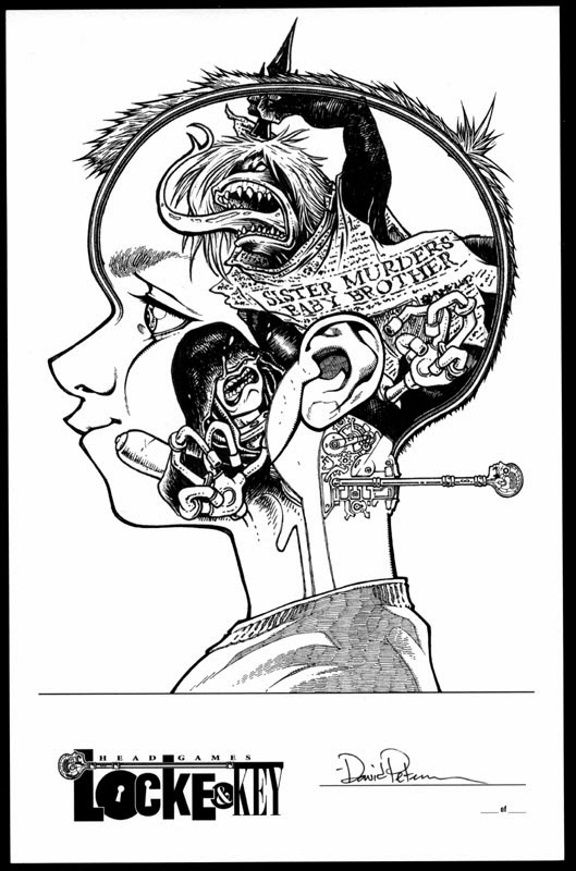
Locke & Key Head Games limited ed. originals

Locke & Key is a comic I was late to the game with but have been trumpeting as one of my favorite books ever since I discovered it. The folks over at IDW asked me to do artwork for their special limited editions of Head Games (the 2nd collection in the series). I was given 3 blank cover plates and 10 empty-head Bodies to fill with my take on imagery from the series (and not just limited to Head Games). An original (along with originals by Jim Mafood, Langdon Foss, Alan Robinson, & Tonya Harris) will be inserted in each book (Bodie Heads in the "Black Label books, Covers in the Black Label ones).

Below these final art images are sketches and in-progress shots as I worked on the project...

Black Label:

Beyond the Black Door

Keys

Tears & Fears

Toys

Undertree Key & Squirrel

Benjamin Locke

Open the Moon

Dodge & Ellie

The Crown of Black Currants

Animal Key

The Tempest

Open Mind

Keyhouse

Process:


It was a pleasure and honor to get to do these, and I hope I get to play in and around Keyhouse again someday.

Upcoming Appearances:
North Carolina Comic Con: November 9-10


Blog Archive