Tuesday, May 25, 2021

Usagi Yojimbo Dragon Bellow Cover 2 Process

I was fortunate enough to be asked by IDW and Stan Sakai to do a run of covers on the new Usagi Yojimbo reprints of 'The Dragon Bellow Conspiracy'. I'll be doing six in total, and for this blogpost I'll be sharing my process for the creation of the cover art for issue #2.

This issue is currently up for pre-order through Diamond with the code MAY210473. Just ask your local comic shop to order it for you, or order it though an online retailer. 
The issue will be in shops July 28, 2021

To the left you can see the finished cover, but below I'll go through the steps in creating it.

Layout/Pencils
For this second cover, the subject was easy. There's a great fight in the issue between Usagi and Shingen the leader of the Neko Ninja (cat ninja). The fight starts in a forest, but then moves to a cliff-side waterfall. I loved the Sherlock & Moriarty duel at Reichenbach Falls vibe it had and set my cover there.

I drew Usagi and Shingen each separately on copy paper in leaping poses, and placed them into my template in Photoshop (keeping in mind where the logo bar will crop the image) There I could resize them and shift them until I liked their placement. Then I spent way too long looking at photos and drawings of waterfalls to figure out how to draw mine, which I also did on copy paper. I then did a quick digital paint test to see how all the shapes and forms blocked out against each other.


Inks:
When the above layout was approved by the editor and Stan, I started the inks. First step was to print the layout file onto copy paper (over two sheets that had to be taped together at the seam) and tape that to the back of a sheet of Strathmore 300 bristol. On my Huion lightpad I was able to ink the cover art using the printout as my pencils lines. This way in the end the inked artwork is very crisp and clean with no need to erase pencils lines. I used Copic Multiliner SP pens to ink the art (the 0.7 and 0.3 nibs).

I left a gap around the characters and didn't let the waterfall inks touch them so that it would help push the background back further, but also to help me in the next step of digital coloring.

Color Flats:
The inks were approved and I scanned them in to Photoshop to start the coloring process. This first part of coloring digitally is called 'flatting' and is a professional version of coloring inside the lines. Establishing what each area's color is and where it ends. This not only is a color base for the image, but also allows a quick flat color area to be able to quickly isolate to render or make adjustments on. 

In this step I also established all my color holds (areas where I want the black inkwork to be a color other than black). The main one was the background (I also used color holds on Usagi's scar and a bit of the detail on Shingen).


Final Colors:
Here again is the finished art (this time sans-logo). To render all of the color I mostly used the Dodge and Burn tools (Photoshop tools based on real photography techniques for purposely over or under exposing film as it develops). Burn is do darken and Dodge is to lighten. I use a stock Photoshop textured brush as I add shadows and highlights with these tools so the work looks a little more organic and less digital.

It's an honor to be asked by Stan to do these covers and to get his approvals as I work through each cover. 

Usagi Yojimbo: The Dragon Bellow Conspiracy #2 is out in stores July 28th

Tuesday, May 18, 2021

Plotmasters: CLAW

The latest episode of The Plotmasters Project went up on the site today. It was an episode Jesse and I recorded LIVE on my Twitch stream for ONLINECON titled: Cats Trio Revisit: CLAW! 

To the left you can see my finished art for my Plotmasters update of the Cats Trio big-baddie. Below in this blogpost I'll show the steps of the process to create the artwork

If you haven't seen the episode, I've posted the video at the bottom of the blogpost, or you can link to it directly on YouTube here: https://youtu.be/ok2waaIu_jI


I wanted to play up the military side of the character. Give him tactical gear, and show him amidst a pile of destruction and billowing plumes of smoke. In this rough pencil sketch you can see a few abandoned poses on top––the one on the left owing a lot to Wolverine. 

But the sketch I liked best and worked up the most was one where he's almost casual about what he's done: 'All in a day's work' attitude, with perhaps a glare of 'I'm coming for you next'.

I found lots of online reference for various body armor,  packs & pouches, and weapons to get the look right.

As you can see relative to the paper the above sketch was pretty small, so I enlarged it and then on a lightpad redrew it tighter, working out more details as I went. 

I scanned those tighter larger pencils and did a digital paint-up to help me see the shapes and especially the light to dark value shifts of the plume of smoke.

On his kneepads and shoulder armor I added some insignias (the 02 later was changed to 03 to denote Claw's correct order in the the experiment subjects) And for the shoulder piece I made up my own emblem that he fights under.


I wanted the symbol to have some history, some nazi-like menace, something that makes seemingly regal symbols look sinister when added together in context. 

So I did a clipart search for some heraldry. The cross was meant to be similar to the nazi iron cross, but without being rooted in that specific brand of fascism, the grail cup has lots of connotations that go to myth and vessels for purity, and the shield chevron was a military badge shape I found. I added the three together into this patch. I like the design, and I like how it works for a villainous group.


The next step was to print out the above layout and tape it to the back of a sheet of Strathmore 300 series bristol. On a Huion lightpad I'm able to see through the surface of the bristol to use the printout as a guide as I ink the artwork.

I used Copic Multiliner SP pens (the 0.3 & 0.7 nibs) to ink the linework.

The pencils were fairly tight for this piece, so most of the inks were just direct translations other than adding texture to the rubble and the plume of smoke.

I left a white gap between Claw and that smoke trail. It helps separate him from the background visually, but also makes a part of the coloring a bit easier when I establish the color hold for that area.

To start the colors, I scanned the inked artwork into Photoshop and added flat colors to Claw. This is a tedious stage of digital coloring called 'flatting' that is essentially a professional version of color-in-the-lines, establishing all the color areas. 

At this stage I also isolated all the linework I wanted to be a color hold (an are where I wanted my inked lines to be a color other than black. That gap I left between Claw and the smoke really helped me care out the lines that belonged to the background and leave the main figure's lines alone.

Most of the color choices had already been made in my quick digital paint up back in the layout stage.

And here again is the final version with a logo treatment from my original Cats Trio Plotmasters update

The rendering was all done using the dodge and burn tools in Photoshop while using a stock brush.

This piece concludes the episodes for Season 1 of The Plotmasters Project. Jesse and I hope to do more as time permits.


Below you can watch The Plotmasters Project episode: Claw: https://youtu.be/ok2waaIu_jI.

Tuesday, May 11, 2021

The Buck-Toothed Yahbex

Last Friday on my Twitch Stream, we did the fifth community draw-along event #DrawTheExtinct where I posted an image from an old block print I made with a few animal photo inspiration prompts and the idea to create an imaginary extinct animal. I worked on my piece live on my Twitch stream while viewers worked at home and then on Monday we shared our finished pieces. 

Here is my finished Buck-Toothed Yahbex. And below are my steps to create it as well as the community submissions.


We started with the prompts of my original linocut print & sketch from a piece titled 'Extinct' as well as a yak, an ibex, and a beaver (specifically the teeth of the beaver and the horns of the ibex). I named the creature the Buck-Toothed Yahbex.

I told the viewers that they could use any combination of the inspiration prompts––they could make their version as cute and cuddly as a pocket pet stray kitten, as monstrous and deadly as a giant kaiju destroying cities, or anything in between. I also wanted this to be an excuse to get their pencils moving. I invited all skill levels, because I'm a firm believer that you shouldn't have to be good at something or pursuing mastery of it to just simply enjoy the act of it...and art is no exception.


On the Friday stream I started drawing with mechanical pencil on a sheet of copy paper to try and reimagine the beast. One of my problems to solve was how to fit a tall animal into the space of the final composition without losing details and I decided to work on the anatomy of it laying down. The image here is after I'd scanned my pencils into Photoshop and made some proportion checks and moved the hear around a bit.


After I'd locked in my above design, I printed that piece out on copy paper and taped it to the back of a sheet of Strathmore 300 series bristol. Using a lightpad, I was able to see through the surface of the bristol as I inked the Buck-Toothed Yahbex. I used a Copic Multiliner 0.7 SP pen to ink the art. I was still streaming this portion on Twitch, though as my end of stream time was coming up, I was nervous I wouldn't finish in time. Turned out, I was able to get the last bits of ibex-style horn inked as I said goodbye to everyone watching and offered encouragement as they worked on theirs over the weekend. 


Off stream I scanned the inked artwork into Photoshop to prep it for final color. First thing was to drop it into the template I have for #DrawTheExtinct pieces with the border, background, and a base shadow already established. Then I started drawing in flat colors. This part of coloring (called flatting) is just a professional digital version of coloring-in-the-lines to establish the color areas.

My color choices were somewhat based on the original lino print, but I tried to make the fur closer to a realistic and believable grey rather than blue.


Below you can again see the final rendered corrected colors with a border and type applied. 


But, as this is a community event, I wanted to share all the other entries posted in the Discord. I awarded a prize and we voted together on a few more (prize winners marked with *) on Monday's Twitch stream and we all enjoyed seeing what each other had done. I hope we get even more participants next month (first Friday!)

Cortrah

AU Tiger


Dark


Evil Cartoonist


Flannel Wizard*

KFlagg*

RedJarOJam

Sarahs_Crumbs (wip)


Serarel


Shnookerdoodle*


Tyrie*


VernNYC*


Tuesday, May 4, 2021

Owlhen Caregiver Cover process

The Owlhen Caregiver is a new Mouse Guard single issue will be coming out soon. The issue collects three short stories: Piper The Listener, The Wild Wolf, and a brand new tale, The Owlhen Caregiver. You can order the issue currently through your local or online comics retailer.

The Diamond order code is MAY210942. 
The 32 page issue will be in shops: Jul 14, 2021  

For this blogpost I'll go through the steps and references for creating the cover art you see to the left.
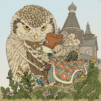

First I should start with the reference material. The Owlhen story, like many of my short stories, adapts a visual stylization for the tale within a tale. I looked to early 20th century Russian illustrator Ivan Bilbin for my reference point. On the interior pages I emulated his work more convincingly, with his flat illustrative style focusing on detailed contours rather than rendered forms or lines for shadow. For the cover art, I wanted a more David Petersen/Mouse Guard looking version so I rendered the piece more naturally. Though I wanted to keep the elaborate flat pattern on the cloak of the mouse character––and I borrowed that design from this piece of Bilbin's titled The Island of Buyan from 1905.


The next piece of reference is the owl's nest, which I wanted to be more of an architectural location than a natural rendering of a nest made of sticks (this is a fairy tale story after all). To keep in the theme of Russia, I researched their history of wooden stave churches and found this location: The Church of the Nativity of our Lady of Peredki, which has been moved to an open air heritage museum Vitoslavlitsy in Veliky Novgorod, Russia.

Luckily because it's a historic site that is easily accessible, there are lots of photos available online from different angles that would help me use it page after page. In the Mouse Guard version, I turned several of the turret sections from a log-cabin timber construction to a woven bird's nest look.

The last reference I gathered was for the owl. I'd featured a Great Horned Owl in the Winter 1152 storyline and wanted something visually different. Researching various owl species, I landed on the Northern Hawk Owl which had the right size scale I wanted as well as some interesting feather patterning.


I penciled my characters and location on different sheets of copy paper. With each element drawn separately I could composite them together in Photoshop––this allows me to make size and position adjustment as I go to try and get the compositional layout that works best for my eye. In Photoshop I tinted each drawing a different color to help me see each one and figure out which lines belong to which thing. 

I also used Photoshops tools to warp my re-drawn Bilbin-esque fabric pattern to match the contour of the mouse's cloak.


I inked this on Strathmore 300 series bristol. First, I printed out the above layout composition onto copy paper (it took 2 sheets that I had to tape back together) and taped it to the back of the bristol. On my Huion lightpad I can see through the surface of the bristol down to the printout to use as a guide while I ink. I used Copic Multiliner SP pens (the 0.7 & 0.3 nibs)

To make the coloring step easier, I left a gap in the inks between the figures in the foreground and the architecture of the nest-building. Even in black and white, it visually helps break up the planes.


I scanned the inks back into Photoshop and started the coloring process. That first part of digital coloring is like a professional version of coloring-in-the-lines called flatting. It's where you establish all the color spaces with flat colors. I'd already colored the interior story pages, so the color choices were mostly established. 

At this step I also made all of my color holds (areas where I want the inkwork to be a color other than black). I created a color hold each for: the architecture, the owl, the owl's eyes, the fabric patterns, and the feather's stripes.


The last step was to render all the color by adding highlights, shadows, and textures. I did that with the Dodge and Burn tools and a stock textured Photoshop brush.

Here is the solicitation info for the issue, due out July 14th 2021:

Which of life's biggest lessons can be learned from the smallest amongst us? A young mouse learns that compassion and kindness are the great virtues in "The Owlhen Caregiver." "Piper the Listener" finds a brave mouse venturing into the wild country to learn the tongues of other beasts. And a grizzled oldfur shares the lesson of putting a whisker out too far in "The Wild Wolf." Three poignant tales mark creator David Petersen's return to his beloved Eisner and Harvey Award-winning series in this self-contained special. 

Order now through Diamond
MAY210942 –– $4.99