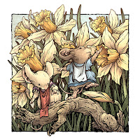
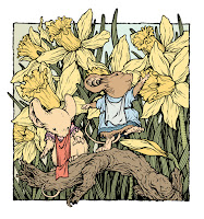
 Though I don't usually do inked 8" x 8" commissions any longer, a long-time fan made a special request that I was happy to make happen. To the left you can see the finished piece, which I also colored for use in my next sketchbook.
Two young girl mice enjoying the spring daffodils.
Below I'll walk through the process I used to create the finished artwork.
 Reference Material:
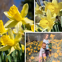
The fan emailed me a photo of his daughters in a field of daffodils and asked if I could illustrate the scene but with his daughters as young mice from the Territories. He also referenced the cherry blossoms in the far distance. The problem with 'recreating' a photo like this with mice is scale and focus. The Daffodil blooms would be enormous--so it becomes harder to show the mice as central character while still getting enough flowers in the image to imply a field--and that pretty much also means the cherry blossom element had to go too.
Along with the family photo, I also sourced a few closeup photos of daffodils to draw from.
 Pencils/Layout:
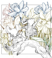
Knowing the scale problem, I drew two young mice on a fallen dead branch. I then drew multiple daffodils. All of these were drawn by hand separately on different sheets of copy paper. After I had a pile of drawings, I scanned them into Photoshop and started arranging them into a composition. With the each being drawn separately, it was easy to tint them different colors, keep them on different layers and slide them around or resize them. I also noticed in most of my reference that daffodils tend to all face the same direction, so a few of my daffodil drawings either had to get mirrored, rotated or scrapped to make sure my composition looked correct.
Inks:
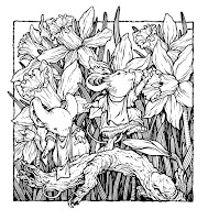
When I had adjusted the pencil drawings in Photoshop into a composition I was happy with, I printed out that image on my home printer. I then taped that printout to the back of a sheet of Strathmore 300 series bristol board. On my Huion lightpad, I was able to see through the surface of the bristol down to the printed image that I could use as a guide for inking the final art. I inked this using Copic Multiliner SP pens, the 0.7 and 0.3 nibs.
Flat Colors:
Once I finished the inking, I scanned my artwork into Photoshop to start the coloring process. At this stage, I'm not concerned with any texture or lighting or rendering--just adding flat colors to establish what areas are what colors.
I went with the clothing color cues from the fan's family photo.
 Final Colors:
The last step was to render the colors to add highlight and shadow and texture. I did this almost entirely with the dodge and burn tools in Photoshop and I also added a color hold (areas of the ink work that I don't want to be black but rather a color I can shade and manipulate to push distance or reinforce lighting effects)
This piece will be eventually collected in my next sketchbook tentatively titled 'Dawn, Daye, & Dusk' later this year.
No comments:
Post a Comment
Note: Only a member of this blog may post a comment.