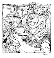
To the left you can see one of those pieces finished and colored ready for a page in that sketchbook––and in this blogpost I'll break down the process to get there.
The request was a sea otter as a renaissance printmaker. While I'm happy to do this kind of subject, I didn't know if it would fit into a Mouse Guard sketchbook––but as I worked on it, I enjoyed the piece so much, that it's going in even if this isn't how I'd depict otters in my books.
I drew different elements on sheets of copy paper and then assembled them in Photoshop. Besides drawing an otter holding paper, I wanted to ficus on giving him an appropriate renaissance flourish to his clothes--specifically his hat and getting a historically accurate printing press. To bedazzle the hat, I just added a crab instead of a feather plume, and for the press I referenced the Rembrandt Press in Amsterdam.
With the pencil drawings assembled with a bit of digital assistance into a layout I liked, I printed out the above image onto copy paper. I then taped that copy paper onto the back of a sheet of Strathmore 300 series bristol. On my Huion lightpad I can see through the surface of the bristol down to the printout to use as a guide as I ink. I used Copic Multiliner SP pens (the 0.7 & 0.3 nibs).
I tried to use a lot of hatch marks to define the greytones in the piece--which ties into my own experience when getting my degree in Printmaking.
I tried to use a lot of hatch marks to define the greytones in the piece--which ties into my own experience when getting my degree in Printmaking.
The original artwork was then packed up carefully and shipped off to the owner. But before it left, I got a proper high-res scan so that I could include it in the next Mouse Guard sketchbook.
First step to coloring is called 'flatting'. It's basically a professional version of coloring-in-the-lines and establishing what color area each thing in the piece is. The final colors can be altered, but because they are easy to grab flat tones, I can render each color area separately from the other.
Here are the final colors all rendered and textured. I do most of this work only using two tools in Photoshop: Dodge and Burn. These are tools that date back to when Photoshop was a photo retouching tool and emulate part of the development process to over and under expose areas––ie: make areas darker and lighter. So with a stock textured brush I add shadows and highlights.This piece will eventually be collected with many more in an upcoming sketchbook I plan to release in early/mid 2022


No comments:
Post a Comment
Note: Only a member of this blog may post a comment.