Model Building:
Like many artists, I find it easier to draw something, if I have a visual reference for it. Even if you have imagined a wonderful setting or room or style of architecture, it can often be complicated to imagine that same image from a different perspective or under different lighting.
When working on Issue #6 of Mouse Guard Fall 1152, I had a tricky few panels that showed the portcullis at Lockhaven's main gate crashing down. I built a model out of bristol scrap stock I had laying around. Using an x-acto, some rubber cement, tape and a pencil to sketch in some panel details, I had a nice little model of Lockhaven's gate.
The trick proved so useful that when it was time to create the town of Barkstone for the 'field guide' portion of the Fall 1152 hardcover, I found several free paper-models used by gamers to use in tabletop miniature games. Julia assembled a doze of these or so and taking multiple pictures, I was able to make a rough layout for all of Barkstone.
At the start of the Winter series, the mice arrive in Sprucetuck, which was in my mind, to be an apartment style town of Ewok technology mixed with Brian Froud's design sensibilities. I was worried about showing the perspective of the various balconies, elevators, railings, etc. without some model help. I took a day to build a multi-floor section out of cardboard, bristol, rubber cement, and pencil drawn details. Using multiple photos and rotating the model, I was able to see a more full version of Sprucetuck, without having to build much of it at all.
Knowing that Gwendolyn's office was going to be a repeated setting, I made a model of half of her office in the Fall series. It was one of the fastest I have made, and I'm really looking forward to making a better one with the full run of her office. However, even this little crude version can instantly help me visualize a scene from a different angle and give me reference for what details will also be seen or not seen.
The repeated arches in in Darkheather, seen in the Winter series, were driving me nuts. I printed out a drawing of the arch pattern and tacked it to 1/2" insulation foam board (available at any Home Depot). I cut the shapes out with a jig saw and drew in the details with a pen. I used the same technique of shooting the model several times while not moving the camera, but moving the model, to create an elaborate maze of them.
Lockhaven's Larder is proving to be another frequently used location. Unfortunately, the model is out-of-date by the way I started drawing one of the walls in issue 3 of Winter. I thought about reworking the model, but this one is pretty small, and I'm afraid I'd ruin it and have to start over if I tried altering it. I just use it for a quick "pre-viz", as the move folks call it.
For the bone chamber that Saxon falls into, I knew I wanted the architecture to be grand and spooky. For this one I took photos of an arch pattern I liked and printed it out. I glued the printout onto bristol scrap and cut the parts to form the vaulted ceiling. The dome was tricky, but I made it using a paper model plan for a globe. There is a cut-out section of the floor so I could get an up-shot view and the dome is removable for a down-shot view.
This last model was the trickiest. With some of the models, I was dealing with rooms with simple shapes, or geometry I could easily get patterns for. This one, which is part of the mouse prison/tomb of Darkheather, was built from scratch. In bed one night I was thinking about the architecture of this space and thought that the floor plan could imitate the 6 sided patterns (a stylized heather bloom in most cases) I used to decorate the weasel home. I could imagine the columns from a top down perspective, but I couldn't imagine what the space would look like, especially at mouse size. I started with the central column and worked outward.
All the models hang around my studio (with the exception of Sprucetuck witch came all apart and is mostly stored in a bag in my filing cabinet). I really find that the models help with the visualization and composition of a scene, they can help with perspective problems, and force you to stop drawing and do something else productive with your hands and time (which can be a great gear-shift to give you a break when you are stuck in a rut).
2009 Appearances:
Here is list of the confirmed shows I am doing next year.
New York Comic Con: Feb 6-8
WonderCon: Feb 27-Mar 1
Emerald City Comic Con: April 4-5
Motor City Comic Con: May 15-17
Heroes Con: June 19-21
San Diego Comic Con: July 22-26
Wizard World Chicago: August 6-9
Baltimore Comic Con: Oct. 10-11
*more to be added soon*
Fan Art:
Thanks to the wonderful Katie Cook for sending me two awesome mousey-doodles.
I really love Katie's work and how she's never afraid to mix cute with gore.
Tuesday, December 16, 2008
Wednesday, December 3, 2008
From the Vault: TOWER!
Tower: The Board Game
(WARNING: COPIOUS AMOUNT OF GEEKY CONTENT TO FOLLOW)
I'm opening the Petersen vault (as I did with Jesters) on a game project. It started while playing the old TSR board game Dungeon. My pal Seyth and I were complaining about the flaws in it and how we would fix the flaws. It ended with a year long (not full time, we were both still in college) development of our game: Tower. Having played it on assorted game nights I can attest that it's not that much better than Dungeon, but because we made it, it has a soft spot in our hearts.
One of the first changes we made was to have more diverse characters. Dungeon had 4 (?) types of characters but multiple copies of those types. We decided that if there are two magic using characters, they should have differences. We made 15 characters and based a lot of them on our own D&D characters (My elven thief and Seyth's Dwarven Berzerker were first on the list). Here's another post where I go into more info & art about the characters
Tower uses three different kinds of cards. Treasure cards can be either worth gold or have a use in gameplay. They are separated into 6 levels (one for each floor of the tower) with level 1 being least valuable and 6 being the most. Spell cards help magic users keep track of what spells they know and which they have used. And after years of playing we decided to help balance some of the characters who weren't as well off with hand-drawn item cards. Each character gets 1 item specific to them at the start of the game. Unfortunately, this didn't completely balance anything, but made for other quarrels about how fair/unfair someones personal item is.
The game is played on three separate boards each showing 2 floors of the Tower. I layed out the boards in Pagemaker and have since lost the files (and my copy of page maker...good riddance). I originally wanted to have the boards stack and pivot out of the way to access the lower sections, but the design proved too tippy or heavy. This photo also shows the 'Monster manual" that is indexed as to which monsters appear on which levels. I id most of the artwork for the manual, but Jesse Glenn (Kenzie) provided several of the creature art pieces. Some of his are the most loved/memorable in the game (like the Owlbear).
In addition to making the characters all unique in the game, they all needed artwork and miniatures for gameplay. I customized Lego figures, drew portraits of each character, and fabricated character cards that could stand up to drunken use. I added sculpy to the legos and baked them in the oven at a low temp, so as not to distort the lego plastic too much.
To randomize which monsters appear in which room, I made lettered tokens 'A'-'E' & 'X'. I rolled out sculpy, stamped them with a rubber monogram stamp and then cut them into chips with a piece of thin walled brass tube. It was when I was fabricating these pieces that Julia and I were dating and getting serious. She still says this game fabrication was a bit scary for her and she wondered if I was stable enough to be a good boyfriend.
So there it is. A huge amount of work went into the game when I should have been studying harder or paying more attention to my girlfriend (especially when you consider how flawed it still is). But on New Years eve, it's the game that everyone wants to drag out and play.
Other Work:
I have turned in my dummy copy of Snowy Valentine's Day to Harper Collins. I have a while to breathe and tweak the sketches before doing the final work, but I am very happy with the results. Obviously, I can't share too much of the book, but here is one of the pieces/scenes I am most proud of. Jasper Bunny, looking for the perfect Valentine's gift for his honey bunny, visits the porcupine children who are knitting scarfs for their mother. Jasper learns he can't knit and that porcupine tots find that funny.
I also got an opportunity to do some work that will be featured on products for comic book artists (not sure if I can reveal who/what yet). I was asked to do a few sample panels in my style, but without being something already under copyright etc. The Ladybug with the top hat and moustache still cracks me up a bit.
Wednesday, November 26, 2008
Mouse Guard Winter #4
The wait is over! I really appreciate all the patience the fans have shown and I hope you all enjoy Issue #4. As I mentioned earlier, Jesse Glenn, who composed the music for the Ballad of the Ivory Lass, also recorded a version where he performed the lyrics as well.
So here for download is the MP3: Ballad of the Ivory Lass
Happy Thanksgiving to all! (I know I'm a day early) I am thankful for having such loyal and awesome fans who really appreciate what I'm doing in comics. It means a great deal to me that I went from being a fan, to having this as my profession, and I couldn't have done it without fans.
I am looking forward to getting back to posting more regularly about my various projects. I also plan on getting back to posting Fan Art, going into my artistic vault, and perhaps a few more tutorials.
Saturday, November 22, 2008
Mouse Guard Issue #4
I have word both from Diamond and ASP that the long delayed Issue 4 of Mouse Guard will be in stores Nov 26th! This is my favorite issue to-date, has my favorite cover, and features Mouse Guard music!
Speaking of which, as I mentioned on my blog before, Jesse Glenn (the real life Kenzie) not only wrote the music for me to scribe a ballad, but once I was done, he recorded a version of it with him singing three-part-harmony! I will make the MP3 available here next Wed. once the issue is in stores.
So re-read Issues 1-3 of Winter (you may need the refresher, I certainly did!) and check back here Wed. for that special download.
Another note on ASP and Mouse Guard. The latest release date for the RPG is Dec. 24th, and the Limited Ed. Slipcase B&W hardcover is slated for release at the New York Comic Con in Feb.
I can't thank fans enough for not only taking a chance on a odd-shaped book about mice with swords, but also for being so patient and loyal. I have heard from many of you offering support and kind words when the book was in publishing limbo. Trust me when I say that it meant a great deal and helped me through a frustrating and stressful time. Hopefully that is all behind us now, and I can focus on just telling the best story I can and hopefully entertaining you fine folks in the process.
So if you are an old fan, or just joining us: Welcome.
"All Who Come Are Welcome"
Friday, November 14, 2008
Portsmouth or Bust~!
This Sunday (Nov. 16th) is the Portsmouth Comic Show. I will be there as well as Steve Bissette, Christopher Golden, and Craig Rousseau (and more!).
You can find info for the show at the link above!
PS: Thank you for all the comments and E-mails about my health. So far, no other reactions, and no signs of a cause.
I will update on this and all things Mouse Guard as soon as I can.
Tuesday, September 30, 2008
Health Problems:
Some of you may have alrerady heard, but for those who didn't, or didn't get the full story at Baltimore, I'll recap. On Sunday morning, after having breakfast at the hotel in Baltimore, I headed over to the convention to setup. Once I got to my table I felt very itchy and hot. I couldn't stop rubbing my eye and my palms itched terribly. I headed to the bathroom to splash some water on my face, and found that as I walked my hands were swelling. Once in the bathroom, I didn't really recognize the guy looking back at me in the mirror because my face was swelling so badly.
Julia took me to the E.R. where it was established that I must have had an allergic reaction to food (though I have never had any food allergy in my life). My swelling was starting to effect my tongue and throat so that it could have been possible that I would have become unable to breathe. I was kept at the E.R. for about 5 hours total for medicine and observation. I was able to get back to the convention and sign some books, but because my hands were still a bit swollen, I wasn't able to do any sketches.
I want to apologize to the fans who I told to stop by Sunday for sketches and the fans who came by for signatures. I really wouldn't ditch a con unless I had good reason. I think the people who helped watch my table Sunday (Emily Jenkins, Jeremy Bastian, and Nick Tapalansky) were cautious to reveal the personal nature of my absence, but I want everyone to know I was in the E.R., not simply sleeping one off or being lazy.
A big thanks to Emily who did the lion's share of the table sitting for me. She not only managed to keep the books available to fans, but also got all my finished commissions to their owners and made a few page sales!! Also thanks goes out to Dr. Kim and Dr. Rice and the staff at University of Maryland Medical center for their help.
I have an appointment tomorrow to start testing for what may have cause my reaction (so far being guessed as a raw-fish-cross contamination). Because of these health problems and Mid-Ohio next weekend, I may be slow or unable to respond to e-mails and blog comments, but please be patient and I'll try and catch up when I can.
Other than the allergic reaction, Baltimore was great!!! I really like this show a great deal. Marc Nathan does a great job making it feel like a home-town convention, with a big budget guest list and staff. I was worried that because the Diamond retailer summit that usually is linked to the con, was in Vegas this year, Baltimore attendance would be down. I don't know what the official count was, but by my estimation, it was up from last year!
New convention banners
Thanks to Devyn of imphotographics.com for dropping off my new convention banners in Baltimore. Space was a little tight so I was only able to show off one of them at Baltimore, but thought I'd take photos of how great I think they turned out.
Fan Art
I have three pieces of artwork to share this time. The first is from Jackie Santiago. She was set up with Nick Tapalansky in artist's alley at Baltimore. This was her first time with an artist alley table. She says she did very well and picked up a great deal of commissions.
Next up is another piece I received in Baltimore, but unfortunately, I don't remember the artist's name and I cannot read the signature (it's a tiny drawing, smaller than a business card). She drew Sadie knitting because she knew from Mouse Guard, that Sadie had spent a great deal of time alone at the outpost Frostic and that it would be a good hobby (shared by the artist).
The last one, but certainly not least, was one I should have posted back after the super show. It's a sketch card by Lin Workman. The color is very vivid and I really appreciate that he took the time to do it as a surprise gift.
Upcoming Appearances:
Monday, September 22, 2008
Happy first day of Autumn, Autumn!
We are entering my favorite time of year, Fall (any wonder the first Mouse Guard book takes place in that season?). It was three years ago that Julia and I adopted our dog, and since it was the first day of Autumn, we named her as such. We got her at a pet-adopt-a-thon at the Detroit Zoo (where my sister-in-law works). Autumn was a rescue from the west side of Michigan near Muskegon. After some research we found that she is an Anatolian Shepard. And the only breeder in MI is near there, so we wondered how she ended up at a rescue. Turns out, her bite (the way her teeth align) does not conform to the characteristics where she could be used to breed. But, their loss is our gain. She really is the best dog I have ever owned.
This weekend (Sept 27th & 28th) I'll be at the Baltimore comic convention! I really enjoy this show, it's a nice size, not too big, not too small. As normal, I'll be signing, and doing doodles and I'll have free temporary tattoos. I'm also excited to have my new Convention banners dropped off to me from IMPhotographics. So if you are attending the show, stop by and see me and my new banners!
I was chatting with fellow-ASP creator A. Dave Lewis the other day about Michigan and our current state of affairs. He was asking me for a point of view from someone living and working in MI. We talked about the departure of the auto industry and how Michigan needs to move on and find other industries or revenue to welcome into the void left by the auto-evacuation (that is not to say I don't value the still producing auto jobs here, but it is unrealistic to think that the auto industry will ever boom here again like it did in the first half of the 20th century). One of the points that I always come to is that MI should be a vacation/tourism location. A. Dave was surprised by my statement and asked, "why?"
I could easily fill up an entire blog post explaining why, but I'll instead say that I never intend to leave MI as a home because everything I'll ever want is right here. It's why I based Mouse Guard's landscape and city names on the state I consider my playground. Michigan.org has been playing some awesome ads here to encourage MI travel, but I don't know if they are playing to a wider audience, but these ads give me goose bumps and say the types of things I think we should have been saying about our state for a decade (and all narrated by Michigan native Tim Allen). Here are the links to my personal favorites so far. The last link is the Michigan.org site with even more radio and TV ads.
After a convention where I met Bill Willingham face-to-face, I was offered one of the tale-within-a-tale stories in Vertigo's House of Mystery series. My story (written by Bill, artwork by me) will be in issue 7, due out on Nov. 5th. Here is a sample panel from pencils to final colors. I doubt I can say anything about the story..and by posting this I probably have already said too much.
I may get a chance to do a step-by-step drawing tutorial that appears on the StarWars.com kids site. Here is the final drawing that I colored of a smelly on the outside, even smellier on the inside winter mount. I'm a pretty big Star Wars fan (there have been a few SW references in Mouse Guard so far) and I was pretty geeked to get this opportunity. I'll post when/if the tutorial gets accepted and is posted.
I have been hanging on to this fan art by Ryan 'invincifan' from the Comic Geek Speak forums. I found it again after reading this article on Newsarama where "Sheik Muhammad Munajid claimed the mouse is "one of Satan's soldiers" " and "warned that depictions of the creature in cartoons such as Tom and Jerry, and Disney's Mickey Mouse, had taught children that it was in fact loveable...that under Sharia (Islamic law), both household mice and their cartoon counterparts must be killed."
Saxon is a marked mouse......
Good thing my mice have weapons.
Wednesday, September 10, 2008
From the Vault: Jesters
Old Friends:
A few weeks ago, I got together with two of my closest friends Mike Davis and Jesse Glenn. I have known Jesse since I was 11, and Mike since I was 13. They stood in my wedding, they are like brothers to me. It had been far too long since we were all sitting around a table, so we planned a game day. We played Risk, Settlers of Cattan, and Crononauts. I bring this up because I know how instrumental they were in getting Mouse Guard's ball rolling.
All three of us are artists and we spent all our spare time together playing role playing games and drawing and making up comics. Through the years we created things together and we created things alone that we only asked for critiques on. Mouse Guard I did alone, but added my dear friends as characters and asked for their opinions on my mousey world right from it's creation. Some of the ideas we never got around to really developing are ones that I still like to dust off and take a look back on. This is a long way of saying that I want to regularly some of those projects from ----
The Vault: Jesters
This time around, I took a look though the folder marked 'Jesters'. Jesters spawned from Halloween costumes Jesse made for he and I. We were invited to a party and needed quick costumes, we also knew we could get in 'free' if we dressed as some sort of clown and offered to serve drinks and tend the front door. After that party I thought we had the start of some fun characters. I named them Donovan and Jakeus (D for David/J for Jesse). The concept was to have two medieval adventurers/spies who were entrusted to know all the kings dealings and could easily get into other kingdoms under the disguise of being fools or jesters. My concepts were taken right from the costumes and our own likenesses.
Later Jesse started writing a very funny/witty script where the Jesters discover a plot against the king but are thrown in jail for arguing in public in a bar before they can do anything about it. My artwork was being heavily influenced by my admiration for Mike Mignola's work and Jesse never finished the script. I still think the concept has potential, but for now will remain in the vault.
Tutorial:
A friend asked me to look at a scan that was sent to him to figure out why it looked odd. Turns out the person who scanned the artwork scanned it as a bitmap. Now I know a lot of tutorials and pros will tell you to only scan your linework for comics as a bitmap. For Mouse Guard I scan as greyscale and here's why. On a bitmap setting when a scanner is 'looking' at the artwork and it finds a 'grey area' it has to interpret it as either black or white. There are several methods it can use (usually settings you can adjust or set before you scan). I put together an example of a greyscale gradation and how the various settings effect it.
-Threshold: maps out large areas as either black or white. once the tone gets to light it's just pure white
-Pattern Dither: will try and stipple out a black and white uniform pattern in the pixels to simulate the gradation.
-Diffusion Dither: same as pattern dither, but in a random distribution rather than uniform
-Halftone Screen: uses a patterned shape that increases or decreases in size depending on the value of the tone it interprets.
while each of these have their uses [Threshold will simulate how an old copier would have made an image, Diffusion dither works well for sending photographs by fax if you have to, halfone screen can be used stylistically (look a McDonald's drink cup)] I prefer to scan in greyscale and the on a case-by-case basis adjust the levels (either with the levels tool or by dodging and burning in specific areas) myself.
Fan Art:
I was directed to this one by a friend. It's from an artist on Deviantart.com who goes by PlainYellowFox. I really like the attitude on both mice as well as the colors in the background!Nice Job PYF.
Friday, August 29, 2008
Mid-Ohio Con!!
In addition I have also added a few shows that have not made their way on to the 'appearances' section of my websites. Julia and I have also started booking shows for 2009, and should have an appearance list together shortly. Until then here is the schedule for the rest of '08!
Tutorial:
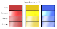
When using the Dodge tool, the results are almost reversed. Highlights saturates as it lightens, 'Midtones' keeps it roughly the same, and 'Highlights' desaturates. In this example of my base colors though, it was almost impossible to tell the difference between the 'Midtone' and 'Shadows' settings in terms of how they altered the colors as they lightened.
I will be a guest of the Mid Ohio Con!! I'm really excited about doing this show. I have never been there, but heard wonderful things about it. They were kind enough to do a nice write up about me coming on their blog
In addition I have also added a few shows that have not made their way on to the 'appearances' section of my websites. Julia and I have also started booking shows for 2009, and should have an appearance list together shortly. Until then here is the schedule for the rest of '08!
Tutorial:
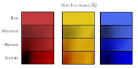
I have been asked several times to elaborate on my coloring techniques. While I'm not ready to give up my secrets, I did want to do a little swatch-visual aid to discuss the tools Dodge & Burn.
Quite simply, Dodge makes colors lighter, Burn makes them darker. They are tools that I use to render and shade after I have established basic colors. You can use any of the dynamic brush settings when using either tool (scattering, texture, shape, etc) but for purposes of demonstration, I used a simple round brush. There are 3 range settings for each tool as well as an 'exposure' % setting (which I like to think of as a 'how-heavy-handed' % setting). The three ranges are Highlights, Midtones, and Shadows. While these dictate which range of tones are MOST effected by the tools, it also dictates how the colors are lightened and darkened.
When using the Burn tool, 'Highlights' tends to desaturate as it darkens. 'Midtones' keeps a similar saturation of color, and 'Shadows' increases the saturation.
When using the Dodge tool, the results are almost reversed. Highlights saturates as it lightens, 'Midtones' keeps it roughly the same, and 'Highlights' desaturates. In this example of my base colors though, it was almost impossible to tell the difference between the 'Midtone' and 'Shadows' settings in terms of how they altered the colors as they lightened.
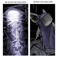
I find that using the destauration or over saturation of each setting can be to your advantage. In the current issues of Mouse Guard, some of the mice are stuck in a cavernous kingdom with little to no light. When I use the Burn tool on those pages, I have it set for 'Highlights' so that it mutes my shadows. In extreme light or snow settings, I use the 'Highlights setting on the Dodge tool so that the lighter areas get very intense and blinding.
I hope to do a few more of these types of tutorials. I am a fan of James Gurney's blog for all that it has to offer and teach on a daily basis, and while I'm no James Gurney, I'd like to share more about the theories of creative work. I have a few topics in mind for the future: Greyscale vs Bitmap and modelmaking.
This one was sent to the ASP site and then forwarded on to me. It's a painting with 3D-panel-breaking-detail by Pam Burton. Thanks Pam!!!