Of course, it's impossible not to think of Jim Lee's fantastic 4 adjoining covers for X-Men #1. Those made a big impact on me when I was a teen. For my TMNT/Usagi cover, I had 5 issues of real-estate to fill, 4 turtles, two rabbits, a cat, a rhino, and one cyborg villain. I was nervous to try something so big, but in some ways, it felt like a bucket list type comic gig to pay homage to this cover of Jim's while also getting to Draw TMNT and Usagi.
Wanting to avoid matching Jim Lee's composition exactly, I decided to move the villain in. Originally I wanted him on cover #3, dead center, but when I noodled with a thumbnail or two, I realized it would be better to shift him on to #4 and have an asymmetrical balance with six of the heroes coming in from one side and only two on the other.
Here you can see my list of pairings, wanting to get one Turtle and one Usagi character on covers 1, 2, 3, & 5. I also made notes of which character was larger in the foreground, and which was further behind in the back––staggering the IP's so that each franchise got the same number of close-ups.
I also knew that inherent in these kinds of adjoining covers will mean there is some dead-space in the whole composition because of needing to avoid putting anything important into the edge of each issue's cover where it's trimmed. So, I planned to make sure I had some characters or their weapons overlap those seams and crossover onto the next cover.
While Usagi's flying kick does end up crossing over the cover gap, it was because I ran out of space before hitting the edge of the paper before getting his foot drawn. A little displaced foot on the same sheet of paper would allow me to adjust once I had my pencil drawings scanned.
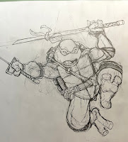
Stan had drawn some specific details for the turtles' belts and weapon storage. So, instead of just drawing the turtles the way I always do, I looked to Stan's interiors to give the subtle changes to their 'costumes' so that they fit with the interiors. I also tried to make the ties of their bandannas echo Usagi's ears.
I also left his sais out of the drawing originally, opting to loosely sketch them on the back side of the paper over a light pad until I got the geometry correct, then while still on the light pad I could trace them over on the front with confidence.
For Gen the Rhino here, I planned that I could have him crushing one of the baddie's clockwork robot's heads in his left hand, and place the displaced sword in his right. What I didn't plan for was how I drew his head too small, but that was something I could easily fix in Photoshop after it was scanned.
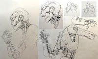
For the last cover the plan was to have Dr. WhereWhen's arm crossing over into it and Jotaro (who is secretly Usagi's son) very close to getting a fatal blow in on our villain.
This piece wasn't working for me though. I was looking through some reference photos of stances with a single samurai sword and found something like these sketches, but it wasn't dynamic enough, and it didn't work well with the already established pose of Dr. WhereWhen. Sometimes when I do compositions like this (without a solid thumbnail) I run the risk of generating sketches that get abandoned rather than adjusted because there's no good way to get them to work without starting over.
Instead I went with this more furious batting stance, which left room in the lower left for the villainous cyborg's arm in the foreground. I was very happy with the energy I was able to get with this pose.
The other struggle with Jotaro was getting him drawn so that he both looked enough like Usagi that he could be his son and could be mistaken for him by one of the TMNT who have only met our hero a handful of times––but also looks like an individual. Stan is able to make the distinction with some simple and subtle shape changes to his head, but mostly through the nose being bigger and darker. It took me a little while before I found what I thought was a good balance of Jotaro being his own man, but also the son of his father.
The pose had to match the energy of Jotaro, but also fit in an already tighter cover due to WhereWhen's arm eating up so much of the composition. It means that I knew a bunch of Mike's body wouldn't be seen––so while I had to sketch those parts out to make sure everything lined up, I didn't need to do finished pencils on them.
Below is the entire 5 issue layout assembled, all my sketches and drawings, photoshop corrections, resizing, and edits, as well as some quick blocked in flat colors to help me see where each character started what was junk and where the other character ended (and with all the armor detail, getting base colors really helped me figure out what I was looking at when one character overlapped another).
What you need to know is that The TMNT/Usagi Yojimbo WhereWhen five issue mini series starts April 12th. My covers are called 'Retailer Incentive' covers and will arrive in a 1/50 ratio for retailers.


No comments:
Post a Comment
Note: Only a member of this blog may post a comment.