 I've made a Creator Commentary video for the fourth issue/chapter of Mouse Guard: The Black Axe! Please feel free to follow along in your copy of the story in either issue form of from the hardcover as I talk about the behind the scenes details, art notes, and my head-space as I go page by page and panel by panel. Enjoy!
Tuesday, July 28, 2020
Black Axe #4 Creator Commentary
 I've made a Creator Commentary video for the fourth issue/chapter of Mouse Guard: The Black Axe! Please feel free to follow along in your copy of the story in either issue form of from the hardcover as I talk about the behind the scenes details, art notes, and my head-space as I go page by page and panel by panel. Enjoy!
Tuesday, July 21, 2020
Mouse Guard 'Wasp Hive' Process
This year I've been creating new Mouse Guard pieces with the idea of collecting them in a new sketchbook. That sketchbook collection is titled 'Dawn, Daye, & Dusk' and is finally off to the printer! I plan to release it in August in my online store https://mouseguard.bigcartel.com/
For this blogpost, I'll share of of the pieces in that sketchbook and show the process steps to get the artwork completed.
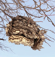
I started by being inspired by this abandoned and broken wasp's nest that was outside of our veterinarian's office the last time we had Coco & Bronwyn in for a checkup.
When I encounter items in the wild that would be an interesting visual in Mouse Guard, I try to take a photo of it...something much easier to do now that cell-phone cameras are of such good quality. I have folders of photos like this I've taken of plants, architectural details, fabric patterns, and certain cloud colorations.
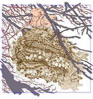
I did a lightbox tracing of a printout of the nest on a clean sheet of copy paper. In this stage I was translating the forms into the mark-making that I do, while also doing some visual editing––removing unnecessary details, simplifying & unifying patterns, and removing excess branches to get some visual focus. On a new sheet of copy paper, I drew a mouse looking weary. Once these two pencil drawings were both scanned and tinted in Photoshop, I was able to digitally add some color to block in shapes, including the far away branches.
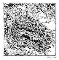
The above layout was then printed out and taped to the back of a sheet of Strathmore 300 series bristol. On a lightpad, I was able to ink the piece with Copic Multiliner pens (the 0.7 for almost everything except the mouse's face that I did with the 0.3). The lightpad allows me to see through the surface of the bristol down to the printout which I use as my 'pencil' lines to guide me.
Because I knew the far branches were going to be painted as color holds when I colored it, I avoided inking those lines up to anything in the foreground (or the border) to help with isolating them.
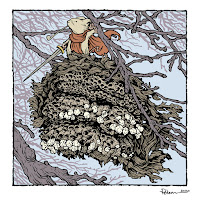
Once the inks were finished, I scanned them into Photoshop to start the coloring process. This part is called 'flatting' where I just add flat colors (no rendering, gradients, effects, etc) to establish where colors start and stop...which part is hive and which part is mouse, etc.
I used roughly the color palate of the original photo, and then gave the mouse a red-orange cloak to help them stand out in the muted cool tones of everything else.
As I mentioned in the inking stage, I applied a color hold (an area where I want the inkwork to be a color other than black) to the far away branches.
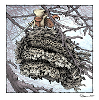 The last step was to do all the texture and rendering to the piece. I do most of this with one stock textured brush in Photoshop and the Dodge and Burn tools.
To the right you can see the finished piece––which will also be soon available in print in the upcoming Mouse Guard sketchbook Dawn, Daye, & Dusk.
For this blogpost, I'll share of of the pieces in that sketchbook and show the process steps to get the artwork completed.

I started by being inspired by this abandoned and broken wasp's nest that was outside of our veterinarian's office the last time we had Coco & Bronwyn in for a checkup.
When I encounter items in the wild that would be an interesting visual in Mouse Guard, I try to take a photo of it...something much easier to do now that cell-phone cameras are of such good quality. I have folders of photos like this I've taken of plants, architectural details, fabric patterns, and certain cloud colorations.

I did a lightbox tracing of a printout of the nest on a clean sheet of copy paper. In this stage I was translating the forms into the mark-making that I do, while also doing some visual editing––removing unnecessary details, simplifying & unifying patterns, and removing excess branches to get some visual focus. On a new sheet of copy paper, I drew a mouse looking weary. Once these two pencil drawings were both scanned and tinted in Photoshop, I was able to digitally add some color to block in shapes, including the far away branches.

The above layout was then printed out and taped to the back of a sheet of Strathmore 300 series bristol. On a lightpad, I was able to ink the piece with Copic Multiliner pens (the 0.7 for almost everything except the mouse's face that I did with the 0.3). The lightpad allows me to see through the surface of the bristol down to the printout which I use as my 'pencil' lines to guide me.
Because I knew the far branches were going to be painted as color holds when I colored it, I avoided inking those lines up to anything in the foreground (or the border) to help with isolating them.

Once the inks were finished, I scanned them into Photoshop to start the coloring process. This part is called 'flatting' where I just add flat colors (no rendering, gradients, effects, etc) to establish where colors start and stop...which part is hive and which part is mouse, etc.
I used roughly the color palate of the original photo, and then gave the mouse a red-orange cloak to help them stand out in the muted cool tones of everything else.
As I mentioned in the inking stage, I applied a color hold (an area where I want the inkwork to be a color other than black) to the far away branches.
 The last step was to do all the texture and rendering to the piece. I do most of this with one stock textured brush in Photoshop and the Dodge and Burn tools.
To the right you can see the finished piece––which will also be soon available in print in the upcoming Mouse Guard sketchbook Dawn, Daye, & Dusk.
Tuesday, July 14, 2020
Mouse Guard Harvest Town Process
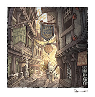 Since the COVID-19 outbreak I've been creating new Mouse Guard illustrations with the intent to collect them into a new sketchbook. The sketchbook's title is 'Dawn, Daye, & Dusk' with a theme on lighting and time of day being a component to most of the pieces.
The sketchbook is expected to be released in August 2020 in my online store, but for this blogpost I'm showing one of the pieces 'Harvest Town' and the art steps to get there.
I started with inspiration from a real place: the intersection of Shambles and Little Shambles streets in York. I've not been there myself, but I cam across this photo while looking for 'medieval streets' in an online image search, and printed out the results. I hadn't looked at the printout in a few years and came across it again as I was prepping for the new sketchbook.
On a lightpad I put a clean sheet of copy paper over the photo printout and redrew the architecture with my own interpretation of shapes, materials, and details.
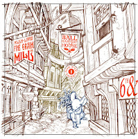 I then also drew a lone mouse returning with grain and some additional background buildings and plants on separate sheets of paper. In photoshop I assembled my drawings (tinting each one a different color to help me see everything clearer)
In Photoshop I flipped the image horizontally (I liked it better that way visually) and added text to the signs. Fun fact, every sign is a nod to the (now canceled) Mouse Guard movie: Director Wes Ball, Screenwriters T.S. Nowlin & Gary Whitta, FOX studios, and 6th and Idaho (Matt Reeves' production company).
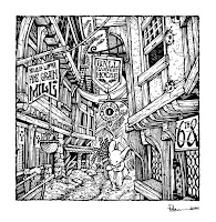
With the layout all digitally assembled and tweaked, I printed that out and taped it onto the back of a sheet of Strathmore 300 series Bristol. On a lightpad I started inking it with Copic Multiliner SP pens (I think I inked part of this piece on Twitch) The lightpad allows me to see through the surface of the bristol down to the printout so I can use it like pencil lines when I'm inking.
This piece took some work to add lines and texture, while also not making it too busy and visually muddy.
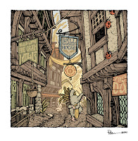
After the inks were finished, I scanned them back into Photoshop to begin the coloring. The first step is to add flat colors to everything to establish what elements are which colors. It's like a professional version of coloring-in-the-lines. This step helps for when I want to re-isolate any area so I can render it without effecting the areas around it.
At this stage I also added color holds (areas where I wanted the ink work to be a painted color other than black) to parts of the background to help imply the lighting effects and the depth of distance.
 The last step was to render the color. I do this in Photoshop mostly using the Dodge and Burn tools with a textured brush.
To the right you can see the finished piece––which will also be soon available in print in the upcoming Mouse Guard sketchbook Dawn, Daye, & Dusk.
Tuesday, July 7, 2020
Mouse Guard 'PREVAIL' Process
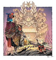 While creating original pieces for my upcoming Mouse Guard sketchbook: "Dawn, Daye, Dusk", I made the illustration to the left titled 'Prevail' of a Guardmouse and a pheasant mount at dawn with a bit of heraldry as the background.
While the finished 24 page sketchbook won't be available for another month or-so, for this blogpost, I'll break down the steps to creating the final art as well as the inspiration and influences.
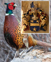 My two inspirations were these. First, the idea of drawing a bird all geared up with saddle and rigging to be a mount, and I wanted a visually interesting bird, so I went with a pheasant. This photograph found online became my reference for one.
And second, this bit of heraldry I photographed at the Turku Cathedral when I went to visit my niece when she was an exchange student in Finland.
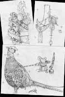 I started with drawing my own version of the heraldry––but with a mouse-shaped helm and 7 pointed stars (I like them over 5 or 6 pointed stars because they don't have heavily specific human patriotic or religious connotations) Knowing that the heraldry was to be symmetrical, I focused on only drawing half of it.
I then moved on to the pheasant, using the photo as reference. Once I had the bird drawn, I layed another sheet of copy paper over it on a lightpad and drew all the riding equipment. That way, if I didn't like a part of the gear, I didn't have to erase or re-drawn any part of the pheasant. I, of course, also drew the mouse (and included a helmet which I didn't end up using in the final piece)
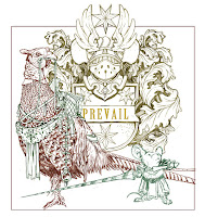
With the pencil work done, I scanned all my sheets of paper into photoshop and started laying out my composition. I like working digitally with my pencils drawings, because I can resize, rotate, and adjust it all until the composition is just how I want it. Or, in the case of the heraldry, I can copy and mirror the drawing so that it's complete (as well as adding in the text 'PREVAIL'.
I tint the various drawings different colors to make it easier to see what lines belong to which element in the composition.
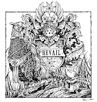 I then printed out the digital layout onto copy paper and taped it to the back of a sheet of Strathmore 300 series bristol. On a light pad, I was able to see through the surface of the bristol down to the printout as a guide while I did the final ink lines. To ink, I use Copic Multiliner SP pens (the 0.7 & 0.3 nibs mainly)
I inked a lot of this piece on my Twitch stream. I was focused on adding the right line weight on the pheasant so that the various feather types were all 'readable' without becoming a complete mess of black. Somewhere in between this step and the last one, I also penciled in a log shape on the printout so that the figures were standing on something.
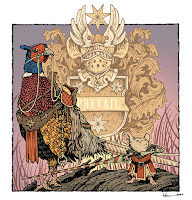
After the inks were done, I started coloring the piece. The first step of digital coloring (after scanning the ink drawing) is to establish the color areas with flat color (also known as flatting). At this stage of the color-work I also was establishing the color holds. These are areas where I want the ink-work to be a color other than black, and it takes some time and patience. For this piece, I added color holds to the heraldry, the grass, the text, some of the pheasant's feather patterns, and the swirl design on the mouse's lance.

The last step was to do the rendered color. I used the dodge and burn tools in Photoshop with a textured brush to get most of the light and shadow work done.
As a fun afternote, the original of this piece was purchased by a fan of mine in Finland who was unaware of the connection of the heraldry and Turku Cathedral until after he bought it.
Subscribe to:
Comments (Atom)


