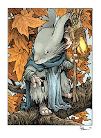
 Kenzie, the blue cloaked patrol leader of Lockhaven, deserves a print all to himself. I've been trying to offer up more of the 5" x 7" matted prints at conventions and in my online store. With a Saxon, Sadie, and Gwendolyn print already available, I wanted to include that stalwart mouse of wisdom to the lineup. Because of his lack of a sword, and his calm nature, he's not the most requested of characters, but the fans who love Kenzie, really love him and they are not in any small number. In today's blogpost I'll share the process for creating the image for this print.
Sketch:
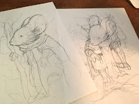 I did two sketches for this piece. It's rare I get this torn between sketches. I can usually hone in on what I like more about one idea/concept/rough and decisively choose. But for some reason, I had to call in the assitance of my Editor Cameron Chittock to talk me through this choice. The one on the left was calm, resolute, and peaceful....but ultimately a bit dull. And the one on the right was better, but didn't drive home those Kenzie qualities in body posture as well as the other. With Cam & my wife Julia both weighing in, I came to the decision that the more dynamic pose was best.
 Layout:
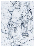
I scanned in the rough pencils and re-sized them to match the size & ratio I'd need for the final artwork & print. I think (though I'm not entirely sure) I fiddled a bit in Photoshop with the proportions and angle of the head. I also added in a drawing of a lantern. I didn't use the lantern design Kenzie has from Winter 1152 because the Saxon print already had that criss-crossing wire frame and I didn't want to repeat myself. I opted to do something tall and lender to match Kenzie's frame (I try to make every detail about Kenzie make him feel tall: the long straight cheek hair, the staff, the long front-cloak, etc.)
Inks:
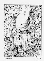 I printed out the above adjusted layout and taped it to the back of a sheet of Strathmore 300 series bristol. On a light pad (I really like the Huion brand of these) I can see through the surface of the Bristol and ink using the printout as my 'pencils' to guide me. I used Copic Multiliners (the 0.7 & 0.3 nibs). After Wind in the Willows, it was hard not to want to add hatching in on every leaf to give a better sense of depth and to help Kenzie stand out a bit more, but I reserved to do that in color instead...
 Color Flats:
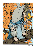
After scanning in the inked piece (and adjusting the levels and cleaning up any dirt, dust, etc from the scan) the first step to coloring is Flatting in colors. This means, like any good coloring book user, you color spaces inside the lines. But when flatting, you don't need to worry at all about shading, lighting effects, or even if you are going to use the real colors (here I stuck close to what I knew the palate was for the final piece). Unlike some colorists, I like to use new Photoshop layers for new areas of color. This allows me to not have to 'cut in' precisely when I butt up against an area I've already colored and it allows me to smudge up and fade out the color in places where my linework isn't closed off completely without disturbing the color next to it.
 Final Colors:
After the areas of color are isolated by flat colors, I went in an rendered each part using the Dodge & Burn tools in Photoshop. I have my settings on Range: Highlights and 1% exposure most of the time and I use a textured brush. I tweaked color balances with leaves and subtle areas like Kenzie's nose. At this stage, I also added in a glow to the lantern and made the veins of the maple leaves more subtle.
The final 5" x 7" matted print will be available at my 2017 convention appearances and in my online store.
More of the 5x7" Mouse Guard character print process Blogposts:
Saxon Print: http://davidpetersen.blogspot.com/2015/04/5x7-saxon-print-process.html
Sadie Print: http://davidpetersen.blogspot.com/2016/04/sadie-5x7-print.html
Gwendolyn Print: http://davidpetersen.blogspot.com/2016/05/gwendolyn-print.html
2017 Appearances:
Emerald City Comic Con: Mar. 2-5
C2E2: April 21-23
Heroes Con: Jun. 16-18
San Diego Comic Con: July 19-23
Baltimore Comic Con: Sept. 22-24
New York Comic Con: Oct. 5-8


