Tuesday, December 29, 2009

Color Tutorial: Color Hold:
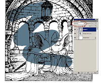
A color hold is a technique where the linework becomes a color rather than black (or different from the rest of the linework in color). Here is the way I prepare my files for color holds. In 'A' I have my scanned artwork (greyscale) and I have made a duplicate layer of it that I named 'masterhold'. Using the 'select color' tool, I select white. There is a sensitivity adjustment that I found works well for me at '150'. Then I'll clear (delete) the white. In step 'B' I adjust the contrast down and the brightness up. This takes out some of the stray variant pixels so that everything is even, it also helps show me that this is not black linework, it's going to be a hold. Notice that with no other layers visible, 'masterhold' is transparent everywhere but the line work and is set to layer mode 'normal' (unlike a lineart layer that I set to 'multiply as I mentioned before). Step 'C' shows where I have erased all the areas on 'masterhold' that I don't want held as a color, leaving just the decorative swirls to be painted any color.
New Year's Games:
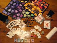
This week is New Year's Eve, which means Tower, the board game I made is dragged out and played by our guests. I found a bunch of the artwork I did nearly a decade ago for the character cards. As I mentioned before part of the goal was to make more diverse characters for Tower than it's predecessor Dungeon had. Many of our old D&D characters served as inspiration.
These were mainly done with a black ballpoint pen and watercolor pencils.

Packus: His design is somewhere between George Lucas and the Pringles logo.
Tyne: The last of these I painted because the character kept changing through development
Lucas: My D&D thief. I never played the same Lucas though, I just kept re-making him
Madaline: A character that was in the TSR Dungeon game we based Tower on, thought it would be fun to carry her over.
Ninja: This is where we were getting desperate for ideas.

Dalton: Was based on a guy my friend Seyth and I worked with at Starbucks. I think we included him because he wouldn't like the idea of being included.
Solae: I have a soft spot of this drawing, and I can't even tell you why.
Luthor: Looks like I was inspired by some anime here.
Fike: Based on my friend Mike and his desire to name all his characters 'Mike Fox'
Quiver: Seyth made up this guy. I dunno why I gave him a Mike Nesmith wool cap

Fisher: This was Seyth's long standing D&D Dwarf character. He is way too powerful in the game Pax: She was a fill-in character we made up who had her name changed a lot.
Jhan: Based on Seyth's roommate in college 'Silverthatch' was a joke because he wanted to dye his hair silver.
Annice: This one of the other character portraits I'm happy with and I can't point out why.
Demtremi: My college roommate's D&D character which was strongly influenced by Drizzt Do'Urden
Fan Art:
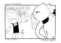
Derek & Nikki Davis of Bitter Tea Studios gave me this original strip from their online webcomic. This one they said was inspired by Mouse Guard. Thanks for the art and including mice of daring-do in your comic Derek & Nikki!


Upcoming Appearances:*
----2010----
Alaska Library Conference: March 4-7
CGS Supershow: March 27-28
C2E2 (Archaia Booth): April 16-18
Motor City Con: May 14-16
San Diego (Artist Alley): July 22-25
Baltimore Comic Con: August 28-29
*more 2010 dates may be added

Tuesday, December 22, 2009

Merry Christmas and Happy Holidays!
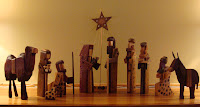
For our first Christmas as a married couple, I made a nativity set for Julia. I have loved nativity sets since I was a kid. This set I made mainly out of wooden frame stock for stained glass windows that I had left over. The textures were achieved through wood carving tools, branding the wood with various tools, and a dremmel. I also made use of 5-6 different wood stains and assembled the pieces after the stain had dried. I wasn't able to handmake a gift this year, but wanted to share this one that we love bringing out every year. I also want to wish all my fans a wonderful Holiday!

Coloring Tutorial: Dodge/Burn
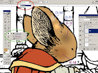
Last post I showed the way that I layer my color in photoshop. This time I want to revisit the method that I 'render' the colors. I start with a base color for every area and then use the dodge and burn tool to add the shading and highlights. The Dodge and Burn tool (circled in green) allow you to lighten (dodge) and darken (burn) the colors. Each tool has a setting (circled in red) as to which range of colors it will effect the most, but that setting also effects how it darkens or lightens. I did a few quick spot samples to show that burn on medium (B-M) tends to saturate the color as it darkens, just as dodge on highlights (B-H) saturates as it lightens. While burn on highlights (B-H) and dodge on medium (D-M) desaturate as they do their jobs. I also want to point out that you can use any of the various brushes with dodge and burn and also alter the 'exposure' (strength) to your liking.

Muppet Geek:
Last week Katie Cook and I joined Jamie D, Shane, and Adam 'Murd' Murdough on Comic Geek Speak for an All-Muppet themed episode. While recording I brought up that as a kid I had the Kermit Fisher Price Puppet, but none of the others (I have them now thanks to ebay) but it led me to build my own. After the CGS show I dug out my VHS tape of me working on them and took some screencaps of me as an awkward looking pre-teen holding up my handmade Muppet puppets . The Comic Geek Speak Muppet episode is available now through the CGS IPhone app, and will be released on their website for non-IPhone users in a few months.

Ustream:
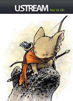
After watching Karl Kerschl do a live video stream from his drawing table on ustream.tv, I thought I'd like to give it a shot. I have done two of them now, and I really enjoyed them. I have a mic going so the viewers can hear me (as well as either see my drawing table or my PC desktop). I read the chat messages that come in from viewers as I'm working so in addition to talking about whatever process I'm working on, I can answer your specific questions. This piece is one that I inked and colored last Sunday on ustream. There are no specific times for when I'll do the next stream, but I post notices with links on Facebook and Twitter the day I plan to do one.

Fan Art:
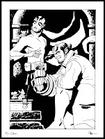
Unexpectedly in the mail today a package from Evan 'Doc' Shaner arrived. He sent me this original art featuring my mice along with Hellboy and Abe Sapien! I really like that the Black Axe and the Right Hand of Doom are touching...very epic. Thanks Evan!


Upcoming Appearances:*
----2010----
Alaska Library Conference: March 4-7
CGS Supershow: March 27-28
C2E2 (Archaia Booth): April 16-18
Motor City Con: May 14-16
San Diego (Artist Alley): July 22-25
Baltimore Comic Con: August 28-29
*more 2010 dates may be added
Tuesday, December 15, 2009

Color Tutorial:
I get asked about my coloring techniques in e-mails and at conventions, so I wanted to start posting some basics. I am a self-taught photoshop user, and that there may be better ways, or other ways to meet the same end, but these are the steps I take. I also want to mention that while I'm using Photoshop 7, what I'm showing will apply to any version of Photoshop older than 5.0.

When I started, learning to color, I read a tutorial on coloring (here). However, I found the method of using channels a bit complicated for my simple mind, and tend to do everything just utilizing layers.

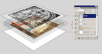
I place my scanned linework into a new file and label the layer 'Linework'. Using the dropdown for layer modes, I set 'Lineart' to multiply. Multiply means that photoshop will read anything that is white as transparent and anything black as opaque (greys become a % of opacity based on their tonal value). On this example, you can see that I have set the 'Lineart' layer to multiply (dropdown circled) and made a new layer to splash some color on so you can see how the setting allows the color to be seen in the white parts of the drawing.

You may notice that Photoshop makes a layer called 'Background' automatically. I never try and do anything to this layer. I only put color on new layers I make so that anywhere I didn't put color on any given layer is transparent (opposed to the 'Background' that starts as a default of white). I make a new layer for any new area of color. If I dislike how something looks, it's easy for me to re-isolate that area (even after I have rendered it) by selecting it's layer to make changes. Also if I continually make new layers under my most recent color layer, I may already have established the edge of an area and won't have to be as careful drawing the next color in. In this simplified example you can see how the layers stack up: Lineart on top (set to multiply) with multiple new color layers underneath (labeled fur, skin, cloaks, etc.), and an untouched background on the bottom.

Belated Happy Birthday:
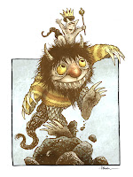
The awesome Katie Cook had a birthday last week so I did a Where the Wild Things Are piece for her. It was fun to draw and color and easy to part with when I knew it was going to such a good home of geekdom. Happy belated Birthday Katie!

Ink & Stein:
The last Ink & Stein of 2009 is this Saturday. For those not in-the-know: Ink & Stein is a gathering of comic artists and writers (though we have artists and writers who are not in the comic field) where we socialize, bring our current work, bounce ideas off one another, and draw/write. We meet at the Corner Brewery in Ypsilanti, MI at 7pm. Info on 2010 Ink & Stein sessions coming soon. (and this month's logo art provided by Jay Fosgitt)

Fan Art:
Austin Wilson sent in this photo of his Lieam plushie guarding his Christmas tree. Thanks Austin! If any other fans want to share their fan artwork (photos, drawings, sculptures, etc.) send it to me through the contact link on mouseguard.net.

Upcoming Appearances:*
----2010----
Alaska Library Conference: March 4-7
CGS Supershow: March 27-28
C2E2 (Archaia Booth): April 16-18
Motor City Con: May 14-16
San Diego (Artist Alley): July 22-25
Baltimore Comic Con: August 28-29
*more 2010 dates may be added

Tuesday, December 8, 2009

Model Building:
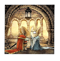
While working on a cover for Legends of the Guard (which I can't show yet), I wanted to feature an architectural library setting. I looked through my reference photos from Ireland and found this one that I took at the Trinity college library (where photography was prohibited, so excuse the out-of-the-coat-quick-shot blurriness). However, I wanted to go beyond this photo and make something more Mouse-Guardish.

I hate figuring out these things in perspective. It takes me forever to get all the layout lines and construction lines for concentric circles, etc. So I find it more rewarding, and enjoyable to make a model. After a sketch of what one column would look like, I built this model piece. It's all made from left over bristol board scraps and rubber cement. This took about an hour or two to build while I listened to an audio book. I drew in details like the book shelves and the column's mortar lines to that I would have to refigure those perspective lines again later.

When you do this type of modular model with only one section built, the plan is to use the piece over and over to fill up the entire building. I had to make sure the arch and balcony sections extended far enough that they would meet when I composited everything together. This rough floor plan shows how the one section would get moved down again and again to become the full model.

On our dining room table I taped down two lines of blue painters tape (low tack so it wouldn't hurt the table). I made sure they were parallel and marked off even increments noting where the model needed to be placed on each side. I set up a tripod and photographed the model in each spot on the tape lines. Then using photoshop, I composited all the photos together to make this photo I could reference. I know some would say that I could have spent less time just working out the perspective, but I like how this method leads to imperfections and lines that are not 100% on the perspective lines. It makes it seem like a real place that mice would have built. It has settled and it's no longer geometrically perfect, which my perspective drawing would have been.

Muppet King Arthur #3:
Boom hasn't previewed this anywhere yet, but I saw a few sites that sell comics online have already posted an image (though the colors are oversaturated and wrong), so I figured I should give fans the better image. Issue #3 is the grail issue. It took some self control not to put the "Legendary Black Beast of Aaaaarrrrrrggghhh" From Python's Holy Grail.


Upcoming Appearances:*
Live reading: Holiday Walk at Flint Public Library: Dec. 8 (6:30 & 7:30pm)
----2010----
Alaska Library Conference: March 4-7
CGS Supershow: March 27-28
C2E2 (Archaia Booth): April 16-18
Motor City Con: May 14-16
San Diego (Artist Alley): July 22-25
Baltimore Comic Con: August 28-29
*more 2010 dates may be added
Tuesday, December 1, 2009

Free Comic Book Day 2010:
Archaia will be releasing a Free Comic Book day 'flip' book that features a new Mouse Guard story from me and a Fraggle Rock story and cover on the other side. Here is my cover for the Mouse Guard side of the issue. The white box is for comic retailers to stamp or label their logo/address in hopes to attract new readership to comics to their store. The story I'm doing will be 10 pages and will take place in Spring 1153 (as an homage to everyone who asks when 'Spring' is coming in the book series)

Watercolor paintings c.2004:While I love watercolor as a medium, I always struggled with feeling like my watercolors were good enough to stand alone without ink line to help. So around 2002/2003 I started playing with the idea of painting loose and then going back over with pen to isolate shapes that were variations of color or stroke or form.

It got me going on a kick of painting superheroes & comic book characters. I was using paper that I had purchased and cut for our wedding invitations that was left over. In fact, some of these (all of them have sold or be given away long ago) may have the hand stamped image of leaves intertwining from our wedding on the back of them. The trick, I found, was to have a painting that was loose enough to need the linework, but strong enough that the forms were still all there without line.
(R-L: Rorschach, Spider-Man, & Dr. Doom)

The balance between the watercolor and line wasn't always what I wanted. Sometimes I felt I would overuse the line, while other times I felt I had overpainted the painting. I found that using negative space and strong lighting composition helped to not make the paintings turn into 'stained glass mud'. I would tend to work on multiple pieces at one time so that as one was drying I could be working actively on the next, and then back to the dry one, etc. This was at a time before I had started working on Mouse Guard as a comic series. I thought that these types of paintings would be good examples of my work that may generate commissions as well as be saleable items.
(T-B: The Flash, Han & Chewie, & Grifter)

These paintings received a positive reception by other artists who were posting on the hellboy.com forum. And being a Hellboy fan, I couldn't help but paint Mignola's characters this way. The forum artists also organized a holiday gift exchange of Hellboy themed pieces of art. I did several more of these style pieces in a larger format for the exchange. There was also a fan-posted anthology comic where Maija Graham wrote and I Illustrated a Screw-On-Head story in this method
(Top Row L-R: Liz, Johann, Hellboy, Abe, & the Baba Yaga)
(Bottom Row L-R: the Fairy folk, Roger, Rasputin, Lobster Johnson, & Screw-On-Head)


As Mouse Guard started coming out, I thought it would be foolish to drop the paintings from my convention display. So every con, I was painting a series of characters that all went together. The first of which was the Arkham Asylum lineup. I sold limited prints in little manila envelopes (printed with stencil lettering "Arkham Files" and printed coffee-ring stains) to help my table sales for those unfamiliar or uninterested in Mouse Guard.
(L-R: Mr. Freeze, Poison Ivy, the Penguin, Two-Face, the Joker, the Riddler, Catwoman, & the Scarecrow)
The last set of these I did was a grouping of Jedi. Mouse guard was strong enough on it's own and not having a relationship with the companies and publishers who owned copyright on the characters I felt I was pushing my luck. I picked 6 species (Twi'leck, Mon Calamari, Human, Rodian, Ithorian, & Wookiee) set them on different locations (Coruscant, Naboo, Kamino, Tatooine, Hoth, & Kashyyyk) and gave them all lightsabers.
This set I was happier with the original watercolors than usual, so I scanned the un-inked versions in case I preferred them. Here you can see the whole set in original and final states.


Fan Art:Bo Harris gave this color pencil and ink drawing to me at the Windy City Con last Sept. I like how alone and unfettered to civilization this mouse is. He looks pretty self-sufficient. Thanks Bo!
And if you have Mouse Guard fan art you want to share, email me through the mouseguard.net contact info to send me your work.

Upcoming Appearances:*
Live reading: Holiday Walk at Flint Public Library: Dec. 8 (6:30 & 7:30pm)
----2010----
Alaska Library Confrence: March 4-7
CGS Supershow: March 27-28
C2E2 (Archaia Booth): April 16-18
Motor City Con: May 14-16
San Diego (Artist Alley): July 22-25
Baltimore Comic Con: August 28-29
*more 2010 dates may be added
Blog Archive