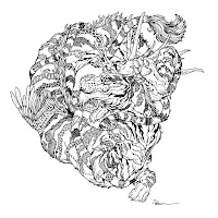
Here is my finished colored Dragon. And below are my steps to create it as well as the community submissions.
This month the prompt was three words: Proud, Patch-work, & Tiger
I opened several tabs of google image searches of Tigers, Milt Kahl's drawings of Shere Khan, and some of Nora Potwora's Art
I started on copy paper with the head and then on another sheet overlayed on a lightpad, I drastically changed the body by making it loop overtop the head.
The stripes were drawn as just stripes, but I knew that when it came to the inking, they were the place I'd emphasize the 'patchwork' prompt.
I assembled the drawings digitally and then digitally drew in some wings and antlers after getting more reference. The colors were just to help me see the various body parts more clearly when inking to keep track of textures and forms.
I printed out the above design and taped that onto the back of a sheet of Strathmore 300 series bristol. Using a lightpad, I was able to see through the surface of the bristol as I inked the dragon. I used Copic Multiliner 0.7 pen to ink the art.
The inking on this piece started with the contours and overall form. I was unable to finish the inks on-stream, but returned to them later that night off-stream, where the inking became all about the patchwork stripes and getting those textures and patterns to read, but still look like a dark stripe.
The next day, I scanned the inks to I could start the coloring process. After prepping the digital scan of the inks, I established color holds (areas where I want the inks to be a color other than black––on the overall lines to a dark brown, and a dark purple on all the patchwork textures with a few yellows thrown in to offset...later on I'd also add a hold to all the stitching lines).
Then it was time to start the color flatting process––basically professional coloring-in-the-lines. Some of this is just to make it easy to re-isolate various parts when doing later painting & rendering. Most of the colors were already established in the rough, but to add some more fantasy to it, the patches were a purple instead of a black/brown.
The inking on this piece started with the contours and overall form. I was unable to finish the inks on-stream, but returned to them later that night off-stream, where the inking became all about the patchwork stripes and getting those textures and patterns to read, but still look like a dark stripe.
Then it was time to start the color flatting process––basically professional coloring-in-the-lines. Some of this is just to make it easy to re-isolate various parts when doing later painting & rendering. Most of the colors were already established in the rough, but to add some more fantasy to it, the patches were a purple instead of a black/brown.
For the final colors I used the dodge and burn tools to add shadows and highlights to give the dragon some form. The stripe-patchwork all needed separate attention to vary their colors and values so they truly looked like patches. Below you can again see the final Dragon...
But, as this is a community event, I wanted to share all the other entries posted in the Discord.
88UncleEnie
Capt.Nemo
Dakota
Jodudeit
JonathanTowry
KyleGerbrandt
mina_nah
Nate Pride
redSkwrl
soulseekerolga
VernNYC (1)


No comments:
Post a Comment