
 Character development over time:
This week is a bit of a "From the Vault" type post...but with less focus on explaining the vaulted project and more on the evolution of developing characters over time. This project (originally titled "'R Wars") was started by my buddy Mike Davis (Real life Rand inspiration...I'll share another project he and I collaborated on after college next week) as a sci-fi comic about a rag-tag group of aliens and one human. I don't have a lot of the early art from this other than my own, so I'll tend to focus on two of the characters you see here: Zubelflex & Cap
 In high school (when this story begins) our normal method character development was started by each of us having a character based on us (I think this is also because we all role played together). Mike's human character was essentially a manga version of himself. And Jesse Glenn (Kenzie) was drawn as a large furry noseless creature called J-Man. Jesse and Mike tried coming up with designs for my character, but ended up with nothing they like or that could be easily re-drawn. So I took a crack at it and came up with this drawing and named him "Zubelflex".
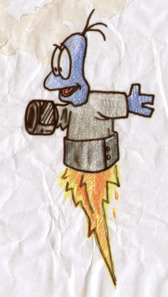 At some point, I felt the cast needed to be rounded out more. Mike had added in a race of creatures that were somehow supposed to be related to salamanders and he named the lead one Sal and based his personality on our friend Nick...but I thought this group was the perfect place for a character I had drawn on my own several years before called "Cap Transfo". I first drew Cap in 8th grade science class putting together a bit of cartooning I had mimicked from practicing drawing Roger Rabbit & the Loony Tunes characters. He was blue because I only had a blue color pencil in my bag. He was a scientist that had barrel-like attachments to his arms and legs that could shoot fire, launch grappling hooks, or eject buzz saws (think part Inspector Gadget part Gizmo Duck).Over the course of high school, the characters became more refined. With Jesse as the most accomplished artist of us at the time, we all emulated his style of drawing. I certainly copied his style of drawing eyes from Cats Trio when drawing these characters. Cap became smoother & squatter. I nixed the multi-purpose barrels that his arms formed into in favor of him having a single "tech bucket" device that had a data screen and could shoot fire (I figured it was small a modified ship engine). Sal, Davis, & J-man simply became my interpretations of Mike or Jesse's drawings, and Zubelflex got more gangly and tall. I based Zube's vest on the longer sleeveless liner of my winter trenchcoat (we all wore trechcoats at the time..it's wasn't a cult thing...they were warm and we thought they made us look cool).
 That last evolutionary jump was more about simple refining of what was already there (and learning how to draw something consistently at all). But later on...much later on...I thought it would be fun to revisit the characters. Not just revisit them, but redesign them. From high school through college and beyond up to that point, any time I'd drawn them, it was just a slight revision of the style you see above...like I was staying on-model for a client. But I wasn't drawing that cartoonish/animated look any more, and it was time to break free of the old designs. I kept the overall shapes of their anatomy, but tried a new line style and a look of something more like a creature than a cartoon.
 While the Sal above looks more like a creature design, I felt I lost something in him, I also didn't tackle J-Man or Cap. So here is a doodle from a notepad (I was on the phone) where I got back to some of Sal's original charm and versions of Cap & J-Man in this style. J-man with a pipe worked for me instantly...but there was somethin about Cap that looked a little too Ninja Turtle-ish and not pushed far enough away from my high school era shapes and design.
 I looked at a few of Bobby Chiu's demos and took a stab at a digital painting of cap...I don't know that I got away from a blue TMNT, or if the look serves the character...but It was a good excersize in getting far enough away from an original concept to see where the boundaries are.
 Later I gave the same design another shot, but in pencil (with digital colors) I made his head wider, his eyes smaller, and his neck longer (and a few more than his on-model 3 whips of hair). I like this version, but the angle of the eye still makes him look unfriendly compared to past versions.
Now because this project or the characters have never been committed to anything published (I tend to think of stories and characters not really 'existing' until they are made accessible for a fan to see it presented in a completed form...otherwise it's all concepts in flux) There is no happy ending or 'right' or 'final' design to share with you...only the most recent drawings I've done of them and the ideas of direction I'd like to take them if I ever had the time & resources...
 While I love comics, I think the sci-fi series would be even better as a TV or webisode project. The alien characters would all achieved with puppets of different types: Zubelflex: costumed body with an animatronic head (think the 1st TMNT movie or Dinosaurs...but with a skinny furry galoot) J-Man: a Full body puppet with the head operated by the puppeteer's arm (think big bird or Bear in the Big Blue House) & Sal and Cap are hand puppets with digital bunraku used when full body shots of them are needed....and Davis is performed by a human teenager. Of course if that were to happen, a whole other round of visual development would need to happen to realize the characters in 3D and with the materials used to make puppets and the limitations of their types of movements in mind (or to positively look at it, to take advantage of the types of movements & looks puppetry does best).
 Holiday Sale:
In my online store, I've started an online sale that runs through the end of the year! Enter code MOUSEGUARD at checkout to receive 10% off your entire order. I've also added some copies of the RPG Boxed set. In those copies I've opened the sets and signed the rule books, but there aren't many of them, so if you'd like a copy, now is the time.
We have tried our best to get the cheapest shipping rates on everything we can (also accounting for our boxing & packing materials). I know the prices on a few items is high, but I assure you they are as-close-to (and in some cases cheaper) than the best shipping prices we can find.
 Watercolor Wednesday: In case you missed last week's Watercolor Wednesday pieces, here they are for a closer look. The first was a fairy tale type giant. Perhaps he's not even an ogre-ish race of giants, but a human who grew to giant size. And where would you sit if you grew that large? You would want a nice sturdy chair that didn't stand a chance of toppling over. 4 closely growing trees would be the legs of your resting spot. You would also have to commission a talented knitter to make your striped socks in 27XL and a very good hatter to fashion a cap large enough for your crown. Oh, you would also nap in your tree chair when your socks and cap were made...
 Also...a tiki mask in a harvest looking theme (you know...for Thanksgiving last week)
Tomorrow I'll post a few more paintings in my online store.
2013 Appearances: Emerald City: March 1-3
Fabletown Con: March 22-24
C2E2: April 26-28
Spectrum Live: May 17-19
Heroes Con: June 7-9
San Diego Comic Con: July 17-21
*more 2013 dates coming*


