Showing posts with label Plotmasters. Show all posts

Tuesday, July 14, 2026

Cats Trio Re-Revisit

I recently posted about a Cats Trio revisit that I drew at the end of last year...well, during my friend group's RPG session, I started doodling and started drawings of the cats again. And as a fun indulgence, I did a full finished piece of it.

For those who don't know, CATS TRIO was a comic my friends and I worked on (never finished) at the start of high school. Three mutated/anthropomorphic cats befriend a similar raccoon as the group discover their shared origins, survive in abandoned places away from human eyes, and avoid being hunted by another of their kind (a TMNT homage to be sure). 

For a past post about Cats Trio: https://davidpetersen.blogspot.com/2017/08/cats-trio-revisit-cover.html
Or, watch the Plotmasters Project episode about it here: https://www.theplotmasters.com/cats-trio

I took the rough pencils of the three cats I drew during game night, then revised a better drawing of the raccoon before putting them all into Photoshop and moved and resized them until I had a composition I liked. To help me see each of their forms, I blocked in some base colors for each character so that as I moved them individually, their colors moved with them.

Using a photo of a derelict bridge as reference, I penciled a background that gave the whole piece a 'Stand By Me' vibe.

The layout was then printed and taped to the back of a sheet of 11" x 17" Strathmore 300 series bristol. On my Huion lightpad I'm able to see through the surface of the bristol to the printout to use as a guide as I ink the lineart. I used a Copic Miltiliner SP 0.7 nib pen.

I left the details of the characters fairly open focusing more on line weight for their contours, fur texture, and clothing wrinkles. I spent more time on detail for the environment.

The inks were then scanned and brought into Photoshop again where I started the coloring process by blocking in all the flat colors (this professional version of coloring-in-the-lines is called 'flatting). Most of the color choices were already established from past Cats Trio pieces, but I did make some adjustments of value, saturation, and hue for this piece to help the viewer's eye move through it better.

At this stage I also established color holds (areas where I want the ink lines to be a color other than black) on the bindle bag, their pupils, and all of the background.

The final art (seen here without the Cats Trio logo) was rendered using the dodge and burn tools. I happened to be finishing the color rendering on the final character's at the virtual RPG gaming session with that same group of friends one week later). I pushed the background way back to make sure the characters were more of the focus (ironic with all the ink detail back there)

These characters are old friends. They occupy a special place in my heart that idealizes a great time in my young life establishing lifelong friendships. And while I have no current plans to develop Cats Trio, it's always fun when I get a chance to say hello to these guys and keep them alive.

Tuesday, June 16, 2026

Cats Trio Revisit

I still find tremendous nostalgic comfort & joy in CATS TRIO: a comic my friends and I worked on (never finished) at the start of high school. Three mutated/anthropomorphic cats befriend a similar raccoon as the group discover their shared origins, survive in abandoned places away from human eyes, and avoid being hunted by another of their kind (a TMNT homage to be sure). Here is a new revisit I did just as a fun indulgence. 

For a past post about Cats Trio: https://davidpetersen.blogspot.com/2017/08/cats-trio-revisit-cover.html

Or, watch the Plotmasters Project episode about it here: https://www.theplotmasters.com/cats-trio

This revisit came from my going through old sketchbooks to scan for Patreon and I found a thumbnail lineup of the group that I think I drew at the time of the Plotmasters Project episode. I pulled it out with the idea of just inking it at that same size...but quickly realized it was both very small and that the characters were too loose to go straight to ink (especially the further to the right).

So, I blew up a scan of the rough and re-penciled it at a larger scale. On the back of the paper I also penciled in a boarded up fence I wasn't sure I wanted to add or not. 


Both sides of the pencils were scanned and reassembled in Photoshop and I found an old rusted road sign to reference I could add my Plotmasters Project-era CATS TRIO logo to.

With that printed out and taped to the back of a sheet of Strathmore 300 series bristol, I started inking the piece on my Huion lightpad. On the lightpad I can see through the surface of the bristol to the printout to use as my 'pencils' as I ink with a Copic Multiliner SP 0.7 nib pen.


Inks were scanned and the color process began by adding flat color to everything establishing not only what areas are what colors, but also what the overall base colors are. I pulled the color choices I'd made from my Plotmasters Project episode revisit, but they still needed to be altered a bit (hue, value, saturation) here and there for this piece.

It's at this stage that I also establish the color holds (areas where I want the inklines to be a color other than black). I did this on their pupils, glasses, the sign text, and the rust.


Here again are the final rendered colors. To add the shadows, highlights and texture I sued the Dodge and Burn tools in Photoshop with a stock textured brush.

These characters feel like old friends. They occupy a special place in my heart that idealizes a great time in my life with great friends. And while I have no current plans to develop Cats Trio, it's always fun when I get a chance to say hello to these guys and keep them alive.

Tuesday, November 12, 2024

Plotmasters Project Re-Run


This week is Jesse Glenn's 50th Birthday. My best friend, the Kenzie to my Saxon and a collaborator for decades. Te celebrate, I wanted to go back and promote our video podcast: THE PLOTMASTERS PROJECT where we looked back and revisited our earliest stories and characters together. Below are all 10 episodes for you to enjoy as we share a fraction of our old artwork and ideas going back to the early 90's and then draw updated pieces to see what those ideas would look like today.


CATS TRIO


QUIETUS

BLACKCAT

DRAGONS pt1


DRAGONS pt2


PSYCHO-MANTIS


HERO SQUAD


R-WARS


FEATHER


CLAW


Gallery of updated pieces:

CATS TRIO: David 


CATS TRIO: Jesse


QUIETUS: Jesse


QUIETUS: David

BLACKCAT: David

BLACKCAT: Jesse


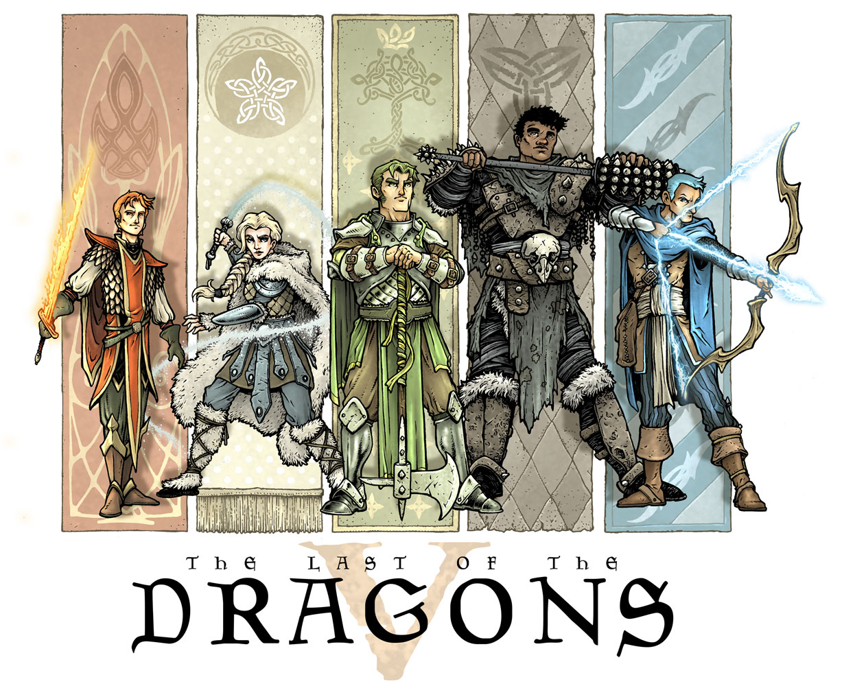
DRAGONS: Jesse


DRAGONS: David


DRAGONS: David

DRAGONS: Jesse


HERO SQUAD: Jesse


HERO SQUAD: David


PSYCHO-MANTIS: Jesse


PSYCHO-MANTIS: David


FEATHER: David


FEATHER: Jesse


R-WARS: Jesse


R-WARS: David


CATS TRIO - CLAW: David

CATS TRIO - CLAW: Jesse


Tuesday, April 16, 2024

Pirate, Spaceman, Cowboy, Knight

A Pirate, a Spaceman, a Cowboy, and a Knight all walk into a bar...or into some new designs. In a Plotmasters type exercise, I took an old drawing and tried to improve on both the artwork & the concept as a whole. I have no intention of developing this beyond a nostalgia trip and re-design exercise. You can see the results to the left, but in this post I'll explore where they came from and the process in revamping them.

In 1999 or 2000 I drew the piece on the right as well as a list of characters for the idea. In true Plotmasters fashion, the characters were clearly myself, Jesse Glenn, and the others would be based on the usual friends of mine that provided inspiration. I was clearly in my 'emulate Mignola' phase when I drew the Pirate and the Spaceman.

The overall idea was for a group of mis-matched characters to go on adventures together––and when I say mismatched, I mean in the same way a kid might team up action figures and toys from very different toy lines and in very different genres and scales. 

Sound Familiar? Toy Story, right? Well––it does match that franchise, and I did draw the original two as well as my list well after the first movie was out. But, instead I was influenced by an episode of The Twilight Zone called "Five Characters in Search of an Exit" where archetypal characters are stuck in a cylinder with no memory of how they got there only to find out they are toys in a Christmas donation barrel. And instead of a Soldier, a Hobo, a Bagpiper, a Clown, and a Dancer, I went with toy genres that were popular when I was a kid, but also seemed timeless.


And I have to admit, even in the re-designs, I couldn't get away from Toy Story, and so I leaned into it. My first step for the re-design was to draw the characters that had already been visualized, but this time to play with proportions to make them more stylized and toy-like.

I pushed the horizontal of the Pirate, making him low and squat, with the only vertical height being given by the ostentatiousness of his feather and sword. The Spaceman I wanted to push into a shape beyond what a human could wear as a costume and embrace a design of something more futuristic...though I think the design borrows a lot from Lego Space sets and Gizmo Duck.

To keep this exercise simple, I opted to ink them large and with a brush pen––focusing on the overall shapes and concepts and not on details and textures. This was inked on a 12" x 12" piece of Strathmore Bristol.

I remember being torn at this point in the process about the characters as toys vs characters inspired by toys Toy Story/Twilight Zone issue. And I wish I'd included a base plate (like on plastic army men) on the Pirate's foot & peg to make him much more obviously a toy.


I then scanned the inks and colored them in Photoshop. Rather than my normal Mouse Guard style of coloring, I went back to a technique I did on a Plotmasters episode for 'Hero Squad'. 

For this process each character is colored with flat base colors. Then a layer is placed above that set to 'multiply' and a pale purple is used to paint in flat shadows––same process but a layer set to 'screen' to create highlights. The last steps were to add color holds to the Spaceman's logo and face and a crinkled paper background to the duo to project the feel of this being part of a kid's imagination.


Written on the original drawing were two additional characters (I'm sure I was even considering more, but stopped at 4 in total): Cowboy & Knight. The trick with doing a modern drawing of a friendly toy cowboy is how to avoid Woody from Toy Story. I really leaned in to the toy-object idea and made his head and body wood block, his arms and legs rope and his hair and mustache yarn. 

The Knight I decided could be a material opposite to armor and made him a knitted plush. The cowboy design is based on my college friend Seyth––the Knight I don't know––perhaps Nick (see Cats TrioDragons, or R-Wars).


Like the others, I inked these on 12' x 12" Strathmore bristol with a brush pen. I like how they tall gangly Cowboy and short squat Knight shapes echo the first two re-designs of the Pirate and Spaceman.

I did worry that I was going to have to do more detail on these compared to the others just to get the materials of the yarn & rope across. Being aware of that helped me me better about not going down a rabbit hole of texture and detail and to just limit it to define basic forms and imply materials.

I think it's fun to imagine that while the previous two characters were store bought, these two toys were hand-made for the child, or that the cowboy especially was an older broken toy with knotted rope used to replace missing pieces.

The coloring process was the same as before, but this time I had a harder time choosing the base colors. There's a long tradition of me-characters being red and Jesse characters being blue. 

I know Seyth's favorite color is green, but how to make that work as Cowboy attire (when I so dearly wanted that bandanna to be red) took some subtle adjustments until I got something that worked. For the knight I just used Yellow & Orange to round out a Primary + Green scheme. I like that it makes the Knight look even a little more cautious and timid rather than the association of bravery with a knight.


Here again are the quartet together––just drawn for fun as an exercise. 


Where I think this idea could still work and differentiate itself from something like Toy Story or the Twilight Zone episode is for the characters-as-characters to exist only in the imagination of the child. Unlike Toy Story where the toys really are alive, these would be inanimate toys, but ones where the child living through some kind of distress (anything ranging from detention or being grounded to dealing with a terminal illness or an abusive parent) uses the toys as talismans and imagines the things they do that help the child navigate emotionally through the situation.

*PS*
Another idea of how to use these characters/designs would be in a co-operative video game set in a house (bedrooms, bathrooms, kitchen, etc) where each player can control one of the toys. They can pair up to accomplish special moves (the pirate can be hooked on to the cowboy's lasso and be thrown up to a higher location, the knight can ride the spaceman to joust objects out of the way, etc) each character would have their own pros and cons (the pirate walks slow, but has good reach with the sword, the spaceman is fast but makes the most noise, the knight is squishy and can fall without taking damage, etc.

Tuesday, May 18, 2021

Plotmasters: CLAW

The latest episode of The Plotmasters Project went up on the site today. It was an episode Jesse and I recorded LIVE on my Twitch stream for ONLINECON titled: Cats Trio Revisit: CLAW! 

To the left you can see my finished art for my Plotmasters update of the Cats Trio big-baddie. Below in this blogpost I'll show the steps of the process to create the artwork

If you haven't seen the episode, I've posted the video at the bottom of the blogpost, or you can link to it directly on YouTube here: https://youtu.be/ok2waaIu_jI


I wanted to play up the military side of the character. Give him tactical gear, and show him amidst a pile of destruction and billowing plumes of smoke. In this rough pencil sketch you can see a few abandoned poses on top––the one on the left owing a lot to Wolverine. 

But the sketch I liked best and worked up the most was one where he's almost casual about what he's done: 'All in a day's work' attitude, with perhaps a glare of 'I'm coming for you next'.

I found lots of online reference for various body armor,  packs & pouches, and weapons to get the look right.

As you can see relative to the paper the above sketch was pretty small, so I enlarged it and then on a lightpad redrew it tighter, working out more details as I went. 

I scanned those tighter larger pencils and did a digital paint-up to help me see the shapes and especially the light to dark value shifts of the plume of smoke.

On his kneepads and shoulder armor I added some insignias (the 02 later was changed to 03 to denote Claw's correct order in the the experiment subjects) And for the shoulder piece I made up my own emblem that he fights under.


I wanted the symbol to have some history, some nazi-like menace, something that makes seemingly regal symbols look sinister when added together in context. 

So I did a clipart search for some heraldry. The cross was meant to be similar to the nazi iron cross, but without being rooted in that specific brand of fascism, the grail cup has lots of connotations that go to myth and vessels for purity, and the shield chevron was a military badge shape I found. I added the three together into this patch. I like the design, and I like how it works for a villainous group.


The next step was to print out the above layout and tape it to the back of a sheet of Strathmore 300 series bristol. On a Huion lightpad I'm able to see through the surface of the bristol to use the printout as a guide as I ink the artwork.

I used Copic Multiliner SP pens (the 0.3 & 0.7 nibs) to ink the linework.

The pencils were fairly tight for this piece, so most of the inks were just direct translations other than adding texture to the rubble and the plume of smoke.

I left a white gap between Claw and that smoke trail. It helps separate him from the background visually, but also makes a part of the coloring a bit easier when I establish the color hold for that area.

To start the colors, I scanned the inked artwork into Photoshop and added flat colors to Claw. This is a tedious stage of digital coloring called 'flatting' that is essentially a professional version of color-in-the-lines, establishing all the color areas. 

At this stage I also isolated all the linework I wanted to be a color hold (an are where I wanted my inked lines to be a color other than black. That gap I left between Claw and the smoke really helped me care out the lines that belonged to the background and leave the main figure's lines alone.

Most of the color choices had already been made in my quick digital paint up back in the layout stage.

And here again is the final version with a logo treatment from my original Cats Trio Plotmasters update

The rendering was all done using the dodge and burn tools in Photoshop while using a stock brush.

This piece concludes the episodes for Season 1 of The Plotmasters Project. Jesse and I hope to do more as time permits.


Below you can watch The Plotmasters Project episode: Claw: https://youtu.be/ok2waaIu_jI.

Tuesday, April 13, 2021

Plotmasters Project: Feather

The latest episode of The Plotmasters Project went up on the site today. It was an episode Jesse and I recorded LIVE on my Twitch stream for ONLINECON titled: FEATHER! 

To the left you can see my finished art for my Plotmasters update of the idea. Below in this blogpost I'll show the steps of the process 

If you haven't seen the episode, I've posted the video at the bottom of the blogpost, or you can link to it directly on YouTube here: https://youtu.be/62WCxKYYjSU

Once upon a time...ok, it was the late 90's, I was drawing a lot of fantasy folklore & fairy-tale stuff. A character that was like a short bearded elf (who was a stand in for myself) kept reoccurring as I built up a mental narrative about him becoming the lonely caretaker for a world when the rest of his kind departed it. He encountered primitive little lizard creatures, a talking wooden man, hooded figures who cultishly want to burn the world down slowly, and a skeleton with tempting offers meant to be a deal-with-the-devil kind of character. It was all a metaphor for things I was experiencing during a bad break-up in college. And in spite of the hurt I was feeling when I was drawing the pieces to the right, I still am very fond of the story set-up and characters.


So for my update, I mainly just wanted to draw the characters better, imply a bit more worldbuilding, and set a tone of melancholy bordering on sadness instead of outright sorrow and despair. I wanted all of the characters to feel like they could be puppets for a Jim Henson company project. Feather himself needed to feel both alone and surrounded by the world he's left with. I drew the characters on different sheets of copy paper (Feather's head and body were drawn separately) and assembled them in Photoshop into a useable composition with a stock border pattern, and some type for the title. 


I then printed out the above layout at about 11x17 (on two sheets of copy paper that I assembled into the full image) and attached it to the back a sheet of Strathmore 300 series bristol. Instead of inking at this stage like I normally would, I just did a really tight pencil job. I'd originally thought about rendering the entire piece in graphite, but after just rendering the border, I realized it was going to be too much work and very risky where I could smudge it or mess up the overall value structure all too easily. And there were times where I thought again about inking the outlines, but since I wanted this piece to feel softer than my normal process, I finished the lineart all in pencil and prepared for the next stage.


I scanned the finished pencils into Photoshop and painted in everything in greyscale. This was a digital way of getting my piece to the point of where I'd planned to render the original physical piece in graphite, but in a much safer and more effective way.

I probably don't evaluate my work in greyscale enough. It's a great way to make sure your overall value structure works. In a piece like this with atmosphere, multiple characters, and some light sources the greyscale rendering was an important step.


The last step was to paint in color on new layers that simply tint the values beneath to the color you are painting. It's one of the ways people colorize old black and white photos. I'd debated tinting each lizard creature a little differently, but opted to keep them as a mass of figures all in the same orange tone rather than make them each unique characters fighting for compositional space. 


Below you can watch The Plotmasters Project episode: Feather.

Blog Archive