Tuesday, October 25, 2022

Soothsayer Deck of Bone Cards

In the Mouse Guard short story 'King, Knight, Fool, Villain' (which you can watch a reading of here: https://youtu.be/A1lm_necUII) A hermit soothsayer offers to read the fortune of a young mouse using a deck of Bone Cards. I've made the deck a reality that now you can own. Tomorrow in my online store the Soothsayer's Deck of Bone Cards is available for purchase, as is all of the original card art for the deck. http://mouseguard.bigcartel.com/product/soothsayer-s-deck-of-bone-cards

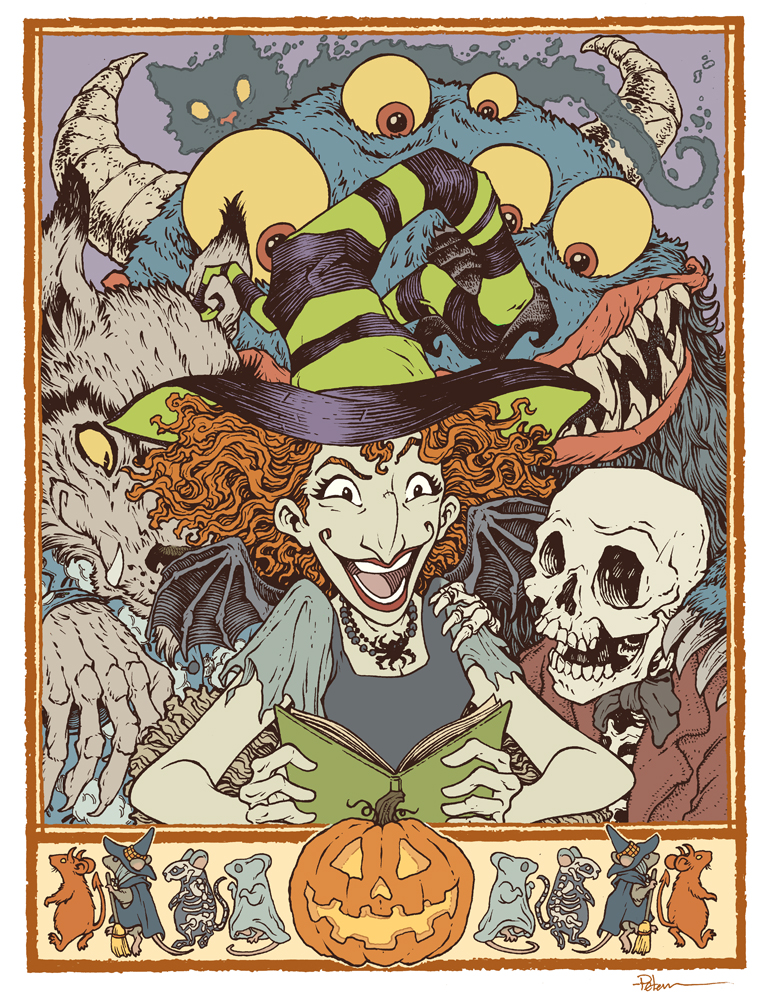
It comes with a reference card that explains the method of fortune telling as well as some suggestions for possible interpretations for each card. The deck comes in a burlap pouch with a stenciled mouse skull and crossbones. Below I'll talk more about the deck.

As you can see in these selected panels from the short story, I had do design a few of the cards just to draw the comic. Obviously the King, Knight, Fool, and Villain cards were necessary, but I also had to design the card backs and a handful of other cards that can be seen in a few panels. I'd drawn about ten of the cards just for the story. In the narration there's a line about a few of the card names, as well as fleshing out that there were 37 in total (a number I chose for no meaningful reason). So, while writing this tale, I made a list of what all 37 cards should be. 


To the left you can see the full set of card designs. After the story was done I drew the rest of cards on my Twitch Stream. The originals are black brush pen on Strathmore bristol, but after I scanned them, I did some Photoshop trickery to make them a rusty sepia tone to match the story art as well as add some effects to make them look like they were block printed. (for more info on that technique, I just modified Texture Labs' YouTube tutorial for Grungy Block Printing Type: https://youtu.be/nRcpoRHTU0U. I was able to upload a few versions of the card back as well, with different printing/wear patterns on each to help add to the block printing authenticity of the deck.


In my online store tomorrow I'll be selling the decks, as well as all of the original card art for the set.
http://mouseguard.bigcartel.com/product/soothsayer-s-deck-of-bone-cards 

In the drop down option menu, you can order a deck (or multiples) and/or a deck + one of the original pieces of art (you are not limited to only purchasing one original, just every original comes with a deck of the cards). 


'King, Knight, Fool, Villain' is a short that hasn't been published traditionally yet. It will eventually be collected with 'Piper the Listener', 'The Owlhen Caregiver, and 'The Wild Wolf' as well as two new shorts when I write/draw them. But, I did ask voice actor David Sharp to do a reading of the story that is currently up on YouTube. You can watch below.

Tuesday, October 18, 2022

Scary Godmother Tribute for the Baltimore Yearbook

 For roughly a decade the Baltimore Comic Con has published a convention art book called 'The Baltimore Yearbook' that usually features a creator-owned character or property, where that creator is a guest of the convention. Selected guest artists are asked to contribute a piece of fan art for the book to celebrate the creator and property. It allows us to play in someone's world, and offers a chance for attendees to meet new creators as they go around the show floor collecting autographs in their yearbook.

This year's subject is Jill Thompson's Scary Godmother! To the left you can see my finished art, and below in the blogpost I'll walk through my process.
We are always encouraged to include our own characters into our Yearbook piece--to create a cross-over image that might not have otherwise happened. I'm always hesitant to add mice from Mouse Guard into these pieces––but a few years ago in the Blacksad piece I did add a mouse character as they would appear in that title. And here I thought it would be fun to add in some mice dressed for Halloween characters to form a border (and distract from the fact that the rest of the composition would be a character pile-up.

Once I had my border, I drew each character separately (starting with Scary Godmother herself) on copy paper while using a light pad (think of it as making Photoshop layers in the physical world.) I adjusted the size & position of the characters until I had a composition I was happy with (and adding some quick flat color helped me see if the composition worked in terms of light/dark masses.

With the pencils/layout done, I printed out the composition (on two sheets of legal paper that had to be registered and then taped back together) and then taped that to the back of a sheet of Strathmore 300 Bristol. On my Huion lightpad, I can see through the surface of the bristol down to the printout to use it as a guide to ink by. I used Copic Multiliner pens (mostly the 0.7 nib) to do all the inkwork.

The trick was balancing my normal texture work with the usually very open forms Jill has when she draws and paints these characters. The original inks for this piece will be up for auction at the convention.


Once the inks were finished, it was time to start coloring the piece. I scanned the inks and began laying in flat colors. This part of the process is called 'flatting' where the color areas are all established with flat colors (no shading, no rendering, no textures, no effects). Some of the color choices were done for me by needing to be on-model from Jill's comics, but I'd also made some choices for the saturation and values when I did my quick color blocking in the pencils stage.

In this step I also established all the color holds (areas where I want the ink lines to be a color other than black) like Boozle the ghost cat's outline, the border, and the glow inside the pumpkin.


The last step was to do the final rendering and lighting effects for the piece. I did this mostly using the dodge and burn tools and a stock Photoshop brush.

This piece will be published in the Baltimore Yearbook later this month. That book will be available for purchase at the convention and through the con's website afterwards. The original inked piece will also be for sale in the art auction at the con on Saturday.


Tuesday, October 11, 2022

Celanawe - 10th of the Black Axe wielders

For a new 10 piece print set, I illustrated all of the past wielders of the Black Axe from Bardrick to Celanawe. I'd shown and listed the wielders in the Black Axe book--but they were only ever visualized as embroidery details on the Adana Tapestry––and I wanted to give them a more solid design existence. The set of ten 4.75" x 4.75" prints is available for sale in my online store and comes in a vellum envelope:

https://mouseguard.bigcartel.com/product/wielders-of-the-black-axe-print-set

To the left you can see the finished art for the Celanawe, 10th of the Black Axes print in the set. Below I'm going to go through the process to create the art.


Layout:
I wanted Celanawe's piece to feature wolves––which is a trick to include due to scale...either they are so far away that they are silhouettes, cropped to obscurity, or the mouse is so tiny they aren't a focus of the art any longer. So I had to cheat a bit with some foreshortening. I had a Celanawe already drawn and then I started placing in photo reference pics of various wolves until I found one that seemed like a believable composition. I then redrew the wolf from the reference, and added a bit of a rocky bit of coverage Celanawe can hide in. Some of the rock drawing is digital, but the wolf and Celanawe are drawn traditionally on copy paper and scanned into Photoshop and tinted for clarity.   


Inks:
I printed out the above layout when I was happy with the arrangement and taped that printout to the back of a sheet of Strathmore 300 series bristol. On my Huion Lightpad I'm able to see through the bristol to the the printout to use it as a guide to ink from. I ink with Copic Multiliner SP pens, and I used the 0.7 & 0.3 nibs for this piece.

Knowing the foreshortening and depth of field was going to be important, I left a white gap between the wolf inks and Celanawe, the plants, and rocks in the foreground. This way I could help sell that distance both here in the inks and in the next step.


Color Flats:

When the inks were done, I scanned the art and brought it back into Photoshop to start the coloring process. This is the step where I 'm basically just filling in each area with flat color. In this step I also establish the color holds, areas where I want the ink work to be a color other than black. The wolf and ground in this case became one big color hold, and the runic numeral '10' became another. I did give Celanawe a charcoal colored cloak here––like he had when inducted, but also what he wears in Winter, and unlike the faded light blue he wears in the Black Axe book.


Final Colors:

The final colors were rendered by using the dodge and burn tools in Photoshop (and a textured brush) to add shadows, highlights, and textures. I select areas and play with the color balance to shift colors in some areas.

The entire 10 piece print set is available in my online store: https://mouseguard.bigcartel.com/product/wielders-of-the-black-axe-print-set

Tuesday, October 4, 2022

Halloween Silkscreened Print Repost


Last year around this time I created a Halloween themed piece for the Baltimore Yearbook, and since it didn't have any copyrighted characters, and I really liked the piece, I decided to also offer it as a 18" x 24" silkscreened poster. In this blogpost I'm going to go through some of the process of going from full-color art to a 3 color piece suitable for silkscreening. If you want to go back to the original post to see the though & art process behind the composition iteself, click here:

Original Blogpost:
 https://davidpetersen.blogspot.com/2021/10/happy-halloween-baltimore-yearbook.html

And if you'd like to purchase one of the few remaining prints: https://mouseguard.bigcartel.com/product/halloween-trio-screen-printed-18-x24-poster


I'd had some experience with breaking down art for the silkscreening process. With a degree in printmaking and three Mondo Prints under my belt (Brave, Rescuers, & Mouse Guard) I have the basics down. But this this piece was different in that I wasn't starting from scratch and already had a full color version that needed to be broken down to three colors.

Assuming one of those three would be the lineart, I needed just the shaded tones broken down. So, I stripped away the lineart, and the colors to make a greyscale version of the tones.


Silkscreen printing is binary, an area on a screen either will or won't allow ink to penetrate the screen. to get the tones to be either on or off, I converted my greyscale version to bitmap, and then in the options for how Photoshop should interpret grays, I chose 'HALFTONE SCREEN".

There are further options for the shape, frequency, and angle of the this halftone treatment. Getting these numbers right for your project always requires a bit of trial and error (or undo and do again--as well as adjusting the levels/contrast of the image before applying the halftone treatment). I went with a line shape and then played with the frequency and angle a bit (in fact, I purposely made alternate versions using different numbers for later steps.

For my first color, I actually combined two alternate angles of the halftone screen pattern and merged them together (this is a recreation I generated for this blogpost––so the angles and frequency doesn't quite match my final art)

As I mentioned above not only does this take trial and error when converting to a bitmap, but also adjusting the levels/contrast of the original greyscale image helps control how thick and thin those halftone screen lines get.

For the printed piece I also generated one of these (just in one angle) going in a third direction that would be the blue-grey color you see in the final.


With the orange lines on one layer and the blue-grey on another, I could mask away areas of either to let one of those colors come through more or less. I also masked out some areas where I wanted more extreme highlights where just the paper color would show through.

And this was a trial and error process too. Instead of erasing away these pixels, I used layer masks that can be easily adjusted or restored without having to undo sixty steps back to get to a previous version.

In this image you can see that I also added in the text in these colors 


The final three color print was Silkscreened on 100 lbs French paper by Ocelot Print Shop in Detroit, MI. It's limited to an edition of 50 (signed and numbered).

And I still have a few left in my online store:


Detail image of the 3 color treatment below:


Blog Archive