Tuesday, January 30, 2024

Usagi Yojimbo: Ice & Snow #5 Cover

For the Ice & Snow Usagi Yojimbo series now being published at Dark Horse I was asked by Stan Sakai to contribute two covers. To the left you can see my final cover art for issue #5.

This cover was new territory for me. In the past my Usagi covers have either been for classic reprints where the entire arc was finished and ready to read, or the Usagi/TMNT crossovers where I completed once piece to sum up the entire series based on some amount of completed material. But, for Ice & Snow, we were working far enough in advance that I didn't have any of Stan's pages for the issue, just an outline & description.

Below I'll go through the steps of creating the piece.

For Issue 5, all I was told for a long while was that it was a stand alone issue. Then Stan gave me an outline of the plot that involved a mountain town over-run by scary cats.

So, I started drawing characters on copy paper. I certainly pulled from my experience drawing the Cats Trio characters. Usagi and Yukichi were easier to draw (as they were meant to be more straight, no action, just calm reaction. The setting was based on a 3D model I found online and rotated to the right angle for the figures.

I scanned in the drawings of everything, assembled them and did quick color blocking to get approval.

When the above was approved, I printed out the layout/pencils and taped them to the back of a sheet of Strathmore 300 series bristol with some painter's tape. On my Huion lightpad I can see through the surface of the bristol to the layout and use it as a guide to ink from. I used Copic Multiliner SP pens (the 0.3 & 0.7 nibs) as I inked the piece.

The complicated amount of overlapping figures made my main goal when inking to vary the density of texture so that the forms could be read clearly from one another.


Stan & Co. approved the inks and I was able to scan them and begin the coloring process. That first step in coloring is known as 'flatting' which is a professional version of coloring-in-the-lines with flat color (no texture, no shading).

Some of the color choices were roughed in for the layout, but still needed to be adjusted for value, hue, and saturation to go with the more stark inks.

At this stage I also established the color holds (areas where I want the lineart to be a color other than black) for the snow, cat's eyes, clothing pattern, and Usagi's scar.

The last step to coloring (seen below) is the rendering. I used the dodge and burn tools along with a stock textured brush to add shadows and highlights. 


Usagi Yojimbo Ice & Snow #5 will be in stores Feb. 14th

Tuesday, January 23, 2024

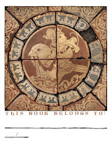
2024 Bookplate

Every year since 2012 I do a new Mouse Guard bookplate for sale at conventions and in my online store. The idea is that this mini-print can be pasted/taped into your book(s), you can write your name in to identify it as yours to borrowers, and since the bookplates are signed, it means you now have a signed book. I try and make each year's bookplate art some medium the mice would/could use. I've done stained glass, relief printing, embroidery, mosaic, etc in past years––this year I was inspired by some medieval encaustic tiles.

The bookplate will be made available at Emerald City Comic Con and then in my online store shortly after.

In digging around for inspiration and looking up 'Medieval Tiles' I came across the Chertsey tiles, which were made around 1250 AD. These are Encaustic tiles, where the different colors you see aren't due to glazes painted on, but rather different colored clays. The base tile is formed in a wooden mold that leaves depressions wherever the lighter tone of clay is meant to be, and then a different clay in the consistency of slip (wet clay) is carefully poured/dribbled in those vacancies. It means that no matter how much the tile wears down from use and abuse, the pattern will never fade or be worn away.

The tiles were unearthed at Chertsey Abbey––though there is some suggestion they weren't commissioned for that location, and though incomplete, have been reassembled by the British Museum.

So, I took one of the digital tile reconstructions, and changed out the center round illustration with one of my own as well as spacing out the word 'PREVAIL' around the ring while losing the 'R' to a lost fragment of tile.

The mouse on a bird seems to be some of the imagery people respond to well of my work, and since so many of the Chertsey tiles were of men on horses, I needed some kind of mouse-mount to help make my tile feel authentic.

The drawing was done in pencil on copy paper and then digitally added in and colored to roughly match the terra cotta tones of the existing tiles.

With the above digital layout ready, I printed it out and taped it to the back of a sheet of Strathmore 300 series bristol. On my Huion A3 Lightpad I was able to see through the bristol and down to the printout to use as a guide as I inked the piece.

I used Copic Multiliner SP pens (the 0.7 nib mostly) to ink the artwork. It was a little odd to be working so starkly on something and basically in inverse values, since everything black was eventually be a lighter yellow/tan color much lighter than the surrounding red clay. I purposely weathered and distressed the edges of the tiles and even the design in some areas to imply chipping and damage.


When the inks were done, I scanned the art and flatted in the digital coloring. On a piece like this that starts with establishing color holds (areas where I want the ink lines to be a color other than black) and so I carefully isolated all the linework that should be the lighter clay color and left everything else black ink.

Then I flatted in the other colors, the red terra cotta, the grey-brown dirt, and a paler grey that was part of the glazing on some of the tiles in the Chertsey reference images.


The last step was to do a final rendering job adding some highlights and shadows in the appropriate places while also getting some texture and color variance in there to make it look more authentic and realistic.


Tuesday, January 16, 2024

Yulefrost Process

 During the Christmas season I drew, colored and inked the piece to the left as a Happy Holidays piece to share with fans. Of course, in Mouse Guard, the winter holiday is Yulefrost, and it's a bit more of a solemn affair. 

This artwork will serve double duty though and also be included in my next sketchbook (which I don't have a release date for)

In this blogpost, I'll go through the process of creating it.


I started with discovering the term 'Lychgate' (a covered gateway found at the entrance to a traditional English or English-style churchyard) and then went on a Google search bonanza of looking at all different styles of them. I landed on a 3D model of one up on sketchfab, which meant I could rotate it to any angle I wanted for reference. I also nabbed this photo of a pinecone to drape in candle, which is how I've drawn mice celebrating Yulefrost in the past.

Using the reference I drew the Lychgate and pinecone as a setting on a sheet of copy paper. Using my Huion lightpad, on a new sheet of copy paper place on top of it I drew the mouse and the candles.

I scanned these drawings into Photoshop and then assembled them (tinting the linework for the elements different colors to help me see which lines belonged to which objects.

I also added in a digital crescent moon shape and an overall border.


With the layout/pencils to my liking, I printed them out and taped them to the back of a sheet of Strathmore 300 series bristol. On the lightpad I was able to see through the bristol and use the printout as a guide to ink from. For pens I used Copic Multiliners (the 0.3 & 0.7 nibs mainly).

Most of the inking was straight forward and I tried to balance my density of linework throughout so that the piece would still be readable and not too muddy. 

I inked the stars and moon in black, even though I knew they'd be a color in the final product.

Then I scanned the inks and started the coloring process with flat colors (nicknamed 'flatting' for that very reason). I didn't have any colors to go on from my layout/pencils like I sometimes do, so I just started dropping in things that made sense (the blue of the night sky, a more grey-brown for the wood, etc.) 

Color holds (areas where I want the ink lines to be a color other than black) were applied to the moon, stars, snow, flames, and a glow around all the light sources.


The last step was to render the piece using the dodge and burn tools (lighten and darken) while also doing a bit of painting and color shifting to light the inside of the Lytchgate that would be affected by the lantern. The final detail was to digitally draw/paint in some puffy falling snow.

As I said, this piece will eventually be collected in my next sketchbook. And in case you didn't see it a few months agao––belated Happy Holidays to you all.


Tuesday, January 9, 2024

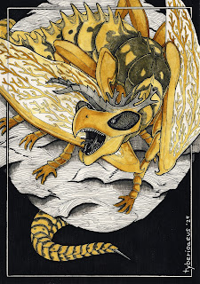
Elegant Coral Wasp Dragon

Last Friday on my Twitch Stream, we did the #DiscoveringDragons Community-Draw-Along! It's a fun event where I welcome all skill levels to push their pencils (or whatever tools they use to make art).


I worked on my piece live on my Twitch stream while viewers worked at home and then on Monday we shared our finished pieces.

Here is my finished colored Dragon. And below are my steps to create it as well as the community submissions.


For #DiscoveringDragons, I post two or three prompt words for everyone to make into a dragon. It's a nice framework for artists of any skill level to focus some time on an 'assignment' to shake the rust off or get the pencil moving again––all while also being loose enough that there's plenty of room for individual expression and interpretation.

This month the prompt was three words: Elegant, Coral, & Wasp

I opened several tabs of google image searches of wasps, wasp wings, coral, and 'elegant dragon' (where I found inspiration for the overall pose.

I wanted my dragon to be more of a dragon-form with wasp traits than a wasp with some dragony expressions. So I sketched out the overall form of the pose before starting to make the head and body sections wasp-like and the underbelly with the texture of brain coral (something I'd push more in the inks). I scanned the pencil rough (on copy paper) into Photoshop to paint in the forms to see the overall mass better.

The worry about incorporating 'Elegant' was something I thought the crossed front paws would solve, but it didn't––and perhaps only the long neck, non-aggressive expression, and the lightness of the wings (where I photoshopped wasp wings in the pattern of feathers) saved me and made it more elegant than I'd planned. 


I printed out the above design and taped that onto the back of a sheet of Strathmore 300 series bristol. Using a lightpad, I was able to see through the surface of the bristol as I inked the dragon. I used Copic Multiliner 0.7 and 0.5 SP pen to ink the art.

The inking on this piece was about varying the line weight on the scaley bits and the wings (more dense in the corners and then thinner in the middle) and to tackle the brain coral texture without overwhelming the inks with too much black––luckily the black wasp markings helped weigh down other areas so the coral bits never seemed too dark. I was unable to finish the inks on-stream, but returned to them after signing off and having some dinner.


When the inks were finished, I scanned them and established color holds (areas where I want the inks to be a color other than black––like the coral texture, the wing outlines, and the interior wing pattern).

Then it was time to start the color flatting process––basically professional coloring-in-the-lines. Some of this is just to make it easy to re-isolate various parts when doing later painting & rendering. So, I established the main yellow color, a coral color for the coral underbelly, a darker color for any of the uninked areas near the black markings as well as the paws and ends of the antennae, and a lighter tone for the wings. 

For the final colors I did most of the highlights, shading, and texture with the dodge and burn tools and a stock photoshop texture brush. I also painted in a bit of a silhouette of the dragon's body where the wings overlaped it to give them a sense of some transparency. Below you can again see the final Dragon...


But, as this is a community event, I wanted to share all the other entries posted in the Discord. 

88 Uncle Ernie


Jodudeit


Jonathan Towry


Nate Pride


redSkwrl


Tyberius


VernNYC


Tuesday, January 2, 2024

Happy 2024!

Happy New Year everyone! I wish you all a safe and prosperous and rewarding 2024. I know we all want for that (along with self-promises to curtail certain vices, engage in better behaviors, & accomplish more) every year––though we rarely live up to those hopes. So, are we delusional to focus on our own pie-in-the-sky once every 365 days? No!––we are engaging in optimism of the highest order. To wish for a world or self better than what might be possible. Much like the mice of Mouse Guard reaching above their station as prey to not merely survive, but thrive. 

I've been struggling with getting the next Mouse Guard book (Weasel War) drawn for years. And again on New Years' Eve, I said my heart's wish aloud––that I may slay that snake in 2024. (Below are the steps to create the artwork seen here)

It all started with seeing a photo a friend took of a mushroom took on a hike. I decided it would be good to have a mouse sitting atop it for a Happy 2024 image (and possibly a new Tee for con season). I drew a rough shape for a banner/ribbon to display the Happy New Year/2024 bit and realized it kinda looked like a snake––so, on another sheet of paper I drew a snake to fill the space. It's a grass snake and while I did use photo reference to get the head right, I drew the rest and the scales without any guides.

Then I digitally put the drawings together and darkened in certain scales (like pixels) to display 2024.

I printed out the above layout of scanned pencil drawings and taped that to the back of a sheet of Strathmore 300 series bristol. On my Huion A3 lightpad I was able to see through the surface of the bristol down to the prinout to use it as a guide to ink from. I used Copic Multiliner SP pens (the 0.7 & 0.3 nibs). 

The last day of 2023 I spent a few hours inking the piece. Knowing I wanted to to be also used as a tee shirt design, I didn't go overboard on texture and tried to make sure the outer contours were strong. I also opted not to darken in the 2024 scales so that this piece could be reused more easily for other things (tee, sketchbook, etc).


After the inks were complete, I scanned the original art to begin the digital coloring process. This starts with laying in flat colors to establish each areas: the mouse's fur is brown, his cloak is red, the snake is a dark grey-green, the snake's belly is a lighter grey-green, etc. Even if these aren't the final color choices, having everything easily isolated to grab for adjustments or rendering is the key.

This step is also where I'd normally establish color holds (areas where I want the inks to be a color other than black), but this piece didn't have any. I did use color to put in the 2024––but in lighter scales rather than darker ones because the snake we so dark already.

The last step was to do the final coloring and rendering. I used Photoshop's Dodge (lighten) and Burn (darken) tools with a stock texture brush to finish the piece.

So, if you didn't accomplish everything you wanted to in 2023 and it disappoints you and makes 2024 seem like an uphill battle where you're starting from behind––Know that I'm there with you...and hopefully we'll slay the snake this year. 


Blog Archive