Showing posts with label Dark Crystal. Show all posts

Tuesday, April 14, 2020

Dark Crystal Roundup


With the Dark Crystal: Age of Resistance Mayrin cover I shared last week being my last visit in the world of Thra for a while, I thought now would be a good time to do a roundup of all my past published Dark Crystal work for Henson & Archaia.


The 2009 Dark Crystal poster
I drew to announce that Archaia had partnered with Henson to make comics.


Power of the Dark Crystal #1 Variant

Beneath the Dark Crystal #1 Variant
*link to process post*


Beneath the Dark Crystal #2 Variant
*link to process post*


Beneath the Dark Crystal #3 Variant
*link to process post*


Beneath the Dark Crystal #4 Variant
*link to process post*


Beneath the Dark Crystal #5 Variant
*link to process post*


Beneath the Dark Crystal #6 Variant
*link to process post*


Beneath the Dark Crystal #7 Variant
*link to process post*

Beneath the Dark Crystal #8 Variant
*link to process post*


Beneath the Dark Crystal #9 Variant
*link to process post*


Beneath the Dark Crystal #10 Variant
*link to process post*


Beneath the Dark Crystal #11 & #12 Variants
*link to process post*


Dark Crystal: Age of Resistance - Ordon Variant Cover
*link to process post*


Dark Crystal: Age of Resistance - Hup Variant Cover
*link to process post*


Dark Crystal: Age of Resistance - Mayrin Variant Cover
*link to process post*


PLANNED 2020 Appearances
Heroes Con: June 19-21 ??
San Diego Comic Con: July 22-26 ??
New York Comic Con: October 8-11 ??
Baltimore Comic Con: Oct 23-25 ??


Tuesday, April 7, 2020

Dark Crystal Age of Resistance cover: Mayrin process

Archaia is publishing a Dark Crystal comic series that ties in with the Netflix series 'Age of Resistance' and I fortunate enough to be asked to do some variant covers for it!

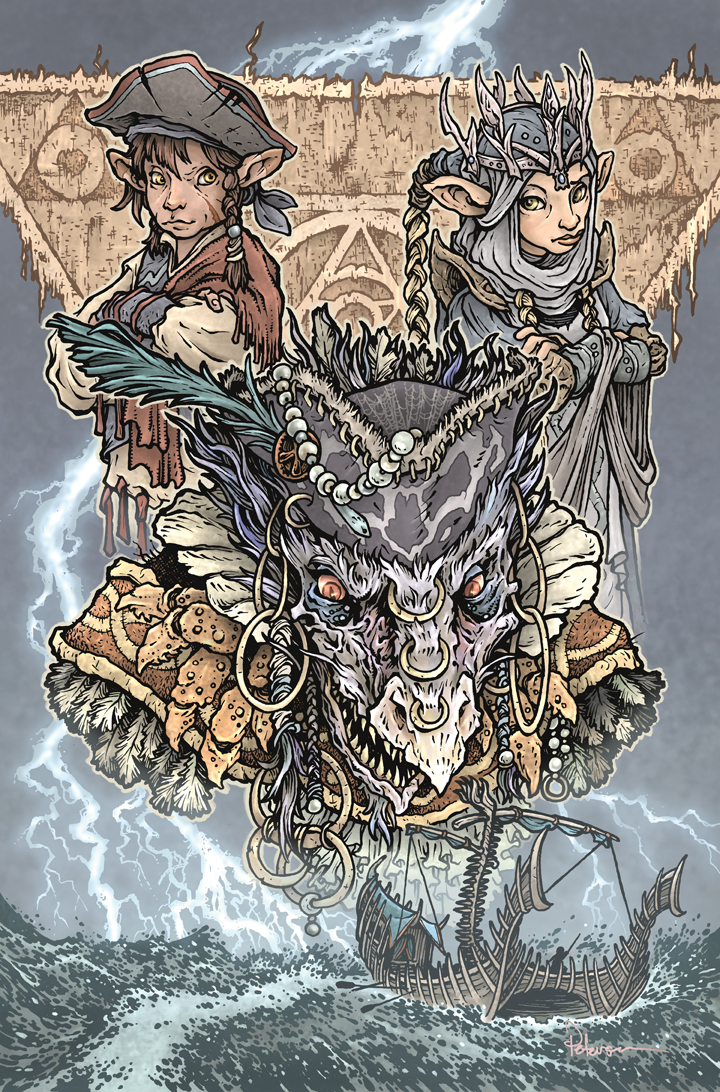
The series is made up of three 4 issue arcs, and the third arc is all about the All-Maudra Mayrin when she was first crowned.


 To the left you can see my finished Mayrin cover, but below I'll break down all the steps I took to create the cover artwork.


Sketches/Pencils:
I started with several pencil drawings of the characters and elements I knew I was going to feature in the cover: Mayrin herself, a Sifa swashbuckling Gelfling she reluctantly works with, a Sifan ship in a storm, and skekSa the Mariner...a character that had only been depicted for the YA novels by J.M. Lee (and illustrated by my friend Cory Godbey). I was given in-house reference from Archaia of character designs for the gelflings and the ship, puppet reference of Mayrin as she appears in the Netflix show, a Cory Godbey drawing of skekSa, and a tapestry triangle design from the art-of Dark Crystal book by Brian Froud.

Layout:
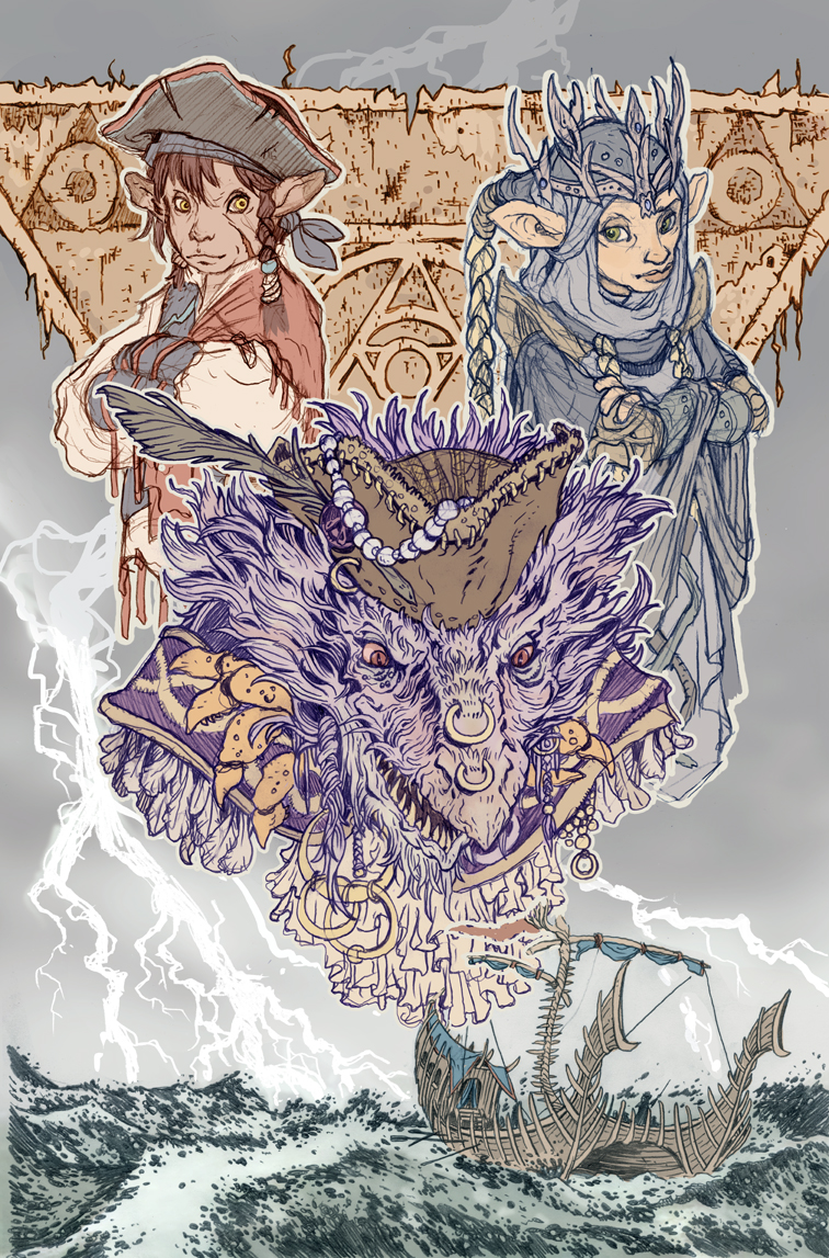
I scanned all the elements and puzzled them together. Because each character was drawn separately, it made it easy for me to make adjustments to them in scale, placement, rotation--and even to distort the drawing a bit (I always end up needing to use the liquify tool in Photoshop to smush gelfling faces around until they are 'right')

I added a quick color pass to help me visualize where the figures masses were and if tehre were any color tangent issues to worry about. This also helps when I send it off to Archaia and Henson for approval, so they know exactly what I'm planning....


Revision:
...aaaaand for the first time in over 17 pieces for Henson, I was asked to revise a rough. The issue was skekSa. Having limited reference for her, I followed Cory's lead with lots of fur and feather textures--but apparently I went too far.

I was re-sent Cory's reference as well as an image of the Mariner skeksis from the interior artist with the note 'less fur/hair––especially around the mouth'.

So I re-penciled her and added in some of the costume details from the new reference.

With the new pencils drawing closer to being 'on-model', I swapped out the versions of skekSa while also making some minor placement adjustments to the geflings to accommodate.

This version was then sent back off to Archaia and Henson where it met with approval for me to move on to the next step....


Inks:
I printed out the revised layout at about 10" x 15" (on two sheets of copy paper that I aligned and taped together) and then taped that printout to the back of a sheet of Strathmore 300 series bristol. On my Huion light pad, I'm able to see through the surface of the bristol, down to the layout to use as my pencil lines while I ink. I used Copic Multiliner SP pens (the 0.3 & 0.7 nibs are my go-to's).

The lightning was inked on the back of the bristol (using that lightpad to help me see) so that I could easily isolate the lighting for the next step (shown here in grey)

As I inked this I streamed the process on my Twitch Chanel.


Flat Colors:
Archaia and Henson approved the inks and it was time to move on to starting to add digital color. That process starts with painting in all the flat colors, no rendering, no effects, no textures––just flat base colors.

A lot of the color choices had already been made thanks to reference and my color mockup at the layout stage(s).

I added several color holds: to the tapestry linework, the sea, the ship, the webbing on skekSa's hat and the skull design, and the swashbuckling gelfling's scar. Color holds are where I can choose to paint the line art  color other than black.
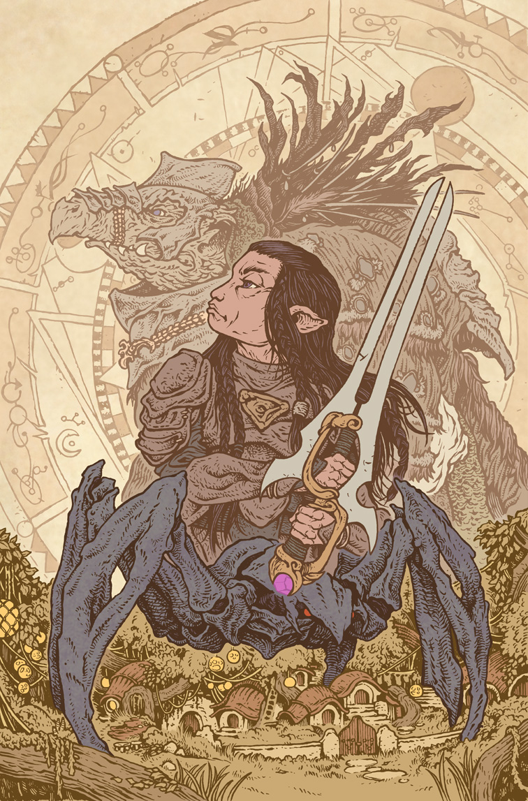
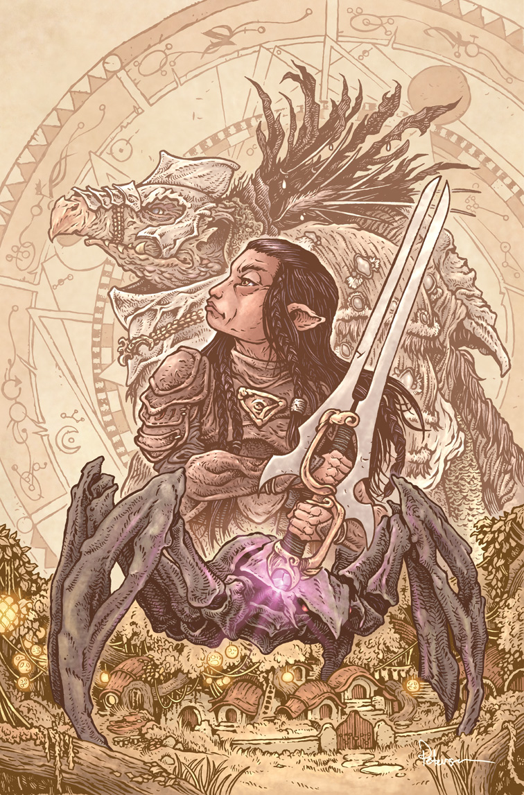

Final Colors:
Below you can see the final colors again. to render the image I use the dodge and burn tools in Photoshop to add highlights and shadows as well as texture. I streamed a lot of this process on my Twitch Chanel also.


And that's my last Dark Crystal cover for a while. This is the last freelance work I had on my plate. And I hope to be able to focus a lot more attention on Mouse Guard again.
Thanks for going to Thra with me. Working on Dark Crystal comic covers has been an absolute joy. A bucket-list treat that younger me wouldn't believe he gets to do now. I hope to come back and visit Thra again--but for now, I'm headed back to the Mouse Territories.


PLANNED 2020 Appearances
Heroes Con: June 19-21 ??
San Diego Comic Con: July 22-26 ??
New York Comic Con: October 8-11 ??
Baltimore Comic Con: Oct 23-25 ??

Tuesday, January 21, 2020

Hup: Dark Crystal Age of Resistance Cover

Archaia is publishing a Dark Crystal comic series that ties in with the Netflix series 'Age of Resistance' and I fortunate enough to be asked to do some variant covers for it!

The series is made up of three 4 issue arcs, and the second arc is all about everyone's favorite brave spoon wielding podling: Hup!


 To the left you can see my finished Hup cover, but below I'll break down all the steps I took to create the cover artwork.

Layout:
For these Age of Resistance covers, I've wanted to make more of a collage and vignette of characters or scenes from the comic rather than the full body profiles I did of the skeksis and mystics for my last cover-run. I started with pencil drawings of each of the characters I needed to include for this cover: Hup of course, and also a Gelfling bard named Barfinnious and the skeksis treasurer skekShod. All of those were drawn separately on copy paper, scanned in, and then moved, resized, and adjusted to make up a composition using a Froudian circle design as a framing mechanism.

I also did a quick color pass to help me see the characters, predict tangent or value problems, and to make sure Archaia and Henson could clearly see what I was going for.

Inks:
Once Archaia and Henson both approved the layout above, I printed it out at about 10" x 15" (on two sheets of paper that I aligned and taped together) and then taped that printout to the back of a sheet of Strathmore 300 series bristol. On my Huion light pad, I'm able to see through the surface of the bristol, down to the layout to use as my pencil lines while I ink. I used Copic Multiliner SP pens (the 0.3 & 0.7 nibs are my go-to's).

As I inked this I streamed the process on my Twitch Chanel.
And I found out that Victor Yerrid, the performer for Hup, watched part of the stream and was kind enough to reach out and compliment the artwork.


Flat Colors:
The inks were sent in for approvals before I could start on the first part of the coloring step: flatting. This is where I digitally paint inside the lines with flat colors what color everything should be. I had a lot of the color choices already figured out because of the reference material and my inital rough, but this was also an oppertunity to make any changes--especially in saturation (color intensity) and value (light/dark) of the piece.

I also added a few color holds on the lute strings and the leather band on Hup's arm. Color holds are where I can choose to paint the line art  color other than black.


Final Colors:
For the final colors, I use the dodge and burn tools in Photoshop to add highlights and shadows as well as texture. I added a little parchment-wash overlay to mute everything out and called the piece done.

Dark Crystal Age of Resistance: Hup begins this month, and my cover will be on next month's issue #6!


2020 Convention Appearances to be announced soon...


Tuesday, September 3, 2019

Dark Crystal Age of Resistance cover: Ordon

Archaia is publishing a new Dark Crystal comic series that ties in with the Netflix show Age of Resistance and I was asked to do some variant covers for it!

The series will be broken into three 4 issue arcs, and the first arc is all about the character Ordon.

To the left you can see the finished cover, but below I'll break down all the steps I took to create the cover artwork.


Sketches:
I started by reading the outline of the comic series given to me by Archaia as well as some character and show info from Henson. Besides the main character of this arc Ordon, I decided to include the following elements for the cover: The Skeksis skekVar the General, the Dual Glaive, an Arathim, and the Gelfling village of Stone in the Wood.

I used a stock photo of a samurai to get Ordon's pose, and then on copy paper and my Huion lightpad, I was able to build up pencil drawings of the other elements that would puzzle piece together in the next step...


Layout:
I scanned all my pencil drawings and put them together in one composition. By having every character/element on a different layer, I was able to resize, mirror, and make adjustments until the composition worked. I did a quick color treatment to the whole piece so it would help me see the various forms and how I'd tone them so that they could all be seen without forming into one blobby mass. The orange borders here represent the live area, trim, and bleed lines.

This was then sent in to Archaia and Henson for them to approve before I could move on.


Inks:
When the layout was approved, I printed it out (it takes two sheets of copy paper taped together to get it to the size I need) and taped it to the back of a sheet of 300 series 11"x17" Strathmore Bristol. Then on my Huion light pad, I can see through the surface of the bristol down to my layout to use as a guide when I'm inking. This way I keep all pencil graphite off of the finished inkwork with no need to erase.

I inked with Copic Multiliner SP pens (The 0.7 nib mainly). I was careful to not butt the inklines of the forms against each other to help give a sense of depth and also so life would be easier in the next step...


Color Flats:
The inks were approved while I was away at GenCon, but as soon as I got home, I started setting up my digital file for color. This step is called Color Flatting, named so because of the flat, hard-edged color layers you are laying down to establish what areas are which colors. Because this piece had so much depth, I also established all the color holds (areas where I want the ink-lines to be a color other than black) and made sure to separate out the linework of the Froud-ian circle design, the Skeksis, Ordon, the Arathim, the village, and the crystal.


Final colors:
The final rendering was done using mostly the dodge and burn tools in Photoshop with a stock textured brush. I did do a bit of painting on Ordon's face to get a little more control over the shading and planes of his visage.

Dark Crystal Age of Resistance #1 will be out in comic shops Sept. 25th.
Use comicshoplocator.com to find a comic shop near you.


2019 Appearances
New York Comic Con October 3-6
Baltimore Comic Con October 18-20
The Fantastic Workshop Nov. 13-18

Tuesday, May 28, 2019

Beneath the Dark Crystal #11 & 12 Cover Process

For my last two covers, numbers 11 & 12 of Archaia's Beneath the Dark Crystal series, I decided to do adjoining covers of the Gelflings Kira & Jen!


With the series being 12 issues, and there only being 10 sets of Mystics & Skeksis, my editors and I knew the last 2 covers would need something different.


We talked about having Jen & Kira together on a cover and having the other cover being Augrah & a Garthim--or the new two main characters in the 'Beneath' series, but as I drew Jen on a sheet of copy paper, I drew him rather larger than I'd drawn any of the Skeksis or Mystics...And I thought, damn, I like the drawing, and I'd hate to re-size it and lose any detail or make inking him harder. So I went ahead and drew Kira at the same scale holding out hope I could find a way to cram them together on a single cover...and I suddenly realized, they were meant to be facing each other! So I re-formatted my photoshop cover template file to be two adjoining covers and layed out the cover that way. I tinted each character to help me see them better, and then drew the background of the prophecy stone (heavily helped by photo reference provided by Henson) on sheets of copy paper and added them to the composition.

With the digital collage of my pencil drawings all sized, set, and approved by Henson & Archaia, I printed it out (took 4 sheets of copy paper I had to tape back together) and taped it to the back of a sheet of Strathmore 300 series bristol. The bristol was a sheet of 19" x 24"...the image itself is about 21" x 17". A very large piece to ink. On my lightpad, I could ink the piece with my Copic Multiliners (I used the 0.7 nib mostly with the 0.3 nib coming out for the eyes and most of Fizgig). I streamed inking this on Twitch over several sessions. 

Once the inks were finished and then also approved by everyone, I could scan them and start on the coloring. With the piece as large as it was, I had to scan it in 2 parts and then reassemble it in Photoshop. The first step in coloring a piece like this for me is establishing the color holds (where the inkwork won't be black, but a color I can paint: The background, Kira's wing edges & Jen's pants pattern) and laying in flat colors for hair, skin, leafs, wings, clothing, etc. I did myself a favor on the color holds by leaving a gap between my background ink-lines and the figures...it made them much easier to isolate.

The last step to a piece like this is to render the color. Something I also shared while streaming on Twitch over a few sessions. Most of my rendering (adding highlights, shadows, and texture) is done with a textured brush and the Dodge and Burn tools in Photoshop. However, in several cases on this piece with the Gelflings' skin, I had to use the paintbrush tool to more carefully control the color choices and the subtlety of the rendering. It's something I rarely do, but have found that when coloring human-esque faces it's necessary.


These will be published as separate covers #11: Kira & #12: Jen. Below are what the covers will look like cut apart.


This is kind of a full-circle moment for me. It was a decade ago in 2009 that I did a Dark Crystal promo for Archaia to announce at SDCC the Archaia partnership with Henson...and it had Kira on the left and Jen on the right with the prophecy stone as a background element. Here I am 10 years later and rounding out the 12 issue arc of Beneath the Dark Crystal the same way.  I'm also very glad to see the growth in my work in that time as a penciler, inker, colorist and in my compositions. 

I've had a blast getting to draw every Skeksis and Mystic and Jen and Kira from the 1982 film for this run of covers. Thank you to Archaia for hiring me to do so, and for the fans for being so supportive of my covers, and for you blog readers who have come along with me to see the process.


2019 Appearances
Heroes Con June 14-16
San Diego Comic Con July 17-21
GenCon August 1-4
New York Comic Con October 3-6
Baltimore Comic Con October 18-20
The Fantastic Workshop Nov. 13-18

Tuesday, April 30, 2019

Beneath the Dark Crystal #10 Cover Process

Here is my tenth variant cover for Archaia's Beneath the Dark Crystal series!


This cover, the last in the run to feature Mystics and skeksis, is of UrSu the Wisest of the Mystics and skekSo the Emperor of the Skeksis. Like my other covers these two are the counterparts of each other and paired together facing opposite directions. To the left you can see the finished artwork for the cover, but below I'll walk through the steps I took to to get there.


I'll start by saying that the challenge of this cover was that there was no official design for skekSo the Emperor in full skeksis garb. In the film he's bedridden and dying. My editor and I asked Henson for any chance of possible past Froud sketches or even perhaps any insight if skekSo is in the new Netflix prequel series, but they were only able to provide me with photos of the puppet used in the original film and some nice images of his bedchambers to draw inspiration from. So I set out to design The Emperor's costume myself.

Like all the past covers, I drew each character on separate sheets of copy paper. For the Emperor, I tried to use some of his blankets, wall hangings, and tasseled chords to drape him in. I also noticed in the run of drawing these covers that skeksis tend to have some carapace from some beast on Thra as part of their adornment––so I gave him a Crystal Bat collar with the crystal eye acting like an all-seeing 3rd eye for the ruler of those wretched cruel creatures. On his back I attempted to draw something resembling a Landstrider skull, but I'm not sure if I really did that so well.

The Wisest of the Mystics was fairly straight forward as a drawing in comparison, and when the two were drawn, I scanned them and tinted them each a different color when laying them out for the composition to help me see them better.

My editors and I waited, a little worried about the approvals on this one. The others were so inline with the original designs, that I took few liberties (other than trying to work out and interpret details of the costumes)––but here I 'd completely made up the visuals for a main character's look. We all breathed a big sigh of relief when Henson approved.

I printed out the above layout and taped it to the back of a sheet of Strathmore bristol to start inking it on a lightpad with Copic Multiliner pens.

In terms of ink details, I do think this one got a bit more texture than most of the other covers as I tried to help the viewer's eye (as well as my own) understand where fabrics and materials changed as they overlapped and draped the characters.


When the inks were approved, I started on flatting the colors. This is the step where I add flat colors, not worried about the texture and rendering and lighting effects of them, to the characters to establish what parts of the image are which colors.

The biggest challenge here was that I had very little to go on for what the Emperor's color palate would be. I opted to make him a bit darker than I think most of the bedchamber & puppet reference was to make this skeksis the most terrifying looking of them all.


The last step was to render all the colors adding highlights and shadows and texture with the dodge and burn tools in Photoshop while using a textured brush.

This cover marks a transition in the run. I still have two covers to go in the series, but this is the last cover to feature skeksis and mystics, and it was the last cover my Mouse Guard & Dark Crystal editor Cameron Chittock worked on with me before he moved on to a new path with his wife (another former Mouse Guard editor) as they start a new chapter in Boston.

2 covers left to go...time for some gelflings...


2019 Convention Appearances

Emerald City Comic Con March 14-17
Heroes Con June 14-16
San Diego Comic Con July 17-21
New York Comic Con October 3-6
Baltimore Comic Con October 18-20

Tuesday, March 19, 2019

Beneath the Dark Crystal #9 Cover Process

Here is my ninth variant cover for Archaia's Beneath the Dark Crystal series!


This cover features UrAmaj the Mystic Cook and skekAyuk the Skeksis Gourmand. Like my other covers these two are the counterparts of each other and paired together facing opposite directions. To the left you can see the finished artwork for the cover, but below I'll walk through the steps I took to to get there.


The first step was to draw each character in profile. I draw the characters on separate pieces of copy paper to help me arrange, position and re-size them into an overall composition. I was able to use reference photos from the original production from Henson to help me figure out all the details on the characters and their costumes. When I scanned the drawings into photoshop, I tinted each drawing a different color to help me see where one character ended and the next began.

The background circle pattern is my redrawing of a Brian Froud design found in the World of the Dark Crystal art book.


Henson and Archaia had to approve the above layout before I could start inking the cover. Luckily, they've both been great about green-lighting my Dark Crystal work so-far (knock on wood for the rest of the cover run). When the approval came through, I printed out the above layout onto copy paper, and then taped it to the back of a sheet of Strathmore 300 series bristol.
On a lightpad I can ink on the surface of the bristol while still being able to see the layout underneath.

I used Copic Multiliner pens to do the inks focusing on how to play with line size and texture to get all those costume and fabric details to still read to the viewer's eye.


After the inks were approved I scanned them and started the coloring process known as 'flatting'. This is where flat colors are drawn in digitally to establish what areas of the image and the figures are which colors. A lot of the color choices were established by the reference photos, but I still handpicked the colors so that I could make some hue and value choices to get a better cohesive palate for the cover as a whole.


I only needed to establish one color hold (where I want the inkwork to be a color other than black) on this piece, and that was for the background pattern.


The final step was to render the colors using the dodge and burn tools (and a stock photoshop brush that adds texture) to add highlights, shadows, and texture to the colors.

At this stage I also dropped in another Froud-design that I inked as a ghostly overlay like the other covers in this series.

With this cover done, that leaves 3 to go!


2019 Convention Appearances
(more may be announced)

Emerald City Comic Con March 14-17
Heroes Con June 14-16
San Diego Comic Con July 17-21
New York Comic Con October 3-6
Baltimore Comic Con October 18-20

Blog Archive