Showing posts with label Process. Show all posts

Tuesday, February 18, 2025

Belladonna Print

Each Year I create a new limited edition signed and numbered 11" x 11" print. The tradition started many years ago when Julia urged me to create a new print for a convention or event that was 'just pretty'. She thought that we had plenty of images of mice wielding swords and threatening snakes and owls––that the audience, especially women, appreciated when I just drew tender moments, or nature, or flowers.  I followed her advice, and for years now fans have proven her right by anticipating and purchasing the new square print I offer.

This year the piece is titled 'Belladonna'. Below I'll show the step-by-step of creating the art.


This piece started more with the character––the mouse is the Matriarch Siobhan (seen in the Black Axe hardcover extras and she will be explored more in the upcoming Dawn of the Black Axe mini series coming out this year). As a Matriarch she was a healer, but there's something about her I always saw as ominous––hence the pairing with Belladonna; a flowering plant known for being poisonous, but also historically used in small doses medically. I drew Sibhan & some of the plant life on a single piece of copy paper, then drew more of the Belladonna on another sheet with the first drawing on a lightpad. Those were then scanned and assembled and I did a quick color blocking to be sure the overall composition was to my liking.

I printed out the above layout composite and taped it to the back of a sheet of Strathmore 300 series bristol. On my Huion A3 Lightpad I can see through the surface of the bristol down to the printout to use as a guide for inking. I used a Copic Multiliner SP 0.7 pen.

Lots of the inking was just about weighting the contour lines and only using texture sparingly (like the density of the veins in the leaves, the spots of the blooms, the shading on the berries, and the embroidery on her stole.


When the inks were finished and scanned, I could start the coloring process. The first step to that is called 'flatting' which is where you paint in all the areas with flat colors only. It's about establishing easy to grab and re-isolate areas for the later step of rendering. Think of it as a professional version of digitally coloring in the lines.

I also added color holds (areas where I want the linework to be a color other than black) to the leaf veins, the spots on the blooms, the berry highlights, and the chalice details.

Some of the color palette was already dictated by the character's look in Dawn of the Black Axe and the belladonna coloring was inspired from several photos found online.

The last step was to render the color with shadows, highlights, and texture. I do most of that work with the Dodge and Burn tools in Photoshop, though I did use a soft paintbrush here and there and several areas where I shifted the color of an area when I had it lassoed (with a feathered edge).
The Belladonna print will be signed and numbered, available at ECCC next month and then in my online store afterwards.


As this is the 14th year I've been doing these, here are the past year's 11x11 limited prints (many of which are available in a bundle in my online store) and links to blogposts for these pieces below


Tuesday, February 11, 2025

2025 Bookplate

 Every year since 2012 I do a new Mouse Guard bookplate for sale at conventions and in my online store. The idea is that this mini-print can be pasted/taped into your book(s), you can write your name in to identify it as yours to borrowers, and since the bookplates are signed, it means you now have a signed book. I try and make each year's bookplate art some medium the mice would/could use. I've done stained glass, relief printing, embroidery, mosaic, etc in past years––this year I was inspired by relief stone carving.

The bookplate will be made available at Emerald City Comic Con and then in my online store shortly after.

The process started when I was wowed by a photo of a restoration/recreation of facade from Louis Sullivan's Gage building. I did some clay relief carving in college this reminded me of. I ended up cutting up the reference photo and making it into a new configuration and then I went about sketching some mice––specifically a scene of the first Matriarch and founding Guardmice as documented in Jeremy Bastian's Legends of the Guard tale.

With this year (in May) being the 20th anniversary of Mouse Guard, I thought showing the in-world founding of the Mouse Guard in stone would be a nice touch. The pencil sketch was quickly digitally blocked in with some greyscale values for reference for the next step.

I printed out the above layout and on my Huion Lightpad I was able to transfer the basic drawing in pencil on the lightpad.  Below you can see three stages of me slowly shading in the areas of the drawing with graphite while using an eraser to pull highlights and a tortillon to smudge and blend the greys.


When I finished that process I carefully cleaned up the outer edges with an eraser and then scanned the piece in greyscale.

To tighten up the value range I adjusted the levels to set the darkest point and lightest point and fiddle with a midrange until I got what looked right to me.

I contemplated leaving the art this way for the bookplate, but decided to add a little bit of tone and color.


So in Photoshop I did just that. The final bookplate has been printed and as I said above will debut at Emerald City Comic Con in March (booth 20505) and then be made available in my online store sometime shortly afterward.


Here are all the past years Bookplates––many of which are available in my online store as a bundle (https://mouseguard.bigcartel.com/product/set-of-10-mouse-guard-bookplates). Below are the blogposts about the process of making each:


Tuesday, February 4, 2025

Dawn of the Black Axe #1 Petersen Cover

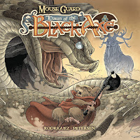
As recently announced, Dawn of the Black Axe is a 3 issue mini series written and colored by me and illustrated by Gabriel Rodriguez (Locke & Key) about the first wielder of the Black Axe! 

It's up for preorder now in local and online comic shops (JAN250017 for my cover) And I wanted to use this post to share a deeper dive into the cover art for cover B (there is also a Gabriel Rodriguez cover as well as another guest variant)

To the left you can see my finished cover with logo etc, but below I'll go through the art steps.


I gave Gabe the big snake battle cover and I opted to focus on the lore of the story. Fans of Mouse Guard may know I've dropped hints about the legend of the Black Axe through my first two books and a short story the Axe Trio, but also in a whole volume called The Black Axe (which is about Celanawe, the 10th wielder of the weapon).

I drew Farrer (based on Gabe's designs of the character) the axe's smith bestowing it on Bardrick while that moment in encircled in a a medieval halo design. The background is also the Adana Tapestry (something like our world's Bayeux tapestry showing the story of the Axe) that leads to the point Bardrick kneels upon––where he receives the axe. This was all done on various sheets of copy paper, scanned and assembled in Photoshop with some blocked in color shapes.

With the above layout in a state that I liked, I printed it out on copy paper (two sheets of legal paper trimmed and taped together after printing to fit the whole image) and taped to the back of a sheet of 13" x 13" Strathmore bristol (art size is 12" x 12").

I inked the piece on my Huion lightpad where I can see through the surface of the bristol down to the printout to use as a guide while I inked. I used Copic Multiliner SP pens (the 0.7 nib mostly)

Lots of texture in this piece, and in black and while it's a little too busy, but I know I'm going to add color to al lot of that linework to add clarity.

The inks were then scanned in and I started the coloring process. The first step is called flatting, basically a color-in-the-lines for professionals with flat base colors (no shading or textures.)

The colors of the characters and the tapestry were already known from coloring the issue and the Black Axe volume, but it still took a lot of careful tweaking to get the saturations and values all right.

Here I also established color holds (areas where I want the lineart to be a color other than black) on the tapestry embroidery, and a few different hols on the halo.

To render the color I used Photoshop's dodge and burn tools with a textured brush to get the highlights, shadows and textures.

Below is the solicitation info for the first issue that will be in shops March 19th, 2025:

CODE: JAN250017 (Petersen cover)
(W) David Petersen (A) Gabriel Rodriguez

The origins of the legendary Black Axe are revealed for the very first time!In celebration of its 20th Anniversary, experience the earliest tale in Mouse Guard history...
Adventure with the ancient weapon's first mouse wielder and champion, Bardrick, as he sets off on an epic quest in the newest installment of the Harvey Award-winning series by Mouse Guard creator David Petersen and Eisner-nominated artist Gabriel Rodriguez (Locke & Key)!

Tuesday, January 28, 2025

Dawn of the Black Axe #1 Rodriguez Cover

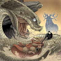
Announced a few weeks ago Dawn of the Black Axe is a 3 issue mini series written and colored by me and illustrated by Gabriel Rodriguez (Locke & Key) about the first wielder of the Black Axe! 

It's up for preorder now in local and online comic shops (JAN250016 for the Gabe cover) And I wanted to use this post to share a deeper dive into the cover art for cover A (I also have a variant cover and there will be at least one other guest artist for each issue)

Gabe agreed to do the project, but really wanted me to be the colorist. It's been the hardest coloring work I've ever done...

The cover art was created after the first issue was already drawn. I co-ordinated with Gabe letting him know what scene/visual I thought he should focus on and also what I was going to do for my cover (that way if he wanted to do something beyond my suggestion, he knew what I was doing to avoid overlap).

This series really leans into snake battles (if you know the Black Axe lore from the illuminated pages in Fall you understand) and I asked for the big confrontation for this issue. Gabe sent over pencils, and then this amazingly clean and detailed inked art. 

While the interior pages were all drawn & inked, I had yet to finish the colors on the issue––importantly, I hadn't yet colored this scene, so the cover is were some of the color choices were made. Bardrick (first wielder of the Black Axe) had a color scheme and so did the snake (Gammeltann) and the elk, but what colors the backround were and how that may alter the hue and saturation of my established character base colors was something I figured out with the cover first.

This flat color stage is where all the color shapes are established, a coloring-in-the-lines for pros. I also established the color holds, which is where I want the lineart to be a color other than black. In this case I made color holds for the elk, the snake's eye, and the puffs of dust.

Rendering (adding shadows, highlights, & textures) has proven to take much longer for me on Gabe's inks than on my own. I think part of that is the realism of forms in Gabe's work requires a different style of lighting. He also tends to have a lot more degrees of depth in a panel, where I almost always break forms into 2 or 3 planes.

To render the color I used a bit of a painbrush tool (something I don't often do on my own work) to get some color transitions, then Photoshop's dodge and burn tools with a textured brush.

Below is the solicitation info for the first issue that will be in shops March 19th, 2025:

CODE: JAN250016
(W) David Petersen (A/CA) Gabriel Rodriguez

The origins of the legendary Black Axe are revealed for the very first time!In celebration of its 20th Anniversary, experience the earliest tale in Mouse Guard history...
Adventure with the ancient weapon's first mouse wielder and champion, Bardrick, as he sets off on an epic quest in the newest installment of the Harvey Award-winning series by Mouse Guard creator David Petersen and Eisner-nominated artist Gabriel Rodriguez (Locke & Key)!

Tuesday, January 21, 2025

Ivory Mouse Carving Illustration

In the past few weeks I have been sent photos of this Japanese carving from several friends, professional peers, and fans. I did a little research and found it is ivory and black coral (for the eyes), a little over 2" tall, from the late 19th century and is in a private collection.

Many years ago a similar thing happened when I was repeatedly sent a photo of a weasel riding a woodpecker, and decided to draw it as that event would happen in Mouse Guard (Blogpost for that piece: https://davidpetersen.blogspot.com/2015/05/weasel-rinding-woodpecker.html)...so, here we go again, I've made an illustration of this mouse and broken down the steps to create the illustration below.

I started with a pencil drawing on copy paper where I tried to keep the pose very close to the carving and only imposing some of my Mouse Guard proportions and flourishes on him. For a setting/background, I opted for the kind of gnarled tangled branch of a flowering tree you often see in Japanese lacquered panels, block prints, and paintings.

The paper was scanned and in Photoshop I gave it all a quick color blocking (mainly to help me to better see the petals from the tree and the rocks from the soil. I also digitally blocked in a circle for a setting sun.

With a layout for the piece I liked, I sized it to 8" x 8" and printed it out on my inkjet printer. That was then taped to the back of a sheet of Strathmore 300 series smooth bristol. On my Huion lightpad I can see through the bristol surface down to the printout to use as a guide while inking. 

The inks were all done with a Copic Multiliner SP 0.7 pen. The time consuming part of the inking was all the texture on the tree. When inking the clothing patterns, I found a website that had several photos of the carving from different angles to use as better reference (https://www.buddhamuseum.com/traveller-mouse_13.html)

When the inks were finished, I scanned them in to Photoshop and started the coloring process. That first step (after cleaning up the scan so the inkwork is crisp) is called 'flatting'. This is where each area is established with a flat base color; no texture & no shading. It's a professional version of coloring-in-the-lines. I went with warm colors overall to harken back to the soft warmth in the ivory carving. 

At this stage, I also established color holds, areas where I want the inklines to be a color other than black. In this case that meant the sun outline and the clothing patterns.

The last step was to render the color by adding shadows and highlights and texture. I do most all of this with Photoshop's Dodge and Burn tools with a stock textured brush.

This was a fun piece to do really just for the fun of it. I know many fans have asked if I'll ever do Mouse Guard stories set in Asia, and while I don't plan to, perhaps this will please their curiosity for such a thing.

This piece will be included in my next Mouse Guard sketchbook that I hope to release later this year.

Tuesday, December 17, 2024

Gilkey Warlocks Page breakdowns

Last month Nick Kowalcyk, Mike Davis, & I got together in Flint, MI to celebrate Jesse Glenn's 50th birthday with him. The four of us were very close friends back in high school, and variations of us have appeared in many Plotmasters Project creations, Mouse Guard, and most unabashedly––in Gotham Academy.

This recent reunion made me think it would be a good time to revisit the story on my blog. Below are my 'Gilkey Warlocks' pages broken down into roughs, pencils, greyscale, & final color. 


Page 1 Roughs:
For the hallway I made a little paper model (though the checkered floor was digitally added in). With this story being for DC and having a proper editorial process (unlike my creator-owned Mouse Guard pages) I had to send roughs in for approval.


Page 1 Pencils:
Because I was worried about smudging up a rendered pencil panel when working on an adjacent one, I decided to draw them all separately, drawing a little bit of overlap to make sure there wasn't going to be a gap between panels.


Page 1 Greyscale:
The pencils were all assembled in Photoshop and then masked off to conform to their appropriate panel shape. I added in borders digitally.


Page 1 Final Colors:
Using different layer modes I was able to color over the top of my greyscale page to essentially tint the image like a colorized black and white photo.


Page 2 Roughs:
The Serpents and Spells RPG name had already been established in the pages of Gotham Academy––but not what the cover of a 1984 era players handbook would look like, so I got to do a fun cover treatment and then paste it in.  I also photographed a huge D20 rather than drawing an icosahedron from scratch.

Page 2 Pencils:
Getting pencils this dark was difficult––I suspect that the file I opened to show you this already had some heavy level adjustments done to darken those darkest darks. On some of the panels I added in little crop marks to know where the panel borders were as I was drawing it, but also to know where to crop it when making the greyscale composite.


Page 2 Greyscale:
All assembled with some added in digital black space in the areas around the last 5 panels.
The digital borders on this included another dashed line between a panel and the zoom-in, something I enjoyed on the first page and continued here.

Page 2 Final Colors:
Keen eyed viewers will notice that on page 1 Jonathan Crane's name was on the secret door, and here we find an abandoned room with chemistry equipment and an erlenmeyer flask with 'FEAR TOXIN' on the label––and there goes Davey (Mike Davis) blowing off all that dust on the table into the air... 


Page 3 Roughs:
These pencils got a healthy amount of digital help when it came time for me to visualize the animated shadows growing off the kids, and then forming into Serpents and Spells monsters. 


Page 3 Pencils:
After the success of drawing the last 5 panels on page 2 together, I opted for the middle section of 4 panels here to all be drawn together.


Page 3 Greyscale:
I'm not sure why, but I think I put reasoning into why each boy's shadow became which monster––and for the life of me I can only remember Glen (Jesse Glenn)'s being an owlbear-like thing because of an inside Joke about real-life Jesse once drawing the friendliest owlbear for my homemade board game Tower


Page 3 Final Color:
This story was written, drawn, and turned in a few months before the first season of Stranger Things aired––you know, that 1980's period piece about four pals playing an RPG when one of them mysteriously disappears after a session. 


So there you have it! I'm still proud of this story, because it got me to stretch narratively (humans, likenesses, panel count (9 panels on page 2!), and in a different medium (rendered pencil).

I did a blogpost about the process of drawing this story back when the issue came out in 2016. The story can still be found in Gotham Academy Vol. 3: Yearbook TPB or Comixology.

Someday soon I hop to have a moment and revisit these characters––to show what each of their Serpents and Spells characters looked like.

Tuesday, November 19, 2024

Sandmason Mouse

Earlier this year I did an inked commission of a Mouse from Sandmason on a desert mount.
The plan is that this piece will be included in the next Mouse Guard sketchbook (hopefully out mid-next year).

I've colored it for that eventual sketchbook and in today's blog, I'm going through the process for drawing, inking, and coloring the final image you see here.

The fan's request was a mouse from Sandmason (a location on the map of the Mouse Territories I've never taken readers to in the course of the books––but a style of dress I did show in the extras of the Winter book when delegates from various cities come to Lockhaven for a summit) on some kind of a mount in the desert sand ala Luke on a Tauntaun on Hoth in The Empire Strikes Back.

The only lizard in Michigan (and I know you're thinking Michigan isn't a desert––but we do have sand dunes, which to a mouse...) is a Five Lined Skink.

I penciled the lizard and the rock on a sheet of copy paper, the mouse on another, and then on a light pad with a fresh sheet of copy paper over the lizard drawing, I drew the saddle/seat and assembled them all together in Photoshop.
I printed out the above pencils/layout and taped it to the back of a sheet of Strathmore Bristol 300 series. On my Huion Lightpad I was able to see through the surface of the bristol down to the layout to use as a guide while I inked the piece. The inks were dong using Copic Multiliner SP pens (the 0.7 nib mainly).

This piece had some tricky textures that had to be subtly managed: the scales, the belly, the sand, the rock...over doing any of those would not just make the piece too cluttered and unreadable, but also would lose the contours of those forms.
With the inks finished I started the coloring process. The first part of which is called 'flatting'. It's essentially a professional version of coloring-in-the-lines to establish what each area's flat base color will be (though, you can use colors that aren't in the final palette and adjust them later) no textures or shading.

It's also at this stage I added in color holds (areas where I want the lineart to be a color other than black) and I established those on the sand, the flag emblem, and the goggle glare).
The last step was to render the final colors. I do this mainly with the dodge and burn tools in Photoshop, but on this piece I did use the paintbrush a bit too. I also will use the freehand lasso tool with a feather (blurred edge) to select certain areas to adjust the color balance on to make subtle transitions––like the skink's nose area.

Hopefully I'll get past my current deadline crunch and get to a point where I know I'll have enough finished images to combine into a sketchbook collection for 2025.

Tuesday, September 3, 2024

Santa Barbara Courhouse Commission

Last September, my friend Stephen Christy and his partner Dominique were married. You may recognize Stephen's name––He was an integral part of bringing Archaia back from it's early collapse, in shepherding the deal between Archaia and Henson, and for being the film liaison for a Mouse Guard movie since the earliest offers came in right up to being a producer on the FOX movie we started. 

I was contacted by a friend of Stephen's who wanted to commission me to draw the Santa Barbara Courthouse where they had their ceremony for him to give as a wedding gift.

I accepted the commission and started with going through lots of publicly available photos of the building as well as a few 3D models on shared model libraries. Once I had a photo, I printed it out and then on a light pad, drew a refined pencil version––tracing the form, but also interpreting how I'd manage the details and complexity in just line and texture.

With the pencil drawing done, I scanned it into photoshop and sized it to match the final art (10" x 10"). I also tinted the linework to make it easier to see for the next step, and painted in some areas where I knew I wanted to add shadows with texture. The last step was to add a horizontal line guide to help me when it came tim to ink something in the sky area.

A printout of that version was taped to the back of a sheet of Strathmore bristol, and on my lightpad I was able to do the final inked drawing with Copic Multiliner SP pens. 

There was a lot of structural detail to get right in the tower, the arch and the windows, so I used a slightly smaller nib size than I normally would, and then built up the stippling for the shadows slowly to make sure I was never losing the forms of the architecture.

I was honored to get to draw a piece to be gifted to Stephen and Dom for their wedding. Happy Anniversary!

Tuesday, July 30, 2024

Magic The Gathering: Kitsa

Last year I was asked by Wizards of the Coast to do some Magic the Gathering card art for their upcoming animal set Bloomburrow (https://magic.wizards.com/en/products/bloomburrow). I played a lot of MtG back in the mid/late 90's, so it was an honor and thrill to become a part of the fraternity of MtG illustrators.

Here is Kitsa, Otterball Elite. Wizards of the Coast has already revealed my version of this card so, I can share the artwork and process for creating it.


The process started with the brief from my art director asking for Kitsa, an otter athlete, slapping an energy ball with his tail through netted hoops while casting a spell. WotC provided me with an enormous PDF with reference for the otters and their clothing and culture for Bloomburrow.

I started with a rough version of Kitsa on copy paper––which was pretty much just studying real-world photos of otters. I then refined the drawing on a different sheet of copy paper using a lightpad to work off of the original. The armor/costuming was so detailed, that once I had my tight drawing of Kitsa, I could overlay another sheet of copy paper on the light pad and draw it all without worrying about erasing a part and ruining the original otter drawing.

The Art Director asked for a change with Kitsa's paw that happened later in the process, but I wanted to address it here since every image after this will have that revision.
The pencil roughs were assembled and combined digitally in Photoshop. Since the background was all underwater, I figured it would be easier to add in those rough shapes digitally with paint brushes and marquee tools. For the bubble placement, I had a layer with a thin outline applied to wherever I pained, so I could add in those light bubble shapes and get something with a defined edge to ink from later. I also gave myself some notes about the magic effects.

With the pencils/layouts approved by my art director, I moved on to inks. I printed the digital composite out and taped it to the back of a sheet of Strathmore 300 series bristol. On my Huion Lightpad, I was able to see through the surface of the bristol to use the printout as a guide as I inked with Copic Multiliner SP pens. The art director for this card requested not to have any large or dense areas of black, so I kept the linework fairly open and was restrained with the amount of texture. The magic around the eyes and coming off of his hand and the ball were inked separately on a sheet of copy paper (not seen here).

T
he inks were then scanned back into Photoshop where I could start the coloring process. This stage. called flatting' is the professional version of coloring-in-the-lines. Just flat color is placed in to establish everything's base colors. the art director also liked when my linework was softer in my Mouse Guard work, and wanted everything to have a dark blue-green color hold (ink lines colored to be something other than black). I also established other color holds on the bubbles, the costume details, and the energy ball.


Here are the final rendered colors for the art (sans card borders) with the magic effects added in. I did the light and shadow and texture by using the dodge and burn tools in Photoshop with a stock textured brush.

I have prints and playmats of Kitsa available for sale: https://mouseguard.bigcartel.com/category/magic.

Blog Archive