Showing posts with label TMNT. Show all posts

Tuesday, March 3, 2026

Magic the Gathering: Teenage Mutant Ninja Turtles


Magic the Gathering is releasing a Teenage Mutant Ninja Turtles set this weekend!


And I was hired to do the artwork for the packaging on the  TURTLE TEAM UP:
Magic players of all skill levels team up with the TMNT to fight bad guys in this exciting new co-operative strategy format for up to four players!  Equip awesome ninja gear, play with your favorite of the four pre-built 60-card hero decks, then crack open the four included Play Boosters for even more ways to get the drop on the pre-built enemies deck featuring Shredder and his cronies!


For the artwork I was asked to include all four turtles as well as Shredder, Rocksteady, Bebop, Baxter, Splinter and Krang all in Dimension X by the Technodrome. Each character was on a separate layer so that depending on packaging variations they could remove certain characters or background elements to suit their needs (seen in two variations below)

But I was able to get permission from Wizards of the Coast to share the full approved art I sent them with all the characters and background:


Magic the Gathering: Teenage Mutant Ninja Turtles is already in pre-release and comes out officially March 6th!

Tuesday, August 27, 2024

TMNT 40th Anniversary Pinup

On July 10th a TMNT 40th Anniversary on-shot was released. I was asked by editors to contribute a pinup to mark the occasion (I'd similarly done one a decade ago for the 30th: http://davidpetersen.blogspot.com/2014/05/tmnt-30th-anniversary-tribute.html)

It was reading the early Eastman & Laird TMNT comics and playing the RPG that really cemented my desire of wanting to write and draw my own comics. The only other comics I'd read at that point were some older X-Men reprints (that had Arthur Adams covers, Dave Cockrum interiors, and John Bolton backup stories) and Archie comics that had a different artist every story––Kevin and Peter were doing something different, and seeing their names above the logo on the cover made me realize these guys were just making stuff up and drawing it––not a factory of creators contributing to a long-standing legacy brand.

Unfortunately due to timing, I didn't have time to draw a new pinup before the tight deadline for the 40th one-shot. But I did have some sketchcovers I inked (and scanned before painting) of each of the brothers. Since they'd never been published, I asked the editors if they minded if I assembled them into a group composition and colored them to include in the issue and luckily they agreed.

Below you can see each individual turtle's inks before coloring and assembly:


Tuesday, November 21, 2023

TMNT RPG Illustration

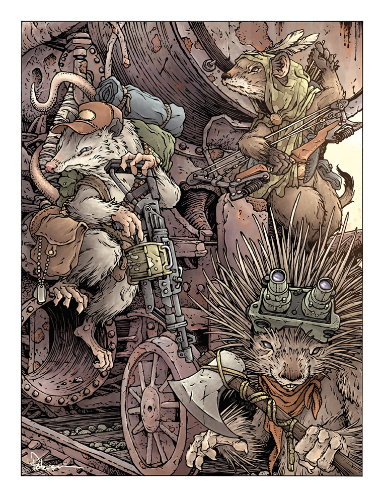
The TMNT RPG is being Kickstarted for a reprint/remastering! To quote the campaign: "Teenage Mutant Ninja Turtles and Other StrangenessThe best-selling role-playing game is back, in beautiful full color with new art by TMNT creators Kevin Eastman, Peter Laird, and more!" I am thrilled that I got to be one of those 'and more's to create a new full page color piece for the book.

The Kickstarter is fully funded (and hitting stretch goals), but it ends Nov 28th, so there's still time to back it and get in on this reprinting of the TMNT RPG: https://www.kickstarter.com/projects/palladiumbooks/teenage-mutant-ninja-turtles-and-other-strangeness


I played the hell out this RPG in middle school and high school. D&D was banned in my house, so this was the first RPG I ever played. I loved the mutation character creation process, and my friends and I used this RPG to flesh out characters and ideas for Cats Trio

The folks over at Palladium wanted an illustration that was more than just TMNT fan-art, something that spoke to the RPG itself, random mutant animals or characters and settings from the canned adventures in the books. I had always loved these three separate illustrations by Eastman & Laird from the original book, so I opted to make them into a party patrolling some derelict space.

I redrew each character in my own way, adding gear and clothes from the RPG as well as from the original illustrations. These were done in pencil on copy paper and then assembled digitally. I found 3D reference for the opossum's gun, the porcupine's goggles (still visible in this layout), the weasel's compound bow, and the setting of a rusted out train. 

Over printouts of those models I penciled my own versions, adding my own details and scratches and dings. To help me see everything's individual forms, I did a quick color blocking before sending it off to Palladium & Paramount for approvals.


The Layout was approved to move forward on. I printed out the above layout onto copy paper and taped it to the back of a sheet of 14" x 17" Strathmore bristol so I could ink the piece on a light pad. I use a Huion A3 lightpad, which is fairly big, but this whole piece wouldn't fit on it all at once.

I used Copic Multiliner SP pens (the 0.5 & 0.7 nibs mainly) to ink the piece. I think I spent most of the time on the train, because I knew the concentration of lines to depict the rust and wear would set a darker value for the 'background' and I could then ink the characters afterwards making sure I didn't add too much texture to their forms so they could still be seeing against the train.


When the inks were finished I scanned them and started the coloring process by placing in flat base colors for every form. Some of these colors were already loosely established in the layout stage, but here I needed to start dialing in on the value ranges for everything.

I struggled with the color for the rusty train, and instead of sitting on this step for a night, I went straight in after this flats image was saved to figure out a painted color blend of grays, purples, and oranges that would make the train look less like a cardboard cutout.

For the train, I relied on several layers that I used the paintbrush tool (rather than the dodge and burn I rely on for most all of my rendering) and I painted a shadow layer (set to multiply) to help block in all those geometric shadow transitions. The characters were rendered using my normal method of a stock textured brush and the dodge and burn tools.

Below you can see the final art again, and I want to remind you to visit and consider backing the Kickstarter:  https://www.kickstarter.com/projects/palladiumbooks/teenage-mutant-ninja-turtles-and-other-strangeness

Tuesday, October 3, 2023

TMNT Raphael painting for NYCC Auction

For several years there has been a charity auction at ReedPop events (NYCC, C2E2, ECCC...) that benefits St. Jude's Children's Hospital. For the NYCC auction this year, they are hoping to crack the 1 Million dollar mark in total donations since they've started. 

So, to help get them further towards that goal, and obviously to help in all the good work St. Jude's does, I decided to do a 16" x 20" watercolor of Raphael for the auction.

I streamed working on this piece on my Twitch Channel, but forgot to take enough in-process photos, so instead I opted to show the process of this piece through the timelapse below.


If you will be at NYCC this weekend, I encourage you to bid on work in the auction.

Tuesday, February 28, 2023

TMNT/USAGI 5 Covers Process 3/3: Colors

 For the past two weeks I've been sharing the process for creating my 5 adjoining covers for the TMNT/Usagi WhereWhen crossover miniseries. I've covered the pencils/layouts and the inks. Today I'm sharing the coloring process. Above you can see the finished colored and assembled covers. Below I'll walk through a bit of the process.

With the inked covers all digitally reassembled, I started the first part of digital coloring called 'flatting' where you are adding flat colors to establish all the color areas in the piece.


This is a professional version of coloring-inside-the-lines to establish the colors for the piece, but also to make it easy to isolate and grab those color areas again and again as I do the rendering. At this step I also added in the color holds (areas where I wanted the line-art to be a color other than black) to Usagi's scar, Tomoe & WhereWhen's pupils, and all the sword blade lines, as well as some of the debris I decided was further back.


To start the final colors in Photoshop CS5, I needed to add shading, highlights, and texture. To do this, I rendered all the covers like one big piece using the Dodge and Burn tools while using a stock Photoshop Brush. Dodge and Burn are tools carried over from Photoshop being a photo retouching tool and are terms for purposefully over or under exposing areas of photographs in a dark room.

More simply Burn darkens whatever values/colors are there, and Dodge will lighten them. The textured brush adds in some random and natural variation as I render giving the piece a bit of texture so it doesn't look quite so 'digital'.
When I was working on the layout of the 5 adjoining covers, I had no idea what to do with the background. I even wondered if I should leave it white and make the piece a bit more graphic (I was thinking of a Joe Mad X-Men cover from the 90's). But as I was flatting the piece, I eyedroppered up the orange color I had as a placeholder for the robot debris and flooded the sky with it––and didn't hate it.

Adding in some gradients and color shifts so that it was brightest at Dr. WhereWhen and darkest at the edges made a difference and both felt like the fatigue of battle as well as reminded me of a Usagi group piece of Stan's.
Most of my color choices were made when I was doing the layouts for this piece and all based on how the characters are colored in the comic already. But, I already have some shifts in color I generally prefer, like warmer versions of cool colors, more muted yellow greens for the turtles, and a warmer creamier color for Usagi's fur. That being said, I had to make further alterations to the base colors once I had the orange background in. Color perception is influenced by the colors surrounding them, so I had to make subtle adjustments to make the piece cohesive.

I also had to lasso areas (with a many-pixeled feathered edge) on each character after rendering them to adjust the highlight colors to be warmer and more yellow/red/magenta to imply the lighting of the background was affecting the characters as well––and that effect needed to be more intense closer to the middle of the composition.

For all the clockwork robot debris, I started with them being a base color that was somewhere between grey/brown and orange. I then went through on two different layers just making some pieces base tones lighter (with a screen layer) or darker (with a multiply layer). I then rendered everything the same way as the figures, while trying to make sense of those heaps of parts, I also knew they needed to be background and not pull focus away from the characters.

So, the rendering detail isn't as deep––and I did very little to shift the colors of various parts to make them look different from one another, I only employed the same lasso color shift to correspond with the intensity of the background.
There were a few areas I did special effects-like tricks like a subtle yellow starburst in the background radiating out from the blast near WhereWhen's wrist. The eyes of Wherewhen and Tomoe got a little effect tweak because of the color hold and I could render in a more rounded shadow and highlight into the pupil. The biggest effect was the keypad on WhereWhen's forearm on cover 5. In the comic it glows a bit, so I added some color hold effects as well as a screen glowy layer and a subtle starburst radiating out from it.

I knew the schedule would be tight getting this piece done on time when I started the layout. The trouble with adjoining covers is that you kinda have to get them all done by the time just the first one is due (because the colors on the background and the overlapping characters need to flow together without seams).

The work was going along smoothly as we neared Christmas, and I even made sure I'd have some down-time over the Holiday before this was due. Unfortunately, I got COVID (exposed on the 24th, symptomatic on the 26th, tested positive on the 27th). I was down for over a week, which really cut into this schedule. Once I was able to sit up without coughing or aching too badly, I just focused on coloring for as long as I could before needing to lay down again. The art was due on the 10th of January (only for cover #1––but as I said, I had to have the whole thing done because of choosing to do adjoining covers). I was up until 4AM on the 9th (technically the 10th by that point) when I finished uploading the completed files. All done, on time, while recovering from COVID.


The TMNT/Usagi Yojimbo WhereWhen five issue mini series starts April 12th. My covers are called 'Retailer Incentive' covers and will arrive in a 1/50 ratio for retailers.

I'll be selling all my inked covers together in my online store the same day the first issue goes on-sale in stores: mouseguard.bigcartel.com


Tuesday, February 21, 2023

TMNT/USAGI 5 Covers Process 2/3: Inks

Last week I showed my Pencils/Layout stage for my TMNT/Usagi 5 issue adjoining covers. This week I'm going through the inking process for this massive piece. Above you can see a photo of the inked covers all lined up on a table in my studio before I scanned them.

I printed out the enormous layout for all five covers which was 4 feet long when everything was taped together. On a Huion A3 Lightpad, I taped a piece of bristol over the printed layout and started inking each cover seprately.

The trick was that covers 2, 3, & 4 were all narrower since the 'bleed' (the extra area of safety art for when the printed comic is cut to size) was just a bit of the covers adjacent to them––and figuring all that out as well as doing the math and making sure it all went together was a little stressful.


As I finished a cover, I'd tape the next piece of bristol onto the previous cover and continue inking any forms that carried over (Usagi's leg, Leo's sword, clockwork parts, WhereWhen's arm, etc.), then I'd carefully tape the newly started cover to the prinout, and carefully untape the previous cover from everything and carry on.

To ink this piece I use Copic Multiliner SP pens. These are technical nylon nibbed pens similar to Microns, but I prefer  Copic's version. The SP's are an aluminum bodied pen with the option to swap out worn nibs and empty ink cartridges (though I almost never need to replace nibs––one of the reasons I prefer these over Microns)

There was a lot of detail and texture across these 5 covers, and with a composition having this many characters and details I like using line weight and density/design of texture to help visually break up the space and describe different objects.

Most of this is done with the 0.7 nib, and I just feather my pressure or go back over areas as I ink to get the desired line weight and sensitivity. The 0.3 nib is usually only brought in for fine facial details like eyes, noses and mouths where a slight error in thickness or contour can spoil the entire piece.

Some of the textures I already had a mental catalog of from my past TMNT covers such as their back shells, belts, and elbow/knee pads. But I then had to play with other densities of line and pattern to help differentiate the parts of the Usagi crew's Samurai armor.


Dr. WhereWhen had unique textures all his own, much different from the more organic forms I usually focus on in my work. Still, I managed to make sure he was battle worn, dented, damaged, and textured so he didn't artistically look out of place with the rest of the piece.

For the clockwork robot debris, I really had to play with scale of form as well as density of line & shadow to help make sure that while it looked like the chaos of battle, it didn't look like static on a TV with no discernible forms or places for the eye to rest––a lesson I learned when doing a similar junk pile for the Plotmasters Revisit episode of R-Wars 


When all the covers were inked and scanned, I used little crop and calibration marks (not seen in these single cover inks, but can be spotted in the photo of all the covers at the top of this blogpost) to reassemble them all.

This was a step I dreaded, because I knew that even with my taking time to do the math for the layout, and carefully aligning each sheet of bristol with the layout crop and/or bleed lines, there was always a chance I wouldn't be able to get all the pieces back together again without some hassle and/or gaps.

There were a few minor gaps and adjustments to make. I made a new layer in photoshop to digitally ink over any gaps in the seams, so that the line of one form smoothly flowed over to the next cover. All-in-all, this process that I dreaded as a potential nightmare took less than 15 minutes. 

Below are detail images of the inks for each character:

Donatello

Usagi

Tomoe


Leonardo

Raphael

Gen

Dr. WhereWhen


Dr. WhereWhen & clockwork robot debris

Michelangelo

Jotaro


Below is the full spread of all 5 covers scanned and assembled with gap corrections (as well as the layout grid for cops and bleed for each cover.


The TMNT/Usagi Yojimbo WhereWhen five issue mini series starts April 12th. My covers are called 'Retailer Incentive' covers and will arrive in a 1/50 ratio for retailers.

I'll be selling all my inked covers together in my online store the same day the first issue goes on-sale in stores: mouseguard.bigcartel.com

Next week I'll cover the colors for the 5 adjoining covers!


Tuesday, February 14, 2023

TMNT/USAGI 5 Covers Process 1/3: Layout/Pencils

 I was invited by Scott Dunbier of IDW and Stan Sakai to contribute five variant covers for the upcoming TMNT/Usagi Yojimbo crossover titled 'Dr. WhereWhen' written and Drawn by Stan. It was my pleasure to do a cover for his last teamup/crossover story a few years ago, which then lead to my doing a run of Usagi covers. Scott told me that I could make the covers non-issue specific, and while that was an idea I rejected at first, I somehow then got into the idea of making all 5 covers adjoin to form one complete battle image when lined up. 

Of course, it's impossible not to think of Jim Lee's fantastic 4 adjoining covers for X-Men #1. Those made a big impact on me when I was a teen. For my TMNT/Usagi cover, I had 5 issues of real-estate to fill, 4 turtles, two rabbits, a cat, a rhino, and one cyborg villain. I was nervous to try something so big, but in some ways, it felt like a bucket list type comic gig to pay homage to this cover of Jim's while also getting to Draw TMNT and Usagi.

Wanting to avoid matching Jim Lee's composition exactly, I decided to move the villain in. Originally I wanted him on cover #3, dead center, but when I noodled with a thumbnail or two, I realized it would be better to shift him on to #4 and have an asymmetrical balance with six of the heroes coming in from one side and only two on the other.

Here you can see my list of pairings, wanting to get one Turtle and one Usagi character on covers 1, 2, 3, & 5. I also made notes of which character was larger in the foreground, and which was further behind in the back––staggering the IP's so that each franchise got the same number of close-ups.


But before I drew any of the hero characters, I had to draw Dr. WhereWhen––our cyborg villain––so I could figure out how I was going to make that character work. Scott & Stan had provided me with a digital Issue 1 of the series already finished (and inks of issue 2, and pencils of issue 3), and Stan's drawings of the character were a design that worked well in his style, but would look mismatched if I drew him similarly to Stan's design against the way I draw the Turtles and Usagi characters. Having drawn a number of covers for Stan, I've had to walk that edge of interpreting characters in my style, while also making them clearly the same characters that fans know and love.

I also knew that inherent in these kinds of adjoining covers will mean there is some dead-space in the whole composition because of needing to avoid putting anything important into the edge of each issue's cover where it's trimmed. So, I planned to make sure I had some characters or their weapons overlap those seams and crossover onto the next cover.

While Usagi's flying kick does end up crossing over the cover gap, it was because I ran out of space before hitting the edge of the paper before getting his foot drawn. A little displaced foot on the same sheet of paper would allow me to adjust once I had my pencil drawings scanned.


I draw my pencils of each character on regular copy paper with a mechanical pencil in HB lead. And while I did have a thumbnail somewhere before I started this, it wasn't much more than a scribble, so I was focused on drawing each character in a cool pose, with the idea that most of the background figures had to be leaping and the foreground characters needed to be leaning or hunched.

Stan had drawn some specific details for the turtles' belts and weapon storage. So, instead of just drawing the turtles the way I always do, I looked to Stan's interiors to give the subtle changes to their 'costumes' so that they fit with the interiors. I also tried to make the ties of their bandannas echo Usagi's ears.


To avoid tangents and worry about compositional messes, I sometimes find it easier to draw some character's body parts separately. Unlike Usagi's foot, here I drew Tomoe's hand and sword hilt apart from her arm on purpose. That way once the piece was scanned I can turn and alter the position not just for her hand's placement, but also where the long blade of her sword ends up. It gave me more flexibility to not have her sword in an awkward spot with Leonardo––and when I draw compositions like this, I don't necessarily know how the parts are going to assemble, what will get covered up, what will be a tangent to fix, etc.

For Raph's pose, I looked at the cover to Teenage Mutant Ninja Turtles #4 (which also became the box art for the NES game, as well as a poster I had in my room in middle school). I loved that pose and Did my best version of copying it, while also mirroring it so that he was facing the correct way to menacingly stare down Dr. WhereWhen.

I also left his sais out of the drawing originally, opting to loosely sketch them on the back side of the paper over a light pad until I got the geometry correct, then while still on the light pad I could trace them over on the front with confidence. 


It wasn't just the turtle's wardrobes that had changed for this mini series, but also all the Usagi characters. They had elaborate samurai armor with lots of details to figure out and interpret. There was a constant window open on my desktop of Issue 1's interiors and well as a google search window for samurai armor where I could look closely at details specific to Stan's drawings as well as historic record.

For Gen the Rhino here, I planned that I could have him crushing one of the baddie's clockwork robot's heads in his left hand, and place the displaced sword in his right. What I didn't plan for was how I drew his head too small, but that was something I could easily fix in Photoshop after it was scanned.


For the last cover the plan was to have Dr. WhereWhen's arm crossing over into it and Jotaro (who is secretly Usagi's son) very close to getting a fatal blow in on our villain. 

This piece wasn't working for me though. I was looking through some reference photos of stances with a single samurai sword and found something like these sketches, but it wasn't dynamic enough, and it didn't work well with the already established pose of Dr. WhereWhen. Sometimes when I do compositions like this (without a solid thumbnail) I run the risk of generating sketches that get abandoned rather than adjusted because there's no good way to get them to work without starting over.

Instead I went with this more furious batting stance, which left room in the lower left for the villainous cyborg's arm in the foreground. I was very happy with the energy I was able to get with this pose.

The other struggle with Jotaro was getting him drawn so that he both looked enough like Usagi that he could be his son and could be mistaken for him by one of the TMNT who have only met our hero a handful of times––but also looks like an individual. Stan is able to make the distinction with some simple and subtle shape changes to his head, but mostly through the nose being bigger and darker. It took me a little while before I found what I thought was a good balance of Jotaro being his own man, but also the son of his father.


Michelangelo was the last character to draw. But this point, I'd both started assembling all of the drawings into a template (which showed me what space I had left) and I'd also done a quick doodle of a leaping and leaning Mike with nunchucks flailing that had a fairly tight head.

The pose had to match the energy of Jotaro, but also fit in an already tighter cover due to WhereWhen's arm eating up so much of the composition. It means that I knew a bunch of Mike's body wouldn't be seen––so while I had to sketch those parts out to make sure everything lined up, I didn't need to do finished pencils on them.

A cover has more than leaping and posing characters though. The background (as well as some of the foreground) was going to be full of clockwork robot debris––foes already struck down by our heroes. In the digital rough, I'd painted in orange blobs to give me an idea of how much junk needed to fill the space without overwhelming it. I printed out what I had so-far, and then on a light pad drew five pages of clockwork robot debris while looking at Stan's drawings of them in the materials I was sent.


Below is the entire 5 issue layout assembled, all my sketches and drawings, photoshop corrections, resizing, and edits, as well as some quick blocked in flat colors to help me see where each character started what was junk and where the other character ended (and with all the armor detail, getting base colors really helped me figure out what I was looking at when one character overlapped another).


You can see the guidelines here that show how the 'bleed' for the covers are actually part of the adjacent cover's live area (other than the left side of cover #1 and the right side of cover #2)...if 'bleed' and 'live area' are too inside baseball for you, no worries––

What you need to know is that The TMNT/Usagi Yojimbo WhereWhen five issue mini series starts April 12th. My covers are called 'Retailer Incentive' covers and will arrive in a 1/50 ratio for retailers.

I'll be selling all my inked covers together in my online store the same day the first issue goes on-sale in stores: mouseguard.bigcartel.com

Next week I'll cover the inks for the 5 adjoining covers!

Blog Archive