Tuesday, March 12, 2013

Runners: "The Big Snow Job" Pinup:


I did a pinup for my pal Sean Wang's sci-fi comic "Runners" second arc: The Big Snow Job. Runners is like all the Han, Lando, & Chewbacca adventures you imagined happened in the Star Wars universe. I met Sean after his first arc had been collected and I was just in the middle of Fall 1152 and we clicked as friends pretty quickly. I did a pinup exchange with him back when he first started posting his second arc as a webcomic (you can see that process post here). Sean invited me back to do another piece, but this time in theme with the 2nd arc as he worked toward collecting it as a single volume...which is now being Kickstarted here.

Here was the process in creating the pinup. I drew out the characters in my sketchbook without really knowing the final composition. This was more a way of re-learning how to draw the characters and in their winter gear. This image is a bit of a photoshop-cheat for sake of the blog...these sketches were stretched over the course of 2-3 pages in my sketchbook and aside less desirable roughs of the character's heads & hands. But when I got a version of everyone that I liked, I scanned them to see if I could piece together a usable layout from it.

The result of assembling the various drawings in several configurations ended up being a square shaped group shot. To bump it up to a tall comic-sized piece, I added a bottom panel of a plot point from The Big Snow Job: a group of yak-like beasts the crew is interested in smuggling....but ends up being more than they bargained for. The inside-binocular framing and the yaks themselves were taken directly from Sean's pages for the sake accuracy in this layout. The lines you see framing the whole piece represent 'live area' and bleed'. Everything important needs to stay inside the innermost line, but I have the extend the artwork out to the outermost line to guarantee that when this is printed, the art goes beyond where the paper will be trimmed.

I printed the above layout and used it as a guide on my lightbox as I inked the final art on Starthmore 300 bristol. To tie the yak panel together with the characters above it, I added a pair of binoculars to Ril's hands. Inking a piece like this I focus on making sure each character stands out against whatever is around them. Sometimes that has to do with texture, sometimes it has to do with light on dark shapes (or the reverse), and sometimes just comes down to a strong contour line. I tried to give each character a different line treatment either on their skin or clothing so the mass of body shapes didn't just blend together. The linework was all done with Copic Multiliners and the bottom panel fills were done with a brush.

To start the coloring process, I layed in flat colors (no shading or texture) on the scanned inkwork. As I've said in all of my past process posts, flatting is a fancy term for establishing color areas that is the equivalent of coloring within the lines. It makes it easier to isolate each part (character A's skin, Character B's glove, Character C's hair..etc...) when it comes time to render the color. I included my layers menu in the screen grab of the flats. I tend to label them all to make life easier on me. The layer marked 'linework' is the scan of the inks. It is set to layer mode "multiply" so that photoshop allows the white areas to become like a transparency and the black linework to be opaque. All other layers are set to layer mode normal. You can see the layers above the linework are the color holds of opaque color on top of the linework, while the layers below the inks are groupings of color groups: skin, clothes, eyes, etc.

The final colors get redered and textured using the dodge and burn tools (terms used in photographic developing that basically mean lighten and darken or over/under expose). I use a textured brush to get that pebbled look to all the colors. Besides the rendering and color holds, this piece has a few other effects. The falling snow is added in digitally (for Mouse Guard I usually do this in ink on paper and then scan and invert the dots and streaks, but for this piece I just painted them in in photoshop). A few characetrs have cold breath coming out of their mouths, and the binoculars got a grain filter added to look more like a digital display screen.

Runners is a really fun and well written and drawn comic. You can read both arcs on Sean's website RunnersUniverse.com for free! BUT, consider going to his Kickstarter where you can get volume 2, and select not only volume 1 as a reward, but also BOTH of my Runner's pieces as prints!: Click here to view the Runner's Kickstarter


Watercolor Wednesday: 
First up from last Wednesday's offerings is a piece titled Applekettle. The word came to me a while back when I needed a name for something, but it ended up being too odd for that purpose. I later used it as the name of the mouse puppetry troupe that put on the marionette show in the 2012 Free Comic Book Day story. This painting was an attempt at a visual of the word...or perhaps the puppetry troupe's logo?

The second watercolor from last week is simply a radish.

I'll post a new painting in the store next week.


2013 Appearances: 
Fabletown Con: March 22-24
C2E2: April 26-28
Spectrum Live: May 17-19
Heroes Con: June 7-9
Albuquerque Comic Expo June 21-23
San Diego Comic Con: July 17-21
*more 2013 dates coming*


Tuesday, March 5, 2013

Reference Model: Haven Guildroom:
With Black Axe #6 (the final issue in that series) having been out for nearly three weeks, I figure it's safe to publish & talk about the model for the Haven Guildroom. If you have not read the issue and are worried about spoilers, it may be time to close this window (but please come back after you've read it!)

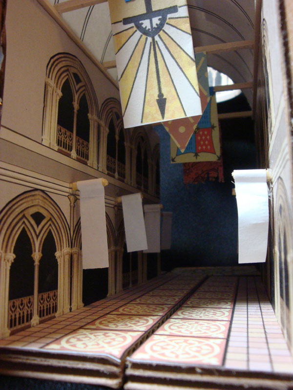
Confession: I made this model twice. The first time is when I was designing the room for the cover image. In the original incarnation the columns that make up the corners were from an attempt to make one full column and then cut into quarters. The result were some sloppy joints and wonkey lines. I'd also built it a bit small so that seeing the detail was harder than it had to be. Months and months later, when it was time to draw issue 6, I knew this model would be important (several pages take place here). So I rebuilt the model using some files I'd saved for the upper columns but also using my artwork from the cover as a skin for one of the walls.I had a better technique for making the upper columns this time too. I used wooden arched ribs or fins that stuck off the column to form a structure I could glue each paper strip of the column to.


The floor is a pattern from a cathedral window. Like all my models, I try to make each part modular so I can get inside the model better and also reuse parts (two of the walls were mirror images of each other, so I could just swap the 1 piece I made to either side. The walls were also keyed on the top (you can see the slot on the top of each wall) That corresponded with a block on the top of the ceiling that it would go over to keep in aligned and in place. In case you are wondering, the only reason the one column is purple is that my print cartridge was dying on me.

The Haven Guildroom is a clandestine order that was originally founded to watch over the secrets of the guild founders of four disciplines: Mathematics, Carpentry, Metalsmithing, & Masonry. I tried to add a lot of details to the room that echoed the 4 motif: 4 walls, 4 columns,  4 wrought hinges per door, 4 cupboards per wall. To show how regarded these founders and their teachings and techniques are to the guild, I had a wall dedicated to saint-like carvings of them. Because the Black Axe story is focused on the axe and its forging, the discussion in this room makes it seem as though the Haven Guild is only now a Templar-like group for the axe...but presumably there are secrets they protect for the other founders as well. And with regard to Farrer's secrets...don't expect that all of them have now been explained. I have more in store for future stories.

The Haven Guildroom as it appears in Black Axe #6.

In two weeks, I'll post the last models I built for Black Axe #6, so if you are enjoying the model posts, there is still one left...if you are sick of the model posts...don't worry, only one more to go.


Watercolor Wednesday: 
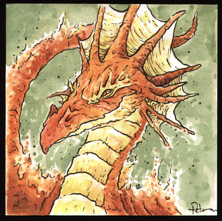
Keeping up with the tradition I mentioned on last week's blog, these Watercolors are redesigns of old characters of mine. First up is Roan a red dragon from a project Jesse Glenn and I started plotting out on my 18th birthday. A while back I posted one of the other dragons from this un-pursued project as a Watercolor Wednesday piece: Loden.

The 2nd watercolor from last week was Cap Transfo, a character I first drew in 8th grade science class. Cap may be the first character I still remember making (and have record of). A little while back, I did a whole blogpost about character design that involved Cap and the project he was associated with (though I also had him & Zubelflex in their own story as buddy cops in the Intergalactic Space Police....you know...the IGSP)


2013 Appearances: 
Fabletown Con: March 22-24
C2E2: April 26-28
Spectrum Live: May 17-19
Heroes Con: June 7-9
Albuquerque Comic Expo June 21-23
San Diego Comic Con: July 17-21
*more 2013 dates coming*

Tuesday, February 26, 2013

Mondo Poster: Brave process:


Last Sunday Mondo released a Brave poster I did for their Oscar themed release night. Mondo has a great reputation for working with talented illustrators & designers and terrific production quality on their prints, so I was thrilled and honored to be asked to participate. I loved Brave and took my nieces to see it at their first Drive-In movie experience last summer. When released after Brave won for Best Animated Film on Sunday, the poster sold out in a few minutes (as Mondo prints tend to do). In this week's blogpost (which preempted the normally scheduled Mouse Guard architectural model, now to-be-seen next week) I'll run through the process of creating the image and the tricks in preparing it for the  silkscreen process.

I started with a rewatching of the movie and planning the concept points to be: a scene that seems 'brave', defining Merida's form by her hair, and getting to draw Mordu the villain bear. I sketched up a design and mocked it up in photoshop. Since the orange hair was a planned focal point, I opted to make the rest of the palette in the blue family. I trimmed the piece out with a designey wreath of the wisps and a border used in the tapestry in the movie. With a silkscreen print, you are limited on colors, so I planned to use colors over again. The orange is also the color of Mordu's dead eye, the brown of the ground is also the details of the border, the tan of the bow is the field of the border.

So it would be easier for me to separate out the colors onto different layers for the silk screen separations, I inked the components separately. The first up was the darkest screen color, the linework of Merida, Mordu, and the ground. Because the final print size is 24" x 36" I wanted to ink this LARGE to minimize any quality loss when enlarging my scans. The inks are 17" x 24" (and had to be scanned in parts since it wouldn't fit on my scanner all at once. The inking was done with Copic Multiliners, a brush for the fills and a brush with liquid white for making the negative space of Merida's hair.

The next inked piece was the border. I pieced together two different borders from Pixar to get the design to fit the perimeter of my piece. The animals were all from the tapestry in the movie, and to fill in the tall side bits, I found a few tapestry borders they used in some promotional art for the film. I hand inked the border because I wanted the piece to work as a whole and not seem like parts of it were photoshoped together. I wanted to hand distress the design in a way that ties it together with the inkwork on the characters. This piece is also 17" x 24" and had to be scanned in parts.

I inked other parts of the piece of smaller pieces of bristol like the darker lines of Merida's hair (seen here with round registration points that match up on the bow). Though I could have just processed the art from Pixar, I decided again to hand ink the Brave logo knotwork for the same reasons I hand inked the border. And that strip in the middle...that's a patch to extend the bottom of the original inks...but I haven't gotten to the reason for that yet....

At this point I processed all my inked artwork and the assets given to me by Pixar and got my file assembled and ready for approval. Pixar hadn't seen my rough, so the 'finished' version was their first time seeing my piece...and they requested changes. Normally, I've found that suggestions given to an artist on approvals for a licensed property are 80% silly and unnecessary. The folks at Pixar though...were 100% right and helped me make a much better finished product. They requested changing the scale of Merida to Mordu, to nix the wreath of wisps into a few ground wisps, to get Merida up higher than the logo (so she's not standing on it), and eliminating the tangent of the arrow on Mordu's lip. To fix this I was able to do most everything digitally (even drawing in some patch hair on Mordu with a Wacom tablet), but the strip of sticks I mentioned before had to be hand drawn to extend the bottom of the image when everything shifted upwards.

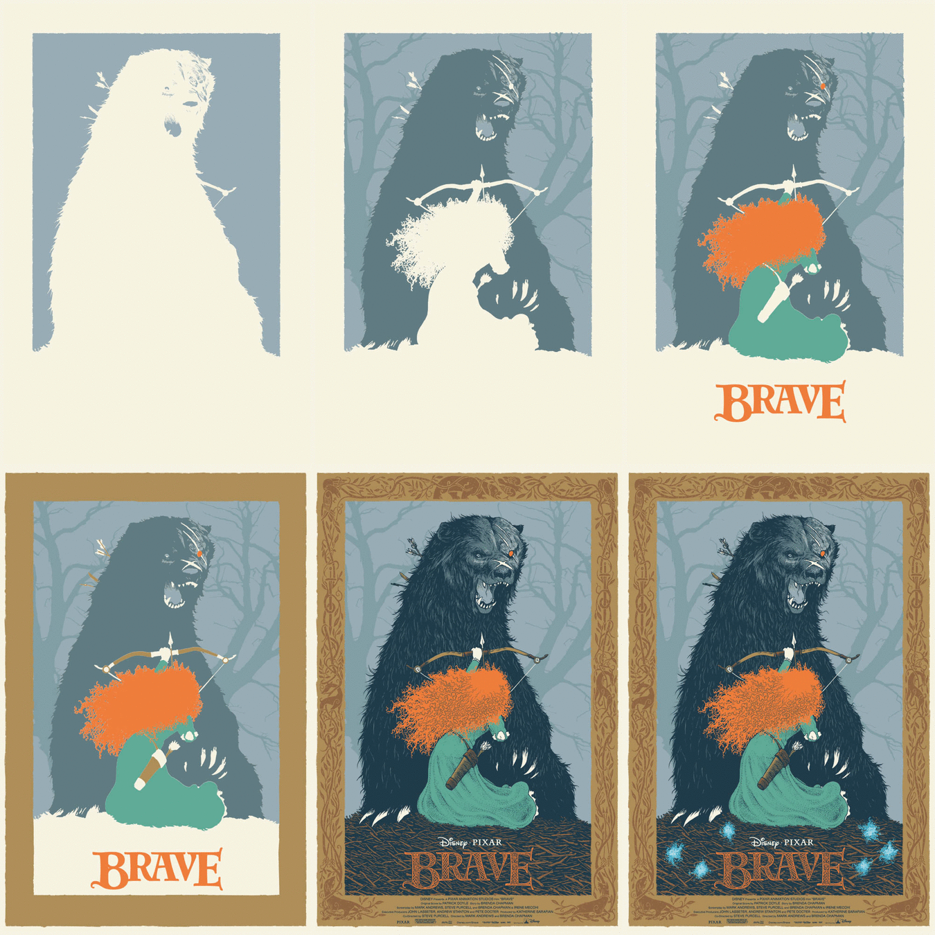
I had a big learning curve on this piece. Not only did I have to re-set my brain to think in terms of limited color, but also about the printing process. The order in which colors are printed and if they need to overlap or not is a real trick to figure out. Colors are generally printed light to dark...but there are exceptions that need to be taken into account there and to make sure there isn't a gap in between colors that butt against each other, the previous color needs to go under the color that will print after it. This is called 'trapping'.  I've put together this animated gif of the different layers to simulate what the print looked like as it was silk screened. I hope Mondo will ask me back for another print, as I now feel I have a better handle on the technical process of planning and preparing the art for a silkscreen printing like this.

Here are a few detail images of Mordu & Merida from the final version of the poster:

And another look at the poster in full.
As I said at the start, the poster sold out at Mondo in a few minutes of its release. At a later date, I will have some copies to sell through my store, but I will not do so until I have the prints in-hand. Please do not try and request them in advance, offer to reserve one, or ask when I will release my copies...I'll Tweet and Facebook update when they become available.


Watercolor Wednesday: Both last week's and tomorrow's Watercolor Wednesday pieces are exercises in redesign of old characters of mine. First up is something I called Poohbah, which started life as something closer to Genma Saotome in Panda form from Ranma 1/2, and ended as something more like a bear with bunny ears & Mickey Mouse markings. He was a bit of a Hobbes character for a little flying boy named Zippy when I created him (even did some animation in my DOS based Disney Animation Studio program in the 90's). This redesign still holds to the idea that while Poohbah may look like a real creature, he's just full of stuffing.


The 2nd is a redesign of a lizard creature I wanted to do as a puppetry project in the late 90's. These lizard guys would be a party of adventurers in the arctype tradition of fantasy RPGs. I still hope to build some of these puppets some day...


2013 Appearances: 
Emerald City: March 1-3
Fabletown Con: March 22-24
C2E2: April 26-28
Spectrum Live: May 17-19
Heroes Con: June 7-9
San Diego Comic Con: July 17-21
*more 2013 dates coming*

Tuesday, February 19, 2013

Monsters & Dames 2013 process


The Emerald City Comic Con has a fantastic Art book they put on every year at their show called: Monsters & Dames. The book features art with...well...Monsters & Dames by the various guests of the convention and the money raised goes to a Seattle Children's Hospital. As I am returning to Emerald City this year, I contributed a piece for the 2013 book. In year's past I've done a Frankenstein's Monster & Bride piece and a Dame riding a dragon. This year I wanted to do something a bit more fairy-tale-ish. So I did my take on Beauty and the Beast.

 I did a lot of looking at other versions of the pair, illustrations by Edmund Dulac and various other golden age illustrators, the animated Disney movie and stage play, and Jean Cocteau's La Belle La Bete 1946 film. The goal was to give something new, and Petersen-ish, but still familiar. I drew a Beauty and a Beast in separate pages in my sketchbook (so if I wanted to redraw or correct one or the other, I could do so without fearing erasing any part of the other) and then assembled them in photoshop. Beauty was inspired by a photo of Anne Hathaway and Beast is an amalgamation of my own illustration tendencies, Disney, and La Bete's wardrobe from the French film. The background is a zoomed in section of iron casting I felt made a nice design and set a mood of both beauty and danger.

The above digital composition was then printed out so I could tape it to the back of a sheet of Strathmore 300 series bristol. On a lightbox I can see through the bristol to the printed layout and use it as a guide while I ink. This also means that unless there is an area I want to tighten up or correct in pencil before I ink it, there is virtually no pencil on the finished piece to erase afterwards. I inked the linework all with a Copic Multiliner pen (mostly the 0.7 nib) and the ironwork with a brush. The embroidery on Beast's cloak and the lacework of his high collar & cuffs was inked in black though I wanted them to appear lighter in the final color version. At this stage I worried that committing Beauty's face to an almost binary black/white line had taken away the softness and tenderness I worked so hard to get in the rough.

The finished inked piece was then scanned so I could flat the colors in. Originally I had Beast's clothing in more of a black/navy configuration and Beauty's dress in more of a gold...but I realized that I was being too heavily influenced by the palette of the Disney movie and Cocteau's film (the colorized cover art to the DVD). I swapped out the blues for reds (a color of aggression and passion) and the gold for pale blue (a color of sweetness, calm, and innocence). Even when drawing this piece, I knew the background was going to be in the violet family, and luckily the clothing color alterations didn't force me to change my background color scheme.

After the color flats are established and I've set the basic palate  I render the piece adding shadows, highlights and color transitions. Normally I do this exclusively with the dodge & burn tools in photoshop (using a textured brush) but this time I also used the paintbrush for some color transitions and a feathered lasso to isolate and enhance the color in selected areas. To get back the softness I felt I lost in the inks from the pencils, I focused on rendering the subtlety back into Beauty's face (with a little help of the Anne Hathaway photo for reference on the planes of her face & neck). I added color holds on Beast's embroidery and lace and to the background iron work too. I didn't want the iron to overtake the emotion of Beast's torn feelings to reach out for what he wants while fearing the outcome and internalizing his own self-loathing (at least that's what I saw going on there...)

The Monsters & Dames book will be available at the Emerald City Comic Con for purchase (as well as the original art being auctioned off there) and remaining books are usually offered for sale online through the Emerald City website after the con ends.


Watercolor Wednesday: For those who missed seeing the Watercolors from last week's Watercolor Wednesday, here's another look at them.
First up: 7 Horcruxes. I'm a big Harry Potter fan. I came across a 7 pointed star design while researching patterns for my Free Comic Book Day story. It occured to me that it would be a great template to make a Horcrux chart. I organized them in the order in which Voldemort made each (starting with the book and rotating clockwise)

Second up is one of my favorite paintings I've ever done for Watercolor Wednesday...and I'm not quite sure why. It's a heap of coins. I painted this at the same time as the Horcrux piece, so the palate is similar (those are the colors I had wet and going). I looked at some historic ancient coins for inspiration, but for the most part, I let the brush suggest details rather than plan them out.

Third painting from last week is a bell. I'd planned on this being more of a Christmas themed painting, but didn't get it done and posted in time. The music below the bell is 'God Rest Ye Merry Gentlemen".


2013 Appearances: 
Emerald City: March 1-3
Fabletown Con: March 22-24
C2E2: April 26-28
Spectrum Live: May 17-19
Heroes Con: June 7-9
Albuquerque Comic Expo June 21-23
San Diego Comic Con: July 17-21
*more 2013 dates coming*

Tuesday, February 12, 2013

Reference Model: Shorestone Interior: 
Last week I showed you the exterior model of Shorestone. To celebrate Black Axe #6's printed release tomorrow, I'm sharing the model I made for the interior of the city of builders. Like last week, there isn't anything spoiler-ish  in this post. Everything you see is on page 2 of the issue. So enjoy the post without worry.

First off, you may be saying "What!?!?! he built this much of a model for what happens on ONE page of the issue!?!?!"...yes. yes I did. At the time, I figured I'd show the interior for more than the one page, but after I finished, I realized that the story had to push on and couldn't linger in this city's thorofare. And as I often come back to locations in the course of Mouse Guard (not to mention the cutaways and guides in the hardcovers) it was more than worth the time to build this model.

I already had the exterior facade model to butt this up to, and that model being locked in also gave me some detail aesthetic cues to use too. I wanted the city to feel detailed, huge, and organized. I repeated the same window design from the exterior for the archway doors and upper level windows. The floor is detailed tile work (designs taken from cathedral windows and some tiles in an Irish church) to again show the different types of craftsmice working & living here. Shorestone is like a city-sized resume for the mice there.

The walls and floor are cardboard skinned with printed paper designs. but each build modularly  so that I could access the model from different vantage points and also reconfigure it for other parts of the city if necessary. The image to the right is a bit of photo trickery. Locking down my camera on a tripod, I photographed the model walls in 2 different locations on the table. Then in Photoshop, I was able to composite them together into something even more big, echoy, and vast looking than my model.

The roof section for the main hall I filled it with banners. I'd made reference to a banner from a Legends of the Guard story being hung at Shorestone (eagle eyed fans won't have trouble picking it out), so I figured Shorestone could have hundreds of banners and flags in their possession ..perhaps they display the colors of the various cities, towns, and groups their laborers made structures for.

Finally, Here is how Shorestone's interior looks in ink & digital color on page 2 of Black Axe #6
Two weeks from now I'll have another model post...hopefully everyone will have had a chance to read the issue..because the next model & post could be spoilerish.

Watercolor Wednesday: Here's another look at last week's Watercolor Wednesday paintings (for those who are new to Watercolor Wednesday, I post a few original watercolors for sale in my online store each Wednesday. They are affordable and go quickly, so follow me on Twitter or Facebook for the quickest notifications of when they go live) First up is a green man, but in autumn colors.


The second watercolor from last week is some sort of goblin-like fey in a red hood. No particular inspiration for these two, just what came out of the brush on to the paper.

Third is what started as me trying to emulate Tony DiTerlizzi's expressions on a cliche Leprechaun. I added the scale mail cloak to try and de-cliche him, but I think now it just seems sillier.


2013 Appearances: 
Emerald City: March 1-3
Fabletown Con: March 22-24
C2E2: April 26-28
Spectrum Live: May 17-19
Heroes Con: June 7-9
Albuquerque Comic Expo June 21-23
San Diego Comic Con: July 17-21
*more 2013 dates coming*

Tuesday, February 5, 2013

Reference Model: Shorestone Exterior:
A few weeks ago Black Axe #6 was released digitally on ComiXology and will be in print on-shelves next week (the 13th)! So, you may have already read the issue, but if you are waiting for the print version, this post won't contain any real spoilers and will only show the first page of artwork from the issue.

A new location is visited in the first scene of the issue: Shorestone. I've never shown any part of Shorestone before this, so I had to design its look for these pages. I took what I'd already put in the RPG book and what purpose I needed the city to serve as as my inspiration. Shorestone is a city that is known for builders, workers of stone especially, but also wood and metal.

I based the overall exterior design on a Romanesque church. The 1/2 hexagon main building facade is cardboard with basswood trim. The entry and towers are chipboard and cardstock clad in printed arch designs. When I got the structures built, I could measure them and make 'faces' or 'skins' for each piece in Photoshop using photos of arches and windows I have in my collections from my travels. The round windows were also printed designs simply glued on to the cardboard.

To beef up the trim on the towers I added a few layers of cardstock under the printed trim pattern. The 'roof' of the towers was achieved by wadding up aluminum foil and packing it so tightly that I could shape it by kneading it against a hard surface. I wanted the exposed facade of Shorestone to ooze skill and craftsmouseship. I added a lot more detail than I normally would with the repetitive trim patterns, edge trim & buttresses, the varied materials & shapes, and even the scale.

The roof of the front was also something I added more detail to than I normally would. I figured in a town of craftsmice know for their skill and talents with architecture, they would have a complicated and useful roof. With mouse cities being mostly underground or inside something (trees, rocks, etc) any extra ventilation and light would be welcome. For the model, the little cupola vents were made of basswood scraps (you can often find bags of bigger than craftstick sized pieces at your local hardware or craft store)


Here is the city exterior as it appears on page 1 of Black Axe #6. Having the model certainly helped me figure out the design of the building itself. I was able to design the place faster than I could have ever could have drawn it all just by trying things out. If I thought something was too tall or too short, I could swap out the cardboard for a different piece. I could design 1 detail and repeat it over and over in Photoshop and just have to glue it on. If I'd tried drawing it, I could have ended up spending the same amount of time and only had a single good drawing from 1 angle out of it.

With the subject of my book being the unbelievable caveat that mice walk, talk, use weapons, etc...I need everything else to be as grounded and as real as I can make it seem. Doing models like these are a time-saver for me (honestly!)  but also add the weight to Mouse Guard I feel necessary.

Oh...and the inside of this model? yes, I designed the inside of the entrance to Shorestone...but I also build a model for what lies beyond too.....That's for next week.

Watercolor Wednesday: In case you missed last week's Watercolor Wednesday pieces, here they are for a closer look. First up is a Monty Python & the Holy Grail themed piece. This is one of my favorite movies and as I still lack the courage to nail liknesses, I opted to depict the knight characters using only their tunic designs.

The other two pieces from last week were a Satyr & a gargoyle...but I don't have too much to add about why or how I painted them...so just enjoy


2013 Appearances: 
Emerald City: March 1-3
Fabletown Con: March 22-24
C2E2: April 26-28
Spectrum Live: May 17-19
Heroes Con: June 7-9
Albuquerque Comic Expo June 21-23
San Diego Comic Con: July 17-21
*more 2013 dates coming*

Blog Archive