Tuesday, February 4, 2014

Updated Tower Portraits

Fans of my blog will know of my hand-made board game Tower. I've posted on it a few times, once about the game in general, and another where I looked back at the portrait art and the characters they portrayed. Today's post is about me revisiting those 15 characters and original art pieces, but this time with updated artwork for each character. This is an exercise I'd like to do more of for the blog: go back and revisit my old characters and concepts and while there take a stab at their redesign, as-if I were working on the project now. But I'm getting ahead of myself. Here are the character portraits I painted about 15 years ago, and new pieces painted in the last few weeks:


Annice Quinn:Annice is a Human Bard. In the game, she cab try to distract monsters with music, ultimately giving her better odds at killing the beast.  Her original look was supposed to be inspired by Gwyneth Paltrow, but I didn't achieve that lofty goal back then. The red, white, and blue wardrobe was inspired by the bright colorful costume of the Bard class in the 1995 D&D player's Handbook. For the update, I didn't do much in terms of design changes, but focused more on improved artwork. I still have an unsteady time drawing humans, and females especially. I wanted Annice to be pretty, but not come across as sexy or sultry in any way. The updated version keeps the hint of a smile and has an improved sense of texture for both her dress and turban-wrap headpiece.


Dalton MattockDalton is a Dwarven Armorer. In the game, he can take one more wound than every other player because of his superior armor. Dalton's original look was based on a co-worker at Starbucks...who was not a dwarf nor an armorer. So, my old painting was mostly a caricature-portrait head with rather ugly armor as a pedestal for it. For my update, I no longer knew what that co-worker looked like (beyond blurred memory) so I could only base the new portrait on the old. I felt Dalton's hair and beard needed to be less neat to be a proper dwarf, and I added the bags under his eyes to show the exhaustion from lugging around the heavy full plate armor. For his new armor, I gave it a pattern to imply that it was a unique piece of work, and though scaled down, the neck still has the old rivet detail.


Demtremi O'BallasDemtremi is a Drow Assassin. In the game, instead of just ambushing players to steal treasure like the other characters, he can kill their characters and take it all, making the other player start over from scratch. Demtremi's old portrait is based on my college roomate Nick Kowalcyk. Demtremis was one of Nick's old D&D characters who I think in turn was inspired by the R.A. Salvatore character Drizzt Do'Urden. For his update, I tried to give the assassin a more menacing look, while not making him outright evil. The armor was added to both add visual interest while also look foreign and otherworldly compared to the rest of the characters' clothes and arms.


Fike the Mox:
Fike is a Human Barbarian. In the game, Fike served as a baseline character with no extra-special abilities or any handicaps (though later we gave him a special bag that allows him to hide 3 treasure cards to they can not be stolen). Fike's original portrait came from me trying to draw a box-headed barbarian build with my friend Mike Davis' hair and beard of the time (the scar was just to show how tough Fike was). Mike tended to name all his RPG characters Mike Fox, and somewhere along the line, we started mocking him calling all his characters Fike Mox. I added a 'the' to imply that Mox was some sort of tribe or region. For the update I just tried my best to make Fike look less goofy and more imposing as a physical specimen.


Fisher Spasky
Fisher is a Dwarven Berzerker. In the game, he has multiple attacks per turn. Fisher is based on my friend Seyth Mirsma's old D&D character (Seyth helped co-create the rules for Tower). I don't think my original version of Fisher looks anything like Seyth's idea of him, but I used this older portrait as my only starting point for the new one (so he still doesn't look like Seyth's idea of Fisher). I pushed for a more expressive face and some texture details for the fur cloak (a garment I think implies toughness, wealth, and determination). The way his front tuft of hair falls down into his face is something my Father's hair does when he gets worked up.


Jhan Silverthatch

Jhan is an Elven Mage. In the game, he has the widest range of magical spells  to choose from. The original portrait of Jhan was based on Seyth's college roommate John. The name Silverthatch was a joke on John's desire to dye his hair silver. For this updated portrait, I did debate giving him premature silver locks, but opted to retain the original design and started coming up with options for where the Silverthatch surname came from...is it a place? a guild? do elves in this bloodline tend to go silver before their time and Jhan hasn't yet? I focused on shifting the facial features away from bing a bad caricature and into looking more like a believable elf.


Lucas Taver
Lucas is an Elven Thief. In the game he can move quickly and pick what he steals from other players instead of choosing randomly. Lucas was my long-time D&D character. I don't think I played with any one incarnation of him more than twice, but I kept re-making him for new adventures. The original version was meant to look like me in my college days, but for the update, I tried to blend that young David Petersen visage with something that looked like a proper elf from a fantasy realm. The floppy hat was scaled back to feel more manageable for a thief to wear and still go un-noticed. The hat band being of a more reddish color and tying into a knot like that is an homage to my Mouse Guard alter-ego Saxon.


Luthor Givem'ell
Luthor is a Halfling Battle Mage. In the game he has only offensive spells like Fireball and Lightning as well as a few chances to cast two spells in the same turn.
The original Luthor art probably owes something to anime I was watching at the time. For the update I tried to keep the old hair, but give it more of a curly Halfling  texture, though he still looks more Dwarven than Halfling in every other respect. I gave the stole a more elaborate design that somehow felt cultural rather than just a pattern for-the-sake-of pattern


Madalyne Chevalier:
Madalyne is a Human Paladin. In the game, she has the ability to heal herself more quickly than other players, as well as being a good fighter. Tower was an attempt by Seyth and I to fix our gameplay & design issues with TSR's Dungeon board game. Madalyne the Paladin was a character card from Dungeon we decided to bring over to Tower. The original art was just an elaboration on the Dungeon art, and in that same way, the update is mostly an elaboration on the original. The flourishes added to the armor include designs I found in historic and ren-faire fantasy armor, etched sun-motif patterns, and a peacock feather for her heraldic plume. Madalyne also got an updated name with the addition of the surname Chevalier.


Packus Shortbeard:

Packus is a Dwarven Cleric. In the Game Packus has some cleric spells at his disposal as well as a special 1 use spell that redistributes all the discovered treasure cards equally amongst the players. For his updated portrait, I gave him a bit more of a beard while still keeping it short. His overall facial structure became more traditional Dwarf, and I gave the armor a touch of believeability to the construction. His front tuft of hair as well as his mole stayed for this incarnation.


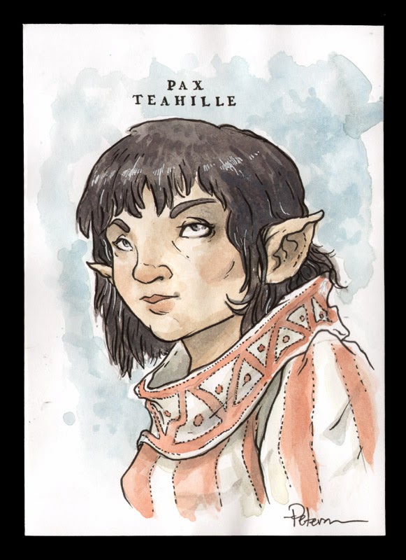
Pax Teahille:
Pax is a Halfling Priest. In the game Pax has the widest range of clerical spells and a special spectral sword she can summon twice to help her attacks. The original portrait of Pax was an instance of me looking at a photo of someone to base the drawing on because of my inexperience & comfort drawing women well. For her update, I wanted to make her look more like a Halfling, so I broadened her face and gave her hair a bit more texture. While struggling to draw her features this time around I tried to think of Tony DiTerlizzi drawings I liked. The costume dress was one I always liked from the original version, so I didn't do anything really to update it.

Quiver Dare:
Quiver is a Gnomish Acrobat. In the game, he can tumble while defending against monsters to lower his chances of being killed by that beast. Quiver is another D&D character of Seyth's. The original portrait was a bit of a caricature (the sideburns mostly) of Seyth, but I don't know why I added the Mike Nesmith-esque wool hat. For the update, I decided to make the hat shaped a bit more like a traditional gnome hat, I kept the diamond pattern tunic because it felt like something a performer-adventurer might wear. The facial structure for Quiver was the biggest change. I wanted him to look less human and more fey-like. I enlarged the nose, sunk the jawline and compacted the eyes/nose/mouth relationship. But I kept the sideburns.


Rien Draak:
Rien Draak (originally un-named) is a Gnomish Ninja. In the game he has a few spells to help him attack quickly. He also has a hooked rope which allows him to quickly escape rooms with monsters with no penalty. The original character and portrait was Seyth & I scraping the bottom of the barrel for ideas. For the update, because there was nothing Gnomish about my original art, I did the biggest re-design of this series. I approached it with what ninja apparel would look like if it came from Gnomish culture. The folded hood is meant to echo a folded Gnome hat. Since he was un-named in the original, I thought he deserved better. The Rien comes from Rien Poortvliet the Dutch illustrator of the Gnomes Book. Draak is the Dutch word for dragon...to evoke the culture associated with ninjitsu.


Solae Pathfinder:
Solae is an Elven Ranger. In the game she has an animal companion that allows her a second attack on a monster at a reduced efficacy. The art for Solae was always meant to show a confident, capeable, and dangerous woman. I didn't want to loose those qualities, but had to figure out how to apply them to a less stylized facial structure. I remembered that when I drew the original I'd looked at photos of Julianne Moore, so I did that again this time, but made sure I was only trying to capture her personality qualities and not her actual facial features. I added a small flourish to the collar of her tunic and had a lot of fun drawing in the texture and drape of her hair.


Tyne Mossbrook:
Tyne is a Halfling Druid. In the game she has a small mix of magic spells, but also some special seed pods that grow rapidly and ensnare monsters. Tyne  was the last character I painted for the original game. I think Seyth and I re-designed her a number of times and I couldn't do the art for her until we had something nailed down. I meant for her not to be a representation of my friend Ann Glenn, but more of a character I could see her play in D&D. For the re-design I widened the face to feel more like a Halfling's, and I added texture and detail to the costume as it stood.


Luke Crane, game designer who wrote the Mouse Guard RPG,  visited me last week, he and I discussed what game mechanics were broken with Tower. We made a mental list of what worked and what was broken. He and I hammered out a few ideas on where I could take the game (in design terms) to get it to a place I could release this game (which fans have asked about since the first I shared it.) I don't know when I'll get to that point, but I have a direction, and 15 new character portraits to go with it.


2014 Appearances:
MSU Comics Forum: February 22
C2E2: April 25-27
Comicpalooza: May 23-25
Heroes Con: June 20-22
San Diego Comic Con: July 23-27
Boston Comic Con: August 8-10
NY Comic Con: Oct. 9-12

Tuesday, January 28, 2014

Monsters & Dames 2014

The Emerald City Comic Con puts out an art book each year called "Monsters & Dames"...with the theme matching the title. The book benefits the Seattle Children's Hospital and is a great collection of artwork from many of the guests and artists in artist alley. I've done pieces for 3 of the past books: Beauty & Beast, Frankenstein's Monster & Bride, & A Dame riding a Dragon. To the left you can see this year's piece, and today's blogpost will cover the process for making the artwork.


The beginning of this piece had a few false starts, including the idea of a monster admiring fairies (dame-fairies), a dame/monster wedding, and a dame walking her pet monster on a leash. I kept playing with monster heads to get me into the right mood for the piece, but none of these were what I wanted. I did like some of what was happening with one of the heads though (middle top), and thought I could make it better...

Taking that head I liked above, I worked out a better head design and felt I got to play with the monster's personality a bit. It combined a few ideas from the past designs, with a little bit of a Disney tiger mouth/jaw structure. The full figure sketch followed, which gave me a sense of the overall layout and scale of Monster to Dame...and then set about getting a dame pose that worked. The final dame sketch was a hybrid of a few reference photos for the pose, dress, & umbrella. For the beast, I was still undecided on those horns...with or without...

I composited the sketches in photoshop into a template for the file specs of the piece. The yellow and orange border lines represent the edge of the 'live area' as well as the 'bleed' (or in layman's terms, where you want to keep all the important bits, and where you need to extend the art out to so when the paper is trimmed you don't have an unprinted edge). I tinted the image of the dame to help me make better sense of the lines and figures. And while debating the horns, I dropped in a photo of some real ram horns and liked them so well, I didn't bother redrawing them for the layout.

I printed out the above composite and taped it to the back of a sheet of Strathmore 300 series bristol. On a lightbox, I was able to see through the bristol and use the printout as a guide to ink by. The inks are all done with Copic Multiliners (the 0.35 & 0.7 nibs mainly) I focused on adding a nice amount of texture while still making sure the outer contours still read well. The bone landscape was roughed in very loosely in the layout, so I did pencil in tighter bones as I inked...referencing dinosaur, large mammal, and human skeletons.

The inks are then scanned back into photoshop and I start the coloring process. This stage is called 'flatting' because I'm simply establishing the color areas with flat base colors. I had no idea what my overall palate would be for this piece, but in the flatting stage it doesn't really matter, just color in the lines and differentiate areas that are meant to be different colors. I tend to make a new layer for most types of 'things' in my file: "beast fur", " skin", "dress", "sky", "bones", etc. It makes it easier to re-isolate an area when I want to render it or adjust the color overall.

Here again is the final render, which I achieved by using the dodge & burn tools (with the drybrush as my brush to add texture & mottling).


The Monsters & Dames book will be available at the Emerald City Comic Con for purchase (as well as the original art being auctioned off there) and remaining books are usually offered for sale online through the Emerald City website after the con ends.

Also this year at Emerald City, I'll be debuting an offset print of last year's Beauty & Beast piece and offering more of them for sale in my online store after I return home.

UPDATE:
Gordon Smuder Interpreted my Monster as a puppet:


2014 Appearances:
MSU Comics Forum: February 22
C2E2: April 25-27
Comicpalooza: May 23-25
Heroes Con: June 20-22
San Diego Comic Con: July 23-27
Boston Comic Con: August 8-10
NY Comic Con: Oct. 9-12

Tuesday, January 21, 2014

Jan 2013 Q & A

This week's post will become a semi-regular topic: Fan/Reader Question and Answer. I put out a call for questions on Facebook and Twitter, and received more than one post's worth, so I'll break this up and post another one in the near future and also then put out a call for more questions.

I apologize in advance that due to the nature of this topic, there will be very little in terms of visuals to spruce up the post.


Q: What is your timeline for books on the Weasel Wars?
-Katie Timko Bath

A: I have not yet started writing, plotting, or planning the schedule for my next full Mouse Guard series: The Weasel War of 1149 (which will most likely be an 8 issue arc instead of 6). After I finished Black Axe and Legends Vol 2, I decided the timing was right for me to take a break from Mouse Guard. I have another creator owned project I'm planning on releasing in 2014 as a one-shot 48-64 page graphic novel. Once I finish that project, I will start The Weasel War, but don't expect it to be solicited until I'm several issues into the series...for my sake and yours I don't want to be under the deadline gun every issue.
Q: Have you started working on your "taking a break from Mouse Guard" project yet? If so how goes it?
-@almostahermit 

A: Speaking of that project, no, I have not started yet. At least not in earnest. Due to various cover work, conventions, and some personal commitments, I have yet to get a real chance to dive in. However, I did sit down with two other creators (on separate occasions) and verbally walk them through the story and each were positive about it and what they thought I'd do with it. That is like a step zero for me, before I start a story, I'll often verbally tell it to a few trusted folks (tightening up the overall flow with each re-telling) and get their knee-jerk reaction. So step zero: check! Now to just do all the rest...and there is a chance I'll not get to it before getting back to more Mouse-work.

Q: What do you DO with all those elaborately constructed models when you're done with them? Do you keep them? Is there an entire replica of the Mouse Guard world in your home?
-Barbara Guttmann

A: Most of the models I build have stood the test of time and are carefully stacked on the tops of the bookshelves in my studio. A few were built rather quickly in the early days, without thought of longevity, so they bit the dust and were scrapped (the gates of Lockhaven, an early model of Gwendolyn's office, and the interior of Sprucetuck are among these). But most of the rest I either made of sturdier stuff or I've gone back and reinforced and improved. After all, I do plan on returning to these location in the Mouse Guard world, and they are super handy as reference. There are a few problems with displaying them in a world of Mouse Guard fashion: 1) As you implied, they would all take up a great deal of space, as it is I've dedicated almost all the spare space I have to storing them stacked and puzzle pieced together. 2) None of them are in the same scale, so putting them next to each other for viewing always seems a bit wonky to me. And 3) None of these are built as display models, they are all made of scrap materials and often they are modular, so there is only 1/2 a room built, and it's all paper glued to cardboard. Someday I'd love to do a few real models of some of my favorite rooms with layed tile floors, cellophane windows, and wood trim.


Q: Will there be Spring & Summer books?
-Ben Farrow

A: I started a pattern there with those first two books that implied I was going to round out the year of 1152 (or carry over into 1153). However, the titles of Fall and Winter work as a homonym & metaphor respectively. Fall works as the Autumnal season, but also that there is an uprising with a potential potential fall of the Guard. Winter can be a metaphor for the end of someone's life, and that is a meaning I meant to imply in that book. As for why no Spring or Summer, I don't want to plan out every day of these character's lives (for your sake and mine). I'd rather leave some open space, for you to imagine your own adventures, for me to leave wiggle room for events if need be, and to suggest that not every season of the character's lives have something so important going on, it's worth writing and drawing a book about. When I do get to the 5th book, which is untitled for now, it will pick up with a post-Winter 1152 storyline....and 5 years or so will have elapsed. So there will be more books, but I don't know if any more will necessarily be seasonally titled.

Q: How much of the future direction for Mouse Guard do you already have planned out in your head?
-Ronn Dech

A: Currently I have The Weasel War (which will be the 4th Mouse Guard book), a 5th, as-yet-untitled book, a few more of the Free Comic Book Day style stories, and a story about Saxon & Kenzie joining the Guard planned. Beyond that I have several ideas for stories directions already, but haven't spent too much time focusing on developing them since I already have a back log. Not to mention, with each story I write, I seem to open doors to characters, events, locations, and history, that I can spin out into if I ever feel stuck...one such example is I'd like to do a medieval Dickensian-style story set in Copperwood which not only is a good story, but explores all of Copperwood as a city.

Q: Is there any form of religion in the world of Mouse Guard? Midnight's Black Axe "following" could loosely have been called a sort of religious cult worshiping the weapon, but I wondered if any other religious sects push the medieval mice along much like Christianity and paganism were a major driving force in medieval Europe
-Kyle Healy

A: For a wide variety of reasons, I have avoided religion in Mouse Guard stories. One of those reasons is that it can get messy both in the story and with fans and/or parents of fans. Perhaps if we change the word "religion" into "belief" in your question I'd say that I could explore that idea more...like a belief in certain superstitions, prophecies, or remedies, but I'd still like to avoid the mice (or any other species at this point) having a deity or dogma they focus on. And while this doesn't reflect my views at all, I think having the mice essentially "alone" with no form of life-line on which they rely but themselves, makes for a more interesting society and story in the books. Any time I deal with something, lets say "supernatural" in Mouse Guard, I'd like to offer no real proof either way to it's true existence, and when you start doing that with real world religions & beliefs, you are making statements I don't wish to make.

Q: Did you have any plans to do stories on the territories as they were before the guard and perhaps the determined mice who helped to start Lockhaven? 
-Neil Rickmond
Q: Are there any plans for a story set in the distant past of the Mouse Guard world?
-Luis Enrique Aguilar

A: Do I have plans to tell those stories, no, but I certainly could mine those bits or use them as settings for a deeper story when one occurs. Each story I do has a purpose beyond just telling an adventure, so if I came up with a good reason to set a story at the founding of Lockhaven or to nail down the pre-history of the Guard, I would certainly do so. Seems like there are at least two fans wanting to know more about that era of the Mouse Guard world. And Jeremy Bastian gave a me an excellent story start of when mice banded together in his Legends of the Guard Volume 1 story.


I'll do another Q&A post next month...so if you submitted a question and don't see it here, you probably will next month.


2014 Appearances:
MSU Comics Forum: February 22
C2E2: April 25-27
Comicpalooza: May 23-25
Heroes Con: June 20-22
San Diego Comic Con: July 23-27
Boston Comic Con: August 8-10
NY Comic Con: Oct. 9-12

Tuesday, January 14, 2014

More Torchbearer Beasts

RPG author Luke Crane put together a group of my monster drawings as a bestiary for his new game Torchbearer. The first set featured a Devil Boar, Sprikken, a Disturbed Spirit, Gruxu, & an Owlbear. I had so much fun doing the set, that Luke and I talked about making this a semi-regular collaboration.

The new monsters in the Petersen Bestiary are available for a FREE download (fun for RPG players as well as for plain fantasy & world-building lovers) here:

at Luke's Site: http://www.burningwheel.com/store/index.php/torchbearer.html
& at DriveThruRPG: http://rpg.drivethrustuff.com/browse.php?manufacturers_id=2183

And the original inked pieces are also available in my online store.

Here is a look at the art for this set of monsters: *update-with background info on each piece*

"Frogman"
I remember these types of monsters fondly from the 80's D&D cartoon. Neighborhood friends on my block and I would use these as our main bad-guys when playing pretend. Before starting this piece, I looked at a few of the various fantasy game illustrations of them and homogonized them into this. I liked the idea of drawing a mostly read frog head and then playing with the proportions so they didn't look physically as threatening. I then layered in jagged scraps of found-item gear and painfully broken weapons to add the menace these guys need.


"Strix"
Luke suggested I do my take on a D&D Stirge type creature. The jaw gave me a bit of trouble for a bit because the proboscis is rigid and would need to have a moth close around it. Friends suggested something like the Predator...and I must say I straight forwardly ripped off the design. My main regret with this was the crab/lobster-like claws. Seems like a silly design choice now.

"Elder Nixie"
The request from Luke was a merman/nixie. I didn't want to do something so humaniod as all that, and so the creaturey-ness of this creature took over completely. I branded it an Elder Nixie to suggest a variant of the nixie species, so that later either I or another illustrator can give Luke a proper nixie/merman. The mouth is an odd form, and I imagine the lower 'jaw' being all soft muscle tissue...it sort of looks like he's eating several squid, but that IS his lower jaw...which dangles like a beard.

"Cinder Imp"
This was a creature of my own invention. I wanted to do something more fairy-tale looking, but still a good go-to for a GM to use in an adventure. I was influenced in part by the devils from the Jim Henson's Storyteller episode "The Soldier & Death". When deciding not to clad him in clothes, I ran into a problem of how to not show genitals and not make him smooth like a Ken-doll. I opted to pepper his body with stippling to look like ash or the cool spots in a pit of embers.

"Giant Cyclops"
My goal here was to not replicate Ray Harryhausen's Cyclops at all, but to make this more than a big guy with one eye. A basic human proportion coupled with a ton of texture and extra anatomy in the neck make this a successful deviation from both of my initial anti-goals. The human bone necklace just made for a nice way to end the drawing and provide a sense of scale and horror.


I already have a grouping of creatures in mind that I'd like to feature for the next set. I have not yet drawn them, so there is no release date in-sight, but I'll tease that it will be a themed grouping of beasts.

2014 Appearances:
MSU Comics Forum: February 22
C2E2: April 25-27
Comicpalooza: May 23-25
Heroes Con: June 20-22
San Diego Comic Con: July 23-27
Boston Comic Con: August 8-10
NY Comic Con: Oct. 9-12

Tuesday, January 7, 2014

Critiques & Portfolio Reviews

Because I'm asked to review people's work at conventions, I have some thoughts on portfolio reviews and critiques I'd like to share as we head into the 2014 convention season. Giving or receiving critiques can be hard and when I was first attending conventions as a professional, I wasn't prepared when the portfolios started opening and young artists were asking for my opinion. I'd had my share of very negative and very positive critiques in college and of course, the most constructive were the ones that were a mix: of both: honest but fair. So over the years, I've developed my method and thought process for how I give a critique.

I start by quietly looking through the entire portfolio in one pass while not engaging the artist much at all. Besides getting an overall impression of the work, I'm also looking for what I see as the stronger and weaker pieces in the portfolio. This way, I can talk to the artists in relative terms about the pieces that need improving by comparing them to their more solid work. I could hold everyone to some absolute high standard, but ultimately, I think the best way to encourage someone and show their their faults without discouraging them, is to point out how techniques they've already applied to some work, could be used to improve all their work.

I developed this approach because of my experience in college being frustrated with some 300 & 400 level professors. Obviously when entering an art program the first few years of classes are to teach you (or re-teach you) the basics and for professors to "break" you of your bad artistic habits, to remold you and open your eyes and get you out of your comfort zone. But by the time you are a junior or senior in a college art program, I felt the professors should stop trying to break you, and focus on your work, and figuring out with you how to make what you are already doing better.

This is what I strive to do with every review. Not to break them or tell them they need to draw like artist X or shake off what makes them unique. I want to congratulate them on what is working and how to make what they already do better. We talk about contour line, line weight, inking techniques, creating greys, texture, style influences, subjects, and mood. I tailor the advice to the work in the portfolio. Sometimes my comments are about still needing to focus on basics, or perspective or anatomy...but other times, I'm getting in and nit-picking details about storytelling or line weights. As the conversation is ending, I usually give the artist some exercises I think will lead them in the direction they want to go..and those assignments can vary from "draw basic shapes and build up forms from them" to "start making comics"

There is also something to be said for how to prepare a portfolio and how to receive a critique.

A portfolio should contain a limited selection of your work showcasing the best you have to offer.
It should have a focus that gives the reviewer a sense of your voice as an artist. There is some merit in showing a wide range of all the varied styles, techniques, and mediums you can use, but ultimately, I find this can lead to too wide a variety of artistic voice that doesn't tell me who you are. It's ok to mix in some color and inks, and pencils, but a portfolio shouldn't be a Swiss-army knife of artistic deeds. Show the type of work you want to do: spot illustrations, comic storytelling, children's book illustrations, whatever the case is. And this should all be your best work to-date.

The best way to receive a review is to listen. Too often I hear the artist who is asking for an opinion, jumping in to self-deprecate, make excuses, or add too much background information. A reviewer can't give you their thoughts and suggestions if you are talking. That's not to say I conduct my reviews being the only one who talks. I ask questions, find out why some pieces were handled certain ways, and try to engage the artist as much as possible. It's totally fine if you disagree with what I or any other reviewer is saying (we may be very wrong about your work), but the only way you really find out if we have anything worth taking to heart is to listen.

So with all of that in mind, I wish you the best of luck when developing and showing a portfolio. I hope the review leads to you growing and improving as an artist or to getting hired for the work you want to do.


2014 Appearances:
MSU Comics Forum: February 22
C2E2: April 25-27
Comicpalooza: May 23-25
Heroes Con: June 20-22
San Diego Comic Con: July 23-27
Boston Comic Con: August 8-10
NY Comic Con: Oct. 9-12

Blog Archive