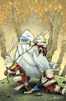
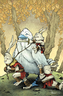
 Jeremy Dale asked me to do a variant cover for his fantasy comic Skyward. It's an all-ages adventure story with a boy and his dog as the main protagonists. In this blogpost I'll discuss the process and steps of making the cover. The final color art can be seen to the left, but read on for more info.
My first step was to figure out what characters to feature. Jeremy and Kelly gave me to restrictions of the cover's subject, so I was open to do whatever I felt would be most interesting to me. Since I know I'm better at animal characters (and better known for them as well) rather than humans, I opted for the large bird character and three of the Rabites
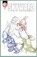 I sketched each of the Rabites separately as well as the bird in my sketchbook. Kelly had told me the Rabites would not be very likely to ever ride the bird, so I though it would be fun for the bird to remain planted while the three Rabites tried encouraging him to go. I scanned the sketches and assembled them in Photoshop. This allowed me to adjust scale, rotate figures (or just heads or arms) and get the positioning just right with the character's relation to one another as well as the borders of the cover. I also dropped in the logo to make sure I wasn't drawing anything important up there that may be covered up. The figures were each tinted to help me with the next step.
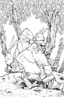 I printed out the digital layout above at full-size on regular printer paper (I had to print it in 2 parts and tape it together). I then used a low-tack masking tape to secure the printout to the back of a sheet of Strathmore 300 series bristol (my final working surface). On my lightbox I was able to see through the bristol and use the printout as a guide to ink on the bristol surface. Having each character tinted makes figuring out where one character ends and the next one starts all the easier. I inked this with a Copic Multiliner (nibs 0.7 & 0.35). I penciled the tree shapes and the ground's edge on the back of the cover (still on the lightbox) and then inked those in after the figures were completed.
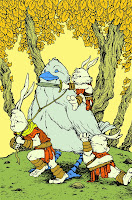 After the inks were done, I scanned those back into Photoshop and started the coloring process. The longest and most tedious part of coloring anything digitally is establishing flats. Because you are painting in flat colors, this step is called flatting. The color choices aren't as important as staying within the lines. In fact, you can use any colors at this stage, just so long as you are setting up that the Rabite fur is one color, and their tunics are another, and their arm & leg wraps yet another. I tend to not use my final colors while flatting because it helps me check if something isn't supposed to be as well as gets me less focused on selecting the right overall palette off the top rather than the work at hand of getting all the areas/color types isolated
 I render the flat colors (after I adjust them closer to what is my final idea of the color scheme) using the dodge & burn tools. These tools lighten and darken the base colors. In addition to using a brush with a texture so the work doesn't appear so digital, there are other controls for these tools like the range & exposure. Exposure controls how much lightening and darkening is one at once, but the range does a bit more than it would let on in title alone. The range can be set to 'highlights' 'midtones' or 'shadows' and while that controls which range of color tones will be most affected by the tool, it also sets how the color lightens or darkens ex:.if it saturates or desaturates on it's way to becoming lighter or darker.
Here again is the final cover art. The Dale's tell me it will be appearing on a future issue, and to keep up with them via Jeremy's site or his Twitter.
2014 Appearances:
MSU Comics Forum: February 22
Emerald City Comic Con: March 28-30
C2E2: April 25-27
Motor City Comic Con: May 16-18
Comicpalooza: May 23-25
Phoenix Comic Con: June 5-8
Heroes Con: June 20-22
San Diego Comic Con: July 23-27
Boston Comic Con: August 8-10
Baltimore Comic Con: Sept. 5-7
NY Comic Con: Oct. 9-12


No comments:
Post a Comment