Tuesday, April 1, 2014

Harry Potter Art collection

No April Fool's Trick...Instead of sharing process or my own artwork this week, I'm going to share part of my original art collection, my Harry Potter themed pieces! I'm a huge fan of the Harry Potter books, J.K. Rowling's writing and the deep world she created (especially considering how easy it is to mess up writing stories with 'magic'). I thought Potter would be a perfect theme for me to ask for when commissioning or art trading with my favorite artists. There are so many characters (generational) as well as locations, memorable scenes, & creatures that I can give the artist a great deal of freedom to play And I'm a big enough fan, that no matter how obscure they get, I'll still be very happy. Here is the collection thus far: (to the left: a print of the Hogwarts' Crest by Joe Dragunas)

Hagrid, Ron, Hermione, & Harry by Jon Morris

Snape & Harry by Skottie Young

Hagrid by Brandon Dayton

Harry playing Quidditch by Duncan Fegredo


Ron playing Keeper (Weasley is our King...) by Katie Cook 

The "Unabridged" 1st chapter of Order of the Phoenix by Katie Cook 

Harry playing Quidditch by Craig Rousseau

Harry years 1-7 sketchcards by Jeremy Treece

A Dementor by Nate Pride

The Gurg (King of the Giants) by Nate Pride

Voldemort by Dave Guertin

Professor Albus Percival Wulfric Brian Dumbledore by Cory Godbey

Dobby the House Elf by Cory Godbey


Kreacher (servant to the house of Black) by Justin Gerard

Rita Skeeter by Paolo Rivera

Young Sirius Black by Becky Cloonan

Hogwarts Adjunct Professor: George Harrison by Andrew Robinson

Luna Lovegood by Chrissie Zullo

Hagrid & Buckbeak silhouette art by Jennifer Menken

Bellatrix Lestrange by Eric Canete

A Thestral by Jeremy Bastian

Alastor "Mad Eye" Moody by Jeremy Bastian

The Sphinx from the 3rd Tri-Wizard task by Jeremy Bastian

Neville Longbottom kills Nagini by Jeremy Bastian


Fenrir Greyback by Ben Caldwell


Luna Lovegood by Jeeyon Kim

Young Minerva Mcgonagall by Ming Doyle

Mouse Harry Potter by Eric Muler

Beedle the Bard by Cory Godbey


Prof. Sybill Trelawney with Harry & Hermione by Jay Fosgitt

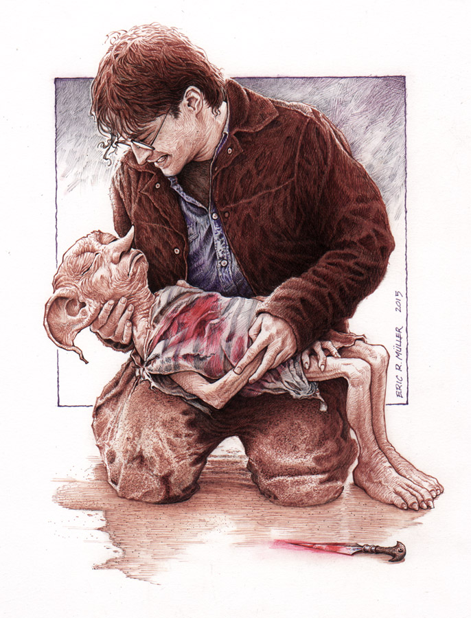
Harry & Dobby by Eric Muller


Harry vs the Basilisk by Sean Price

Young Marauders by Comfort Love & Adam Withers


Dobby by Nick Bradshaw

Rowina Ravenclaw by Matthew Dow Smith


I hope you guys enjoyed the look at these pieces. Not only for perhaps an introduction to some artists work you may not be familiar with, but also to see how a variety of styles, mediums, and layouts can all serve one property or theme. You may have favorites among these, but every one does a great job at capturing some part of the Potter mythos. How amazing would it be to see a Harry Potter anthology graphic novel featuring artwork from the contributors above? WB? JK?


Tuesday, March 25, 2014

Turtles in Time Cover #1 process


I have been asked back by IDW to do the covers for the new TMNT mini series Turtles in Time! I've done 8 TMNT covers for IDW already and getting this assignment for 4 more is a real treat. The Ninja Turtles were some of my first comics, and what started my mind toward writing and drawing my own stories.
To the left is the finished cover for issue #1, where the turtles are in pre-history.
For today's post, I'll break down my process for creating the cover.


Sketches: I was given an era for each cover (though issue #3 has been changed a few times) and for the first, it was prehistoric times. With my earlier covers for IDW, each issue focused on a single character, this time, each cover would feature all 4. And what better way to get all four characters into a good prehistoric image than to have the guys riding a dinosaur! I went with a triceratops as a homage to the Triceratons of the turtle's futures. I tried to get something about each turtles personality in each of their poses and reaction to being in the age of dinosaurs.

I assembled my rough sketches in photoshop in a cover-template. This allowed me to resize and reposition everyone so the overall layout worked without having to draw it all in one-shot. As I mentioned before, each turtle's personality is shown in their pose: Mike: I see as the fun guy who lightens the mood and rolls with the situation because he has to...and in this he's grabbing on and going for the ride. Raph is aggressively charging forward, weapons ready, about to take the triceratops by the horns if need be. Leo is the only one facing the actual danger (the meteors that ultimately may have caused dino-extinction) and is keeping the family together by gripping Don, who is such a logical and concrete thinker, is loosing his mind over the unrealness of where they are.

I printed out the above digital composite and taped it to the back of a sheet of 11" x 17" Strathmore 300 series bristol. I placed the bristol and taped layout on my lightbox and used the printed image as a guide to ink the piece on the bristol surface. To ink, I use Copic Multiliners, the 0.7 and 0.35 nibs for this one, and a brush with a bottle of ink for the fills. I was on the fence about the black silhouette ferns in the foreground and thought I'd gone too far with that look when I finished the piece, but my wife Julia said she liked it and to try coloring it as-is and only make changes if the colors weren't working (smart lady!).

So I went ahead and scanned my inked piece into photoshop (I use an old version for photoshop 7.0...pre-CS) This stage is all about filling in the various ares with their colors...establishing what areas are turtle skin, what areas are dino skin, etc. Because this is not a stage where I'm worried about the shading, I'm only making spaces of flat color, this step is called the flatting stage. I saved this image after I had tweaked the palette closer to what I thought I'd use, but my initial version of the flat colors had the turtles with a brighter green, the dinosaur grey and the sky blue-green. What colors I started with is unimportant when flatting. Once the color areas are all established, it's easy to quickly change the colors of any piece of the image.

The last step was the final rendering and adding special effect color-holds. Here is another look at the final cover:


Other TMNT in Time Cover Process Posts:


2014 Appearances:
C2E2: April 25-27
Comicpalooza: May 23-25
Heroes Con: June 20-22
San Diego Comic Con: July 23-27
Boston Comic Con: August 8-10
NY Comic Con: Oct. 9-12

Tuesday, March 18, 2014

2014 Bookplate Process

For the past two years I have released a 4" x 5" bookplate (You can take a look back at the process for 2012 & 2013). The purpose of a bookplate is to write your name on it and insert it (with photo corners, glue, or tape) inside the front cover of your book (doesn't even have to be a Mouse Guard book) so the book can be identified as coming from your bookshelf. In past years I've done relief printed & stained glass images. This year, I went with an embroidered image. You can see the final plate to the left and in today's blogpost I'll explain the process of creating it.
I started by thinking of something that would look good as an embroidered scrap from the Mouse Guard world. I'd done a tapestry image for a sketchbook a few years ago, and wanted to play with that imagery again. The tapestry is based on a real quilted wall hanging my friend's mother made for their church and I'd drawn my version as part of a commission (right) and also into the pages of the Black Axe. What I like about the tapestry is that it depicts an unknown past matriarch holding three key tenants of Mouse Guard in front of her: defense (the castle), diplomacy (the scroll), & aggression (the sword). The symbolism is perfect for a balance any matriarch of the Guard would need to strike. These also became the basis for the game the mice play in taverns called "Swords, Diplomacy, & Strongholds" (...though I may shorten that game's name to just "Swords and Strongholds"...)

 There were several false starts for figuring out how to do an embroidered look...everything from photoshop plugins and programs, to web-based cross-stitch pattern makers..and even the idea of really doing some embroidery. But I figured out a trick to get what I wanted manually in photoshop. So I needed a rough sketch to build on to start the work. The rough is just a small pencil drawing on copy paper that is a simplified version of the piece above. The right side of the image isn't well fleshed out because I ended up mirroring the left side since no part of this sketch would be visible in the final piece.


The process for making everything look like stitching is by making lots of strokes to simulate each thread. The different colors are each on different layers and each have a bevel effect on them. The various filters and programs I found that auto embroidered an image for you made everything too uniform and precise. I went with this manual way (using a wacom to help with making all those tiny digital brush strokes look like hand-drawn lines) so I could give it a more handmade feel...make it less even, a little more worn and imperfect. Upclose, the illusion fades a bit because this technique can only simulate so much (even with added fabric textures applied), but when scaled down to the final print-size, I think the effect is rather convincing.

Here again is the final image. These will all be signed and numbered limited to an edition of 750. The first convention I'll have this bookplate in-hand for is Emerald City Comic Con in March. After that I'll start offering them through my online store.


2014 Appearances:
C2E2: April 25-27
Comicpalooza: May 23-25
Heroes Con: June 20-22
San Diego Comic Con: July 23-27
Boston Comic Con: August 8-10
NY Comic Con: Oct. 9-12

Tuesday, March 11, 2014

Mondo Poster: The Rescuers

As you may have seen, Mondo opened a Disney themed gallery show with new posters from a number of great Disney movies (Disney posted all the posters online here). I was asked to do a piece for the 1977 movie The Rescuers. I'd done a Mondo print before of Pixar's Brave, and was honored to be asked back. My Rescuers print, is available for purchase at the gallery and Mondo will release any remaining prints online. Today I'll run through the process for making the artwork for the print.

It had been a while since I'd seen The Rescuers, and while a few iconic moments came to mind, I felt I should re-watch the movie before drawing up anything. I'm glad I did. I knew I'd wanted to feature the main characters in the dragonfly-powered leaf-boat, but I had somehow forgotten about the scene with the alligators (Brutus & Nero) carrying off kidnapped Penny & her bear or that she was held hostage on a run-down riverboat. I sketched up all of these elements in my sketchbook and on a scrap of paper to try and hone in on what my versions of these things would look like (while still keeping the look of the classic Disney designs).

From there I did a digital composite of my drawings. I resized characters, changed the spacial relationships between them, and even used the liquify tool to warp some of the lines and features to get the image where I wanted it. Because this piece was ultimately going to be silkscreened, I had to limit the palette to 10 colors, so I was careful, even in this early stage, to be thinking about color usage & using repeating colors. This piece was then sent off to Mondo for approval. With the green light, I printed this off in a large format (took 6 sheets of legal paper to patchwork it back together), taped it to the back of some bristol, and warmed up my light table for the inking stage...

Because the final silkscreened print is 24" x 36" and I wanted to minimize the loss of line quality when getting enlarged, I inked the piece on 19" x 24" bristol. Some of the elements were inked separately (like the water splash & ripples as well as the title & type). This way, I could isolate them easier from the main illustration for their proper color treatment without having to do a lot of extra work.  Even though I have a large scanner, I did have to scan each large sheet of bristol in parts and then edit them back together in photoshop. The pieces were all inked with Copic Multiliners, a brush & ink bottle for the larger black areas.


To prepare a piece for silkscreening is a lot of work beyond the image-making process. Each color represents a separate screen that ink color is squeegeed through. The order in which the colors print is important, and so is if the colors butt up against each other, or if they overlap. If the seam between the colors isn't being printed over with yet another dark color (like the dark outlines), then the first color needs to be printed under where the edge of the next color will be (this is called "trapping"). I learned quite a bit about this on the Brave poster from last year, but this Rescuers piece was more complicated because my linework was more open and I was relying on color for more of the depth & design. This animated .GIF shows each color layer as if it were being printed in order.

Here are a few detail images of Bianca & Bernard, Brutus, Teddy, Evinrude, Penny, & Nero from the final version of the poster:


And another look at the poster in full.


Later this week, I will have some Artist Copies to sell through my online store ...I'll Tweet and Facebook update when they become available. *UPDATE* My signed artist copies are now up for sale (along with the original art pieces): http://mouseguard.bigcartel.com/product/mondo-rescuers-poster-signed-artist-copy

2014 Appearances:
C2E2: April 25-27
Comicpalooza: May 23-25
Heroes Con: June 20-22
San Diego Comic Con: July 23-27
Boston Comic Con: August 8-10
NY Comic Con: Oct. 9-12

Blog Archive