Tuesday, April 24, 2012

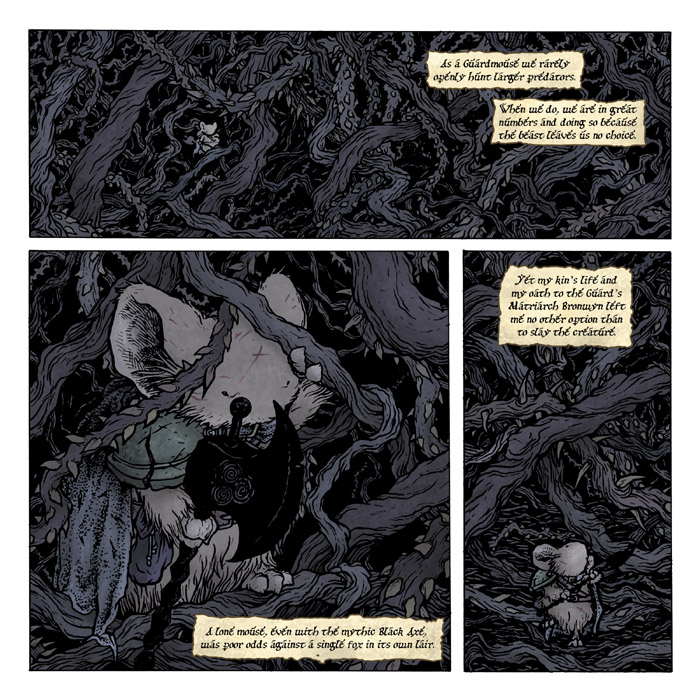
Black Axe #4 page 19 Process:
The fourth installment of The Black Axe came out a few weeks ago, so I consider that enough time passed to show the process on one of my favorite pages from the issue. So if you have not read the issue yet and/or are waiting for the hardcover, consider yourself warned that you may want to turn back now and come back for next week''s post
***Spoilers Below***

In this page Celanawe finally kills the Fox he's been sent to murder. I started with these sketches across 2 pages in my sketchbook. I knew this scene would be broken into three panels: the anticipation, the death blow, and the calm after the storm. With the Black Axe such a big heavy weapon, I have to be visually careful when it strikes a foe. With a sword, I can minimize the gore of the strike and still have it be a believably dangerous wound, but with the axe, it's harder to hide the horror. As usual, I'm free forming little drawings that I feel tell a moment in the story. I'm not looking at panel shapes or layouts at this point, or at best, only vaguely aware of what shapes I'd like the panels to be, but letting the sketches dictate themselves at first.

I scanned my sketches into Photoshop where I have a template made for the panel sizes (and if this page had dialogue, it would have the text placed as well) I decided to give the largest panel to the anticipation. That look in the Fox's eye knowing she's trapped and that she is about to die, is a psychological trigger so that I can ease up on the death blow panel and show less. That death blow panel is the smallest and shows Celanawe more prominently than the victim. At one point I had the 'camera' the other way around, but it would have been too much of a repeat of panel one and I liked focusing on the intensity of our hero's face, his swing, his body language, & get you to think about what this fight cost him (I won't further spoil what happened a few pages previous, but for those who have read the issue, you know what I mean.)

When the layout stage is all done and I've composited, resized, rotated, and mirrored all my sketches into the flow I want, I print them out at actual size. Using a lightbox (where I can see the printouts through the bristol board of the final art) I ink the page with the printed sketches as a guide. You will notice the vines are not as well defined in the sketches above. I save all of that for the inking stage. Some of them I will pencil directly on the page, but a lot of that comes out in spontaneous inking. Interweaving things at random intervals is something I can do on the fly. It looks complicated to some, but it really is just draw a vine for a bit and then stop to have another cross it. In the last panel, I left a bit of open space, this was a visual cue of the weight being off Celanawe for a moment, a brief respite for him and your eyes of the visual tangle I'd kept you in for so many pages.

After the inks are done, I scan them and start the first stage of coloring called 'flatting'. This is where you are establishing flat colored areas to distinguish one thing from another (the fox's head from her eye, Celanawe's fur from his cloak, or even one vine from another.) The character and background colors are all fairly close to the final colors because I was carrying over the palette from the previous pages, but for the briar, I used radically different colors. This was so I could see that I was getting a good distribution color value between the vines. If I started with them all vine colored, it may have been difficult to see if I had accidentally colored outside the lines of one and into another since the values are so close, but with red and green and yellow, it was easy to see that I stayed in my boundaries and didn't overlap too many of the same colors.

The last step for this page was to render (shade, texture, and highlight) the flat colors. I use the Dodge & Burn tools in Photoshop for this almost exclusively. The briar tones were pulled in from a previous page, swapping each of the bright colors from the flats with five subdued colors. To get the thorns a lighter shade relative to the vines they are on, I made a layer with the thorns painted in and set it to screen. That way it just lightened whichever vine color was underneath it. The vines in the far background of the last panel were painted in digitally and then smudged and blurred to allow that space to feel open but not blank.


2012 Appearances:
FCBD: Jetpack Comics: May 5th
Heroes: June 22-24
San Diego Comic Con: July 11-15
Baltimore Comic Con: Sept 8-9
New York Comic Con: Oct 11-14
Detroit Fanfare: Oct 26-28

Tuesday, April 17, 2012

Pre-Mouse Guard~1149


Before Mouse Guard was Mouse Guard, I had an idea for an animal story that was more akin to Disney's Robin Hood than what Mouse Guard is today. It was a way for me to get to have fun with animal characters which I enjoyed drawing, and have a way to script out stories like the roleplaying adventures my friends and I were playing. I started working on this around my freshman year of high school, when my friends and I were making up all sorts of comic characters and stories (including Cats Trio) The comic was to be called 1149, referencing a date in the middle ages (which was also the starting year of one of my favorite computer games: Defender of the Crown)

The characters:
A Fox who got by in life by conning kings into thinking he was royalty, getting invited to their castles, and then making off with their treasures in the middle of the night. A tiger, who was a monk that had strayed from a religious path (in a violent rage fueled event) and became a wandering adventurer because he was no longer welcome at his monastery. A duck who was a grumpy butcher and was the most fearsome merchant in his village. A ferret archer who was exiled from every kingdom and lived in the wild. There was also a bear character, a rabbit, and an opossum who were never fully fleshed out. These drawings represent the earliest versions of the characters.

As high school went on, my friends and I would rotate duties on various comic projects we were dreaming up, but the next time I got back around to these characters, I honed in on the tiger, fox, duck, and ferret. They were going to be my main cast (I also planned on keeping the opossum at this point, but I can't find any drawings of her). I was trying to draw these characters consistently (which is probably why most of these are drawn in profile, as though I was prepping to do turn-around model sheets), because that summer, I started drawing the first 8 pages of 1149 while on a summer trip. Unfortunately, none of those pages survive today.

Towards the end of high school and into the start of college, I did another batch of re-designs on these characters. I was using new materials to draw and color with, and had learned from getting several false starts with comics in high school, that a streamlined design for the characters will only help you draw the story more comfortably. I think this was some of my first realizations about drawing like yourself being easier than trying to mimic other folks (even your friends)   This was marked the last time I tried to draw them with the hopes of 1149 being a comic series.

While in my first year at college I started a re-write of 1149 from the ground up, and had plans for it to be a novel series that I would also illustrate. I expanded the species list (to also include a civilization of mice) and tried to find a sensible way of honoring some of the old characters while still explaining why their species would be on the same landmass as the others. I painted these as character portraits to inspire me as I wrote. The first chapter dealt with two monk rams who found the half dead body of a tiger in a snowstorm on their monastery's mountain. The two rams debated whether to care for or kill the beast. Chapter two started off with three mice: Saxon, Kenzie, and Rand...

In 1996 I also drew three ranger-esque mouse characters for the novel I was starting to write. Saxon, Kenzie, and Rand represented myself and my friends Jesse & Mike. They also represented Sword, Wisdom, and Shield...or to put it another way, aggression, calm, and defense. By developing what their group of Guardmice did, why it was there, and how it functioned, I realized the heart of this story had to be the mice. They were the ultimate under-dog, their struggle was more interesting and important than any of the other species. I dropped the idea of the predators as characters away, and kept them as races meant only to be the threat...of the Mouse Guard.

2012 Appearances:
Boston Comic Con: April 21-22
FCBD: Jetpack Comics: May 5th
Heroes: June 22-24
San Diego Comic Con: July 11-15
Baltimore Comic Con: Sept 8-9
New York Comic Con: Oct 11-14
Detroit Fanfare: Oct 26-28

Tuesday, April 10, 2012

New Mouse Guard Tee!
Starting at C2E2  this weekend I'll be selling new Mouse Guard tee-shirts. (This is a color mock-up, the shirts were not printed in time for the blogpost) There are already shirts available on CafePress, but I wanted to do a new design that was printed locally and that I could guarantee quality control on. We will make these new shirts available for order through mouseguard.net at a later date. We should have the shirts at C2E2 (because we are driving there) but instead of bringing stock of the shirts with me to my other convention appearances, I plan to have a sample available, and then we will take orders at cons, shipping the shirts once we are home.Small, Medium, Large, & XL will be available for $17 each.
I'll be reprinting this shirt if necessary to keep it in stock for a while, but my plan is to periodically introduce a new design after a print run starts to run low.

To create the shirt's image, I did a new design based on my German print design. I didn't want to just re-use the German piece though, I wanted a mouse with swords and a bird behind him that held no meaning to real-world nations. I drew the mouse and bird separately, scanned them to composite them into a single design, and then hand inked this artwork using a print out of the sketch composite as a guide.

Then I scanned my ink work and prepared a digital file for the printer. I wanted the mouse's inkwork to print one color with the bird printed a different color. I approached this the same way I approach color holds  making a layer for the mouse and one for the bird. I deleted the original ink artwork scan layer so the separate mouse & bird layers are sitting on a transparency.

To show that layer break down a bit better, I've made this diagram. It shows that I only have 3 layers: 1) the mouse's outline, 2) the bird's outline, and 3 a background layer. On the mouse & bird layers, there is nothing but their outlines, the space all around them has been deleted to transparency.

C2E2 Info Dump:
-I have a signing every day at the Archaia booth (529)
Friday: 5-6
Saturday: 12-1:30
Sunday: 1:30-3

-I have a panel on Friday at 2:45-Archaia Presents where I'll talk about Black Axe and Legends of the
Guard v2 (and reveal some pages from contributors) Room S501abc

-Another panel on Sunday at 10: 45- Archaia Presents: Better Stories Through World Building with Sean Rubin & Jeremy Bastian. Room N427bc

-Otherwise, I should be at my artist alley table: E11
selling prints, sketchbooks, original art, bookplates, tee-shirts, and taking commission requests (first come/first served each day. No pre-lists made, $200 fully inked 7" x 7" on 12" x 12" bristol. No mice-as-other character requests please)


C2E2 Charity Auction:
While in London I did this piece for the C2E2 charity auction to benefit St. Jude Children's hospital. I did a Ustream brodcast as I drew and inked this piece from my London hotel room, looking out the window for design cues for the lantern and column bases, and now it can be yours! Here are the details on the auction. Happy bidding!


2012 Appearances:
C2E2: April 13-15
Boston Comic Con: April 21-22
FCBD: Jetpack Comics: May 5th
Heroes: June 22-24
San Diego Comic Con: July 11-15
Baltimore Comic Con: Sept 8-9
New York Comic Con: Oct 11-14
Detroit Fanfare: Oct 26-28

Tuesday, April 3, 2012

TMNT Splinter Cover Process


As I hinted in my Leonardo cover process post, I got a chance to do more covers for IDW's Teenage Mutant Ninja Turtles Micro series. This time up, it's their mutated rat sensei Splinter. My goal was to show Splinter as a bit of a guru, a master in a zen calm in his dojo...except insstead of a nice dojo, it's a sewer chamber filled with found and trashed items, and instead of a martial arts master, it's a mutated rat in a robe.

This is a composite of a few drawings in my sketchbook that I assembled to be the rough I turned in to IDW and Nickelodeon. They had a few corrections they wanted me to address. The feet didn't read well and looked like bandage wrapped stumps and they wanted the head to be facing the viewer a bit more and more craggy and brooding: "less Stuart Little". At the time, I wasn't pleased about having to redraw the head. I really liked this drawing...but after looking at it a few more times and starting a new head sketch, I could see how this head wasn't engaging enough

Taking the notes from IDW and Nick, I swapped out the head for one that had more age and wisdom to it and face forward a bit more. I edited out the feet, deciding to let Splinter's robe conceal his folded legs. I also lowered the stool he is sitting on to try and tighten up the space the candle glow would have to fill-in the gaps for. The background remained unchanged at this stage, but I knew that I wanted to make edits and changes to it as I moved forward.

I printed out the rough with the adjustments at full size and layed a sheet of Strathmore 300 series bristol overtop of it on a lighbox. I can see my rough through the bristol as though the bristol was thick tracing paper. At this stage, I filled in some of the gaps of detail on the shelves including an old copy of a TMNT graphic novel, a boy scout handbook, the Black Axe, and an IDW turtles book. There is a broken Mouser head, and the broken ooze canister hanging out on the shelves too. To get the beaded curtain inked, I daubed dots of rubber cement on the blank bristol to form the beads. I inked over them and when the ink was dry, pulled up the rubber cement leaving perfect trails of dots. I used a brush and some white-out to form the strings that hold the beads together.

The next step was to scan the inks and add flattened colors. As I've said before in past process posts, the goal here is to establish the areas that need to be different colors. I'm not worried at this stage (or at least I have to keep telling myself not to worry at this stage...)about the overall lighting and color choices, while I came pretty close to most of the base colors at this point, all I really need to do is organize the photoshop file so that the different areas are separate and easy to isolate for rendering and final color adjustment. One color choice note here though, I opted for the 4 patches on Splinter's robe to match the colors of the bandannas the turtles had in the cartoons & movies (and were recently bestowed with in the IDW series).


To the right is an animated gif you can watch by clicking on it showing the various layers being built up in the flatting process. Step 2 has the layer that ultimately is the the furthest back, but from that point forward, I'm working from the top down (each successive layer is behind the previous one).

The last step is the final rendering. I've added special layers to color hold the linework, to add glows and smoke wisps, and to shade the background evenly as it goes to the top of the image. It was a real trick to get the candles to have the right amount of glow to get the background to desaturate and darken to the right amount (without losing the details I'd carefully added.


2012 Appearances:
C2E2: April 13-15
Boston Comic Con: April 21-22
FCBD: Jetpack Comics: May 5th
Heroes: June 22-24
San Diego Comic Con: July 11-15
Baltimore Comic Con: Sept 8-9
New York Comic Con: Oct 11-14
Detroit Fanfare: Oct 26-28

Tuesday, March 27, 2012

ECCC: Monsters & Dames 2012 Process

For the last three years the Emerald City Comic Con has been putting together a charity book called Monsters & Dames. Guests of the show are asked to contribute a piece of PG-13 artwork featuring the very open-ended theme "Monsters & Dames". I did a piece for it back in 2009, the last time I attended the show.

I'm headed back to Seattle this year so for my piece I decided to do a genre mash-up. I love good dragon design and after seeing some of Corey Godby's,  and realizing it had been ages since I designed and drew a dragon, I made the Dragon my 'Monster'. Cory includes cool hair on his dragons, and I'd never done that. I also pulled inspiration from the feathers on the gryphon from the Storyteller episode The Luckchild. And the pose of the head was inspired by an upshot drawing Brian Froud did of the Chamberlain from the Dark Crystal

For the 'Dame' I wanted her to be riding on the Dragon's head. I made a rough body pose on my dragon drawing, but wanted to flesh her out on another page of my sketchbook. Like I said, I wanted to mash-up the genres so instead of a fnatasy-type barbarian queen or lady-knight, I went for a WWII inspired military lady. "Perhaps she is part of some fantasy anti-aircraft-dragon-blitzkrieg" I thought to myself. I gave her a curvey bombshell frame and pin-up girl hair to set the idea of the era, but without details to really say one way or the other where or when this is.

I assembled the two sketches in photoshop. Because of the scale (both of the figures in relation to one another AND how large I drew the 'Dame') the 'Dame' lost a great deal of detail. The two figures are tinted so it's easier for me to distinguish them from each other when inking. The yellow and orange borders are there as guides. The yellow edge represents where the page will be trimmed (roughly). The orange represents the area called 'bleed'. When the artwork goes off the edge of the page with no border, bleed is extra artwork that goes beyond where the page is cut, so that if the page isn't trimmed to meet the exact edge of the artwork, there is still some spare and you aren't left with a white sliver of non-artwork exposed.

The layout above was printed at full size and then taped to the back of my bristol board for me to do the inks over a lightbox. I had fun with the textures of the various parts of the dragon: hair, feathers, boney horns & snout, and soft under-belly. My pencils were pretty tight on the dragon, so the real work came in inking in all the undefined hair I had scribbled in on the rough. You will notice there is no background to this image...I debated with a skyline or even search lights & zeppelins...but ultimately decided a murky night sky would set the tone and draw the focus to the Monster & Dame better.

The final color process was a bit different for me. Because this was something other than Mouse Guard and I could afford for it to look different, I colored this with a Cintiq & a Wacom Tablet (Thank you to Katie Cook for the use of both). I was able to do a lot of slow building and painterly effects with the tools that I can't get when I color with a mouse. I still found the process off-putting, and didn't prefer it for flatting the colors. At Katie's house I flatted the majority of the piece and then rendered the sky and a bit of the dragon's skin before it was getting late and time to leave. Katie sent me home with her Wacom tablet to finish the job. At home I completed the rest of the rendering and color adjustment using her loan.

After the convention ECCC usually offers the Monsters & Dames book for purchase online if any are left.

2012 Appearances:
Emerald City: March 30-April 1
C2E2: April 13-15
Boston Comic Con: April 21-22
FCBD: Jetpack Comics: May 5th
Heroes: June 22-24
San Diego Comic Con: July 11-15
Baltimore Comic Con: Sept 8-9
New York Comic Con: Oct 11-14
Detroit Fanfare: Oct 26-28

Tuesday, March 20, 2012

Sadie Papercraft:
Want to have a Sadie papercraft model to go along with your Lieam papercraft?
Here is a new .pdf for you to cut out and assemble.
https://www.mouse-guard.net/papercraft
I'm leaning towards either Saxon or Kenzie as the next papermodel. I'll get around to other characters as well like Celanawe, and Gwendolyn, and Conrad, but they will requite modifications to the template that go beyond editing the papercraft's skin, so those will wait until the Black Axe Hardcover is in the can.

London Super Comic Con Commissions:
Thought I'd share some of the commissioned pieces I did for the London Con a few weeks back.
(all requests of the fans): 
Top L-R: Mice in a tavern sharing drinks and games, Green Lantern Mouse vs. DexStarr, Lieam as the Black Axe riding a Wolf
Bottom L-R: Xena & Gabrielle mice, Fellowship of the Rings mice


2012 Appearances:
Emerald City: March 30-April 1
C2E2: April 13-15
Boston Comic Con: April 21-22
FCBD: Jetpack Comics: May 5th
Heroes: June 22-24
San Diego Comic Con: July 11-15
Baltimore Comic Con: Sept 8-9
New York Comic Con: Oct 11-14
Detroit Fanfare: Oct 26-28

Tuesday, March 13, 2012

Black Axe 4 Preview:
I've been told by Archaia that this Wednesday (the 14th) is when fans should expect Black Axe #4 on their comic store shelves! Issue 4 has a pinup by Stuff of Legend artist C.P. Wilson!


Here is a preview of the issue followed by the solicitation description of the issue:

Leaving the fate of Em in the weasel king of Ilder’s paws, Celanawe trudges into the briar lair of a murderous fox. The Black Axe, a weapon forged by Farrer and now wielded by his youngest heir, is put to the test so that one lone mouse can slay the red-furred villain which has claimed enough ferret lives to have the king of Ildur afraid to send his own kin after it. The uneven brutal battle has an only more brutal end.


2012 Appearances:
Emerald City: March 30-April 1
C2E2: April 13-15
Boston Comic Con: April 21-22
FCBD: Jetpack Comics: May 5th
Heroes: June 22-24
San Diego Comic Con: July 11-15
Baltimore Comic Con: Sept 8-9
New York Comic Con: Oct 11-14
Detroit Fanfare: Oct 26-28

Tuesday, March 6, 2012

Mythbusters:
Next week I'm going to see the Mythbusters Live show in Detroit! I'm a big fan of the show and for what Adam & Jamie (and Tori, Kari, & Grant) have done to inspire kids to be more interested in science and math. I've made no secret at San Diego that one of my biggest goals is to meet Adam Savage. Anyhow, I'm getting off track from the artwork...I'm a fan, you knew that...time for me to move on. I did this piece a while back, when I had marionettes on the brain from designing the cover and interior story for the Mouse Guard Free Comic Book Day story.

I drew the sketches while hanging out with Nate Pride. We were the only two to show up to an event at my house, so I wrote it off as a lost work night and decided to draw for fun. The pencil sketches are much larger than I normally work each figure is about 12" tall. I looked at pictures of Adam and Jamie to try and capture a carved wooden caricature of them both. I scanned these in and combined them into one smaller piece. I also made edits in photoshop, I altered the scale of their heads as well as the marionette Busters. I also dropped in a stock photo of their logo.

Using a printed version of my photoshoped collage of the corrected doodles and logo photo, I inked the piece on a sheet of 12" x 12" strathmore bristol. The inkwork is all done with Copic MultiLiner pens (mostly using the 0.7 nib). I debated inking in the strings on the piece itself or inking them on an overlay so I could easily establish color holds on them later. I opted to get the stings in the original art, so that if I ever get the chance to give this to them, it will look complete.


The last step was to scan my inks and color them. The largest part of this job as editing in what areas of my inkwork would be a color instead of black. The rest of the work was in getting the subtle colors I wanted for the puppets so they looked like they were painted wooden puppets that have been dented and dinged around a bit. I was already looking forward to the show this weekend, and sharing this piece with you has only made me more excited.

I also think it would be a lot of fun to make these puppets....but that is for another day when Mouse Guard pages aren't calling...

2012 Appearances:
Emerald City: March 30-April 1
C2E2: April 13-15
Boston Comic Con: April 21-22
FCBD: Jetpack Comics: May 5th
Heroes: June 22-24
San Diego Comic Con: July 11-15
Baltimore Comic Con: Sept 8-9
New York Comic Con: Oct 11-14
Detroit Fanfare: Oct 26-28

Tuesday, February 28, 2012

2012 Bookplate


This year I'm starting a tradition of printing a limited signed & numbered bookplate for the year. I debut these at the London Super Comic Con and have them with me for the rest of my 2012 convention schedule. For now I'm limiting these as convention items. At the end of the year, if I have any left, I will offer them online. I'm not trying to punish fans who can't make it to conventions or trying to drive up their post-con ebay value...I just don't want to run out before I finish my 2012 convention circuit. This year's print is a colored version of a relief print (like a woodblock)


I started with a sketch in my sketchbook that I scanned, tweaked, and printed out at the scale I needed it. I also mirrored the image so that when it is carved and printed, it will un-mirror. Using a stick of graphite, I coated the backside of the printed paper. I taped this down to my block (in this case a piece of Speedball Speedy Carve) and traced my lines with a ball point pen. When I removed this sheet of paper, anyplace I had pressed down with a ball point pen transferred the graphite from the back of the paper to the surface of the Speedy Carve.

Unfortunately, I didn't snap a photo of the speedy carve with the graphite transfer, I only got this one before I  started the process. Speedball's website says that you can transfer printed artwork onto the Speedy Carve material using an iron, but I couldn't get that process to work. With the image transferred I used the carving knives shown here to carve away any area I needed to NOT print (ie: white areas). This type of printmaking is called Relief printing because you are carving away an image in relief.: the areas that protrude are the positive shapes (the areas that will print).

Once the image was fully carved, I used a ink stamping pad to ink up the surface of the block. Usually when relief printing with wood or linoleum you need to ink the surface with a thicker ink and a roller called a brayer, but this Speedy Carve is more forgiving like a rubber stamp, so I'm able to use an inking pad and then place the paper on the surface of the block. It took a few tries to pull a good print, There were a few where I hadn't inked the block evenly, and a few others where I moved the paper and got a double registration.


Here is a scan of the straight pulled print. I carved the hatching into the trees in the background to help push them back into the background of the image. All of the simulated stippling was done by carving patches of cross-hatching only leaving little nubs sitting alone like tiny flat-topped desert mesas. For a bookplate though, I wanted the image to be more than a monochromatic relief print though, so I set to coloring it digitally.

Using the scan of the print, I started flatting the areas. I broke the inked lines into different areas (since I wanted the trees, the moon pendant, and the sword & hilt details to be a different color than the rest of the outlines. The colors seen here were chosen to be clashy & ugly on purpose. This way I can easily see if I got any color in the wrong area (ie: did I stay in the lines) The layer menu on the right of the screen-grab shows that not only are the colors differentiating different areas, but I've made separate layers fro them all (all labeled to make life easier).

The last step in getting the image ready for the bookplate was to correct and render all the color areas. I did so as I've discussed in past posts using a textured brush and the dodge (lighten) and burn (darken) tools.

 The bookplate will be limited to 500 copies, all signed, and sold at conventions for $5.


2012 Appearances:
Forbidden Planet London signing: March 1
Comics & Graphics Berlin signing: March 3
Comic Combo Leipzig signing: March 5

Emerald City: March 30-April 1
C2E2: April 13-15
Boston Comic Con: April 21-22
FCBD: Jetpack Comics: May 5th
Heroes: June 22-24
San Diego Comic Con: July 11-15
Baltimore Comic Con: Sept 8-9
New York Comic Con: Oct 11-14
Detroit Fanfare: Oct 26-28

Tuesday, February 21, 2012

Drawing like yourself:


Yesterday on Twitter I posted an image of the first Mouse Guard drawings I ever did back in 1996. I followed that tweet with the statement:

"The artwork moved away from that style...I needed to develop my own work, & not copy the style of someone I admired. When I learned to 'draw like myself' better things happened"

In 2003 I was at a family bbq, and drawing the mice. I did the drawings in ink & fell onto my etching techniques to make grey tones and interesting patterns. Instead of mimicking my favorite artists and illustrators, I was drawing like myself, and building on work & techniques of my own to push the drawing out somewhere new.

These drawings were also part of the very very first Mouse Guard sketchbook that pre-dated my self-published black and white issue of Mouse Guard in 2005. The first time I set up at the Motor City Comic Con was in October of 2004. I was going to be an artist at an artist alley table, with no book and no previous working experience. All I had were pieces of artwork I made as a fan, for fun, and my own concepts and ideas. Using my home printer, I printed out samples of pieces I'd done. Everything from watercolors of superheroes to pencil drawings of fantasy characters, and of course, some Mouse Guard images.

I've posted and talked about these c.2003 Mouse Guard drawings before, but never in the context of them having been printed in a sketchbook. I printed 2 versions of the same book through my home printer. One was 1 character wide and rather tall, the other (after realizing it was a pain to trim every page by hand) was 2 characters wide so that the width matched the paper size. I added some text to the backgrounds of each character (most of the text was a description of the character or their name's meaning). In total I printed between 4 and 7 of them for that convention, and I have none left now.

I mention this sketchbook because a fan came out of the woodwork having recently acquired one and couldn't find any information online about what it was, when it came from, or how many were printed. Now I really hope that me typing this up doesn't lead to a few going up on ebay and other fans getting milked (I posted all the images from that sketchbook here so that no one would have to pay top dollar to see the contents) However, I know I can't stop a free market with driven completist comic book collecting fans. I merely wanted to share a bit of history, that, up to this point, I have never publicly mentioned.

I'd also like to echo what I said in the opening of this post, when I stopped trying to draw like the people I admired, and just used their work to inspire me to do better (instead of doing knock-off attempts at their work) better things happened for me, and these drawings represent that. I'm not done trying to be better and learn about my own process. I review recent work of mine to see what was working and what wasn't so that I can build off of the successes and keep making things better. It's advice I think that works no matter what creative field you are in. Be yourself.


*Edit*

I'd like to supplement this post with a series of tweets from after this entry was originally posted:

Part of 'drawing like yourself' involves closing off influences for a while & relaxing while you draw. Almost like going into zen-autopilot 

It's ok to learn something by copying and emulating, but at some point you have to shut Artist X's book and draw something of your own

Emulating should be about understanding the deeper decisions Artist X is making: why that composition, why that lighting, why that form..etc

You should have a list of influences as long as your arm. If you're targeted on 1 Artist X, your focus is too narrow. Get wider inspiration

Use the 'why' lessons you gained from artist emulations/study & keep them in your back pocket as you ask yourself 'why' about your own work

Use your own decision making process about the 'why' of what goes on your paper to filter all the inspirational ideas/influences/whys

I think young people wanting into comics & illustration try to emulate what those industries already have. no, we want to see something new!

My thoughts on 'drawing like yourself' come from being a former emulator who tried really hard to be someone else (several times) & failing

It took time to 1st overcome the fear of drawing naturally & then more time learning HOW to draw naturally. Give yourself permission & time

**Edit 2** 
While exploring and old file folder, I found a copy of the sketchbook! The cover is a light grey thick stock and the pages are a faux parchment. The original price sticker is still on the cover, and instead of folding paper in half to 'saddle stitch the binding, I just staped the single sided pages together with red staples along the edge. This is going into my personal archive & is not available.


2012 Appearances:
London Super Con: Feb 25-26
Forbidden Planet London signing: March 1
Comics & Graphics Berlin signing: March 3
Comic Combo Leipzig signing: March 5

Emerald City: March 30-April 1
C2E2: April 13-15
Boston Comic Con: April 21-22
FCBD: Jetpack Comics: May 5th
Heroes: June 22-24
San Diego Comic Con: July 11-15
Baltimore Comic Con: Sept 8-9
New York Comic Con: Oct 11-14
Detroit Fanfare: Oct 26-28

Blog Archive