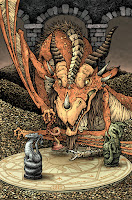
 Archaia is doing a Jim Henson's Storyteller mini series with the subtitle DRAGONS. The 4 issue series will have an original Dragon themed story per issue drawn and written by the likes of Nate Pride, Hannah Christenson, and Jorge Corona. I was asked by my Mouse Guard editor Cameron Chittock (who is also the editor for Storyteller) to contribute a variant cover. To the right you can see my finished cover, but below I'm going to share the process for creating the artwork from start to finish.
 Pencil sketches & concept: Cam and I chatted on the phone about what to do for the variant. Because Archaia needed this early, none of the issues had been finished yet, so I couldn't base my cover on the interior story of any of the issues...but we still wanted my cover to somehow tie into them. So, I proposed that I'd create a new dragon who is pushing carved dragon pawns around deciding the fates of their real life counterparts. Here is my pencil sketch as well as a lightboxed revision I made to the dragon and the 4 pawns (each representing the designs of the dragons in the 4 issues)
 Rough/Pencils: I scanned and assembled my copy-paper pencil drawings in photoshop into a template for the cover. I merged the two dragon drawings and then digitally painted out the setting roughly. The horde of coins gave me a chance to have lots of tiny details...but not really detailed, because they are just repetition of form...and to hide a great deal of Dragon anatomy I didn't want to figure out for this new creature design. The magical chess-board was digitally distorted in from a traditional old magic circle drawing. This is what I then sent off to Cam for him to also show the Henson company for approvals of my concept.
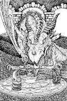
 Inks: Once Henson (and Cam) approved my concept, it was time to start inking! I printed out the rough and taped it to the back of a sheet of Strathmore 300 series bristol. On my lightbox I was able to see through the bristol to the printout and use that as my "pencils" as I inked on the surface of the smooth bristol board. I went a little nuts with the coins...I'd originally planned to suggest a great deal of them, but I couldn't help myself once I started. This was all inked with Copic Multiliners (the 0.7 & 0.3 nibs mainly)
Below you can see a number of in-process photos I took as I inked the cover on my lightbox.
 Flats: This part of the coloring process is just about establishing the various color areas...that the dragon's skin is a different color than his wing flaps, or eyes, or horns, and that the coins are a different color than the background, etc. I'd already made a great deal of my color choices when I did the rough, so this step was mostly about the kindergarden-like task of coloring the right colors inside the lines....but digitally. At this stage, I also added a color hold to all the linework on the board to make it a bit more subtle.
 Final Rendering: The last step is to render, shade, highlight, and add texture to the flat colors. I do most of this using the dodge and burn tools in Photoshop with a textured brush.
2015 Appearances:
Baltimore Comic Con Sept. 25-27
New York Comic Con Oct. 8-11
Art-Bubble Comics Festival: Copenhagen: Nov. 14-15


1 comment:
OK so I just checked out Mouseguard Fall, again from the library, your work plus Jeremy Bastain and Charles Vess has so inspired me to illustrate again and working mostly digitally, inking in Photoshop with varient textured brushes on the Wacom tablet. but seeing this post makes me want to go to my roots of pencil and inks scanned in and finished out color in Photoshop.Thank you for taking the time to show this awesome and Licensed product illustration, also kudos for nailing a creature that lives in the Henson Universe, it is cool yet still has that playfulness of Labrynth and Dark Crystal.
Post a Comment