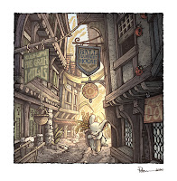
 Since the COVID-19 outbreak I've been creating new Mouse Guard illustrations with the intent to collect them into a new sketchbook. The sketchbook's title is 'Dawn, Daye, & Dusk' with a theme on lighting and time of day being a component to most of the pieces.
The sketchbook is expected to be released in August 2020 in my online store, but for this blogpost I'm showing one of the pieces 'Harvest Town' and the art steps to get there.
I started with inspiration from a real place: the intersection of Shambles and Little Shambles streets in York. I've not been there myself, but I cam across this photo while looking for 'medieval streets' in an online image search, and printed out the results. I hadn't looked at the printout in a few years and came across it again as I was prepping for the new sketchbook.
On a lightpad I put a clean sheet of copy paper over the photo printout and redrew the architecture with my own interpretation of shapes, materials, and details.
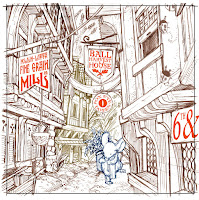 I then also drew a lone mouse returning with grain and some additional background buildings and plants on separate sheets of paper. In photoshop I assembled my drawings (tinting each one a different color to help me see everything clearer)
In Photoshop I flipped the image horizontally (I liked it better that way visually) and added text to the signs. Fun fact, every sign is a nod to the (now canceled) Mouse Guard movie: Director Wes Ball, Screenwriters T.S. Nowlin & Gary Whitta, FOX studios, and 6th and Idaho (Matt Reeves' production company).
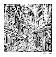
With the layout all digitally assembled and tweaked, I printed that out and taped it onto the back of a sheet of Strathmore 300 series Bristol. On a lightpad I started inking it with Copic Multiliner SP pens (I think I inked part of this piece on Twitch) The lightpad allows me to see through the surface of the bristol down to the printout so I can use it like pencil lines when I'm inking.
This piece took some work to add lines and texture, while also not making it too busy and visually muddy.
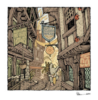
After the inks were finished, I scanned them back into Photoshop to begin the coloring. The first step is to add flat colors to everything to establish what elements are which colors. It's like a professional version of coloring-in-the-lines. This step helps for when I want to re-isolate any area so I can render it without effecting the areas around it.
At this stage I also added color holds (areas where I wanted the ink work to be a painted color other than black) to parts of the background to help imply the lighting effects and the depth of distance.
 The last step was to render the color. I do this in Photoshop mostly using the Dodge and Burn tools with a textured brush.
To the right you can see the finished piece––which will also be soon available in print in the upcoming Mouse Guard sketchbook Dawn, Daye, & Dusk.


No comments:
Post a Comment