My friend and artist Matt Smith (Barbarian Lord, Lake of Fire) is working on a new creator-owned book titled FOLKLORDS written by Matt Kindt (Grass Kings, Mind MGMT) and I was asked to do a variant cover for an upcoming issue. Folklords is a fantasy/folklore setting where coming-of-age involves going on a quest and our hero Ansel decides to wander from his given quest-path to do the forbidden––follow his own quest to find the Folklords and answer why he sees visions of tailored suits and technology.
Matt Smith knew of my Gnomevember drawings from a few years back and asked if I'd specifically like to do a cover featuring the Folklords equivalents seen here on issue 1's cover with his artwork.
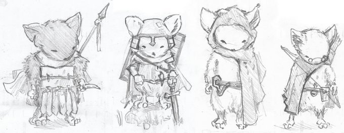
 I loved the idea of getting to do a Gnomish piece for this book, and so I started with pencil drawings of a few Gnomes & their livestock. In Folklords, the Gnomes are farmers who have been pushed out of the fertile land and into rocky territory where they live in a disgruntled state. I took my cues for the trio I was drawing from Matt's cover art (as well as a character lineup sheet he provided me with). I wasn't sure of the overall composition, but knew that three Gnomes would give enough variety and a sense of a balanced composition. The last drawing here of the rock carvings came later––after the next step, and I'll talk about it then.
 With the characters and animals all penciled I scanned in my drawings into Photoshop to compose the image. Because each drawing is a separate scan, I can resize, rotate, adjust, and tint them all individually to carefully puzzle-piece together the layout and make fixes where necessary (the Gnome on the pig needed his leg sifted over a bit and I needed to join the pig's head to the much smaller body drawing I'd sketched. For the rockly landscape, I just quickly blobbed in some tan rocks to imply the landscape and the depth of field I was aiming for. The editor on the book asked me to add some runic carvings to the rocks to help it feel specifically Folklords-ish. So I printed this out at 8.5" x 11" and on a light pad and another sheet of paper, did the above drawing of the rock carvings to be applied to my layout before inking.
 Once the rock carvings were added and all the parties involved gave their approvals, I started on the inks. I printed out the cover digital layout (basically the above image, but with the rock textures added) and taped it to the back of a sheet of Strathmore 300 series bristol. On my Huion light pad I could ink the piece using the printout as a guide. I used Copic Multiliner SP pens (the 0.7 & 0.3 nibs) to add in all the texture & line weight. I may have overdone the inks on the rock carvings...and it made me worry as I looked at the piece and it seemed very busy and lacked the depth of the rough...
I inked a fair bit of this live on my Twitch stream.
 When starting the coloring process to help with the depth issue I established LOTS of color holds. For those who don't know, color holds are areas where I want the inkwork to be a painted color rather than black. And here I made one for every degree of depth I wanted to push: The pig farmer depth, the barrel-gnome depth, the lady with the ducks depth, behind the lady depth, and the far back rocks with no details.
Then I added in flat colors to the piece basing the palate of the characters from Matt's control art he sent over.
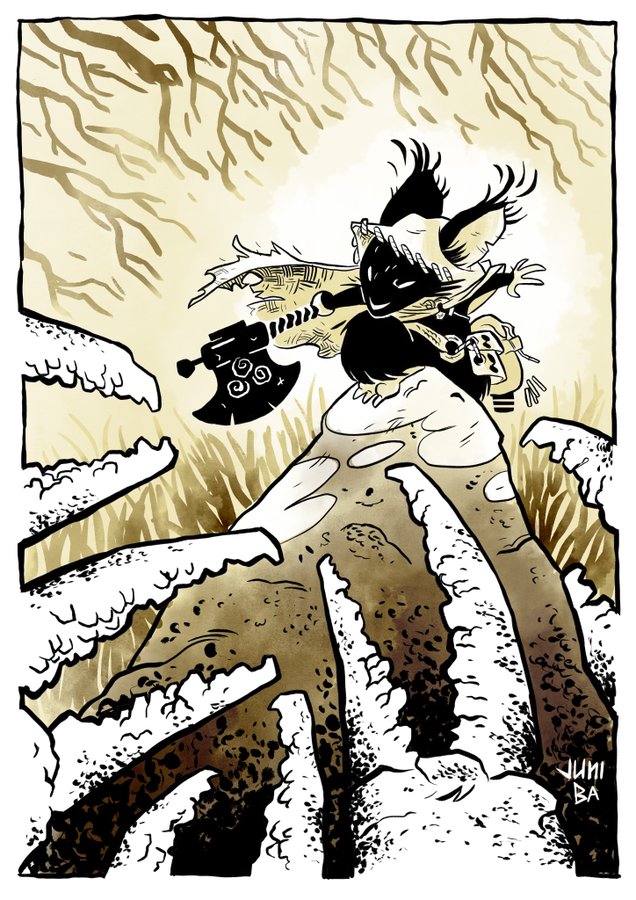
The last step was to render all the color. I used the dodge and burn tools with a stock textured brush mainly...but in a few areas, I did something I rarely do, put away the mouse, pull out the tablet and use the paint brush tool...I did this on their faces where I needed a bit more control over the shading.
Most of the coloring work here was about balancing out the values and hues to re-create the sense of depth and the Grapes-of-Wrath-Dustbowl mood I saw in my rough, but lost on my inks.
FOLKLORDS #1 will be available for sale November 13 in comic shops. This cover will be on a later issue.

2019 Appearances
The Fantastic Workshop Nov. 13-18