Showing posts with label Pinup. Show all posts

Tuesday, August 18, 2026

Outlaw's Apprentice pin-up

Chris Schweizer recently kickstarted his new book Outlaw's Apprentice: Broken Blade and once I saw he was collecting some pinups from other artists for a Kickstarter bonus sketchbook, I strongarmed Chris into letting me do one.

The kickstarter campaign was close to ending when I offered to do the art, and so it was a race to get it done so it could offer any boost/promotion/incentive for some final backers before the campaign closed.

To the left you can see the final colored artwork, and in this post, I'll break down the art process it took to get me there.

I've long admired Chris Schweizer, not only as a comic artist, but also as a craftsman, designer, teacher, and human. He is truly a renaissance man and I advise following him on social media: Bluesky: https://bsky.app/profile/schweizercomics.bsky.social & IG: https://www.instagram.com/schweizercomics/ as well as his patreon: https://www.patreon.com/c/ChrisSchweizer.

His latest series is about an apprentice glassmaker who finds himself along with the mercenary he's apprenticed to in trouble with the law while standing up for what's morally right. The series is free to read on Webtoon or Chris' Patreon: https://outlawsapprentice.com/


I started by drawing the main character Otis on a a sheet of copy paper. My original idea was for him to be walking balance-beam-style on a fallen tree as his outlawed companion Erska walked along side. But after I scanned in my Otis drawing, I realized Erska wouldn't fit, where I planned without blocking some part of Otis' silhouette.

I drew a few loose poses for Erska before settling on this one of her. Each drawing was tinted in Photoshop to help me see them better as forms and I blocked in color for each also to help me understand what the forms all were.

I quickly digitally drew in some background shapes before calling this layout done and ready to ink.

The layout was printed out and taped to the back of a sheet of 300 series Strathmore bristol 9"x12". On my Huion lightpad I was able to see through the surface of the bristol to use the printout as a guide while I inked.

I used Copic Multiliner SP pens for the inking, mostly the 0.7 nib, but I switched off to a 0.3 for the eyes since they were smaller and required more finesse.

Chris told me that the book's dimensions were going to be a smaller mass-market paperback size, and so I was careful to not over detail the inks so they's reduce well without becoming muddy. Because of that, I focused on good contour lines for the characters without much texture, and bolder black shapes for the background.


The inked drawing was then scanned into Photoshop. Worried I wouldn't be giving Chris enough time to promote with my art, I sent him the inked version as I worked on the colors. That first step of coloring is called color flatting. It's basically a digital coloring-in-the-lines on a professional level using only flat colors (no rendering, no textures, etc). 

I started with the color palette in Chris's comics, but then altered some of the hues and values to meet up with my own coloring preferences and to compliment the background colors. 

At this stage I also established color holds (areas where I want the linework to be a color other than black) on the tree, the plants and grass, the character's pupils, and Erska's upper lip.

Here again is the final colored piece. I used the Dodge and Burn tools mostly to add highlights and shadows all while using a stock textured brush to get some nice natural variance to the colors.

Outlaw's Apprentice: Broken Blade is available to read free online now: https://outlawsapprentice.com/ with printed books being available hopefully early next year from Chris. And I know this is the first book in a long series and that he plans to start on book 2 very soon. 

Tuesday, September 30, 2025

Baltimore Yearbook 2025: Bone

Every year the Baltimore Comic Con has published a convention art book called 'The Baltimore Yearbook' that features a character or property, where that creator is a guest of the convention. Selected guest artists are asked to contribute a piece of fan art for the book to celebrate the creator and property. It allows us to play in someone's world, and offers a chance for attendees to meet new creators as they go around the show floor collecting autographs in their yearbook.
This year's subject is Jeff Smith's Bone! To the left you can see my finished art, and below in the blogpost I'll walk through my process.


When I received the invitation email I knew right away that I wanted to draw the Red Dragon from the series. And while thinking about what else from Bone I'd love to draw, Bartleby (the baby rat creature the Bones adopt) came to mind––but it would be strange to have him without at least Smiley Bone...which kinda meant I was including all the Bones...and they would all be hanging on for dear life to the dragon as he charges ahead.  

Then I started thinking about Grandma Ben & Lucious watching on the ground...and while they were fun to draw––it felt incomplete without Thorn (even though I'm not confident drawing attractive human characters).


All of those bits were scanned and then assembled into a template for the technical specs of the Yearbook's formatting. I was able to move characters around, swap drawings in and out, and change their size.

It became obvious that a huge character like Lucious was going to block too much of the Dragon's running pose, and that a Thorn standing next to her Grandmother was better than her riding the dragon.

Lastly, I realized the composition needed something more––the sky was too open and I didn't want to rely on painting a cloudscape in the coloring stage, so I blocked in a swarm of locusts (you'll understand if you've read Bone.)

I printed out the above layout and taped that to the back of a sheet of 14"x20" Strathmore bristol board. On my Huion lightpad I was able to see through the surface of the bristol down to the printout to use as a guide while I inked the final drawing. I used Copic Multiliner pens (mostly the 0.5 nib, but also a 0.7 and occasionally a 0.3) to do all the inkwork. 

Most of what I needed to worry about the the linework was just getting a clean contour and line weight––especially on the Bones...just a hare off and they look off-model very quickly. This original artwork will be up for auction at the Baltimore convention.

The inks were scanned and I started digitally coloring the piece. This involves blocking in flat colors to establish each color's shape. Most of the color choices had been made by reference to the Jeff Smith comics (with colors by Steve Hamaker) and from my layout.

In this step I also established color holds (areas where I want the inklines to be a color other than black) on the locusts, Thorn, Bartleby, & the Dragon's pupils, and Fone Bone's map. 


The last step was to do the final rendering and lighting effects for the piece. I did this mostly using the dodge and burn tools and a stock Photoshop brush.

This piece will be published in the Baltimore Yearbook in October. That book will be available for purchase at the convention and through the con's website afterwards. The original inked piece will also be for sale in the art auction at the con on Saturday.


Past Baltimore Yearbook pieces & blogposts:


2021: Halloween:


2018: Strangers in Paradise:


2017: Tellos:

2016: Archie:


2015: Mouse Guard:


2014: Grendel:


2012: Liberty Meadows:

Tuesday, August 27, 2024

TMNT 40th Anniversary Pinup

On July 10th a TMNT 40th Anniversary on-shot was released. I was asked by editors to contribute a pinup to mark the occasion (I'd similarly done one a decade ago for the 30th: http://davidpetersen.blogspot.com/2014/05/tmnt-30th-anniversary-tribute.html)

It was reading the early Eastman & Laird TMNT comics and playing the RPG that really cemented my desire of wanting to write and draw my own comics. The only other comics I'd read at that point were some older X-Men reprints (that had Arthur Adams covers, Dave Cockrum interiors, and John Bolton backup stories) and Archie comics that had a different artist every story––Kevin and Peter were doing something different, and seeing their names above the logo on the cover made me realize these guys were just making stuff up and drawing it––not a factory of creators contributing to a long-standing legacy brand.

Unfortunately due to timing, I didn't have time to draw a new pinup before the tight deadline for the 40th one-shot. But I did have some sketchcovers I inked (and scanned before painting) of each of the brothers. Since they'd never been published, I asked the editors if they minded if I assembled them into a group composition and colored them to include in the issue and luckily they agreed.

Below you can see each individual turtle's inks before coloring and assembly:


Tuesday, July 2, 2024

Hellboy 30th Anniversary

For Hellboy's 30th Anniversary, I was asked to contribute a piece of artwork for a gallery exhibition at the Copro Gallery in Sherman Oaks, CA to celebrate three decades of Mike Mignola's creation. I've been a fan of Hellboy since the 2nd issue (my local store at the time somehow didn't get enough copies of #1 and I had to hunt it down later) and I've credited Mike's time with Hellboy as a roadmap for my goals for a comics career.

A decade ago I did a 20th anniversary piece: http://davidpetersen.blogspot.com/2014/03/hellboys-20th-anniversary.html. To the left you can see my final colored (just for fun) piece, and below I walk through the steps to creating it as well as showing the inks that will be in the gallery exhibition (and for sale) 

The process started with lots of ruminating over what do do with Hellboy. I've never drawn him for a cover, but between the 20th anniversary piece and the Kickstarter print for the Drawing Monsters Kickstarter I didn't want to repeat myself. I opted for an action pose (this is after discarding a very static sketch of Hellboy with animals from Mouse Guard while holding the Black Axe). I kept the Black Axe in this rough, but I drew and redrew a few variations of his surroundings with iterations of bone-dragon/snakes he was smashing apart before wanting to include a belltower I saw on my trip to Lake Como in May. The crumbling belltower drawing and Hellboy drawing were put together in Photoshop along with some blocked in color and a special clock-face with the hands at 30.

The above layout was printed and taped to the back of a sheet of Strathmore 14" x 17" sheet of bristol. On my Huion lightpad I was able to see through the bristol to use the layout as a guide to ink from. I used Copic Multiliner SP pens to ink with. 

Since the original inked artwork was the piece to be displayed in the gallery show, I focused on making it read clearly without color. That meant adding a lot of tone and texture to all the crumbling bits of tower stones, while leaving Hellboy rather clean line-wise. The framed original will be available for sale through the Copro Gallery.


Just for fun, I wanted to color the inks after I scanned them. It figured it would be good to see the piece in color again (the purpose of the layout's color blocking was to help me see forms as I inked; what was coat or right hand of doom, or stone or beam, or bell, or sky).

This first step of coloring is called 'flatting' and is basically a professional version of coloring-in-the-lines with flat colors to establish each area's base color. At this step I also added color holds (areas where I want the inkwork to be a color other than black) to the entire background as well as the numbers on the clock and the 'US' patch on Hellboy's holster.


Below you can see the finsihed just-for-fun colors (I never make prints of characters I don't have the right for). I did a lot more painting on this piece than my normal coloring process. Rather than using Doidge and burn tools for the majority of the rendering, I painted in shadows with the same color as the dark blue lines of the background, and added in highlights with a lighter warmer color.


Tuesday, September 12, 2023

Bone tribute, Get well soon Jeff Smith

On August 19th the official Cartoon Books twitter account shared the following:

"Jeff Smith is recuperating from a cardiac arrest, which he suffered on Sunday. There will be a long road to recovery, so regrettably we must cancel the remainder of his book tour this year."

Jeff's work, especially Bone, have been a guiding light for all-ages content in the comic & graphic novel space for decades. Jeff's always been a kind and generous supporter and friend, and I wanted to do a piece of tribute art while he's recovering.  


Kathleen Glosan, the production manager of Cartoon Books mentioned that if fans wanted to do any get-well art they'd love to share it as well as if we wanted to mail anything to Jeff she provided an address.

So, I started work on my rough right away. I drew Phone Bone on a sheet of copy paper as well as a mouse arms stretched wide. I then scanned those assembled then in Photoshop and did a bunch of alterations and digital corrections as well as a quickly painted background.

The next step was to print out the above layout and tape it to the back of a sheet of Strathmore bristol. On my Huion lightpad I was able to see through the surface of the bristol and use the printout as a guide to ink from. I used Copic Multiliner SP pens (the 0.7 for most of it, but the 0.3 for the mouse's eye).

It was tricky to ink Phone Bone so cleanly and not add in more texture like I do for most of my contour inking. I then made up for it with the environment.


When the inks were done, I scanned the art and started the coloring process with flat colors. This is the digital step where I clean up the artwork to be crisp blacks and whites and then I lay in flat colors for all of the shapes to establish what areas are what colors. It's a professional version of coloring inside the lines.

Most of the color choices were things I'd already decided on in my layout stage, but I certainly made some subtle changes in hue, saturation, and value to many areas so the whole piece worked together even before I started rendering it.


The last step was to render the color. I use a stock texture brush in Photoshop with the dodge and burn tools (these are carry-overs from when Photoshop was developed as a photo retouching tool and references darkroom exposure techniques). They basically just darken and lighten whatever color(s) they are going over at the time, so that's how I add shadows and highlights. I also select areas (like some individual leaves) and then slide the color balance around to shift the hue to make them look a little more individual and less of a digital mass of the same color.

The original inks have been sent to Jeff, and I hope you all join me in wishing and praying for the best for Jeff's recovery.

Tuesday, October 18, 2022

Scary Godmother Tribute for the Baltimore Yearbook

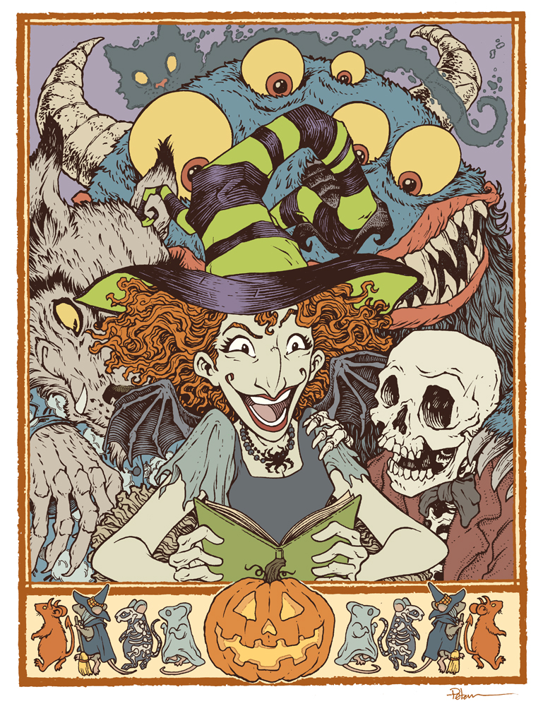
 For roughly a decade the Baltimore Comic Con has published a convention art book called 'The Baltimore Yearbook' that usually features a creator-owned character or property, where that creator is a guest of the convention. Selected guest artists are asked to contribute a piece of fan art for the book to celebrate the creator and property. It allows us to play in someone's world, and offers a chance for attendees to meet new creators as they go around the show floor collecting autographs in their yearbook.

This year's subject is Jill Thompson's Scary Godmother! To the left you can see my finished art, and below in the blogpost I'll walk through my process.
We are always encouraged to include our own characters into our Yearbook piece--to create a cross-over image that might not have otherwise happened. I'm always hesitant to add mice from Mouse Guard into these pieces––but a few years ago in the Blacksad piece I did add a mouse character as they would appear in that title. And here I thought it would be fun to add in some mice dressed for Halloween characters to form a border (and distract from the fact that the rest of the composition would be a character pile-up.

Once I had my border, I drew each character separately (starting with Scary Godmother herself) on copy paper while using a light pad (think of it as making Photoshop layers in the physical world.) I adjusted the size & position of the characters until I had a composition I was happy with (and adding some quick flat color helped me see if the composition worked in terms of light/dark masses.

With the pencils/layout done, I printed out the composition (on two sheets of legal paper that had to be registered and then taped back together) and then taped that to the back of a sheet of Strathmore 300 Bristol. On my Huion lightpad, I can see through the surface of the bristol down to the printout to use it as a guide to ink by. I used Copic Multiliner pens (mostly the 0.7 nib) to do all the inkwork.

The trick was balancing my normal texture work with the usually very open forms Jill has when she draws and paints these characters. The original inks for this piece will be up for auction at the convention.


Once the inks were finished, it was time to start coloring the piece. I scanned the inks and began laying in flat colors. This part of the process is called 'flatting' where the color areas are all established with flat colors (no shading, no rendering, no textures, no effects). Some of the color choices were done for me by needing to be on-model from Jill's comics, but I'd also made some choices for the saturation and values when I did my quick color blocking in the pencils stage.

In this step I also established all the color holds (areas where I want the ink lines to be a color other than black) like Boozle the ghost cat's outline, the border, and the glow inside the pumpkin.


The last step was to do the final rendering and lighting effects for the piece. I did this mostly using the dodge and burn tools and a stock Photoshop brush.

This piece will be published in the Baltimore Yearbook later this month. That book will be available for purchase at the convention and through the con's website afterwards. The original inked piece will also be for sale in the art auction at the con on Saturday.


Blog Archive