Tuesday, August 31, 2021

Usagi Yojimbo Dragon Bellow Cover 5

I was fortunate enough to be asked by IDW and Stan Sakai to do a run of covers on the new Usagi Yojimbo reprints of 'The Dragon Bellow Conspiracy'. I'll be doing six in total, and for this blogpost I'll be sharing my process for the creation of the cover art for issue #5.

This issue is currently up for pre-order through Diamond with the code AUG210595. Just ask your local comic shop to order it for you, or order it though an online retailer. The issue will be in shops October 20, 2021

To the left you can see the finished cover, but below I'll go through the steps in creating it.


Layout/Pencils
Back in 1988 when this story was originally printed in black and white, Stan Sakai drew the covers for the series. For most of my covers so far, I've relied on what he thought was important enough from that issue's story to be the focus of each cover. But for #5, I decided to go off on my own. I worried about the spoiler nature of the imagery (there's a massive explosion at the castle that Usagi & Tomoe survive). I drew the explosion on one sheet of copy paper (thinking of the plumes of smoke I'd draw on my Plotmasters Claw piece) and the forms of Usagi & Tomoe I drew each separately on other sheets of copy paper. I scanned them all, and assembled them getting to resize and make adjustments to each element until I liked the overall composition. Tinting each part helped me see the forms. I also blocked in the severe shadows I would later use color to imply.


Inks:
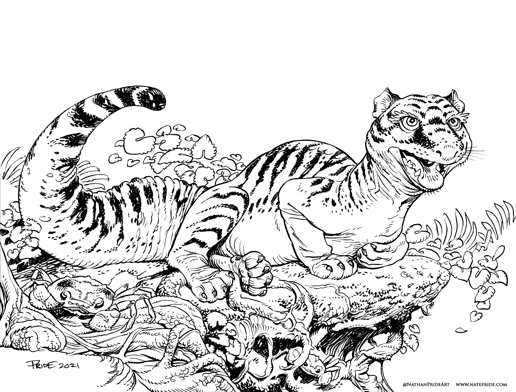
When the above layout was approved by the editor and Stan, I started the inks. First step was to print the layout file onto copy paper (over two sheets that had to be taped together at the seam) and tape that to the back of a sheet of Strathmore 300 bristol. On my Huion lightpad I was able to ink the cover art using the printout as my pencils lines. This way in the end the inked artwork is very crisp and clean with no need to erase pencils lines. I used Copic Multiliner SP pens to ink the art (the 0.7 and 0.3 nibs).

The majority of the inking process was all of the rolling smoke while inking around the negative shapes of the blast forces.


Color Flats:
The inks were approved and I scanned them in to Photoshop to start the coloring process. This first part of coloring digitally is called 'flatting' and is a professional version of coloring inside the lines. Establishing what each area's color is and where it ends. This not only is a color base for the image, but also allows a quick flat color area to be able to quickly isolate to render or make adjustments on.

I used a gradient fill on the background, some orange for each character, & a blue violet for those shadows. I went through and established color holds (areas where I want the inkwork to be a color other than black) on the castle & explosion, as well as Usagi's eye scar.


Final Colors:
Here again is the finished art (this time sans-logo). I made significant changes to the tones from the flats by adjusting color balance, brightness, & contrast. To render all of the color I mostly used the Dodge and Burn tools (Photoshop tools based on real photography techniques for purposely over or under exposing film as it develops). Burn is do darken and Dodge is to lighten. I use a stock Photoshop textured brush as I add shadows and highlights with these tools so the work looks a little more organic and less digital.

It's an honor to be asked by Stan to do these covers and to get his approvals as I work through each cover.


Usagi Yojimbo: The Dragon Bellow Conspiracy #5 is out in stores October 20, 2021

Tuesday, August 24, 2021

King Fisher & Guardmouse


Earlier during this year's ONLINECON I took a few inked commissions. I don't tend to do these any more because of how much added work they are compared to my toned commissions. But, they are something many fans still ask for, and if they are mouse-themed, I can color them for my own use for later publication in a sketchbook.

To the left are the finished colors of one of those commissions (one I will eventually collect in the next Mouse Guard sketchbook). And below I'll run through the art process of creating the art.

The layout/pencils for this piece started as just an earnest drawing of a belted Kingfisher. I looked at a few photos for reference as I worked. The fan's request was that a Guardmouse would be spear fishing while rinding on the back of the bird. So, atop a lightpad on a second sheet of copy paper placed over the King Fisher pencils, I drew the Guardmouse and all the gear associated with fishing and riding a mount.

I then scanned the two drawings and assembled them in Photoshop and blocked in a rough landscape with a quick digital painting.

I printed out the above digital composition and taped it to the back of a sheet of 12" x 12" Strathmore bristol 300 series. On my Huion lightpad, I'm able to see the printout and I can use it as my 'pencil' lines as I ink. This way, at the end of the inking process, there are no actual pencils to erase and the artwork is as clean as I can possibly make it for the commissioner. 

I inked the lines with Copic Multiliner SP pens (the 0.7 and 0.3 nibs mainly). The background was all inked while leaving a white gap between it and the foreground/character lines. This helps add some depth, but also with the next part of the coloring stage.


Then the inks were scanned before Julia shipped off the original art to its new home. With the high-res scan, I could start the digital coloring process to be able to use it later for publication. This process starts with establishing where all the colors go––like a digital professional job of coloring-in-the-lines. I also used this step to paint in all my color holds (areas where I want the inkwork to be a color other than black) like the background trees and the water. Leaving the gap between the inks for the foreground and background made isolating those colorholds easier.


Here are the final colors all rendered and textured. I do most of this work only using two tools in Photoshop: Dodge and Burn. These are tools that date back to when Photoshop was a photo retouching tool and emulate part of the development process to over and under expose areas––ie: make areas darker and lighter. So with a stock textured brush I add shadows and highlights.

My next sketchbook won't release until 2022, but this piece is already a guaranteed page in the publication.


Tuesday, August 17, 2021

Ballad of the Ivory Lass Reinterpreted by Very Handsome Billy

During the 2021 OnlineCon Twitch music streamer veryhandsomebilly reinterpreted the Mouse Guard song 'Ballad of the Ivory Lass' with as one of his chill vibe funk live-learns. 

Link to Billy's Twitch Stream: https://www.twitch.tv/veryhandsomebilly


Watch the performance on YouTube:


The Ballad of the Ivory Lass appeared in Winter 1152 issue/chapter 4. I talk about the writing of that song, what it's narrative purpose was, and about Jesse Glenn providing the melody as a framework all in a Creator Commentary video: https://youtu.be/zVw9YRnbG5U

To listen to the original recording of Ballad of the Ivory Lass performed by Jesse Glenn, you can download the free MP3 here: http://www.mouseguard.net/wp-content/uploads/2012/04/mgballad.mp3

Tuesday, August 10, 2021

The Mustela Leopiger

 Last Friday on my Twitch Stream, we did the eighth community draw-along event #DrawTheExtinct where I posted an image from an old block print I made with a few animal photo inspiration prompts and the idea to create an imaginary extinct animal. I worked on my piece live on my Twitch stream while viewers worked at home and then on Monday we shared our finished pieces. 

Here is my finished Mustela Leopiger. And below are my steps to create it as well as the community submissions.


We started with the prompts of my original 2000's era linocut print titled 'Extinct' as well as a Leopard Gecko, a Tiger, and a Weasel.

I told the viewers that they could use any combination of the inspiration prompts––they could make their version as cute and cuddly as a pocket pet stray kitten, as monstrous and deadly as a giant kaiju destroying cities, or anything in between. I also wanted this to be an excuse to get their pencils moving. I invited all skill levels, because I'm a firm believer that you shouldn't have to be good at something or pursuing mastery of it to just simply enjoy the act of it...and art is no exception.


On the Friday stream I started drawing with mechanical pencil on a sheet of copy paper to try and reimagine the beast. It was a tough job to combine all three parts. The Body shape of the Weasel & Gecko are so similar, that then you are either choosing one of their body details or other others. I went with the ears and tufted tail to represent the weasel. Even after I had a drawing I liked most of on paper, I scanned it and dis come digital manipulation to it in Photoshop to fix proportions and scale before also deciding to finish out the drawing stage digitally with my tablet.


After I was happy enough with my above design, I printed that piece out on copy paper and taped it to the back of a sheet of Strathmore 300 series bristol. Using a lightpad, I was able to see through the surface of the bristol as I inked the Mustela Leopiger. I used a Copic Multiliner 0.7 SP pen to ink the art. I was still streaming this portion on Twitch, though as my end of stream time was coming up, I was nervous I wouldn't finish in time. Turned out, I went a little over-time to get the inks completely finished before I said goodbye to everyone watching and offered encouragement as they worked on their pieces over the weekend. 

Off stream I scanned the artwork into Photoshop to prep it for final color. First thing was to drop it into the template I have for #DrawTheExtinct pieces with the border, background, and a base shadow already established. Then I started drawing in flat colors. This part of coloring (called flatting) is just a professional digital version of coloring-in-the-lines to establish the color areas.

My color choices were essentially going with the tiger's orange and the underbelly of the Gecko and Weasel fur. I did play with blue vs green eyes before settling on green. I also had a lot of work in establishing color holds for all the spot/striped markings.


Below you can again see the final rendered colors with a border and type applied in this final version. 

But, as this is a community event, I wanted to share all the other entries posted in the Discord. I awarded a prize and we voted together on a few more (prize winners marked with *) on Monday's Twitch stream and we all enjoyed seeing what each other had done. I hope we get even more participants next month (first Friday!)


Capt.Nemo*


Cortrah


Dark


Doombot2015


EvilCartoonist*


MegsMashables*


Naereniel


Nathan Pride*


Nuvalo


Pendrake


Ratty Creations


RedJarOJam


sleepless.ninja

Tyberius*


Tyrie


VernNYC


VeryBlueberry2


Kevin Owen


Tuesday, August 3, 2021

Chameleon Guard Patrol

During OnlineCon last year and this year, I took on several inked commissions. The idea was 1) to make some fans happy (since I rarely offer these types of pieces any more) 2) Earn some income in the heights of the pandemic, and 3) build several pieces of work that I could color for an upcoming Mouse Guard sketchbook. 

To the left you can see one of those pieces finished and colored ready for a page in that sketchbook––and in this blogpost I'll break down the process to get there.

The commission request was from longtime fan Kyle Wright who asked for a patrol of Guardmice using a Chameleon as a pack animal loaded up with gear & supplies. Somewhere in the process, I got confused about chameleon species and drew a hooded chameleon instead of a panther chameleon like Kyle asked for (apologies, Kyle.)  I drew the chameleon on one sheet of copy paper, and then on a light pad, used another sheet of paper to draw all the gear (this way if I needed to erase or adjust the items, I didn't risk destroying the original drawing. I then drew the three Guardmice on a third sheet of paper, and scanned all three sheets into Photoshop where I could composite them and add in some quick digital painting for the landscape.

I printed out the above 8"x 8"layout on copy paper and taped it to the back of a sheet of 12" x 12" Strathmore 300 series bristol. On my Huion lightpad I can see through the surface of the bristol down to the printout to use as a guide as I ink. I used Copic Multiliner SP pens (the 0.7 & 0.3 nibs). Getting the details of the Chameleon right without over-inking the details was the hard part. I knew the ink coverage would get dense in all the gear, so I used more restraint on the lizard. And in that same way I used a much lighter touch with the background foliage knowing it would help imply some depth & distance. With the inks done, the piece was sent off to Kyle. 


Before Julia shipped off the original, I got a good scan of the art so I could start the coloring process. That first step is called 'flatting' which is basically a professional task of coloring-in-the-lines and establishing what color area each thing in the piece is. I'd played with the idea of going a little crazy with the colors (going more into the range of a panther chameleon's range rather than sticking to what I drew) but started with a russet look for the lizard knowing that I could alter it as I worked.

I also took this step to establish a color hold (an area where I want the black linework to be a color other than black) on the background leaves to help push them back and add a sense of depth. I also added a few color holds to the chameleon's spots, details on the gear, and a glow on the lantern.


Here are the final colors all rendered and textured. I do most of this work only using two tools in Photoshop: Dodge and Burn. These are tools that date back to when Photoshop was a photo retouching tool and emulate part of the development process to over and under expose areas––ie: make areas darker and lighter. So with a stock textured brush I add shadows and highlights.

This piece will eventually be collected with many more in an upcoming sketchbook I plan to release in early/mid 2022.

Blog Archive