Tuesday, June 28, 2022

Rudyard - 6th of the Black Axe Wieldiers

For a new 10 piece print set, I illustrated all of the past wielders of the Black Axe from Bardrick to Celanawe. I'd shown and listed the wielders in the Black Axe book--but they were only ever visualized as embroidery details on the Adana Tapestry––and I wanted to give them a more solid design existence. The set of ten 4.75" x 4.75" prints is available for sale in my online store and comes in a vellum envelope:

https://mouseguard.bigcartel.com/product/wielders-of-the-black-axe-print-set

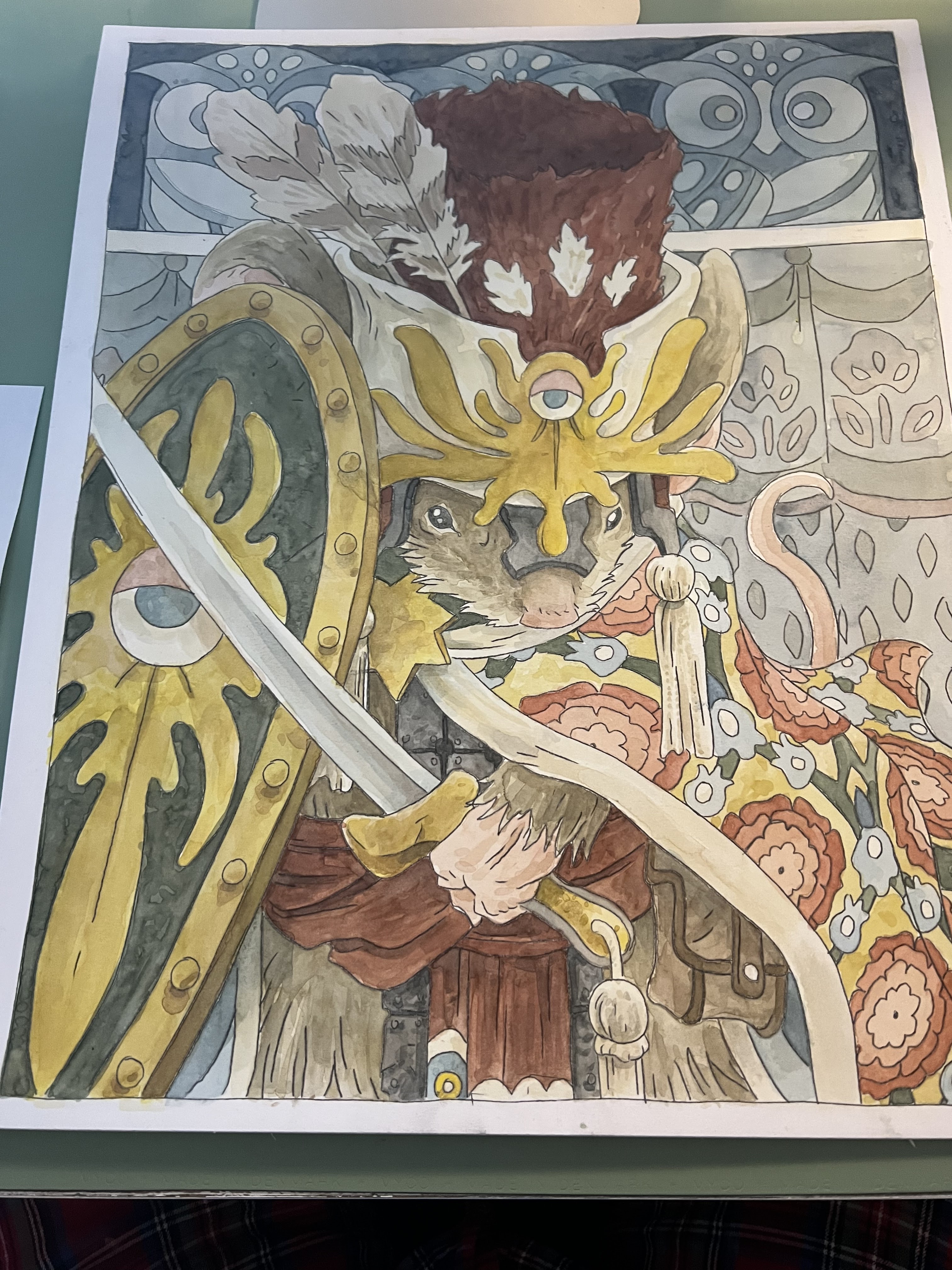
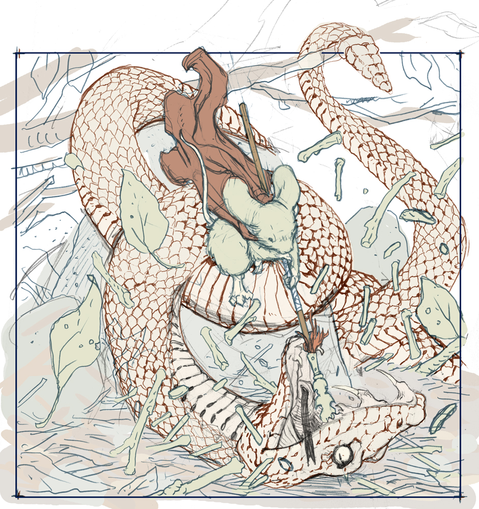
To the left you can see the finished art for the Rudyard, Sixth of the Black Axes print in the set. Below I'm going to go through the process to create the art.

Layout:
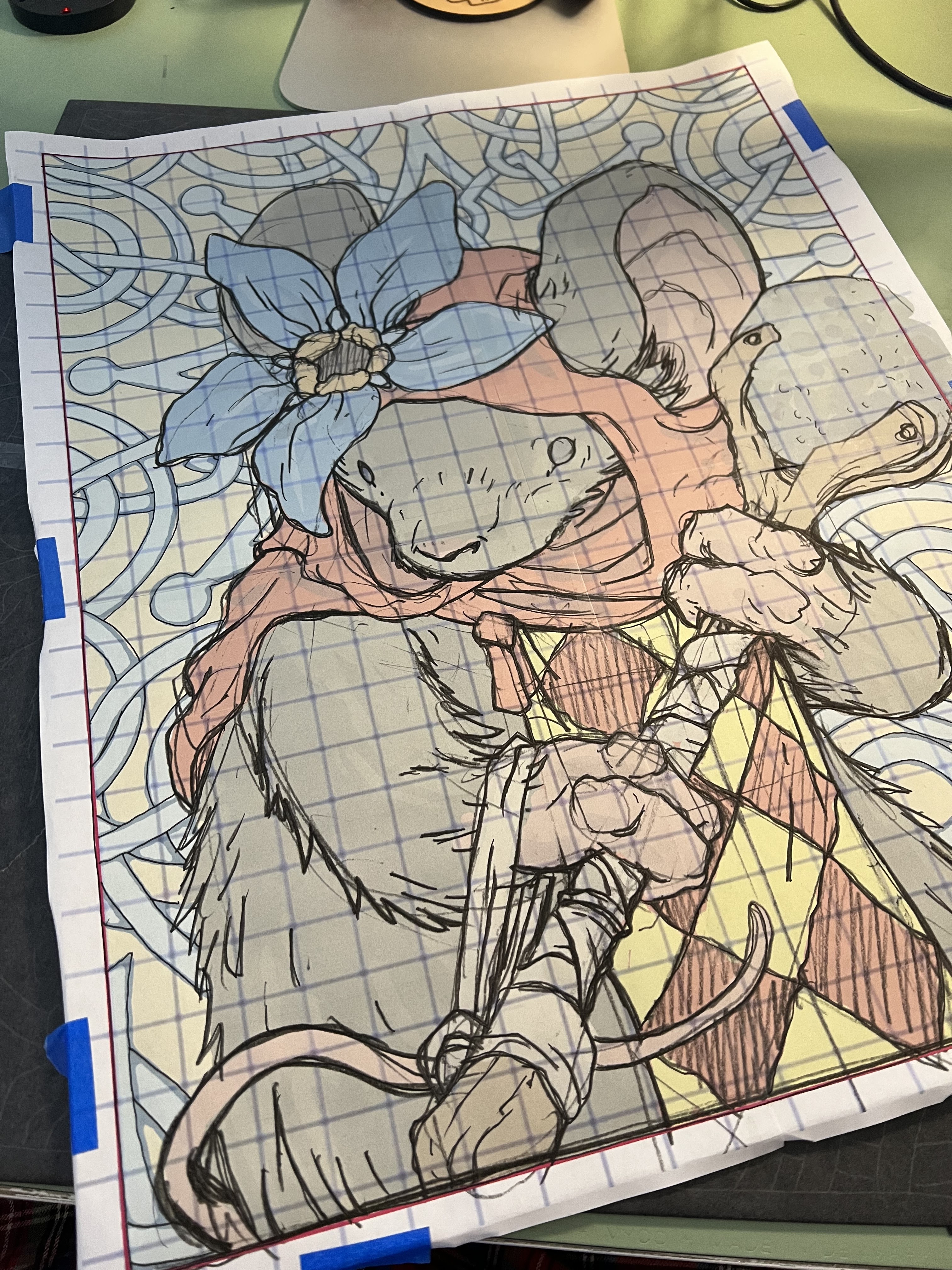
I started with the idea of Rudyard interacting with an animal (with the Rudyard Kipling namesake it seemed right) and opted for an owl and baby owl. I drew Rudyard, the baby owl, the nest/branches, and the mother owl all on separate sheets of copy paper. I worked on them a bit overlaid each other on a lightpad and then scanned them all in and assembled them in Photoshop. The checker cape is something not shown in Rudyard's post axe life, but was in the pre-axe version of him––and I liked it enough to incorporate it here. I also like that it's ambiguous if He's there to help or harm the baby owl––reader's choice.

Inks:
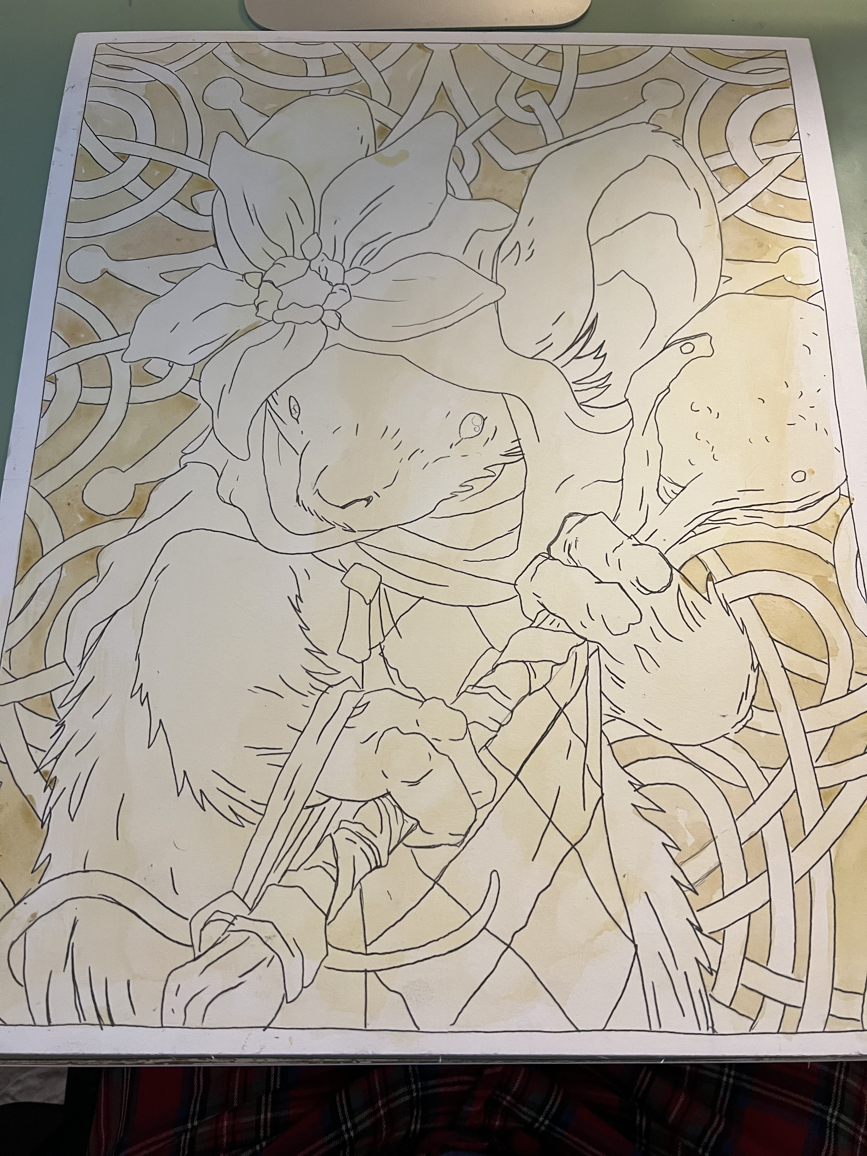
I printed out the above layout when I was happy with the arrangement and taped that printout to the back of a sheet of Strathmore 300 series bristol. On my Huion Lightpad I'm able to see through the bristol to the the printout to use it as a guide to ink from. I ink with Copic Multiliner SP pens, and I used the 0.7 & 0.3 nibs for this piece.

Most of the inks were straight forward on this one. It was all about the density of lines in the deeper parts of the next, and then leaving a gap between the owl and foreground to push the focal depth.


Color Flats:
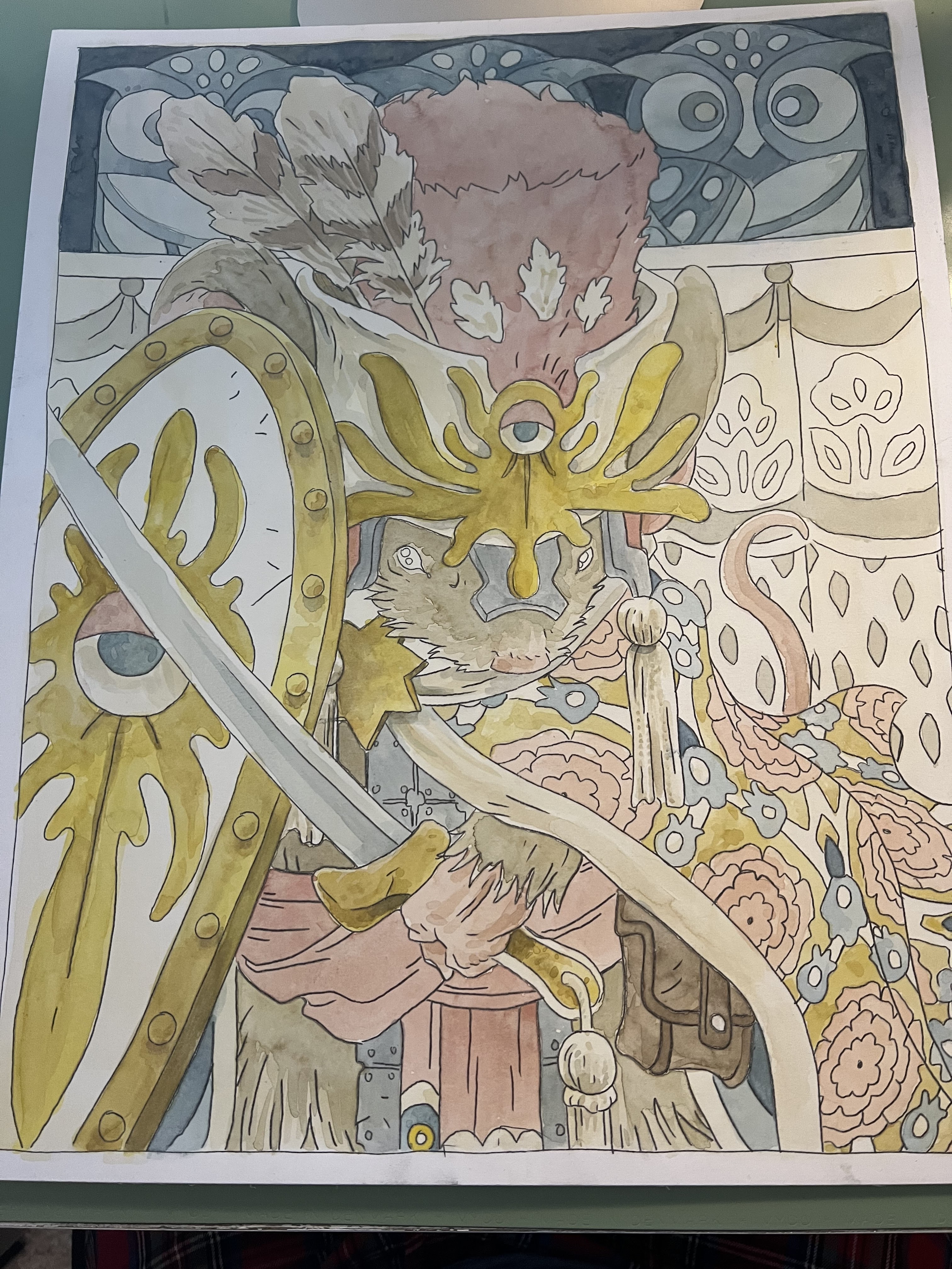
When the inks were done, I scanned the art and brought it back into Photoshop to start the coloring process. This is the step where I 'm basically just filling in each area with flat color. In this step I also establish the color holds, areas where I want the ink work to be a color other than black. Here that's the checked pattern on the cape, the spots on the eggs, the mother owl, and the runic '6'.

I struggled with the colors for the background and owl on this and went back and forth adjusting how light or dark each was and if there should be a low or high contrast between the two or not.


Final Colors:

The final colors were rendered by using the dodge and burn tools in Photoshop (and a textured brush) to add shadows, highlights, and textures. I select areas and play with the color balance to shift colors in some areas.

The entire 10 piece print set is available in my online store: https://mouseguard.bigcartel.com/product/wielders-of-the-black-axe-print-set

Tuesday, June 21, 2022

HEROES CON 2022 Paintings

For my return to Heroes Con this week, I've painted two Mouse Guard pieces. They are each 16" x 20" in Watercolor and color pencil. One of them will be put into the Saturday art auction at the convention. The other will be available at my table the next day with a price set from the winning bid of Saturday's auction.

In this blogpost, I'll go through the steps in making the pieces (or at least as much as I was good about photographing as I painted).


With the Owlhen Caregiver story up for an Eisner and Ruben Award I wanted to do the mouse from that tale who is never named in the story, but I've since called 'Bilbin' after the inspiration for the patterning in the story came from illustrator Ivan Bilbin. I took a drawing that I'd digitally flatted and blew it up to 16" x 20". To print it out at that size, I had to do it in four sheets, and the grid you see is to just help re-align the image when I tape those sheets back together. I then taped a sheet of graphite transfer paper to the final illustration board, and then tape this printout on top of it. 


Using a ballpoint pen to go over all of the lineart on the printout, the transfer paper leaves a perfect copy of the art on the illustration board after I peel back the graphite paper and the printout.


For the other piece, I decided to do a painting of Piper the Listener, who also appears in the Owlhen issue. Same as with Bilbin, I drew her, digitally colored a study, and then blew it up to 16" x 20". The method for printing it out at that scale and taping down the transfer paper was the same as before.


Like the Bilbin piece after I traced over the printout with a ballpoint pen (and medium pressure) underneath was revealed a perfect transfer


Time to start light warm washes. Even though the entire image isn't warm colors, I got at least a pale yellow base over everything


Same treatment for Bilbin. And like Piper piece, I started adding in more density of that color where I knew I needed it. I also added some paynes grey to the top panel


Since I had some yellow going, I deepened the areas that needed the deepest yellows on Bilbin


The pale blue grey of Payne's Grey became the knotwork behind Piper, and the deeper yellows were appropriately added to Piper's flower and tabbard.


Added some more shade & tone to the ywllows and a little bit of pink details on the hat and shield


And it was time to start building up more areas with their warmer base colors.


Piper's fur took several passes to build up to the right opacity for a base before adding shading.


More tonal work on Piper's fur and mace and flower


Bilbin's hat and sash also took several layers before the opacity/intensity was right.

Spent some time adding in all the right tones for the cloak design


I should have gotten Piper's cloak in earlier, and it took a while to get it a deep and rich enough color.


More passes at Piper's cloak, adding the mace handle, and her eyes


Final rendering work on Bilbin himself


And then pushing the background tones back to where they needed to be.


Last painted details on Piper


Because I always think my work looks better with line, I went back a day later and 'inked' in the linework with a dark brown color pencil. Using a color pencil means that the linework is softer and not competing against the painterly bits of the watercolor as much. 


The same color pencil treatment for Bilbin. It took a lot of sharpening the pencil inbetween strokes because the tooth of the watercolor on illustration board wears down any kind of point on the pencil very quickly.

Hope to see folks bidding on Piper at the auction--and then whoever gets to me at my table first thing on Sunday can purchase Bilbin for the same price.

Tuesday, June 14, 2022

Snake Killer Process

 I've released a new Mouse Guard sketchbook titled "Alone Together" (https://mouseguard.bigcartel.com/product/alone-together-sketchbook) The majority of that material is inked commissions I did during last year's ONLINECON event. But to round out the sketchbook sometimes I need to generate some material of my own both to fill up pages and to add certain tone or subject for a thematic through line for the work in the book

To the left you can see one of those pieces finished and colored ready for a page in that sketchbook––and in this blogpost I'll break down the process to get there.

Layout:
I thought the sketchbook needed some action––and what better visual of that in a Mouse Guard book that a mouse vs a snake? So, I started with drawing a mouse lunging down with a spear on one sheet of copy paper, and then a snake writhing and coiled upside-down on another. I scanned those in and resized them, rotated them, and shifted them around until they lined up how I wanted and within a square border. I added in some quick digital color blocking, and the suggestion of a background. I then printed that out and drew in a better and tighter version of the background elements.

Inks:
With the above layout finished, I printed it out and taped it to the back of a sheet of Strathmore 300 series bristol. On my Huion Lightpad I was able to use the printout as a guide to ink from. I used Copic Multiliner SP pens. The 0.7 nib did most of the heavy lifting in this piece and I only used the 0.3 for some finer bits like the mouse's face. Inking in the scales was the most time consuming and stressful part––when that pattern goes awry it's easy for the human eye to catch the mistakes and see the flaws in the drawing.


Color Flats:
With the finished inks scanned I could start on the coloring process. The original inked art was shipped off to the new owner and I worked on this piece for my sketchbook. The color flats stage is just coloring in the lines with flat colors, establishing what every major area's base color is––no rendering, no textures, no effects. Some of the colors I chose when I was blocking in the forms in the layout stage, others like the snake and the background were also informed by reference images of the real things in nature. I added a color hold (areas where I want the linework to be a color other than black) to the branches and leaves at the top in the furthest distance.


Final Colors:

Using Photoshops's Dodge and Burn tools (as well as a stock textured brush) I added all the shadows and highlights. In some places I shifted colors by selecting areas with a lasso tool and using color balance sliders to get them where I wanted them. I also added a little lighting effect to the sky leaving a slight corona around the snake's rattler.

This piece is one of the pieces included in the 2022 Mouse Guard sketchbook 'Alone Together' which is available in my online store: (https://mouseguard.bigcartel.com/product/alone-together-sketchbook)

Tuesday, June 7, 2022

The Lop-Eared Pandrilla

Last Friday on my Twitch Stream, we did the eighteenth community draw-along event #DrawTheExtinct where I posted an image from an old block print I made with a few animal photo inspiration prompts and the idea to create an imaginary extinct animal. This was the last new #DrawTheExtinct draw along (though we will be doing some make up sessions before moving on to a new First Friday theme in August. I worked on my piece live on my Twitch stream while viewers worked at home and then on Monday we shared our finished pieces. 

Here is my finished Lop-eared Pandrilla. And below are my steps to create it as well as the community submissions.

We started with the prompt of my original 2000's era linocut print titled 'Extinct' as well as a a Lop eared bunny, a Panda, and a Gorilla.

I told the viewers that they could use any combination of the inspiration prompts––they could make their version as cute and cuddly as a pocket pet stray kitten, as monstrous and deadly as a giant kaiju destroying cities, or anything in between. I also wanted this to be an excuse to get their pencils moving. I invited all skill levels, because I'm a firm believer that you shouldn't have to be good at something or pursuing mastery of it to just simply enjoy the act of it...and art is no exception.


On the Friday stream I started by drawing with a mechanical pencil my Pandrilla.I focused on the Gorilla stance and mouth adding in panda coloring (and hind paws) and leaving the lop eared bunny as the ears and tail alone. Once I had my drawing pretty well done, I scanned it and did some resizing and morphing tweaks (including mirroring it horizontally so it's facing the alternate direction as last month's entry). While I had it in Photoshop I also slopped down some basic color to help me visualize what I was going for tonally in the final piece.


After I was happy with my above design, I printed that piece out on copy paper and taped it to the back of a sheet of Strathmore 300 series bristol. Using a lightpad, I was able to see through the surface of the bristol as I inked the Lop Eared Pandrilla. I used Copic Multiliner 0.7 & 0.3 SP pens to ink the art. I worked on the outer contours first, then went back in to add all the darker texture and tone to the arms, legs, spots, ears, and paws. The timing of this month's work was perfect. I had my pencils done in an hour and then wrapped the inks 10 min before the end of the stream.

I signed off and wished everyone at home well in their pieces over the weekend and after the stream ended and I got a bite to eat, I scanned the inks and flatted the colors. For these Draw The Extinct pieces I have a template with background and border already established, so it makes some of this color prep work all the easier.

I went with the color scheme I'd roughed in when doing the pencil/layout stage. Though I did warm up the lighter tone and go darker with the dark spots. 


I had a nice long chat with an old friend on the phone as I did the rendering. To get all the highlights, shading, and texture I used the dodge and burn tools with a stock photoshop texture brush. I also selected areas and used the color balance tool to tint them warmer or cooler. Below you can again see the final rendered colors with a border and type applied in this final version.

But, as this is a community event, I wanted to share all the other entries posted in the Discord. I awarded a prize and we voted together on a few more (prize winners marked with *) on Monday's Twitch stream and we all enjoyed seeing what each other had done.


Capt.Nemo


AmyLeB


CreatingRuth*


DePuggo*


EvilCartoonist


Nuvalo


RedJarOJam*


Tyrie*


Nate Pride*


This was the final #DrawTheExtinct species to draw--but we will be doing several more make-up sessions on the 10th and 17th of this month, for folks who only recently discovered the draw-along and want to go back and have some fun, for people who participated, but missed a few critters, or people who want to take another try and a piece they were less than happy with.

twitch.tv/davidpetersen

Blog Archive