Tuesday, April 27, 2021

Dewberries colored Commission

 
Last year for the August 2020 ONLINECON I took a few inked commissions. I don't tend to do these any more because of how much added work they are compared to my toned commissions. But, they are something many fans still ask for, and if they are mouse-themed, I can color them for my own use for later publication in a sketchbook.

To the left are the finished colors of one of those commissions (one I will eventually collect in the next Mouse Guard sketchbook). And below I'll run through the art process of creating the art.

The layout/pencils for this piece started as several sketches on sheets of copy paper. The fan asked for a Mouse-family portrait of he, his wife, and their boys doing something outdoors. With a little more chat, I found out they enjoy picking dewberries in their back yard in the summer time. With five family members to fit into a composition, drawing each one separately so I can scan them and arrange them independently of one another until I get something that works. Tinting the drawings different colors helps me see those forms more easily. The bulk of the dewberry vines were quickly digitally painted in to help me work with masses and distribution of berries and leaves.


I printed out the above digital composition and taped it to the back of a sheet of 12" x 12" Strathmore bristol 300 series. On my Huion lightpad, I'm able to see the printout and I can use it as my 'pencil' lines as I ink. This way, at the end of the inking process, there are no actual pencils to erase and the artwork is as clean as I can possibly make it for the commissioner. 

I inked the lines with Copic Multiliner SP pens (the 0.7 and 0.3 nibs mainly)


Then the inks were scanned before Julia shipped off the original art to its new home. With the high-res scan, I could start the digital coloring process to be able to use it later for publication. This process starts with establishing where all the colors go––like a digital professional job of coloring-in-the-lines. I also used this step to paint in all my color holds (areas where I want the inkwork to be a color other than black). In this piece the holds were limited to the outlines of the berry stains.

Here again is the finished colored image. The rendering was all done using the Dodge and Burn tools in Photoshop while using a stock textured brush. I added some extra layers to simulate the light pushing in from the background.

I most likely won't release my next sketchbook until 2022, but this piece is already a guaranteed page in the publication.


Tuesday, April 20, 2021

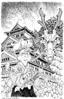
Usagi Yojimbo Dragon Bellow Cover 1 Process

I was fortunate enough to be asked by IDW and Stan Sakai to do a run of covers on the new Usagi Yojimbo reprints of 'The Dragon Bellow Conspiracy'. I'll be doing six in total, and for this blogpost I'll be sharing my process for the creation of the cover art.

This issue is currently up for pre-order through Diamond with the code APR210683. Just ask your local comic shop to order it for you, or order it though an online retailer. The final order cutoff is June 7th, and the issue comes out June 30th.

To the left you can see the finished colored cover, but below I'll go through the steps.

Layout/Pencils:
For this first cover, I had a dilemma. Usagi doesn't do much in the issue (spoiler alert) and the longer tale is being set up by other characters. I talked with my editor about that and he told me to feel free to deviate from the issue's story to do a more arc-wide style cover with the samurai rabbit. I drew Usagi on one sheet of copy paper, and the dragon on another, and on a third sheet I used photo reference of Nagoya Castle to draw the architecture. I scanned these elements into Photoshop and tinted each drawing a different color to help me see each form clearer. I made a few digital tweaks to each drawing with scale, rotation, even some quick digital paint-overs. Then at the last minute I decided to add the swirling ginko leaves to suggest the wind picking up for the storm that continues through the story.


Inks:
When the above layout was approved by the editor and Stan, I started the inks. First step was to print the layout file onto copy paper (over two sheets that had to be taped together at the seam) and tape that to the back of a sheet of Strathmore 300 bristol. On my Huion lightpad I was able to ink the cover art using the printout as my pencils lines. This way in the end the inked artwork is very crisp and clean with no need to erase pencils lines. I used Copic Multiliner SP pens to ink the art (the 0.7 and 0.3 nibs).

I tried to make sure I was breaking up the forms with different tones of grey by inking different textures and patterns (stippling, tick marks, vertical lines, hatching, etc.)

Color Flats:
The inks were approved and I scanned them in to Photoshop to start the coloring process. This first part of coloring digitally is called 'flatting' and is a professional version of coloring inside the lines. Establishing what each area's color is and where it ends. This not only is a color base for the image, but also allows a quick flat color area to be able to quickly isolate to render or make adjustments on. 

In this step I also established all my color holds (areas where I want the black inkwork to be a color other than black). And this cover has several: The architecture, the dragon, the dragon's eyes, Usagi's scar, and the pattern in the sky.


Final Colors:
Here again is the finished art (this time sans-logo). To render all of the color I mostly used the Dodge and Burn tools (Photoshop tools based on real photography techniques for purposely over or under exposing film as it develops). Burn is do darken and Dodge is to lighten. I use a stock Photoshop textured brush as I add shadows and highlights with these tools so the work looks a little more organic and less digital.

It's an honor to be asked by Stan to do these covers and to get his approvals as I work through each cover. 

Usagi Yojimbo: The Dragon Bellow Conspiracy is out in stores June 30th

Tuesday, April 13, 2021

Plotmasters Project: Feather

The latest episode of The Plotmasters Project went up on the site today. It was an episode Jesse and I recorded LIVE on my Twitch stream for ONLINECON titled: FEATHER! 

To the left you can see my finished art for my Plotmasters update of the idea. Below in this blogpost I'll show the steps of the process 

If you haven't seen the episode, I've posted the video at the bottom of the blogpost, or you can link to it directly on YouTube here: https://youtu.be/62WCxKYYjSU

Once upon a time...ok, it was the late 90's, I was drawing a lot of fantasy folklore & fairy-tale stuff. A character that was like a short bearded elf (who was a stand in for myself) kept reoccurring as I built up a mental narrative about him becoming the lonely caretaker for a world when the rest of his kind departed it. He encountered primitive little lizard creatures, a talking wooden man, hooded figures who cultishly want to burn the world down slowly, and a skeleton with tempting offers meant to be a deal-with-the-devil kind of character. It was all a metaphor for things I was experiencing during a bad break-up in college. And in spite of the hurt I was feeling when I was drawing the pieces to the right, I still am very fond of the story set-up and characters.


So for my update, I mainly just wanted to draw the characters better, imply a bit more worldbuilding, and set a tone of melancholy bordering on sadness instead of outright sorrow and despair. I wanted all of the characters to feel like they could be puppets for a Jim Henson company project. Feather himself needed to feel both alone and surrounded by the world he's left with. I drew the characters on different sheets of copy paper (Feather's head and body were drawn separately) and assembled them in Photoshop into a useable composition with a stock border pattern, and some type for the title. 


I then printed out the above layout at about 11x17 (on two sheets of copy paper that I assembled into the full image) and attached it to the back a sheet of Strathmore 300 series bristol. Instead of inking at this stage like I normally would, I just did a really tight pencil job. I'd originally thought about rendering the entire piece in graphite, but after just rendering the border, I realized it was going to be too much work and very risky where I could smudge it or mess up the overall value structure all too easily. And there were times where I thought again about inking the outlines, but since I wanted this piece to feel softer than my normal process, I finished the lineart all in pencil and prepared for the next stage.


I scanned the finished pencils into Photoshop and painted in everything in greyscale. This was a digital way of getting my piece to the point of where I'd planned to render the original physical piece in graphite, but in a much safer and more effective way.

I probably don't evaluate my work in greyscale enough. It's a great way to make sure your overall value structure works. In a piece like this with atmosphere, multiple characters, and some light sources the greyscale rendering was an important step.


The last step was to paint in color on new layers that simply tint the values beneath to the color you are painting. It's one of the ways people colorize old black and white photos. I'd debated tinting each lizard creature a little differently, but opted to keep them as a mass of figures all in the same orange tone rather than make them each unique characters fighting for compositional space. 


Below you can watch The Plotmasters Project episode: Feather.

Tuesday, April 6, 2021

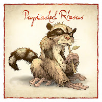
The Pupmasked Rhesus

Last Friday on my Twitch Stream, we did the fourth community draw-along event #DrawTheExtinct where I posted an image from an old block print I made with a few animal photo inspiration prompts and the idea to create an imaginary extinct animal. I worked on my piece live on my Twitch stream while viewers worked at home and then on Monday we shared our finished pieces. 

Here is my finished Pupmasked Rhesus. And below are my steps to create it as well as the community submissions.


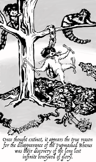
We started with the prompts of my original linocut print from a piece titled 'Extinct' as well as a Rhesus Monkey, a Raccoon, and a Foxhound (though I told people to use other monkeys and dogs as inspiration points if they wished . I named the creature 'The Pupmasked Rhesus'. I told the viewers that they could use any combination of the inspiration prompts––they could make their version as cute and cuddly as a pocket pet stray kitten, as monstrous and deadly as a giant kaiju destroying cities, or anything in between. I also wanted this to be an excuse to get their pencils moving. I invited all skill levels, because I'm a firm believer that you shouldn't have to be good at something or pursuing mastery of it to just simply enjoy the act of it...and art is no exception.


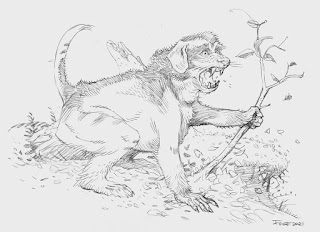
On the Friday stream I started with mechanical pencil on a sheet of copy paper to draw the creature. I outgrew one sheet of paper and taped another piece on to the side so I could finish the raccoon inspired tail. The image here is after I'd scanned my pencils and decided to enlarge the dog-ish muzzle and nose. I also enlarged the entire head after that first adjustment in Photoshop.

I didn't want this version to just be a copy of my old print, so I played more with the head shape trying to pay more attention to my prompts than be sentimental about the old piece.


With the pencils scanned and adjusted, I printed out the image and taped it to the back of a sheet of Strathmore 300 series bristol. Using a lightpad, I was able to see through the surface of the bristol as I inked the Pupmasked Rhesus. I used a Copic Multiliner 0.7 SP pen to ink the art. 

Most of the inking was pretty straight forward other than figuring out how dense to make the black furred areas around the mask, ears and tail stripes. I didn't want to go solid black, but I didn't want to fiddle with too delicate of hatching textures either.


On stream, I not only finished the pencils and inks, but was able to scan the inks and proceeded to the color flats.

Because I was in a rush towards the end of the stream, I didn't want to be precious about my color choices, so I went with obviously wrong invented color choices. Garrish ugliness that offers the benefit of making sure I've colored within the lines.

Below you can again see the final rendered corrected colors with a border and type applied.


But, as this is a community event, I wanted to share all the other entries posted in the Discord (some are works-in-progress I've been told). I awarded a prize and we voted together on a few more (prize winners marked with *) on Monday's Twitch stream and we all enjoyed seeing what each other had done. I hope we get even more participants next month (first Friday!)


AllLegsNoBody


AUTigerCT


Captain Nemo


Cortrah


Dark


Evil Cartoonist*


FlannelWizard


Nate Pride


RedJarOJam*


Serarel*


Tyrie*


VernNYC


Blog Archive