Tuesday, July 27, 2021

Usagi Yojimbo Dragon Bellow Cover 4

I was fortunate enough to be asked by IDW and Stan Sakai to do a run of covers on the new Usagi Yojimbo reprints of 'The Dragon Bellow Conspiracy'. I'll be doing six in total, and for this blogpost I'll be sharing my process for the creation of the cover art for issue #4.

This issue is currently up for pre-order through Diamond with the code JUL210507. Just ask your local comic shop to order it for you, or order it though an online retailer. The issue will be in shops September 29, 2021
To the left you can see the finished cover, but below I'll go through the steps in creating it.
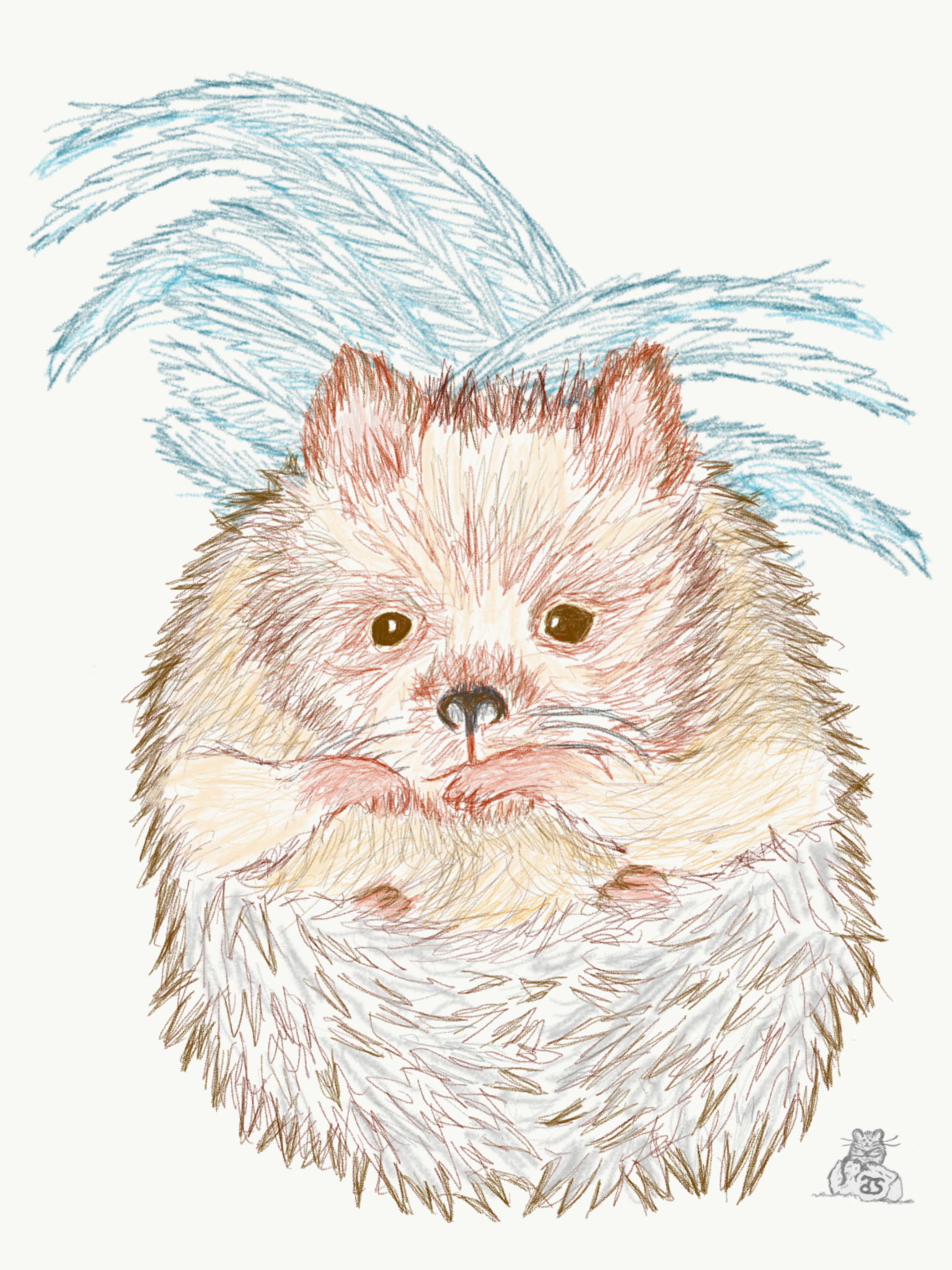

Layout/Pencils
This issue features a really great duel between Gen the Rhinoceros Bounty Hunter and Zato-Ino the blind pig. It's a seminole moment in the Usagi series, so it was my obvious choice for the cover. I'd drawn Gen once before as a commission for a fan, but this was my first time drawing either character for something to be published. I drew each character on separate sheets of copy paper, scanned them in and cobbled together a composition. Photoshop allows me to move, resize, and rotate each character (or limbs & swords if I isolate certain parts of each drawing)––and in this cover that was helpful due to the problem of unwanted visual tangents. I blocked in some quick color to help me see the masses (and to avoid further color/value tangents). and to indicate the lightning and rain.


Inks:
When the above layout was approved by the editor and Stan, I started the inks. First step was to print the layout file onto copy paper (over two sheets that had to be taped together at the seam) and tape that to the back of a sheet of Strathmore 300 bristol. On my Huion lightpad I was able to ink the cover art using the printout as my pencils lines. This way in the end the inked artwork is very crisp and clean with no need to erase pencils lines. I used Copic Multiliner SP pens to ink the art (the 0.7 and 0.3 nibs).

The character inks went relatively quickly other than the hatching on Gen's pants and Zato's robe. While I did ink the lightning with the characters, I flipped over the bristol and inked the rain on the backside of the art. Using a lightbox I was able to see through to the front and make sure I wasn't placing a raindrop through a character's eye and to get the rain dripping off character's faces to follow the right contour. The image on the left digitally simulates what it looks like to see the rain through the bristol on a light pad.


Color Flats:
The inks were approved and I scanned them in to Photoshop to start the coloring process. This first part of coloring digitally is called 'flatting' and is a professional version of coloring inside the lines. Establishing what each area's color is and where it ends. This not only is a color base for the image, but also allows a quick flat color area to be able to quickly isolate to render or make adjustments on.

Setting up the file by scanning the backside of the art to get the rain (which I then have to flip horizontally and align to the character art) and establishing all the color holds for the lightning and wet clothes took most of the time in this step, especially since I'd already established a color palette in my layout to pull from.


Final Colors:
Here again is the finished art (this time sans-logo). To render all of the color I mostly used the Dodge and Burn tools (Photoshop tools based on real photography techniques for purposely over or under exposing film as it develops). Burn is do darken and Dodge is to lighten. I use a stock Photoshop textured brush as I add shadows and highlights with these tools so the work looks a little more organic and less digital.

It's an honor to be asked by Stan to do these covers and to get his approvals as I work through each cover.


Usagi Yojimbo: The Dragon Bellow Conspiracy #4 is out in stores September 29th


Tuesday, July 20, 2021

Gnome Pollinator

 Last year when I had some inked commission slots open, a fan asked for a Gnome gathering flowers while interacting with the bees who were drawn to the smell of the pollen.

I was thrilled to get to play in the world of Gnomes again. Years ago in 2017 I participated in a month-long draw challenge called Gnomevember (You can see the several posts about it here: 

Today's post is about the process of creating the art you see to the left.


But, before we do, I wanted to let all of you know that you can purchase my Gnomevember art (including the piece I'm showing today) through my Society6 page: 

https://society6.com/davidpetersen

There you can get framed prints, pillows, greeting cards, phone cases, totebags, coffee mugs, comforters, clocks, credenzas and more––all with my gnome art.


To start this Gnome commission, I drew out the gnome, basket, and bees all separately on copy paper. Then I scanned them into Photoshop to resize and assemble them into a single working composition. I tinted the gnome and the basket pencil art different colors to help me see them and make sense of which lines belonged to which objects. 

I then did a quick digital color blocking of the forms I'd already drawn, as well as painting in the flowers, spots for a few more bees, and notes for the background. I printed out this digital workup to move on to the next stage.


I physically inked the piece on a Hunion light pad. By taping the above printout to the back of a sheet of Strathmore 300 series bristol, I'm able to see the printout as a guide on the lightpad as I ink. For the inks themselves, I used Copic SP Multiliners (the 0.7 & 0.3 nibs mainly)

Some of the inking was tricky because I only had my rough digital painting to go by––and it's been long enough I don't remember if I did any additional penciling on things like the flowers or the bee on the rock, or if I just inked those with no guide.


The fan who commissioned me was sent the original inks for the piece. But, before Julia shipped it off, I'd scanned the inks to do a digital color job for my own purposes.

The first step of which is to lay in flat color for each form. It's a professional version of color-in-the-lines. At this stage I also established all my color holds (areas where I want the inkwork to be a color other than black) like the wings of the bees or the background flowers.


The last step was to do the final rendering of the colors. I used the Dodge and Burn tools in Photoshop to do this, adding highlights and shadows and texture where necessary to make the image feel complete.

As I said above, this piece is available as a print (and several other forms) on my Society 6 Gnome page:


Tuesday, July 13, 2021

Owlhen Caregiver 'Bilbin' Papercraft

With the special one-shot issue Mouse Guard: The Owlhen Caregiver coming out tomorrow I've created a new papercraft mouse called 'Bilbin'.

It's a free download from my website so that you and your friends & family can print out and craft together your own Owlhen Caregiver (as well as several other Guardmice):

https://www.mouse-guard.net/papercraft

Below you can see photos of the figure who appears in tomorrow's issue as well as influenced by the artwork of golden age illustrator Ivan Bilbin.


Tuesday, July 6, 2021

The Pointed Hedgecock


Last Friday on my Twitch Stream, we did the seventh community draw-along event #DrawTheExtinct where I posted an image from an old block print I made with a few animal photo inspiration prompts and the idea to create an imaginary extinct animal. I worked on my piece live on my Twitch stream while viewers worked at home and then on Monday we shared our finished pieces. 

Here is my finished Pointed Hedgecock. And below are my steps to create it as well as the community submissions.


We started with the prompts of my original 2000's era linocut print titled 'Extinct' as well as a Spitz (American Eskimo) dog, a Hedgehog, & a Rooster. I named the creature the Pointed Hedgecock (with the German word 'Spitz' referring to 'pointed'.)

I told the viewers that they could use any combination of the inspiration prompts––they could make their version as cute and cuddly as a pocket pet stray kitten, as monstrous and deadly as a giant kaiju destroying cities, or anything in between. I also wanted this to be an excuse to get their pencils moving. I invited all skill levels, because I'm a firm believer that you shouldn't have to be good at something or pursuing mastery of it to just simply enjoy the act of it...and art is no exception.


On the Friday stream I started drawing with mechanical pencil on a sheet of copy paper to try and reimagine the beast. I used the shape overall body shape of the Spitz, but went for a mode hedgehog face and back spines and used the comb of the rooster for the ears while making the Spitz's normally curved poofy tail a long rooster tail feather plume. I scanned in my pencil drawing, made a few quick proportion corrections, and then blocked in the color idea of the rooster's feathers as a guide. This simple color I thought would help me see where I'd need to ink delineation notes in the next step.


After I was happy enough with my above design, I printed that piece out on copy paper and taped it to the back of a sheet of Strathmore 300 series bristol. Using a lightpad, I was able to see through the surface of the bristol as I inked the Pointed Hedgecock. I used a Copic Multiliner 0.7 SP pen to ink the art. I was still streaming this portion on Twitch, though as my end of stream time was coming up, I was nervous I wouldn't finish in time. Turned out, I went a little over-time to get the inks completely finished before I said goodbye to everyone watching and offered encouragement as they worked on their pieces over the weekend. 

Off stream I did a few white out corrections to the inks and then scanned the artwork into Photoshop to prep it for final color. First thing was to drop it into the template I have for #DrawTheExtinct pieces with the border, background, and a base shadow already established. Then I started drawing in flat colors. This part of coloring (called flatting) is just a professional digital version of coloring-in-the-lines to establish the color areas.

My color choices were already established from my color blocking back in the layout/pencils stage which were based on the rooster photos I used for reference––but as is my way, most of my greens and blues are a bit muted and warmer than real-life.


Below you can again see the final rendered colors with a border and type applied I also moved the eye a little bit closer to the nose in this final version. 


But, as this is a community event, I wanted to share all the other entries posted in the Discord. I awarded a prize and we voted together on a few more (prize winners marked with *) on Monday's Twitch stream and we all enjoyed seeing what each other had done. I hope we get even more participants next month (first Friday!)

Capt.Nemo


Brittney McInnis (WIP)


Cortrah (WIP)


Dark (WIP)


Doombot


Evil Cartoonist*

iidamariaart (WIP)

KFlaggArt*


Nathan Pride


Nuvalo*


Pendrake


RedJarOJam


Serarel*


ShnookerDoodle


Sleepless Ninja


Tyrie*


VernNYC


veryblueberry2


Blog Archive