Tuesday, May 30, 2023

House of Mystery: The War: PAINTOVER EDITS

Back in 2008 I was asked to draw a story for Bill Willingham for DC's House of Mystery. It was a short 5 pager called 'The War' about an eternal struggle between the birds and the cats (an ultimately the bees too) in an idealized overgrown garden.

This was only the second time I'd been hired to draw pages for a comic that wasn't Mouse Guard. I received a typed script from Bill,  and I had to submit thumbnails (see to the left) and pencils (below) before getting to inks and colors.

In 2010 I shared the process for a single page of the story on this blog: https://davidpetersen.blogspot.com/2010/10/legends-at-nycc-plan-for-this-weekend.html

Recently, in digging through my hard drive for Blog material, I came across the pages (and prelim materials) again. I briefly thought of sharing them before realizing I kinda already had, when it hit me how different the roughs/pencils were from the final art.

I didn't like what I saw. Every artist is more critical of their own work than most everyone else, and older work can intensify the flaw-view. But, I tried to put that aside because I thought to problems weren't so much "Oh, I could draw that much better now", but rather 'I lost clarity and focus in each panel that was present in the earlier stages.

This lead to present me doing critique paintovers of my own pages. I limited myself to  fixing the compositions that were already there rather than imply a redrawing or completely different composition or panel arrangement. Below you can see the original colored page on the left of each image and the paintover on the right.

Page 1: In panel one and three I wanted to increase the scale of things like the wall, the gate, the roses, bushes, and the blades of grass. Depth and focus was also a concern on these pages, and panel one needed more light streaming in and for the tree not to be a silhouette.

For panel two I tried pushing the light back and the shadow closer and vice-versa. I think I prefer the light in the distance, But I also prefer how I upscaled the flowers and plant growth in the darker background version.

Page 2: Scaling up the forms and leaving more open space for color (in the roses, rock, and stone wall) makes them much more readable. 

I also wanted to lighten backgrounds around the cat and bird characters to make them more readable. I played with scale of the bird and the splash in panel three. The last panel is still a mess, but I do think pushing light in the background and offsetting some darker forms like the trees and turtle help make the panel less flat than it was.

Page 3: I opened up the backgrounds around the bird in panels one and four (more like the roughts/pencils) and plated with scaling up some forms again. Panel 2 needed to be cropped in and more birds added. Here I did redraw a bit of the cat's face & pose, but it was more about showing that the emotion could have been pushed more.

Panel three needed depth. The only thing selling it in the original was scale. I for some reason didn't draw leaves (but instead cross-hatched a mass) which made it harder to push the birds inside a shaded canopy looking down onto the cats walking the path. Here I corrected with leaf forms and a better color/value scheme.

Page 4: Cropped in tighter on the cat in panel one (and did the face/pose redraw like on the last page). Panel two needed more depth with light but also with more varied scales of cats coming toward us. Panel three got a better bird angle (so it looks like it's flying in rather than hovering), as well as actual tree leaves and more bees. Panel four was about pushing the depth by scaling back and lightening the hive, and then rotating the bird for a better fall and adding more bees. 

The last panel's depth was similar to before: more open forms of the roses, bushes, and wall--then a better lighting scheme. The old man and bench needed to be less front-on. It looked awkward. So did the floating book on his lap. And I liked the open lenses in the pencils, so I lightened them up. More bees and bigger ivy for the foreground.


Page 5: Better shadows on the man in panel one coupled with a lighter and less busy grassy area made a real difference in panel one. For panel two I did the normal to open up forms and depth––I also fixed his leg pose to give him more of a shuffle, and widened his cane.

Panel three and four saw the bird get upscaled, with better value compositions and lighting in each. Lighting plated a big part of fixing the last panels too. Pushing the depth (which also draws the reader's eye focus through the panel), enlarging the tree form, and adding bees finished the job.

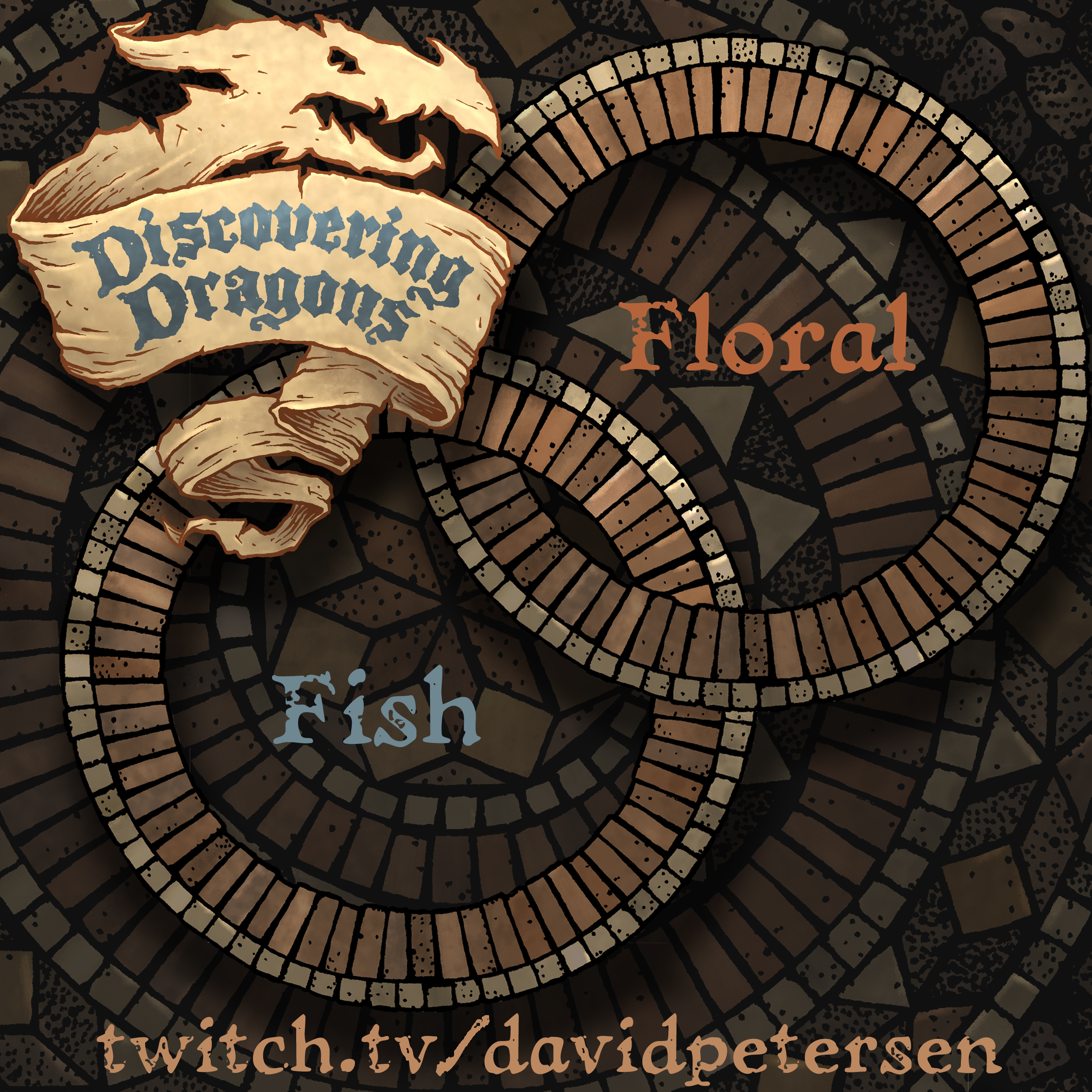
I streamed these paintovers on my Twitch Stream: twitch.tv/davidpetersen and did so to show how I see growth in my own work, but also fixes and techniques for finding and solving what's wrong with a page.

If you'd like to see me do this kind of critique again, come to my twitch stream––I may do it again on another freelance short story I drew...


Tuesday, May 23, 2023

Stained Glass

Ironically––this post about a church's stained glass windows was already scheduled before last week's post about my childhood church burning down and the lost beauty inside it...

Last October for our wedding anniversary, I drew the stained glass window Julia and I were married under in 2003.
(19 years and counting!)

I gave Julia the original inked artwork as a gift, but decided to color it just for fun (though I have been tempted to make stickers of it).

Below is a few steps of process for (re)creating the art for her.


Here's a photo of us that day and a better look at the window. We were married in the First Methodist Church in Ypsilanti, MI (where we both went to EMU). 

When looking for a church to get married in, Julia and I attended one of their services to see if the Pastor & setting felt right to us. I think the woodwork and stained glass are a big part of why we opted for it.

Most of the photos I had of the window left the lead-work blown out. But I was able to find one from that day and a few more online that gave me a clear view of each section.

I printed out the clearest version I had of that photo and on my light pad I placed the printout and covered it with a sheet of Strathmore 300 bristol. 

Using a Copic Multiliner SP pen or two (the 0.7 & 0.3 nibs) I traced over each bit of the design--sometimes adding in little broken & repaired bits for character.

I did miss a few of the lead lines, but I drew them in digitally when I was coloring the file.


With the inks scanned (and the original gifted to Julia as we had a nice dinner in together) I eventually started the coloring process called 'flatting'. It's a professional version of coloring-in-the-lines basically. And I used the eyedropper tool in Photoshop to get the colors as close to the real window as possible (though constantly making little adjustments for myself artistically)


For the final colors below, I added a bit of texture and tinted each individual piece of glass just a bit one way or the other compared to its neighbor so they all looked like separate pieces. I also added a color hold over all the lead to suggest light poring through the glass and blowing out the darkest darks to our eyes.

Would you want a 4" sticker/decal of this window? Let me know––enough people ask and I'll make it happen.


Tuesday, May 16, 2023

Oak Park Burned Down

My childhood church of Oak Park in Flint, MI burned down this month. It had closed as the church I knew a long time ago, but had re-opened to a private group, then closed again, then re-opened as a wedding venue. From what I've seen and read, it has been closed since 2015. However, due to accidental arson, it will never reopen, and none of the woodwork, stained glass, or furniture can ever be salvaged or re-purposed.

My dad, who also grew up in that church, was the one who emailed to let us know and he took the photo you see to the left of the damage. His heart hurt at the loss and shared how painful it was to see it in that condition after the lifetime of memories associated with it as well as the structure itself.

I wrote him back with a similar feeling of sorrow over what was lost. There were two kinds of beauty in that place––One kind of beauty is simply made of memories; the fellowship over the years with our church family, potluck meals together, the experiences of groups getting together to repaint, repair, or clean areas that had fallen into disrepair, good sermons, bad sermons, Christmas pageant rehearsals, the Wolfe family bringing popcorn balls to all the children at Christmas Eve service, Sunrise services at the crack of dawn as the light broke through the eastern stained glass window, hiding from my Sunday School teacher to avoid class for a week, lighting the candles as an acolyte for over a decade, Silent Night being sung acapella each Christmas Eve as we illuminated the entire sanctuary with just candles. I told my Dad that these these things were always meant to be temporary—never meant to last other than in our memory.

The other kind of beauty is something that could have been preserved indefinitely, something this fire did destroy:  the artistic beauty of the architecture. In my time at that church I think I explored every inch of the building that was accessible (and even a few spots that really weren't). From the top of the bell tower into the second basement to the pipe loft for the organ (accessible by catwalk)––I knew that building.

And I really appreciated how beautiful the trimmings were. We had several ornate large illustrative stained glass windows, one of the largest functional pipe organs in the area, murals and stenciled wall painting by Elmer 'Bud' Peterson (no relation), and carved woodwork everywhere: the wall paneling, the communion rail, the pulpit and lectern, the alter, the vents for the organ––even our speakers & hymn number plaques!

When I was in college at Mott, my grandfather told me at a family dinner that he had all of the stained glass fragments as well as two round windows still in-tact from the 1960's era remodel where one of the large windows and several smaller ones were removed to add on an addition (which I knew as the library, classrooms, bathrooms, office, chapel, and nursery. He wanted me to have those bits and to put them to good use. My Mom, who worked in the office at the church at the time, pointed out that he shouldn't do that and that we didn't own those––the Church did.

While Commandment #8 is Thou Shalt Not Steal––Thank GOD my Grandfather did and that I assisted him in the crime. Because those two round windows aren't burned in the carcass over on the corner of Saginaw & Hamilton in Flint, MI. Their beauty lives on in our dining room.

When I started doing my own stained glass work after college, I incorporated some of the fragments into portraits I made for my Dad, Mom, & Grandparents. Sounds weird to say it, but I wish we'd stolen a lot more from that church.
Before writing my Dad back, to tell him all of this I went through the family photo albums to glean any more good memories from Oak Park that I could find. Funnily enough there were very few photos of events at the church, or of the people––that church family.

Most of the photos we ever bothered to take were of that second kind of beauty––the kind that is meant to last forever.


Below are some of those photos including paraments my Mom made for the pulpit and lectern, the rose on the alter the Sunday after my birth, and my Dad decorating the Christmas tree we donated from our back yard to the church that year


Tuesday, May 9, 2023

Floral Fish Dragon

 Last Friday on my Twitch Stream, we did the #DiscoveringDragons Community-Draw-Along! It's a fun event where I welcome all skill levels to push their pencils (or whatever tools they use to make art).

I worked on my piece live on my Twitch stream while viewers worked at home and then on Monday we shared our finished pieces.

Here is my finished colored Dragon. And below are my steps to create it as well as the community submissions.

For #DiscoveringDragons, I post two or three prompt words for everyone to make into a dragon. It's a nice framework for artists of any skill level to focus some time on an 'assignment' to shake the rust off or get the pencil moving again––all while also being loose enough that there's plenty of room for individual expression and interpretation.

This month the prompt was only two words: Fish & Floral.

I opened a few tabs of google image searches of Fish (specifically beta fish) dragons and flowers (specifically Marigolds). 


I started with a pencil drawing on copy paper starting with the head of the fish. I played with varying degrees of opened mouth, then focused on giving it fins or swoopy, draped flower petals that swirled more like a garment's sleeves. 

As I said above, I looked at Marigolds for the flower reference. For the arms, I wanted this to seem more aquatic, so they are a vestigial level of weakness––in fact the next row of limbs back are more like floral fins with arms. I ran out of paper before I added the single horn, so I drew it off to the side of the paper, scanned it, and assembled what you see here in Photoshop.

I then printed it out so I could do the tighter pencil drawing you see to the left on top of it on a light pad.


I taped it to the back of a sheet of Strathmore 300 series bristol. Using a lightpad, I was able to see through the surface of the bristol as I inked the dragon. I used Copic Multiliner 0.7 SP pen to ink the art. 

Line quality and texture was my way of making sure the different parts of the dragon could be read apart from one another. Also varying the density of those textures helped sell the depth & distance.

I wasn't able to finish the inks before my stream ended and wished the viewers all luck with their pieces and told them we'd take a look at everyone's work on Monday.

After some dinner, I came back up to the studio and finished inking the piece as I listed to a true crime podcast. Once the inks were finished and scanned, I let the podcast play and started the coloring process. That first step is to flat in the colors––basically professional coloring-in-the-lines.

Knowing the Marigold reference, the flower petals were that dark red orange. I liked the idea of making the fishy bits echo the colors of a Marigold's stem. 

I added color holds (areas where I want the black inkwork to be a painted color) to the flame & the eye.


 For the final colors and all the highlights, shading, and texture I used the dodge and burn tools with a stock photoshop texture brush. Below you can again see the final rendered dragon.


But, as this is a community event, I wanted to share all the other entries posted in the Discord.

MississippiWoodNymph


UncleErnie88


redSkwrl


jodudeit


Wicked Goblin King


Doombot2015


pendrake


towrygames


Capt.Nemo


Kelsey - 10 y/o


Sydney - 12 y/o


inkypencil


Nuvalo


Nate Pride


Tyberius

Tuesday, May 2, 2023

Mouse in a storm

Earlier this year I was contacted by a longtime fan Anthony. He and his friend David had been placing orders in my online store for a while, sending the items to each other as secret gifts. Anthony reached out because his longtime friend since art school, David, was dying of cancer. He wanted to commission a piece for David that he could receive in hospice to help brighten his final days.

Here is the commission all colored, but I will go through the process for this piece in today's post.


The emotional bond, not just of two long time friends, but brothers-in-art, struck a chord with me. I thought of those brothers of mine, and while we are not family, how much we mean to each other. David was going to be leaving behind a wife and young children too. It was an emotional circumstance to try and create a piece of art for.

I drew a lone Guardmouse. Because David's treatment options were all but exhausted, he opted to spend his remaining days at home, with his family. The Guardmouse has his sword sheathed. His body faces one direction, but he looks onward in the other––torn between past and future. Around him the crunch autumn leaves are coming off their branches, smaller twigs are breaking off and blowing past him in the cold winter wind that is inevitably coming. Yet, the Guardmouse stands and faces it.

Unlike many of my compositions where I draw on multiple sheets of copy paper and then combine them all, this time I drew it all in one shot. I taped that drawing to the back of a sheet of Strathmore 300 series bristol and inked it on a light pad. I used Copic Multiliner SP pens (the 0.7 & 0.3 nibs).

I'd left most of the groundcover and debris as loose scribble in the pencil drawing––inking those kinds of things in on the fly is a zen place for me, where I can zone out and just think about creating depth and pattern with densities of inkwork.


The original inks were sent off to David, and I received a touching letter back from him in return as well as some examples of his drawings.

I started working on a color version from the scan I took before mailing off the original. 

This step it like professional coloring-in-the-lines, and most of the color choices were based on the natural world, other than the mouse's fur (which I inherently kew should be a light tone) and the cloak, which I chose to compliment the orange autumn leaves.

I finished the color by rendering it with the dodge and burn tools in Photoshop (as well as a stock textured brush). 

I emailed the colored piece to David––but he had already passed away. His widow wrote back a very lovely response. I wish their family the best in their loss, and that includes David's art-brother Anthony too.

Rest in Peace, David Houry.

Blog Archive