Tuesday, September 28, 2021

Usagi Yojimbo Dragon Bellow #6 Cover

I was fortunate enough to be asked by IDW and Stan Sakai to do a run of covers on the new Usagi Yojimbo reprints of 'The Dragon Bellow Conspiracy'. I'll be doing six in total for Dragon Bellow, and for this blogpost I'll be sharing my process for the creation of the cover art for issue #6.

This issue is currently up for pre-order through Diamond with the code SEP210495. Just ask your local comic shop to order it for you, or order it though an online retailer. The issue will be in shops November 17, 2021

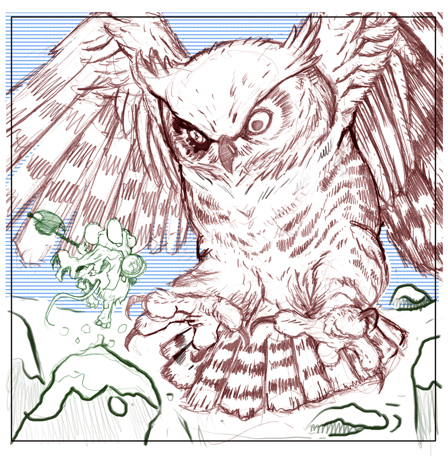
To the left you can see the finished cover, but below I'll go through the steps in creating it.


Layout/Pencils
This issue almost feels like three separate epilogues for the previous five issues. So, without a concise story that spans the whole issue, I opted for a moment that felt like a nice 'the end' for most of the action the series has had so far. In the issue, Stan drew a scene where Usagi & Tomoe sit with Lord Noriyuki in a room with painted screen panels. I drew the characters all with sake cups (as we see Lord Noriyuki order sake for his guests) but when Stan saw the little bubbles I had over each cup in my piece, he was concerned because the Lord is underage and wouldn't be drinking. We settled that with no bubbles or sake bottle, they could very well be all drinking tea.


To get the room layout, I used a model I found in the Goggle Sketchup warehouse and rotated it until is suited my needs. I dropped it into my Photoshop file for this cover and resized and cropped it until it fit with my characters. I then printed out the cropped model image and on a lightpad drew the lines in pencil on another sheet of paper. This helped me make some subtle changes and get the details I needed while still being able to draw the screen panels. I then blocked in colors for the above layout so that Stan and the editor could get the best idea of what I was going after for the cover.


Inks:
When the layout was approved by the editor and Stan, I started the inks. First step was to print the layout file onto copy paper (over two sheets that had to be taped together at the seam) and tape that to the back of a sheet of Strathmore 300 bristol. On my Huion lightpad I was able to ink the cover art using the printout as my pencils lines. This way in the end the inked artwork is very crisp and clean with no need to erase pencils lines. I used Copic Multiliner SP pens to ink the art (the 0.7 and 0.3 nibs).

I feel like I spent most of the time on the ceiling details, and in trying to capture the look of a printed/painted 2D image on the screens in ink.


Color Flats:

The inks were approved and I scanned them in to Photoshop to start the coloring process. This first part of coloring digitally is called 'flatting' and is a professional version of coloring inside the lines. Establishing what each area's color is and where it ends. This not only is a color base for the image, but also allows a quick flat color area to be able to quickly isolate to render or make adjustments on.

Most of the color choices had been made in the layout stage, but I made changes to the value structure as I worked. In this step I also added color holds (areas where I want the lineart to be a color other than black) to the background and a lighter one on the screen's landscape paintings.


Final Colors:
Here again is the finished art (this time sans-logo). I made significant changes to the tones from the flats by adjusting color balance, brightness, & contrast. To render all of the color I mostly used the Dodge and Burn tools (Photoshop tools based on real photography techniques for purposely over or under exposing film as it develops). Burn is do darken and Dodge is to lighten. I use a stock Photoshop textured brush as I add shadows and highlights with these tools so the work looks a little more organic and less digital.

It was an honor to be asked by Stan to do these covers and to get his approvals as I work through each cover...but don't worry I'll be back to Usagi covers very soon...

Usagi Yojimbo: The Dragon Bellow Conspiracy #6 is out in stores November 17, 2021

Tuesday, September 21, 2021

Flintrust Commission/Sketchbook Piece

Last year and earlier this year I did an online event called OnlineCon where I opened up a list for inked commissions. It's not often that I offer fully inked commissions like this any more, but I was open to the idea of making fans happy in troubled times, supplement my income with conventions responsibly canceled, and to generate material for an upcoming Mouse Guard sketchbook.

To the left you can see one of those pieces finished and colored ready for a page in that sketchbook––and in this blogpost I'll break down the process to get there.

The request was Saxon, Kenzie, and Lieam patrolling a Mouse town or village. I decided as I started to sketch out buildings to make it Flintrust, a town on the map, but has only been seen so-far in the Mouse Guard story 'The Owlhen Caregiver' (You can see a blogpost about the architectural inspiration for the town here: https://davidpetersen.blogspot.com/2020/09/owlhen-caregiver-reading.html
 I drew the architecture here on one sheet of copy paper, and then the mice separately on another (so I could play with their positioning in the final lauout). A little bit of repeated flint arrowhead pageantry and some digital text, and the layout was done.


I printed out the above layout on copy paper and taped it to the back of a sheet of Strathmore 300 series bristol. On my Huion lightpad I can see through the surface of the bristol down to the printout to use as a guide as I ink. I used Copic Multiliner SP pens (the 0.7 & 0.3 nibs). There was a lot of detail to try and make sure didn't blend together in the architecture. Playing with textures and density of texture helped make the space clear so the image still reads in the end.

When I had these inks finished, Julia shipped off the original art to the its new owner.

Before the art was shipped off though, I got a high-res scan of it so I could start the coloring process for this piece. That first step is called 'flatting' which is basically a professional task of coloring-in-the-lines and establishing what color area each thing in the piece is. The final colors can be altered, but it's good to establish the distinction between the beams, buildings, flags, doors, and mice.

I also took this step to establish color holds (areas where I want the black linework to be a color other than black) on everything from the midground back, this was my way of helping to sell a depth of focus.


Here are the final colors all rendered and textured. I do most of this work only using two tools in Photoshop: Dodge and Burn. These are tools that date back to when Photoshop was a photo retouching tool and emulate part of the development process to over and under expose areas––ie: make areas darker and lighter. So with a stock textured brush I add shadows and highlights.This piece will eventually be collected with many more in an upcoming sketchbook I plan to release in early/mid 2022.

Tuesday, September 14, 2021

Celanawe Vs One Eyed Owl Commission/Sketchbook Piece

 Last year and earlier this year I did an online event called OnlineCon where I opened up a list for inked commissions. It's not often that I offer fully inked commissions like this any more, but I was open to the idea of making fans happy in troubled times, supplement my income with conventions responsibly canceled, and to generate material for an upcoming Mouse Guard sketchbook.

To the left you can see one of those pieces finished and colored ready for a page in that sketchbook––and in this blogpost I'll break down the process to get there.


The request was to recreate the epic battle between Celanawe and the One-Eyed Owl from Winter 1152. The fan commissioning the piece asked that the owl be partially in flight. I drew the owl and Celanawe each separately on sheets of copy paper and then scanned them. With each drawing digitally tinted a different color I was able to easily see each figure as I moved, rotated, and resized them to create a composition. I digitally drew in some quick snow blanketed ground and rocks and toyed with the idea of horizontal lines to tone the background.


I printed out the above layout on copy paper and taped it to the back of a sheet of Strathmore 300 series bristol. On my Huion lightpad I can see through the surface of the bristol down to the printout to use as a guide as I ink. I used Copic Multiliner SP pens (the 0.7 & 0.3 nibs). I wanted the owl to have the most density of ink, while fading that off in the tail feathers as the snow is kicked up. I decided not to add the horizontal lines to the sky because I was worried it would compete with the owl and the overall composition..

When I had these inks finished, Julia shipped off the original art to the its new owner.

Before the art was shipped off though, I got a high-res scan of it so I could start the coloring process for this piece. That first step is called 'flatting' which is basically a professional task of coloring-in-the-lines and establishing what color area each thing in the piece is. The final color choices don't matter so much here, and to take the pressure off, I went with some garish choices just to get this step done. 

I also took this step to establish color holds (areas where I want the black linework to be a color other than black) on all of the snow and the wounded eye.


Here are the final colors all rendered and textured. I do most of this work only using two tools in Photoshop: Dodge and Burn. These are tools that date back to when Photoshop was a photo retouching tool and emulate part of the development process to over and under expose areas––ie: make areas darker and lighter. So with a stock textured brush I add shadows and highlights.This piece will eventually be collected with many more in an upcoming sketchbook I plan to release in early/mid 2022.

Tuesday, September 7, 2021

The Bearded Puemel

Last Friday on my Twitch Stream, we did the eighth community draw-along event #DrawTheExtinct where I posted an image from an old block print I made with a few animal photo inspiration prompts and the idea to create an imaginary extinct animal. I worked on my piece live on my Twitch stream while viewers worked at home and then on Monday we shared our finished pieces. 

Here is my finished Bearded Puemel. And below are my steps to create it as well as the community submissions.


We started with the prompts of my original 2000's era linocut print titled 'Extinct' as well as a Camel, a Puma, & a Goat.

I told the viewers that they could use any combination of the inspiration prompts––they could make their version as cute and cuddly as a pocket pet stray kitten, as monstrous and deadly as a giant kaiju destroying cities, or anything in between. I also wanted this to be an excuse to get their pencils moving. I invited all skill levels, because I'm a firm believer that you shouldn't have to be good at something or pursuing mastery of it to just simply enjoy the act of it...and art is no exception.


On the Friday stream I started drawing with mechanical pencil on a sheet of copy paper to try and reimagine the beast. I knew I wanted to keep it low to the ground so I started with the posture of a reclined camel, but then decided to go with puma legs instead, thinking the humps and face were communicating camel enough. I scanned it and did come digital manipulation to it in Photoshop to make the neck longer and upscale the head. I added a little tone to the overall silhouette to make sure it read as a shape the way I wanted.


After I was happy enough with my above design, I printed that piece out on copy paper and taped it to the back of a sheet of Strathmore 300 series bristol. Using a lightpad, I was able to see through the surface of the bristol as I inked the Bearded Puemel. I used a Copic Multiliner 0.7 SP pen to ink the art. I was still streaming this portion on Twitch, though as my end of stream time was coming up, I knew I wasn't going to finish, so after I said goodbye to everyone watching and offered encouragement as they worked on their pieces over the weekend, I finished inking the humps off stream.

Once Julia and I had some dinner, I scanned the artwork into Photoshop to prep it for final color. First thing was to drop it into the template I have for #DrawTheExtinct pieces with the border & background already established. Then I started drawing in flat colors. This part of coloring (called flatting) is just a professional digital version of coloring-in-the-lines to establish the color areas.

These initial color choices were partly based on the blue-grey tones of the lino cut and I thought I'd use the goats tones for this fantastic beast. I added a color hold to the pupil of the ye so that I could play with it's color as well as to be able to render a highlight on it in the next step. 


Below you can again see the final rendered colors (where I brought in more warmth and a transition shift from the puma legs to the goat/camel head) with a border and type applied in this final version. 


But, as this is a community event, I wanted to share all the other entries posted in the Discord. I awarded a prize and we voted together on a few more (prize winners marked with *) on Monday's Twitch stream and we all enjoyed seeing what each other had done. I hope we get even more participants next month (first Friday!)


88UncleErnie*


AmyLeBaron


Bentu Estu*


Capt.Nemo


CjDj


CosmicBard


DePuggo


Dïne*


Doombot 2015


EvilCartoonist


Gania


Itunpsicala


MarlieOnDiscord


Naereniel


Nate Pride


NekoVen


Nuvalo*


PaperbackRhino


Pauline*


Pendrake


RedJarOJam*


Sleepless Ninja


Steve Sketches

Tyberius


Tyrie


VernNYC


VeryBlueberry


XHunter


YojMia


Бельфегор


Blog Archive