Tuesday, April 26, 2022

Bardrick-1st of the Black Axe Wielders

For a new 10 piece print set, I illustrated all of the past wielders of the Black Axe from Bardrick to Celanawe. I'd shown and listed the wielders in the Black Axe book--but they were only ever visualized as embroidery details on the Adana Tapestry––and I wanted to give them a more solid design existence. The set of ten 4.75" x 4.75" prints is available for sale in my online store and comes in a vellum envelope:
https://mouseguard.bigcartel.com/product/wielders-of-the-black-axe-print-set

To the left you can see the finished art for the Bardrick, First of the Black Axes print in the set. Below I'm going to go through the process to create the art.

Layout:
I started with a pencil drawing of Bardrick himself on copy paper, and then added another sheet of paper on top of it on a light box for the snake skeleton environment. I scanned both sheets into Photoshop (tinted them to make viewing them easier) and added some basic color blocking as well as a quick medieval tent.
With Bardrick being the fist I wanted him to be battle worn, so he has a tattered cloak which is stitched together in places. The helmet is the one I'd shown in the illuminated illustrations from Fall. And since one of the Black Axe's first mythic deeds was to have 'slain the five serpents who surrounded all that was' I though the snake bones as well as a tent that I thought implied a arduous campaign against the serpents.
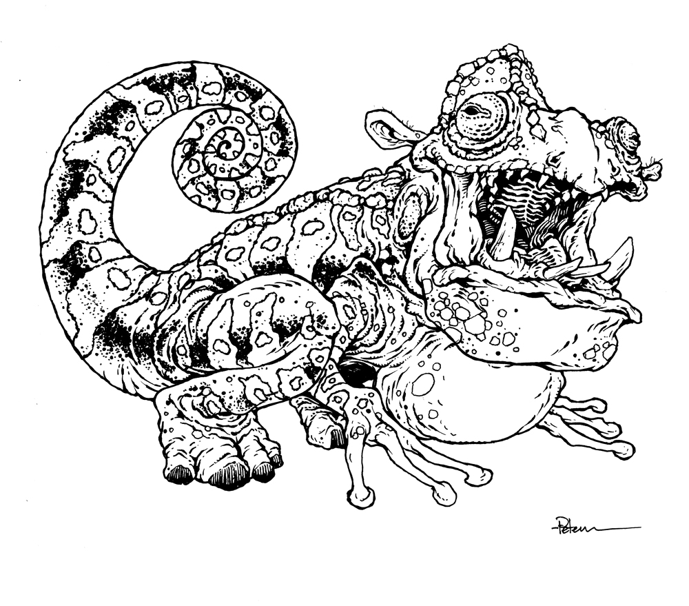
Inks:
I printed out the above layout when I was happy with the arrangement and taped that printout to the back of a sheet of Strathmore 300 series bristol. On my Huion Lightpad I'm able to see through the bristol to the the printout to use it as a guide to ink from. I ink with Copic Multiliner SP pens, and I used the 0.7 & 0.3 nibs for this piece.

I had to be careful with the density of the ground covering so that the snake skeleton could still be seen. I also made sure I left a little white gap between the background details and Bardrick--this helps me coloring in the next step, but also gives some visual separation in the planes of depth. 

Color Flats:
When the inks were done, I scanned the art and brought it back into Photoshop to start the coloring process. This is the step where I 'm basically just filling in each area with flat color. In this step I also establish the color holds, areas where I want the ink work to be a color other than black. In this piece that consists of all the tent lineart and the numeral '1'. That 1 is a runic numbering I stole from artist Jeremy Treece which is a large 1 with a smaller roman numerals coming off the right side--in this case, just another 1.

Final Colors:
The final colors were rendered by using the dodge and burn tools in Photoshop (and a textured brush) to add shadows, highlights, and textures. I select areas and play with the color balance to shift colors in some areas.

The entire 10 piece print set is available in my online store: https://mouseguard.bigcartel.com/product/wielders-of-the-black-axe-print-set

Tuesday, April 19, 2022

Mouse Guard Flower Spot Illo Process

This year I've released a new Mouse Guard sketchbook (past sketchbooks are available in my online store: mouseguard.bigcartel.com) and many of the colored inked commissions I've been sharing on this blog will are collected there. But, I also wanted to generate some pieces of my own. And some of those pieces will need to be smaller illustrations  for things like the inside front and back covers.

To the left you can see one of those pieces finished and colored that has a place in that sketchbook––and in this blogpost I'll break down the process to get there.


We have a flowering Rose of Sharon bush that lines our back yard, and in the summer it is in full bloom with bees stopping by each flower like it was visiting an old neighbor. The Rose of Sharon overhands our deck a bit, and I took a few photos with my phone thinking they'd make for good Mouse Guard illustration inspiration. 

I drew the flower and bee in one go on copy paper, and then on another sheet overlyaying it on a light pad, I drew in the mouse gently holding the petals open and watching. When both were scanned I blocked in some color to help me see what each form was (as well as to add some more leaves I felt the composition needed.


I printed out the above layout on copy paper and taped it to the back of a sheet of Strathmore 300 series bristol. On my Huion lightpad I can see through the surface of the bristol down to the printout to use as a guide as I ink. I used Copic Multiliner SP pens (the 0.7 & 0.3 nibs). 

Most of the focus was on getting the details and textures of the flower and leaves right. I added a stippled trail of pollen (almost like the fairy godmother's magic trails in Disney's Cinderella) that I planned to exploit with color in a later step.
 I started the coloring process for this piece by scanning in the inks and then laying in flat colors. The step is called 'flatting'  for that reason––it's basically a professional task of coloring-in-the-lines and establishing what color area each thing in the piece is. I used variations of the colors from my layout combined with my real life reference in the backyard.

I also took this step to establish a few color holds (areas where I want the black linework to be a color other than black) on the lines that transition the tones in color on the flower, the bee's wings, and that trail of pollen magic.

Here are the final colors all rendered and textured. I do most of this work only using two tools in Photoshop: Dodge and Burn. These are tools that date back to when Photoshop was a photo retouching tool and emulate part of the development process to over and under expose areas––ie: make areas darker and lighter. So with a stock textured brush I add shadows and highlights.

This piece is in the new Mouse Guard sketchbook: Alone Together available now in my online store: mouseguard.bigcartel.com .

Tuesday, April 12, 2022

Usagi Yojimbo: Lone Goat & Kid #6


I was fortunate enough to be asked by IDW and Stan Sakai to do a run of covers on the new Usagi Yojimbo reprints of short story issues that will be collectively called 'Lone Goat and Kid'. I've done six in total, and for this blogpost I'll be sharing my process for the creation of the cover art for issue #6.

This issue is currently up for pre-order through Diamond with the code APR221602. Just ask your local comic shop to order it for you, or order it though an online retailer. The issue will be in shops Jun 22, 2022.

To the left you can see the finished cover, but below I'll go through the steps in creating it.


Layout/Pencils:
In this issue, We finally focus on the titular characters of the mini series: Yagi, the Lone Goat and his kid. Obviously, this is a play on Kazuo Koike & Goseki Kojima's Lone Wolf and Cub. This cover needed to be a rush job, there was a change at the distribution level that altered when solicitations are due, so I had about a week and a half to fit this cover's steps into my normal workload.

So, I went fairly straight forward with a reinterpretation of Stan's original cover back in 1990. For my version, I did shift the camera's view to a dutch angle to unsettle the vibe. The image you see to the right is several separate drawings all cobbled together in Photoshop, and then quickly colored to help me figure out the overall shapes and to easily convey to the editors and Stan what my vision was.


Inks:
When the layout was approved by the editor and Stan, I started the inks. First step was to print the layout file onto copy paper (over two sheets that had to be taped together at the seam) and tape that to the back of a sheet of Strathmore 300 bristol. On my Huion lightpad I was able to ink the cover art using the printout as my pencils lines. This way in the end the inked artwork is very crisp and clean with no need to erase pencils lines. I used Copic Multiliner SP pens to ink the art (the 0.7 and 0.3 nibs).

The tricky parts to ink on this cover were the background shapes of the tree silhouettes so that they didn't touch any linework in the foreground, and the drawings of Usagi––which I considered inking with a brush pen, but decided to just do my best to emulate that look with my technical pens.


Color Flats:
The inks were approved and I scanned them in to Photoshop to start the coloring process. This first part of coloring digitally is called 'flatting' and is a professional version of coloring inside the lines. Establishing what each area's color is and where it ends. This not only is a color base for the image, but also allows a quick flat color area to be able to quickly isolate to render or make adjustments on. Most of the color choices had been made in the layout stage, but I made many subtle color and value adjustments to get the base colors just right before rendering. In this step I also established color holds (areas where I want the lineart to be a color other than black) on the background trees, the goats' eyes, and the drawings of Usagi.


Final Colors:
Here again is the finished art (this time sans-logo). To render all of the color I mostly used the Dodge and Burn tools (Photoshop tools based on real photography techniques for purposely over or under exposing film as it develops). Burn is do darken and Dodge is to lighten. I use a stock Photoshop textured brush as I add shadows and highlights with these tools so the work looks a little more organic and less digital.

Usagi Yojimbo: Lone Goat & Kid #6 is out in stores Jun 22, 2022..

Tuesday, April 5, 2022

The Croaking Hippomeleon

Last Friday on my Twitch Stream, we did the sixteenth community draw-along event #DrawTheExtinct where I posted an image from an old block print I made with a few animal photo inspiration prompts and the idea to create an imaginary extinct animal. I worked on my piece live on my Twitch stream while viewers worked at home and then on Monday we shared our finished pieces. 

Here is my finished Croaking Hippomeleon. And below are my steps to create it as well as the community submissions.

We started with the prompt of my original 2000's era linocut print titled 'Extinct' as well as a a Hippopotamus, a Chameleon, and a Frog.

I told the viewers that they could use any combination of the inspiration prompts––they could make their version as cute and cuddly as a pocket pet stray kitten, as monstrous and deadly as a giant kaiju destroying cities, or anything in between. I also wanted this to be an excuse to get their pencils moving. I invited all skill levels, because I'm a firm believer that you shouldn't have to be good at something or pursuing mastery of it to just simply enjoy the act of it...and art is no exception.

On the Friday stream I started by drawing with mechanical pencil on a sheet of copy paper to try and reimagine the beast. I saw the jaw & mouth as belonging to the hippo, and the body being more chameleon, and the hind legs of a frog (though I changed the rear feet to hippo feet). But after I'd drawn it, I had second thoughts about the body shape. I wanted to tighten up the length and get closer to a frog when it came to the stance and distance between the front and hind legs, so I placed another sheet of paper over my original drawing and on the lightpad I could redraw a back end that met the goals.


I then scanned both of the above drawings and assembled them in Photoshop. I liked the original hippo foot I'd drawn so I pasted that into place over the new hind leg while also doing some other quick corrections digitally. To help with the color pattern, I then did a quick digital color mockup to help me keep track of the stripe and spot spacing as well as areas that should be different kinds of texture (like the puffed out neck).

After I was happy with my above design, I printed that piece out on copy paper and taped it to the back of a sheet of Strathmore 300 series bristol. Using a lightpad, I was able to see through the surface of the bristol as I inked the Croaking Hippomeleon. I used a Copic Multiliner 0.7 SP pen to ink the art. I was surprised that I was able to get the inks done before the stream ended on Friday. I assumed all the patterning and the texture on the body and tail would keep me occupied for a long time, but I managed to finish with some time to spare.
While still on stream I scanned the inks and flatted the colors. For these Draw The Extinct pieces I have a  template with background and border already established, so it makes some of this color prep work all the easier. 

I went with the color scheme I'd roughed in when doing the pencil/layout stage since I thought some different colored stripes might be fun.

And with the flats done, and having gone a little over time on the stream, I signed off and wished everyone at home well in their pieces over the weekend.

After a break and some dinner I went back to do the rendering. To get all the highlights, shading, and texture I used the dodge and burn tools with a stock photoshop texture brush. I also selected areas and used the color balance tool to tint them warmer or cooler. Below you can again see the final rendered colors with a border and type applied in this final version. 

But, as this is a community event, I wanted to share all the other entries posted in the Discord. I awarded a prize and we voted together on a few more (prize winners marked with *) on Monday's Twitch stream and we all enjoyed seeing what each other had done. I hope we get even more participants next month (First Friday!)


88UncleErnie


Amy LeBaron*


AR


BubbaWorld


Capt.Nemo*


DePuggo*


Doombot2015


EvilCartoonist*


Itunpsicala


Morphs


NardDog85


Nate Pride*


Nuvalo


RoamingWitch


Sketchy


Blog Archive