Tuesday, February 22, 2022

Baldwin the Brave Faux Etching

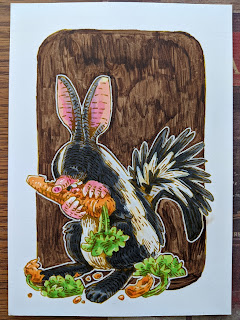
 For the 2022 Bookplate, I originally thought it would be interesting to do an etching for the artwork. I was a printmaking major in college, and I really credit that process with so much of my mental organizations as I layout and ink a piece of my work. However, I no longer have access to the etching supplies & equipment I'd need to safely do an etching at home––so, I opted to fake it and do a faux etching piece that looked close enough that it would work for the bookplate...which I should also address, I decided in the end that this image you see to the left didn't hold up when reduced to bookplate size. My plan is to offer it as an 8" x 8" print in my online store (mouseguard.bigcartel.com) in April when I do another ONLINECON event on my Twitch channel


I started by looking at a few etchings of Albrecht Dürer's, specifically this one of St. George. In fact, I started doing a piece of Baldwin the Brave (from the Mouse Guard short story of the same name) in this same pose (not mounted on horseback) with a goose instead of a dragon, but I didn't like him facing away from the viewer. So I started again.

Etchings are prints where a metal plate (zinc or copper) are coated with an acid resist, that resist is then scratched away wherever the artist wants a line to be, and then place the metal plate in acid for the metal to be eaten away (or etched). When the plate is clean and then coated and wiped with ink, the ink goes into all the crevices where the acid etched a groove into the plate, and the image is printed on semi-damp paper on a press.


For the second attempt, I drew a better hero pose for Baldwin, and used the wolf that appears in the story, tangled in the bell rope, as the drama and background element.

This is all pencil on copy paper (later scanned into photoshop and tinted), and in some places (the wolf and the bell) I overworked this for just being a pencil/layout for the final piece, but I wanted some practice at the types of line marks and density I wanted to go for in the final artwork.


I printed out the above layout to the correct scale, and taped it to the back of a sheet of Strathmore 300 bristol. On a lightpad (I use a Huion A3) I was able to see through the bristol surface so I could use the printout as a guide when doing the final drawing. Unline most of my work where I'd use a pen to ink the linework at this stage, I wanted to get a line quality with a little more subtlety and soft edges. So, I 'inked' this piece with a mechanical pencil. I used a lot of pressure, and didn't try to shade my drawing like a traditional pencil drawing, I wanted dark purposeful marks, but with a touch of softness to help sell the faux etching photoshop trickery a few steps down the line.

The original 'inked' pencils were scanned, and I did a tiny bit of level adjustment to help drop out a few light smudges and the bristol's surface texture. 

I felt this piece still needed some tone--which means introducing faking another etching technique called Aquatint. 

Instead of coating a metal plate with a even & complete coat of an acid resist, with aquatint you dust the plate with a rosin. Those little dots of rosin resist the acid and allow the in-between spots to be etched away in the acid bath, making that part of the plate a bit like different grades of sandpaper. Those little pits hold ink at different densities to create different shades of grey/black when printed. In Photoshop I made a grey texture similar to an aquatint texture to use in my last step.


The final assemblage of parts includes: the pencils + a duplicate of the pencils with a slight blur to soften the edges + 3 different densities of my faux aquatint texture (each masked out in places so it appears only exactly where I want it to) + a paper tone & texture & + a sepia color tint over the whole thing.

This was a fun project, and while it won't work for the bookplate, I do plan to release it as a print in April. And someday, when it's COVID safer & when I have access to a studio with the right equipment, I'll do a real Mouse Guard etching again.

Tuesday, February 15, 2022

Usagi Yojimbo: Lone Goat & Kid #4

I was fortunate enough to be asked by IDW and Stan Sakai to do a run of covers on the new Usagi Yojimbo reprints of short story issues that will be collectively called 'Lone Goat and Kid'. I've done six in total, and for this blogpost I'll be sharing my process for the creation of the cover art for issue #4.

This issue is currently up for pre-order through Diamond with the code FEB220445. Just ask your local comic shop to order it for you, or order it though an online retailer. The issue will be in shops Apr 27, 2022.

To the left you can see the finished cover, but below I'll go through the steps in creating it.


Layout/Pencils:
In this issue, Usagi is a captive of the Komori Ninjas––bats with sword blades on their wings. And in a scene oddly like that of Saxon vs the bats in my Winter 1152 book, Usagi attacks one of his foes as they plummet to the bottom of the cave. I wanted to use that moment to draw for my cover. 

So, I started by drawing the bat falling backwards. I did pull up some quickly googled photo reference of people falling backwards to get the pose. Then I placed that drawing on my lightpad and with a clean sheet on top, I drew Usagi's attack lunge.

I used a real photo of Gyokusendo Cave in Okinawa Japan as photo reference. On the lightpad I drew over the forms of the stalactites to get the linework for the background.


Once I had those three drawings, I assembled them in Photoshop. Each drawing was tinted a different color to help me see as I masked out any overlapping lines. I then did a quick blocking in of all the forms with colors. This helps not just me to see the forms and understand the composition overall––but also as I send it in to the editor and Stan Sakai for them to completely understand what I'm going for.

It may seem like overkill to have gone this far in the 'pencils/roughs' stage, but in my experience doing covers, I do less work overall (meaning fewer changes & edits) when the first approval image is so clear and nothing is left to guesswork or interpretation.


Inks:
When the layout was approved by the editor and Stan, I started the inks. First step was to print the layout file onto copy paper (over two sheets that had to be taped together at the seam) and tape that to the back of a sheet of Strathmore 300 bristol. On my Huion lightpad I was able to ink the cover art using the printout as my pencils lines. This way in the end the inked artwork is very crisp and clean with no need to erase pencils lines. I used Copic Multiliner SP pens to ink the art (the 0.7 and 0.3 nibs).

On my previous cover I'd spent most of my inking time on the Kimori bodysuit lines. And while there was a lot of that to do on this cover, there was only one of them––and a LOT of stalactites to render in a gradient of ink intensity.


Color Flats:

The inks were approved and I scanned them in to Photoshop to start the coloring process. This first part of coloring digitally is called 'flatting' and is a professional version of coloring inside the lines. Establishing what each area's color is and where it ends. This not only is a color base for the image, but also allows a quick flat color area to be able to quickly isolate to render or make adjustments on.

Most of the color choices had been made in the layout stage, but I made changes to the value structure as I worked. In this step I also made all the background a color holds (areas where I want the lineart to be a color other than black) 


Final Colors:
Here again is the finished art (this time sans-logo). To render all of the color I mostly used the Dodge and Burn tools (Photoshop tools based on real photography techniques for purposely over or under exposing film as it develops). Burn is do darken and Dodge is to lighten. I use a stock Photoshop textured brush as I add shadows and highlights with these tools so the work looks a little more organic and less digital.

Usagi Yojimbo: Lone Goat & Kid #4 is out in stores Apr 27, 2022.

Tuesday, February 8, 2022

Banded Haremole (or Banded Lepusmole)

Last Friday on my Twitch Stream, we did the fourteenth community draw-along event #DrawTheExtinct where I posted an image from an old block print I made with a few animal photo inspiration prompts and the idea to create an imaginary extinct animal. I worked on my piece live on my Twitch stream while viewers worked at home and then on Monday we shared our finished pieces. 

Here is my finished Banded Haremole (though originally I called it the Banded Lepusmole as you'll see below). And below are my steps to create it as well as the community submissions.


We started with the prompt of my original 2000's era linocut print titled 'Extinct' as well as a Skunk, a Mole, and a Hare.

I told the viewers that they could use any combination of the inspiration prompts––they could make their version as cute and cuddly as a pocket pet stray kitten, as monstrous and deadly as a giant kaiju destroying cities, or anything in between. I also wanted this to be an excuse to get their pencils moving. I invited all skill levels, because I'm a firm believer that you shouldn't have to be good at something or pursuing mastery of it to just simply enjoy the act of it...and art is no exception.


On the Friday stream I started drawing with mechanical pencil on a sheet of copy paper to try and reimagine the beast. I liked the idea of drawing it standing in a similar posture as my original print. I felt like the body shape of the mole made sense to pair up well with the paws (though I did for a brief moment consider hare hind paws). Then Hare ears and teeth, and lastly skunk markings (to denote 'banded') and tail.

I scanned my pencils and did a quick color blocking pass in photoshop to help me see the forms, especially where the darker fur met the lighter fur.


After I was happy enough with my above design, I printed that piece out on copy paper and taped it to the back of a sheet of Strathmore 300 series bristol. Using a lightpad, I was able to see through the surface of the bristol as I inked the Banded Haremole. I used a Copic Multiliner 0.7 SP pen to ink the art. I spent most of my inking time on stream working on the fur contours and mole-like paws––and I saved the darker fur texture/tone for last. 

I finished the inks on-stream and was able to scan and start the color flats while still broadcasting. For these Draw The Extinct pieces I have a  template with background and border already established, so it makes some of this color prep work all the easier. 

The Banded Haremole's colors were mostly established by my decisions on the color blocking step when working on the pencils.

After the stream ended and I had a chance to grab some dinner, I returned to finish the flats, blending the transition between the light and dark fur and establishing the paws and claws.


To get all the highlights, shading, and texture I used the dodge and burn tools with a stock photoshop texture brush. Below you can again see the final rendered colors with a border and type applied in this final version. 

But, as this is a community event, I wanted to share all the other entries posted in the Discord. I awarded a prize and we voted together on a few more (prize winners marked with *) on Monday's Twitch stream and we all enjoyed seeing what each other had done. I hope we get even more participants next month (First Friday!)


Amy LeBaron


Andorinha *


BlueFledgeling97


Capt. Nemo


DePuggo


Doombot2015


EvilCartoonist *

Mjar


Nate Pride *


Nuvalo


Pendrake


RedJarOJam


Tyberius


Tyrie *


Tuesday, February 1, 2022

Nightwatch Gazebo

Early next year I plan to release a new Mouse Guard sketchbook titled "Aline Together". The majority of that material is inked commissions I did during last year's ONLINECON event. But to round out the sketchbook sometimes I need to generate some material of my own both to fill up pages and to add certain tone or subject for a thematic through line for the work in the book

To the left you can see one of those pieces finished and colored ready for a page in that sketchbook––and in this blogpost I'll break down the process to get there.


The idea for this piece came from a photo shared on a Twitter account that shares abandoned architecture. The photo is from the gardens of Quinta da Regaleira in Portugal. I altered the proportions to me a it a bit more squat and compact. After I drew the architecture on a lightpad using the photo as a guide, I drew separately two Guardmice on a night's watch. In Photoshop I combined the elements and added a digital moon and some bat silhouettes.

I inked the piece with a printout of the above layout taped to the back of a sheet of Strathmore 300 series bristol. On my Huion lightpad I can see through the bristol down to the pencils and use them as a guide while I ink. 

I used Copic Multiliner SP pens (the 0.7 & 0.3 nibs) to ink this as I streamed on Twitch, answering fans questions as I worked.


When the inks were finished, I started the color flatting (the first step of digital coloring where you establish all the color spaces with flat color). I also added all my color holds at this stage. Color holds are areas where I want the ink lines to be a color other than black, like the background trees, the moon, the bat silhouettes, the stars, and the flames.

I'm finding that I rarely do piece with cool blues, so for this night watch I purposely went into that color range--though some of the choices are desaturated or warm enough, nitpickers would say I still didn't get there.


Below you can see the final colors all rendered withe the Dodge and Burn tools and ready for inclusion in the sketchbook I'll release next year.

Blog Archive