Tuesday, March 31, 2015

Mouse Guard LEGO display: ECCC

Last weekend at the Emerald City Comic Con, the Seattle based ArchLUG LEGO builder club put together an amazing display of scenes and architecture from the pages of Mouse Guard. The display was populated by minifig LEGO with Mouse Guard heads created by Guy Himber of Crazy Bricks. To the left you can see the group (minus a few who couldn't attend) and I at the display, and below are the photos I grabbed with buildings and scenes from Fall, Winter, Black Axe, and Legends of the Guard.


Mouse Guard Sculpture

Lockhaven


Midnight's Army at the gates of Lockhaven

Guardmice on the walls of Lockhaven

Celanawe, Kenzie, & Saxon watching Midnight's Army

Lockhaven


Lieam and the snake

Barstone

Barkstone


Barkstone

Inside the June Alley Inn

Streets of Barkstone

Carpenter squaring off lumber

Streets of Barkstone

A Mouse Thief?

Outside Barkstone's Gates


Crab attack on Calogero


Crab!

Sadie & Conrad against a Crab


Crab attack on Calogero


Bunny Caravan

Bunny Caravan

Lieam & Celanawe against the Owl 

Celanawe falls victim of the owl


Matriarch's Chamber


Matriarch's Chamber

Mice in the reeds

Leaf Boat

Leaf Boat

Celanawe & Em on duckback


Lower Port Sumac
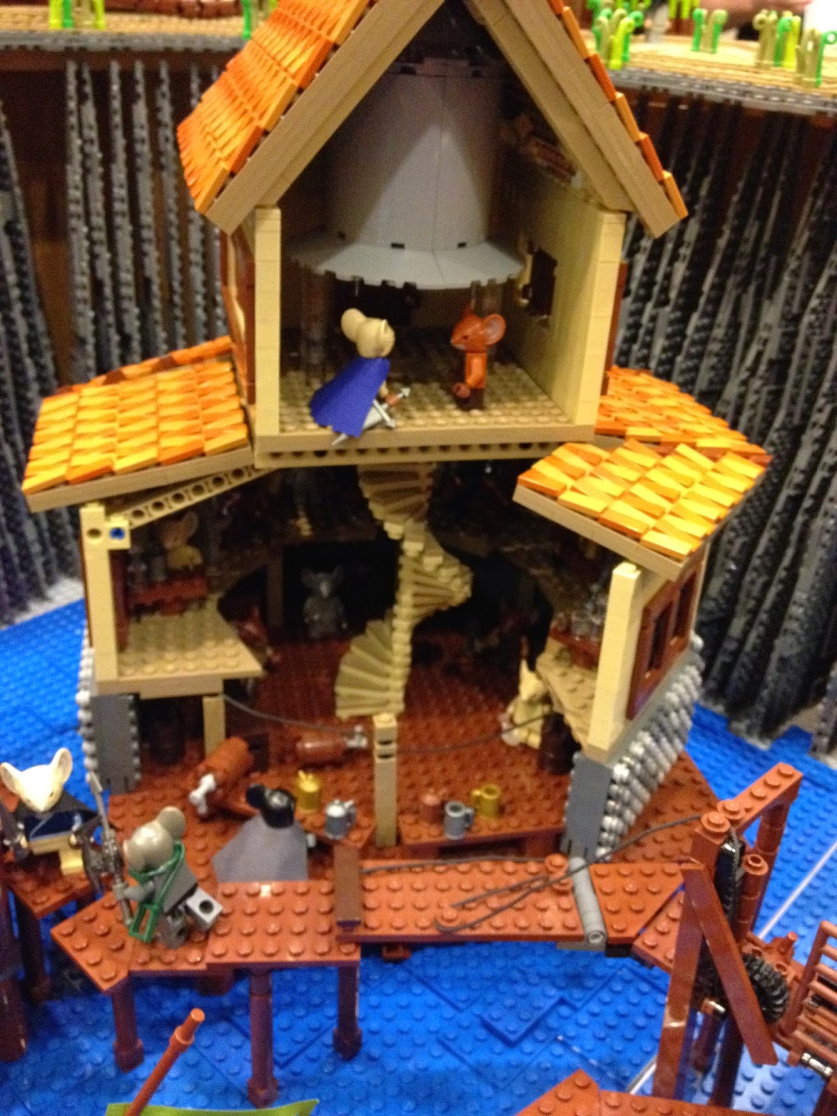

The Mariner's Bell

Lower Port Sumac

Upper Port Sumac: The Drupe


Shorestone Exterior

Shorestone Interior
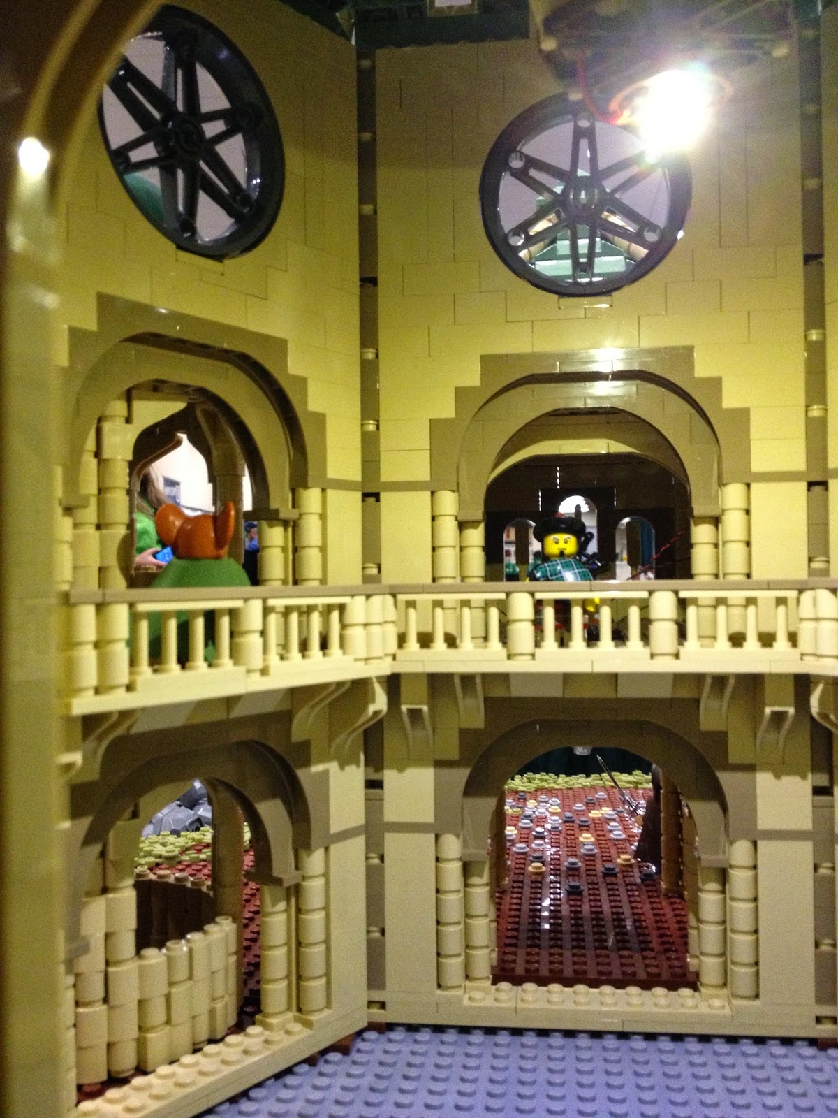
Shorestone main entrance


Shorestone

Haven Guildroom

Shorestone

Big thanks to builders Alice Finch, Paul Hetherington, Dave & Kelli Smith, Thomas Garrison, Daniel Fortine, Bob Weiss, RJ Coughlin, Steve Walker, Scott Fowler, Dan Sabath, Sean Edmison, Anu Pehrson, David Frank, Thorin Finch, Shawn Snyder, Jim Edelen, Michael Kuroda, Dave Ingraham, & Guy Himber


2015 Appearances:
C2E2 April 24-26
Motor City May 15-17
Denver Comic Con May 22-25
Heroes Con June 19-21
Long Beach Comic Con: Sept. 12-13
Baltimore Comic Con Sept. 25-27
New York Comic Con Oct. 8-11
Art-Bubble Comics Festival: Copenhagen: Nov. 14-15

Tuesday, March 24, 2015

2015 Bookplate process

For the last 3 years I've released a limited print designed to be a bookplate for your books (Mouse Guard or otherwise). In years past I've used some type of process other than inked linework & digital color to create the image for the bookplate. I've done block printing, faux stained glass, faux embroidery, and for this year, I made a real* mosaic. To the left you can see the final bookplate design, but below I'll run through the process for making the piece.
I started with a sketch I refined in photoshop (adding color cues & an elaborate background design) that I printed out and glued to a piece of chipboard (the stuff the backs of sketchpads are made of). Then I started the slow-and I do mean slow-process of cutting up little 'tiles' of chipboard and gluing them down to the mounted printout with super-glue. To fit into some of the stranger places, I'd refine the tile shapes using a hobby knife. 
Because I didn't pre-paint the chipboard tiles (there was too much chance for loss or over production of any given color), when I'd get a section of color finished, I'd paint those glued down tiles with acrylic paint. Going one color at a time made it easy to not get lost in the process of re-figuring out which tiles needed to be which color. I'd make small color variances within each area so the piece looked like it was made up of imperfect tile bits rather than looking painted or photoshoped to be one flat color.

The process took much longer than I thought and over the course of two days I gave myself a bad arm cramp and a knot in my back and neck from leaning over the detailed tile bits for so long. It was a major relief on the last day when I was filling in the small areas of the background, though I had more accidental gluings, chipboard de-laminating, and lost custom cut pieces in the last few hours than I did on the whole project. 
Once the tiles were all glued down, I sprayed several clear coats of sealer over the entire piece. When that dried, I crossed my fingers as I mixed up custom grout, and rubbed it into the gaps between the tiles, obscuring the mosaic in the the process with thick muddy grout. Then I started wiping away the grout from the surface, hoping this roughness wouldn't chip tiles, peel paint, or just plain not come off. Ultimately, only two tiles had any damage from the grout process and to the left you can see the final mosaic.

Unfortunately, it didn't read well as a small image, so I made a lot of adjustments in photoshop for the final bookplate file. Here again is the final image. These will all be signed and numbered as a limited edition. The first convention I'll have this bookplate in-hand for is Emerald City Comic Con this month. After that I'll start offering them through my online store.


2015 Appearances:
C2E2 April 24-26
Motor City May 15-17
Denver Comic Con May 22-25
Heroes Con June 19-21
Long Beach Comic Con: Sept. 12-13
Baltimore Comic Con Sept. 25-27
New York Comic Con Oct. 8-11
Art-Bubble Comics Festival: Copenhagen: Nov. 14-15


Tuesday, March 17, 2015

Legends of the Guard Vol 3 #4 Cover Process

This week I'm sharing the cover to the final issue of Legends of the Guard Vol. 3 (I still have 1 cover to do for the Hardcover collection, but that's for a later blogpost). The final cover is shown to the left, but below is the process for the piece from concept to pencils through to colors. 

My original note to myself when I started this volume of Legends was: "#4: Insects crowning a mouse". The visual I had in mind then was much spookier and moodier, with misty dark blues in a foggy forest with a floor of scattered bones. But when it came time to draw this cover, I felt more whimsical and wanted the piece to feel more like a fairy tale. The mouse would be wearing a long cloak held up by some flying insect (I quickly thought moths were the right choice).  On copy paper, I sketched out the elements, doing some Google-fu to research types of moths and their markings as well as fireflies and even a caterpillar of one of the moth species.
I scanned those pencil drawings into Photoshop and started composing the cover's layout (keeping in mind where the fold between front and back cover is as well as where the logo is placed). For the background, I had a checkerboard pattern in mind already (I was thinking of is because of Edmund Dulac, one of my favorite illustrators, used it in his fairy tale illustrations often). I went in search of stock photos of stone arches that I could decorate with a checkered pattern and found an islamic facade that fit the bill. I modified the proportions, re-built the pattern and used it in several places the original photo didn't have it (including as the tile floor)

After that digital composite was built up with all the characters placed an background set, I printed it out at full size (8.25" x 16.25") and taped it to the back of a sheet of Strathmore 300 series bristol. On my lightbox, I was able to see the printout and use it as a pencil guide to ink on the bristol surface. Because I knew I wanted to push the background wall back with color to separate its business from the characters, I left a little space between the subjects and any of the background inks (other than where they meet the floor).


I scanned the inked artwork and started the process of establishing color areas called "flatting". The palate for the background was partly established by the original stock photo, but also by a few of Dulac's pieces I had in mind while working on this piece. The other colors were just put in as place holders as I filled in the spaces on the characters differentiating them from one another.


The final colors were achieved (after altering my flats to the palate that worked to keep the characters visible but looking like they belonged in the scene) by using the Dodge & Burn tools in Photoshiop and a textured brush. I added some effects to the fireflies to make them glow and some subtle rendering on all my color holds on the background and tilework.

Legends of the Guard Vol.3 #4 will have the full "legend" of this image on the inside front cover. And will feature stories by: Aaron Conley & Fabian Rangel Jr, Becky Cloonan, & Ryan Lang.


2015 Appearances:
C2E2 April 24-26
Motor City May 15-17
Denver Comic Con May 22-25
Heroes Con June 19-21
Long Beach Comic Con: Sept. 12-13
Baltimore Comic Con Sept. 25-27
New York Comic Con Oct. 8-11
Art-Bubble Comics Festival: Copenhagen: Nov. 14-15

Tuesday, March 10, 2015

Lavender Print Process

Since 2012 I've released a new 11" x 11" limited edition print every year. Past year's pieces have been titled "Peacock", "Raspberry", and "Moonflower". Julia requested that these prints be pretty and not just a mouse doing battle, but more aesthetically feminine. This year is no exception, and instead of waiting until C2E2 (like my past releases) I'll be offering this at Emerald City Comic Con this month and then at the rest of my appearances and in my online store shortly. To the left you can see "Lavender" and below I'll go through the process of creating the image.

I started with a drawing. After looking through a book Julia has called "The Lavender Lover's Handbook" as inspiration for the blooms, I drew a mouse sitting on a grouping of them while playing a Rebec. I'd contemplated having her wield a scythe, but in the desire to meet Julia's goal of "pretty" I opted for the medieval instrument. Her checker motif was a pattern I was admiring in a few Edmund Dulac illustrations. And the addition of the flail was to subtly ground her as a Guardmouse. This was drawn on sketch paper with a mechanical pencil.

After scanning the drawing, and printing it out at actual size (11" x 11") I taped it to the back of a sheet of Strathmore 300 series bristol and placed it on my lightbox. On the lightbox, I can see the printout  through the bristol and follow it, like I would pencils, when inking...and all without the mess of pencils to erase or blueline to digitally remove. I'd suggested a lot of the Lavender density in my pencils, so I played it carefully as I inked them in to make sure I wasn't going overboard with texture and visual static...making her seated position believable while still leaving some negative space as visual breathing room. Inked with Copic Multiliners (0.7 & 0.3 nibs)

I scanned the inks back into Photoshop to start the coloring process called "flatting" This is where you establish areas of color (the fur, the cloak, the lavender, the skin, etc.) with only flat tones. You don't have to even use the final color scheme when flatting, but I already had a good sense of the palate for this piece in my head. I wanted to play a classic yellow-violet complementary color scheme to balance the large amount of lavender blooms. To give the appearance of something like dust particles or pollen, I added a color hold to my background inked dots and gave them a slight glow.

The last step was to render all the color and add highlights, shadows and texture with the dodge and burn tools in Photoshop. You can see that I didn't change much to my initial flats when it came to the hues. 

As I said at the top of the post, this piece will be available as a limited print at ECCC and all my con appearances this year, as well as in my online store once I get home & settled from Seattle.


2015 Appearances:
C2E2 April 24-26
Motor City May 15-17
Denver Comic Con May 22-25
Heroes Con June 19-21
Long Beach Comic Con: Sept. 12-13
Baltimore Comic Con Sept. 25-27
New York Comic Con Oct. 8-11
Art-Bubble Comics Festival: Copenhagen: Nov. 14-15

Tuesday, March 3, 2015

Monsters & Dames 2015

Every Year the Emerald City Comic Con publishes a charity art book called Monsters & Dames to benefit the Seattle Children's Hospital. The theme of the book is pretty self-explanitory in the title, but I decided to do something a little more Mouse Guard than I have in years past. To the left you can see the finished piece and this week's blogpost will show the process for making it from concept to colors.
With this year being the 10th anniversary of Mouse Guard, I opted to depict a "monster" & "dame from Mouse Guard. Someday I'd like to do an entire book just about all the Matriarchs of the Mouse Guard and I though this would be a good test illustration for that eventual book. To the right are my sketches on copy paper of a coyote skull (because I purchased one recently on a visit to The Evolution Store) and a past Matriarch Raina (who is referenced in the 'extras' of Black Axe (I also abandoned a drawing of a fisher because I felt this "monster" needed to have more of a supernatural feel than just a beast of the wild.
With the two sketches above, all I had was the idea that somehow Raina was able to lull a living skeleton predator to not gobble her up with the beauty of her music. Unfortunately  I didn't save a file of the step where I composite my sketches in Photoshop...so excuse the lack of a visual at this step. But I put the two drawings together in a square frame (so it will be easier to re-use in Mouse Guard at a later date) and added a top and bottom border of medieval sheet music (the arrangement found online) and with the Matriarch's name. I printed out that digital composite of drawings, music notation, and text for the next step...

I taped the printout to the back of a sheet of Strathmore 300 series bristol. Then placing the bristol on my lightbox I was able to see the printed image and use it as my 'pencil lines' to ink from on the bristol surface. I used Copic Multiliners (a felt-tipped nib ink pen similar to Microns...but better in my opinion) to ink in all the contour lines, texture and detail. The pile of bones, spider web, & harp-magic were not roughed in, even on my photoshop composite (you'll have to trust me on that) and I just inked the bones as I went from my head or lightly penciled in some guide marks for the web and sweep of the magic dots.

The inkwork is then scanned back into Photoshop to start the digital coloring. This step is called 'flatting' because you are establishing color areas with flat un-rendereed color. For a palate, I started with the established yellow-orange wardrobe of Raina from her window in Black Axe. To compliment that orange (and add some spook) I went with a darker blue for the background, and then balanced it out with yellow parchment & orange ink details on the top & bottom borders.
The last step is to render the color with shading and textures. I use a stock brush and the dodge & burn tools in Photoshop to achieve this. For this piece I added a lot of color holds, which are like a special effect where I have the inkwork as a color instead of black line. The music notation, text, spider web, harp strings, and music-magic are all painted with color to make the piece feel lees like a filled-in coloring book, and more like an illustrated scene. 
The Monsters & Dames book will be available at the Emerald City Comic Con for purchase (as well as the original art being auctioned off there) and remaining books are usually offered for sale online through the Emerald City website after the con ends.


2015 Appearances:
C2E2 April 24-26
Motor City May 15-17
Denver Comic Con May 22-25
Heroes Con June 19-21
Long Beach Comic Con: Sept. 12-13
Baltimore Comic Con Sept. 25-27
New York Comic Con Oct. 8-11
Art-Bubble Comics Festival: Copenhagen: Nov. 14-15

Blog Archive