Tuesday, August 27, 2024

TMNT 40th Anniversary Pinup

On July 10th a TMNT 40th Anniversary on-shot was released. I was asked by editors to contribute a pinup to mark the occasion (I'd similarly done one a decade ago for the 30th: http://davidpetersen.blogspot.com/2014/05/tmnt-30th-anniversary-tribute.html)

It was reading the early Eastman & Laird TMNT comics and playing the RPG that really cemented my desire of wanting to write and draw my own comics. The only other comics I'd read at that point were some older X-Men reprints (that had Arthur Adams covers, Dave Cockrum interiors, and John Bolton backup stories) and Archie comics that had a different artist every story––Kevin and Peter were doing something different, and seeing their names above the logo on the cover made me realize these guys were just making stuff up and drawing it––not a factory of creators contributing to a long-standing legacy brand.

Unfortunately due to timing, I didn't have time to draw a new pinup before the tight deadline for the 40th one-shot. But I did have some sketchcovers I inked (and scanned before painting) of each of the brothers. Since they'd never been published, I asked the editors if they minded if I assembled them into a group composition and colored them to include in the issue and luckily they agreed.

Below you can see each individual turtle's inks before coloring and assembly:


Tuesday, August 20, 2024

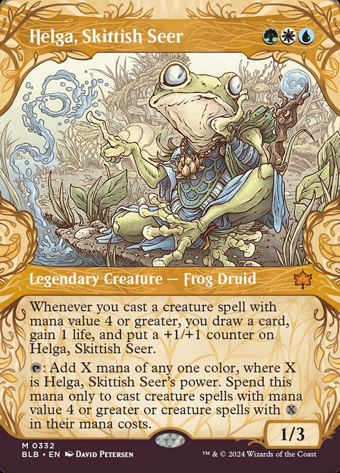
Magic The Gathering: Helga, Skittish Seer

Last year I was asked by Wizards of the Coast to do some Magic the Gathering card art for their upcoming animal set Bloomburrow (https://magic.wizards.com/en/products/bloomburrow). I played a lot of MtG back in the mid/late 90's, so it was an honor and thrill to become a part of the fraternity of MtG illustrators.

Here is Helga, Skittish Seer, one of the Frogfolk, who despite bing my 3rd card revealed, was my first to draw. The set was released in early August, and since Wizards of the Coast has already revealed my version of this card, I can share the artwork and process for creating it.

The process started with the brief from my art director Aliana Rood
asking for Helga, a  Lemur Tree Frog sitting on the banks of a pond staring into the distance while absentmindedly conjuring water magic. They wanted a tone of adolescent angst and loneliness. WotC provided me with an enormous PDF with reference for the frogs and their clothing as well as reference for Helga's specific character design. 

I started with a pencil version of Helga on copy paper to get the pose and mood of the character right. I then placed another sheet of copt paper over her on a lightpad and drew her costuming. The brief also called for a specific blend of frogfolk and ratfolk architecture in the background, so that was done on another sheet as well which is why there is a void on the background pencils. Lastly I penciled a version of her twisty water magic.

All of those pencil roughs were assembled and combined digitally in Photoshop as well as tweaked with reproportioning and rotating elements. At this stage, I also like to do a preliminary digital color blocking, to make sure I have the color and value tangents worked out, and also to show my art director at WotC so they are on the same page as I am (no one likes surprises in the later stages of a commissioned art piece). 

With the pencils/layouts approved by my art director, I moved on to inks. I printed the digital composite out and taped it to the back of a sheet of Strathmore 300 series bristol. On my Huion Lightpad, I was able to see through the surface of the bristol to use the printout as a guide as I inked with Copic Multiliner SP pens. The art director for this card requested not to have any large or dense areas of black, so I kept the linework fairly open and was restrained with the amount of texture.

The inks were then scanned back into Photoshop where I could start the coloring process. This stage. called flatting' is the professional version of coloring-in-the-lines. Just flat color is placed in to establish everything's base colors. the art director also liked when my linework was softer in my Mouse Guard work, and wanted everything to have a dark brown color hold (ink lines colored to be something other than black). I also established other color holds on Helga's eyes, the water bits, and the entire background. 


Here are the final rendered colors for the art (sans card borders). I did the light and shadow and texture by using the dodge and burn tools in Photoshop with a stock textured brush.

I have prints and playmats of Helga available for sale: https://mouseguard.bigcartel.com/category/magic.

Tuesday, August 13, 2024

Bloomburrow Tee

Wizards of the Coast asked me to do artwork for a tee-shirt that the Bloomburrow team would have for the release, when demoing the game, and as a memento of the new card set from Magic the Gathering.
I was given a lot of free reign and asked to draw an adventurer from Bloomburrow in my own style that summed up the cozy but serious vibes the setting provided. They also asked me to hand letter a version of the logo, but allowed me to take liberties with it. Of course, because it was a silk-screened shirt, there were color limitations.

To the left you can see the baseball version of the tee WotC sent me, but below I'll go through the steps for creating the art.


I was given options for the species of the focus of the tee: Bird, Bat, or Frog (though I think they were open to me trying another animal if I felt strongly about it). The art brief asked for the Planeswalker logo and for the design to be self contained, so I decided I'd draw a border of natural plant elements with the symbol at the top (I also liked the idea of a circle of the mana symbols at the bottom to balance it out. I sent over a bird, frog, and bat rough options, each with their own border plant details to echo some of those species mana colors.


The Art Director liked the frog version best, but asked for a few changes: to make the water magic more swirly, to make it overall oval shaped, and to add bugs to the border. I tightened up the pencil drawings of the frogfolk and the new round border as well as adding in some ladybugs (which I thought had a nice easy to see pattern that wouldn't get lost in the detail of the border line chaos).

These pencil drawings were all assembled in Photoshop and tinted to ultimately help me see everything clearer when I'd get to the next step.


Before I could start inking, there was one more request to change out a few of the ladybugs for other insects, so one became a grasshopper and the other a moth. 

I printed this big piece out and taped it to the back of a 14" x 17" sheet of Strathmore 300 series bristol. On my Huion lightpad, I could see through the surface of the bristol to the pencils underneath and use them as a guide. I used Copic Multiliner SP pens (I think just the 0.7 nib)

I scanned the inks so I could start on breaking down the colors for a limited color silk-screened shirt.

I first tried with a three color and a four color pass (each color on its own layer to make it easier for the silkscrener).

Happier with the four color version I turned it in to the Art Director––but he surprised me by suggesting to add some more colors to make the water magic pop in the final.


Here is the finished art I sent off to WotC for the shirt. They ended up swapping out my hand-drawn Bloomburrow logo for the official one (never heard why). Someday for fun I'll see what it would look like if I did a full color render of this art.

Tuesday, August 6, 2024

Infant Melon Dragon

Last week on my Twitch Stream, we did the #DiscoveringDragons Community-Draw-Along! It's a fun event where I welcome all skill levels to push their pencils (or whatever tools they use to make art). It takes place on the first Friday of the month.

I worked on my piece live on my Twitch stream while viewers worked at home and then on the following Monday we shared our finished pieces.

Here is my finished colored Dragon (twentieth in the series). And below are my steps to create it as well as the community submissions.

For #DiscoveringDragons, I post two or three prompt words for everyone to make into a dragon. It's a nice framework for artists of any skill level to focus some time on an 'assignment' to shake the rust off or get the pencil moving again––all while also being loose enough that there's plenty of room for individual expression and interpretation.

This month the prompt was two words: Infant & Melon

I opened several tabs of google image searches of baby dragons, watermelons, & cantaloupes.


I started on copy paper with the body form of my baby dragon. I thought of going with more of a cute swaddled infant of a chibi character, and opted for this young looking dragon shape. I'd originally planned to use a watermelon as my melon reference––but Julia suggested I look up a 'horned melon'.

Using my lightpad, over the top of my pencils for the dragon shape, I drew new details of the horned melon and the inner fruit-seeds for the belly and tail vines/leaves. All of these pencils were scanned into Photoshop and assembled with some quick color blocking to get my layout where I wanted it.

I printed out the above design at full scale and taped that onto the back of a sheet of Strathmore 300 series bristol. Using a lightpad, I was able to see through the surface of the bristol as I inked the dragon. I used Copic Multiliner 0.7 pen to ink the art.

The inking on this piece was a subtle affair of getting the horned melon rind texture right, and then using lighter weight lines for the seeds (imbedded in the fruit) and a slightly different texture of the leaves.


I was able to finish my inks on stream and even started the coloring process before having to sign off an wish every one success over the weekend with their Dragons. Later that same night after some dinner I finished the flatting process. In addition to the basics of color flatting–basically professional coloring-in-the-lines, I also established color holds (an area where I want the ink to be a color other than black)––the overall lines became a dark brown the belly became a medium green, the seeds a light green, the pupils red, and the leave veins dark green.

Most of of the color selections were already established in the rough, but I played with the final value/hue choices for a while before getting to this point.

For the final colors I used a bit of the paintbrush to make the tip of each 'horn' of the melon skin a darker orange, and then the dodge and burn tools to add shadows and highlights to give the dragons some form.
Below you can again see the final Dragon...


But, as this is a community event, I wanted to share all the other entries posted in the Discord. 

Capt.Nemo


Dakota


JC


Jonathan Towry


KyleGerbrandt


Maliloki


Nathan Pride


Pendrake


redSkwrl


SoulSeekerOlga


SteveSketches


88UncleErnie


VernNYC


Tuesday, July 30, 2024

Magic The Gathering: Kitsa

Last year I was asked by Wizards of the Coast to do some Magic the Gathering card art for their upcoming animal set Bloomburrow (https://magic.wizards.com/en/products/bloomburrow). I played a lot of MtG back in the mid/late 90's, so it was an honor and thrill to become a part of the fraternity of MtG illustrators.

Here is Kitsa, Otterball Elite. Wizards of the Coast has already revealed my version of this card so, I can share the artwork and process for creating it.


The process started with the brief from my art director asking for Kitsa, an otter athlete, slapping an energy ball with his tail through netted hoops while casting a spell. WotC provided me with an enormous PDF with reference for the otters and their clothing and culture for Bloomburrow.

I started with a rough version of Kitsa on copy paper––which was pretty much just studying real-world photos of otters. I then refined the drawing on a different sheet of copy paper using a lightpad to work off of the original. The armor/costuming was so detailed, that once I had my tight drawing of Kitsa, I could overlay another sheet of copy paper on the light pad and draw it all without worrying about erasing a part and ruining the original otter drawing.

The Art Director asked for a change with Kitsa's paw that happened later in the process, but I wanted to address it here since every image after this will have that revision.
The pencil roughs were assembled and combined digitally in Photoshop. Since the background was all underwater, I figured it would be easier to add in those rough shapes digitally with paint brushes and marquee tools. For the bubble placement, I had a layer with a thin outline applied to wherever I pained, so I could add in those light bubble shapes and get something with a defined edge to ink from later. I also gave myself some notes about the magic effects.

With the pencils/layouts approved by my art director, I moved on to inks. I printed the digital composite out and taped it to the back of a sheet of Strathmore 300 series bristol. On my Huion Lightpad, I was able to see through the surface of the bristol to use the printout as a guide as I inked with Copic Multiliner SP pens. The art director for this card requested not to have any large or dense areas of black, so I kept the linework fairly open and was restrained with the amount of texture. The magic around the eyes and coming off of his hand and the ball were inked separately on a sheet of copy paper (not seen here).

T
he inks were then scanned back into Photoshop where I could start the coloring process. This stage. called flatting' is the professional version of coloring-in-the-lines. Just flat color is placed in to establish everything's base colors. the art director also liked when my linework was softer in my Mouse Guard work, and wanted everything to have a dark blue-green color hold (ink lines colored to be something other than black). I also established other color holds on the bubbles, the costume details, and the energy ball.


Here are the final rendered colors for the art (sans card borders) with the magic effects added in. I did the light and shadow and texture by using the dodge and burn tools in Photoshop with a stock textured brush.

I have prints and playmats of Kitsa available for sale: https://mouseguard.bigcartel.com/category/magic.

Tuesday, July 23, 2024

Saxon, Kenzie, and Rand

Saxon, Kenzie, and Rand––all were rather grand...
For SDCC this week, I decided to do a new print. It was a last minute decision, and a crazy rush to get the art finished off to the printer, proofed, and ready with copies for the con. But, I managed to pull it off.

To the left you can see the finished 14" x 20" print. And below, I'll go through the steps to create it.
When I started I knew I wanted the print to be large, have known Mouse Guard characters, perhaps a bird, and be as much a landscape study as a Mouse Guard piece. There were a few rough sketches––one very loose, then a tighter one, and a re-draw of Kenzie to get the pose better.

Kenzie standing surveying what's ahead with his lantern staff was clear in my mind as a focal element, but deciding on how many mice, toying with the idea of a mouse structure (or a mouse structure in ruin), and how much/what vegetation was still being discovered in this sketching stage.
So, I went for a walk...

Around my neighborhood I crouched down and took low-perspective photos of various weeks, exposed tree roots, leaves, and weeds. To the left you can see most of the photos I took on that walk, but there were more with other plants I decided not to use for the final art.

A walk like this can be good. It wasn't long, just 20 min or so––long enough to get away from the desk, think about the piece in a more relaxed environment, and gather some reference.


I put it all together with tighter pencil drawings of Saxon, Kenzie, and Rand as well as a sparrow (referenced from a few photos) and a background incorporating the photo inspirations.

All of these elements were drawn separately on copy paper and then tinted differently in Photoshop as I placed and moved and nudged each character until the layout was right. Then I blocked in some rough color to help me see the forms––what was cloak or leaf or root or feather, etc.

With the layout locked in, I printed out a version of it that was 20" wide and 14" tall (I did this on three sheets of legal paper and then registered the image and taped them all together.). On my Huion lightpad I inked this huge piece on a trimmed down piece of 24" x 18" bristol with the printout taped to the back. To ink I used a Copic Multiliner SP 0.7 nib pen. 

I'll have the original art for sale at SDCC.

This piece needed to get to the printer though, so as soon as the inks were done, I scanned the art and started coloring by flatting in color. This step is where I block in shapes with flat color (no rendering, so effects) to distinguish all the different color areas––like a coloring-in-the-lines assignment for professionals.

At this stage I also added color holds (areas where I want the lineart to be a color other than black) on Rand's shield, Kenzie's lantern, and all of the background (including the sparrow) that is behind the mice.

The last step was a long night or rendering mainly using the dodge and burn tools with a textured brush to give all the forms light and shadow. I'll have 14" x 20" prints available at SDCC and perhaps in my online store after I'm home from the con.

Tuesday, July 16, 2024

Magic The Gathering: Camellia, the Seedmiser

Last year I was asked by Wizards of the Coast to do some Magic the Gathering card art for their upcoming animal set Bloomburrow (https://magic.wizards.com/en/products/bloomburrow). I played a lot of MtG back in the mid/late 90's, so it was an honor and thrill to become a part of the fraternity of MtG illustrators.

Here is Camellia, the Seedmiser. Squirrels are green/black mana cards with a penchant for bones. The set is in previews now and will be released August 2nd, and since Wizards of the Coast has already revealed my version of this card, I can share the artwork and process for creating it.


It began with a brief from my art director asking for Camellia descending stairs as a haughty diva showing off her leaf dress. 

I started with just squirrel anatomy poses at first until I had one I thought might be a good pose that conveyed 'diva'. On my lightpad though I made several redraws and iterations adding different costuming, trying a few hand poses, and because Julia suggested it––her tail draped over her arm like a stole. The branch and skull setting was suggested from the source material reference as well as the brief. I looked at some real animal skulls for reference.

The pencil roughs were assembled and combined digitally in Photoshop. At this stage, I also like to do a preliminary digital color blocking, to make sure I have the color and value tangents worked out, and also to show my art director at WotC so they are on the same page as I am (no one likes surprises in the later stages of a commissioned art piece). This is the stage where I can also easily make adjustments moving a character or resizing something.

With the pencils/layouts approved by my art director, I moved on to inks. I printed the digital composite out and taped it to the back of a sheet of Strathmore 300 series bristol. On my Huion Lightpad, I was able to see through the surface of the bristol to use the printout as a guide as I inked with Copic Multiliner SP pens. The art director for this card requested not to have any large or dense areas of black, so I kept the linework fairly open and was restrained with the amount of texture.

The inks were then scanned back into Photoshop where I could start the coloring process. This stage. called flatting' is the professional version of coloring-in-the-lines. Just flat color is placed in to establish everything's base colors. the art director also liked when my linework was softer in my Mouse Guard work, and wanted everything to have a dark brown color hold (ink lines colored to be something other than black). I also established other color holds on all the dress trim and details as well as the background to add depth.

Here are the final rendered colors for the art (sans card borders). I did the light and shadow and texture by using the dodge and burn tools in Photoshop with a stock textured brush. There was a last minute edit at the request of the art director to add more green, so I intensified the glow coming from the left to be unnatural light.

I have prints and playmats of Camellia available for sale: https://mouseguard.bigcartel.com/category/magic.

Blog Archive