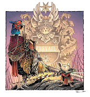
 While creating original pieces for my upcoming Mouse Guard sketchbook: "Dawn, Daye, Dusk", I made the illustration to the left titled 'Prevail' of a Guardmouse and a pheasant mount at dawn with a bit of heraldry as the background.
While the finished 24 page sketchbook won't be available for another month or-so, for this blogpost, I'll break down the steps to creating the final art as well as the inspiration and influences.
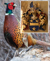 My two inspirations were these. First, the idea of drawing a bird all geared up with saddle and rigging to be a mount, and I wanted a visually interesting bird, so I went with a pheasant. This photograph found online became my reference for one.
And second, this bit of heraldry I photographed at the Turku Cathedral when I went to visit my niece when she was an exchange student in Finland.
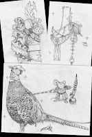 I started with drawing my own version of the heraldry––but with a mouse-shaped helm and 7 pointed stars (I like them over 5 or 6 pointed stars because they don't have heavily specific human patriotic or religious connotations) Knowing that the heraldry was to be symmetrical, I focused on only drawing half of it.
I then moved on to the pheasant, using the photo as reference. Once I had the bird drawn, I layed another sheet of copy paper over it on a lightpad and drew all the riding equipment. That way, if I didn't like a part of the gear, I didn't have to erase or re-drawn any part of the pheasant. I, of course, also drew the mouse (and included a helmet which I didn't end up using in the final piece)
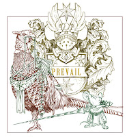
With the pencil work done, I scanned all my sheets of paper into photoshop and started laying out my composition. I like working digitally with my pencils drawings, because I can resize, rotate, and adjust it all until the composition is just how I want it. Or, in the case of the heraldry, I can copy and mirror the drawing so that it's complete (as well as adding in the text 'PREVAIL'.
I tint the various drawings different colors to make it easier to see what lines belong to which element in the composition.
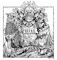 I then printed out the digital layout onto copy paper and taped it to the back of a sheet of Strathmore 300 series bristol. On a light pad, I was able to see through the surface of the bristol down to the printout as a guide while I did the final ink lines. To ink, I use Copic Multiliner SP pens (the 0.7 & 0.3 nibs mainly)
I inked a lot of this piece on my Twitch stream. I was focused on adding the right line weight on the pheasant so that the various feather types were all 'readable' without becoming a complete mess of black. Somewhere in between this step and the last one, I also penciled in a log shape on the printout so that the figures were standing on something.
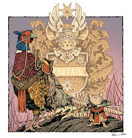
After the inks were done, I started coloring the piece. The first step of digital coloring (after scanning the ink drawing) is to establish the color areas with flat color (also known as flatting). At this stage of the color-work I also was establishing the color holds. These are areas where I want the ink-work to be a color other than black, and it takes some time and patience. For this piece, I added color holds to the heraldry, the grass, the text, some of the pheasant's feather patterns, and the swirl design on the mouse's lance.

The last step was to do the rendered color. I used the dodge and burn tools in Photoshop with a textured brush to get most of the light and shadow work done.
As a fun afternote, the original of this piece was purchased by a fan of mine in Finland who was unaware of the connection of the heraldry and Turku Cathedral until after he bought it.


No comments:
Post a Comment