

This issue is currently up for pre-order through Diamond with the code JUN210503. Just ask your local comic shop to order it for you, or order it though an online retailer. The issue will be in shops Aug 25, 2021 Reference
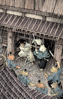
For Stan's 1988 cover of this issue, he'd drawn Usagi and Tomoe rushing out of the castle's jail gates and engaging in combat with several opponents. I decided to do very much the same cover idea but from a bit more distance and from a higher angle to show the architecture more. Layout/Pencils
Using the model placed into the cover template, I was able to draw over top a printout of it to get my architectural details the way I wanted them (I was also referencing Stand drawings from the interior pages of this issue).
With the architecture and perspective locked, I drew Usagi and Tomoe on separate sheets of copy paper and pasted them into the drawing in Photoshop. I could resize and rotate them until they were placed to my satisfaction. I did the same with the villains. and then gave everything a quick digital color paint job. Not only does this help me figure out the look, tone, and shape blocking of the piece, it also helps the editor see what my intentions are with little left up to interpretation.
 Inks:
Inks:
When the above layout was approved by the editor and Stan, I started the inks. First step was to print the layout file onto copy paper (over two sheets that had to be taped together at the seam) and tape that to the back of a sheet of Strathmore 300 bristol. On my Huion lightpad I was able to ink the cover art using the printout as my pencils lines. This way in the end the inked artwork is very crisp and clean with no need to erase pencils lines. I used Copic Multiliner SP pens to ink the art (the 0.7 and 0.3 nibs).
Most of the inks on this piece were for the architecture. The characters are very small and the hardest part was inking Tomoe's face and getting the expression correct from my pencils.
 Rain Effects:
You may have noticed in my original layout, I included the rain drops hitting the roofs and forming rings in the puddles on the ground. I got the idea from some of Stan's panels from the interior art and just wanted to include that element here to add to the drama and challenge our heroes are facing in this jail break.
 Color Flats:
 Final Colors:
To the left you can see the finished cover, but below I'll go through the steps in creating it.

For Stan's 1988 cover of this issue, he'd drawn Usagi and Tomoe rushing out of the castle's jail gates and engaging in combat with several opponents. I decided to do very much the same cover idea but from a bit more distance and from a higher angle to show the architecture more.
While I used Nagoya Castle as a reference model for my first Usagi cover in this series, this time I searched the Google Sketchup 3D warehouse for user uploaded models of Japanese castles with gates that looked similar to the interior drawings from the issue. This is Yamato Koriyama castle, and using the 3D model I could rotate it and get my camera angle just right for what I had in mind.

Using the model placed into the cover template, I was able to draw over top a printout of it to get my architectural details the way I wanted them (I was also referencing Stand drawings from the interior pages of this issue).
With the architecture and perspective locked, I drew Usagi and Tomoe on separate sheets of copy paper and pasted them into the drawing in Photoshop. I could resize and rotate them until they were placed to my satisfaction. I did the same with the villains. and then gave everything a quick digital color paint job. Not only does this help me figure out the look, tone, and shape blocking of the piece, it also helps the editor see what my intentions are with little left up to interpretation.

When the above layout was approved by the editor and Stan, I started the inks. First step was to print the layout file onto copy paper (over two sheets that had to be taped together at the seam) and tape that to the back of a sheet of Strathmore 300 bristol. On my Huion lightpad I was able to ink the cover art using the printout as my pencils lines. This way in the end the inked artwork is very crisp and clean with no need to erase pencils lines. I used Copic Multiliner SP pens to ink the art (the 0.7 and 0.3 nibs).
Most of the inks on this piece were for the architecture. The characters are very small and the hardest part was inking Tomoe's face and getting the expression correct from my pencils.

You may have noticed in my original layout, I included the rain drops hitting the roofs and forming rings in the puddles on the ground. I got the idea from some of Stan's panels from the interior art and just wanted to include that element here to add to the drama and challenge our heroes are facing in this jail break.
To ink the rain I flipped the inked bristol art over and inked the rain effects on the back while looking at the art on a lightpad (I've digitally simulated the look of it on the lightpad here). This way all the rain will register with the inks perfectly, and I can isolate the rain inkwork when coloring on a separate layer.

The inks were approved and I scanned them in to Photoshop to start the coloring process. This first part of coloring digitally is called 'flatting' and is a professional version of coloring inside the lines. Establishing what each area's color is and where it ends. This not only is a color base for the image, but also allows a quick flat color area to be able to quickly isolate to render or make adjustments on.
The colors were fairly straightforward as I'd done a lot of the color choice making in my layout piece. In this step I only had one color hold (areas where I want the black inkwork to be a color other than black) on Usagi's eye scar.

Here again is the finished art (this time sans-logo). To render all of the color I mostly used the Dodge and Burn tools (Photoshop tools based on real photography techniques for purposely over or under exposing film as it develops). Burn is do darken and Dodge is to lighten. I use a stock Photoshop textured brush as I add shadows and highlights with these tools so the work looks a little more organic and less digital.
It's an honor to be asked by Stan to do these covers and to get his approvals as I work through each cover.
Usagi Yojimbo: The Dragon Bellow Conspiracy #3 is out in stores August 25th

No comments:
Post a Comment