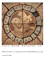
Every year since 2012 I do a new Mouse Guard bookplate for sale at conventions and in my online store. The idea is that this mini-print can be pasted/taped into your book(s), you can write your name in to identify it as yours to borrowers, and since the bookplates are signed, it means you now have a signed book. I try and make each year's bookplate art some medium the mice would/could use. I've done stained glass, relief printing, embroidery, mosaic, etc in past years––this year I was inspired by some medieval encaustic tiles.
The bookplate will be made available at Emerald City Comic Con and then in my online store shortly after.
The bookplate will be made available at Emerald City Comic Con and then in my online store shortly after.
In digging around for inspiration and looking up 'Medieval Tiles' I came across the Chertsey tiles, which were made around 1250 AD. These are Encaustic tiles, where the different colors you see aren't due to glazes painted on, but rather different colored clays. The base tile is formed in a wooden mold that leaves depressions wherever the lighter tone of clay is meant to be, and then a different clay in the consistency of slip (wet clay) is carefully poured/dribbled in those vacancies. It means that no matter how much the tile wears down from use and abuse, the pattern will never fade or be worn away.
The tiles were unearthed at Chertsey Abbey––though there is some suggestion they weren't commissioned for that location, and though incomplete, have been reassembled by the British Museum.
So, I took one of the digital tile reconstructions, and changed out the center round illustration with one of my own as well as spacing out the word 'PREVAIL' around the ring while losing the 'R' to a lost fragment of tile.The tiles were unearthed at Chertsey Abbey––though there is some suggestion they weren't commissioned for that location, and though incomplete, have been reassembled by the British Museum.
The mouse on a bird seems to be some of the imagery people respond to well of my work, and since so many of the Chertsey tiles were of men on horses, I needed some kind of mouse-mount to help make my tile feel authentic.
The drawing was done in pencil on copy paper and then digitally added in and colored to roughly match the terra cotta tones of the existing tiles.With the above digital layout ready, I printed it out and taped it to the back of a sheet of Strathmore 300 series bristol. On my Huion A3 Lightpad I was able to see through the bristol and down to the printout to use as a guide as I inked the piece.
I used Copic Multiliner SP pens (the 0.7 nib mostly) to ink the artwork. It was a little odd to be working so starkly on something and basically in inverse values, since everything black was eventually be a lighter yellow/tan color much lighter than the surrounding red clay. I purposely weathered and distressed the edges of the tiles and even the design in some areas to imply chipping and damage.
Then I flatted in the other colors, the red terra cotta, the grey-brown dirt, and a paler grey that was part of the glazing on some of the tiles in the Chertsey reference images.
The last step was to do a final rendering job adding some highlights and shadows in the appropriate places while also getting some texture and color variance in there to make it look more authentic and realistic.
Here are all the past years Bookplates––many of which are available in my online store as a bundle (https://mouseguard.bigcartel.com/product/set-of-10-mouse-guard-bookplates). Below are the blogposts about the process of making each:
Blogposts:


No comments:
Post a Comment