Tuesday, April 9, 2013

Genres & Diversity of Audience in Comics 
-or- A Comic for Everyone:

I find myself delivering the same message at 80% of the panels I speak on at conventions. I figured it bears repeating here: Comics are a means of telling a story as valid as film, television, prose, poetry, and theater. Any type of story is fair game in comics and can be told with sequential imagery...any genre, any topic, which also means, any audience can be addressed. Comics are not simply superheroes. While the industry could benefit from having a more diverse offering of material, as it stands right now, there is a comic for any and every person willing to try comics. Male, female, very old, very young, any race, creed, or interest, there is a book on the market today for them.

Sequential stories can cover Comedy, Horror, Westerns, Sci-Fi, Adaptations, Talking Animals, Popular Characters, Autobiographical, Historic Fiction, Non-fiction, Fantasy, Romance...basically there is a comic to cover all the any genres or shelves in a bookstore or video store (though that reference is going to go the way of the dodo in a matter of years). I cobbled together this post from slides I've used at a few library/school/educator talks I've done. I limited myself to only three titles per-subject and tried to make sure I had at least read if not also own the material.

It is by no means a complete list of book types or good material within that category...It's more of a 'best of' from my bookshelves. Also note that the categories are broad...'romance' doesn't need to mean 'trashy romance'...just a story about relationships...'horror' can also be 'suspense'..etc. But instead of belaboring the explanations...here are the titles:

Fantasy:


Comedy:
Muppet Show, Dork Tower, Jeremy


Horror:

Historical Fiction:
300, Usagi Yojimbo, League of Extraordinary Gentlemen

Kids:

Adventure:
The Crogan Series, Little Nemo, Rex Steele

Pulp:


Romance:


Non-Fiction:

Sci-Fi:

Adaptations:

Webcomics*
*I used examples of webcomics where the material is still free to view online, but the creators have published quality collections of the comics which makes it easier to curl up with on a Sunday afternoon or loan to a friend.


I encourage you to look through these suggestions and links and try something new you have never tried before. And if you see something you already know and enjoy, suggest it (or lend it) to a friend or relative who isn't a comic reader, but may be interested in the subject matter or genre of the book. Everyone loves stories, so everyone should love comics.


Watercolor Wednesday: 
Last week I posted three watercolors for sale. I enjoy drawing dragons and thought they'd make for good Watercolor Wednesday material. Here are three metallic dragons: Gold, Silver, & Bronze..


2013 Appearances: 
C2E2: April 26-28
Spectrum Live: May 17-19
Heroes Con: June 7-9
Albuquerque Comic Expo June 21-23
San Diego Comic Con: July 17-21
*more 2013 dates coming*

Tuesday, April 2, 2013

Writing Process:
've told interviewers and fans that I don’t consider myself to be as much a writer as I am a storyteller. The difference there is that I use images as my primary tool to explain & explore a story, not words. Sure Mouse Guard has dialogue and narration, and even before that I have to write something for myself to draw, but I don’t tend to smith words into the shapes of my imagination. I use them as bracing to hold up the pictures and as notes to remind me of the flash of images as I thought about my next story. 

oday’s blogpost will be about my writing process and also how it evolved. Today I write differently and with a different purpose than I did back in late 2004 when writing Mouse Guard Belly of the Beast. Then I was merely making notes, now I write scripts that help me shape the character's actions. But then and now I did always start with an end goal and an outline of notes. For that first issue I knew my goal was to have introduced the characters, concept of the Guard, and to have shown the real dangers of the natural world to the mice. I then wrote something that would work to that goal.

t’s similar to something I've heard other writers talk about as ‘know the ending’. But I don’t always know the ending of an issue or chapter when I sit to write it, but I know my goal for writing it. Sometimes they are one in the same: Character X dies and on his deathbed passes the torch to character Y. That was both the goal and ending to the last chapter of winter. But my goal in some issues is to explain a societal nuance or get the reader involved and to care about a character or place...and that is not an ending. Any number of endings could satisfy that goal.

y next step is to write an outline of steps I think should take me to an end. This is the same with writing the outline for an entire series like Fall, Winter, or Black Axe, or just for getting though one issue. The outline hits all the major steps of the story I want or need to include. I tend to write this rather quickly and without writing too many sub-notes under any given plot point. So some of those points come naturally and are just gut decisions. Other times I play out two (or more) variations of the same story, but with characters or situations taking opposing turns to the other version I've typed. It’s a bit of an exploration process, but also just a way to dump my thoughts one step beyond my head, because just the act of saying them aloud or writing them down give you the instant insight to edit or reject them.

nowing how to explore those ideas with writing or just brainstorming in the shower (a place I still find inspirational, so I keep a wax pencil & piece of plexiglass nearby for jotting down notes with wet hands) is something I judge by gut reaction. However I also think it stems from playing and running roleplaying games in my younger days. As a player, I was responsible for making my character as interesting as they can be for the GM to have moments to work off of and as a GM, I had to play off players’ decisions. When I ran games, I’d often not prepare a great deal, because I knew with any one choice my players could divert the entire story away from anything I’d thought of and into new and interesting or troublesome territory that I had to make work. Thinking on my feet like that helps with story writing when I write myself into a corner or the story shifts in a direction I didn't plan.

ow because I write AND draw Mouse Guard, the document I write is different than other comic writers’ text-for-the-artist. Just like theirs, it is meant to inspire and direct the artwork while providing a framework that fits into a larger whole. But the writer me doesn't have to worry as much about ideas getting lost in translation to my artist. Even if I have a good idea while writing, I don’t belabor the description of it, I rely that with just the seed of that inspiration jotted down, I’ll either have the same visuals I imagined when writing (it’s all in my brain after all) or I will have improved on it by leaving room for it to breathe. 

hen I started Mouse Guard I was writing the outlines with no dialogue and then drawing the story only filling in dialogue at the end where it was needed or perhaps making notes on the backs of pages as dialogue occurred to me. Through the Winter 1152 series, I started writing scenes of dialogue, still drawing mostly from outline, but using some character conversations as training wheels to get characters ‘acting’ more meaningfully at the right moments. Now for The Black Axe, I've been writing full on scripts. Not that they would make sense to work from for anyone other than myself, they exist to help me imagine and pace the art. There are no stage directions, location descriptions, page break notes, or emotion cues...just dialogue. The rest comes to me as I layout panels and make handwritten notes on the outline & script as I do so.

elow, I've posted examples of the finished outlines used to write scripts for Black Axe #5 & #6. I have not included the scripts themselves, because for the most part they are just the text from the issues. I advise that if you have not yet read any of Black Axe, you avoid looking at the images.


Watercolor Wednesday: 
Last week I posted three watercolors for sale.I had a sheet of paper with some watercolor smudges and splashes on it, and instead of scrapping the paper, gave it an equal wash and then painted the mummies in after that dried.


2013 Appearances: 
C2E2: April 26-28
Spectrum Live: May 17-19
Heroes Con: June 7-9
Albuquerque Comic Expo June 21-23
San Diego Comic Con: July 17-21
*more 2013 dates coming*


Tuesday, March 26, 2013

Legends of the Guard Vol.2 #1 Cover Process


The second volume of Legends of the guard will be starting up soon. The first issue is being solicited this month, so let your comic shop know you want a copy. In this post, I wanted to share the process of making the cover for issue one.The inspiration for this cover came from two sources: The Mouse Guard RPG handbook and illustrator J. B. Monge.

 First, I leafed through the 'Denizens of the Territories" chapter in the RPG book to see if there were any species of animal listed there that I hadn't drawn that might be interesting enough for a cover. I landed on 'Salamander' and thought they would be very fun to draw and build a story around. I also had started studying Jean Baptiste Monge's illustrations, specifically his illustrations for fairy folk who had loaded up animals with gear & supplies. In my sketchbook I drew out some ideas for a mouse cave explorer & some Salamanders.

I scanned the drawings from my sketchbook and mocked up a layout for the cover in Photoshop. Placing the mouse, the background stones and the salamanders on various layers, I could re-size and adjust the placement of each until I was happy with a layout (I also had to make sure there was room for the logo and such). Because so much of this cover would be reliant on the lighting from my inks & the final colors, I laid in a toned background and added some lighting references.

Using the above digital composite as a guide on a lightbox I inked the cover on Strathmore 300 series bristol. The contour lines came first with a lot of stippling that followed to give all the suggestion of the direction of light. You may also notice that I added a different salamander. In the rough, I'd just copied over my 2nd salamander drawing to remind me I wanted another one in there. While I was inking I sketched up a third salamander and placed the sketch under the bristol to ink him on the final surface.

Once the inks were done, I scanned them and started the process of coloring by flatting in all the color areas. This step is mainly to establish that different areas are different colors (the fur is different from the coat, is different from the rocks, is different from the salamanders, etc.) While these were not my final colors, I did try and have the mouse's hat echo the color of the salamanders (since the shape of it echoes their tails) and his coat echo the background color.

For the final rendering, I muted a lot of the colors and tried to get more contrasting lighting effects than I normally would. Here's another look at the cover art sans-logo & text.

Legends of the Guard Volume 2 #1 will feature stories from Ben Caldwell, Nick Tapalansky & Alex Eckman-Lawn, and Stan Sakai.


Watercolor Wednesday: 
The watercolor from last week's Watercolor Wednesday is a piece called "The President of Nothing...Yet".


2013 Appearances: 
C2E2: April 26-28
Spectrum Live: May 17-19
Heroes Con: June 7-9
Albuquerque Comic Expo June 21-23
San Diego Comic Con: July 17-21
*more 2013 dates coming*


Tuesday, March 19, 2013

Reference Model: Upper Port Sumac:
As I described in Black Axe #2, Port Sumac is really 2 towns...the lower one down by the water and the upper one, high atop the bluff. For Black Axe #6, I had to show the upper town. I wanted to keep with the stacked, assembled hodge-podge look of lower Port Sumac, but without the emphisis on docks & ship parts. I decided that there are a few buildings that are exposed to the open air, but the rest of the city proper, is inside the grassy loam and accessed through one of the buildings like a gatehouse.

Instead of designing these from scratch, I resorted to buying several commercial papercraft models.I printed out a few copies of each, but instead of assembling them as instructed, I kitbashed them making them into new buildings that were not someone else's sole design and also gave that look of layered building over time. A few branches from my yard provided the reference for the bases of the Staghorn Sumac plants that form a canopy over the upper town.

As I built the models, I came up with purposes for them. I needed a tavern for the scene, so that one was obvious, but the other two were thought of as I glued and taped and pasted. The one pictured to the left became the access to the rest of the city. The central opening leads to a secure door, and the bell above acts as a warning bell for the residents outside of the secure walls to get inside when predators are afoot.

The smallest structure (which only appears in the bird's eye panel of the town) I figure is a gatehouse of sorts. Beyond it is the path by land that leads either down to lower Port Sumac or out into the wider territories. I show Celanawe coming from this direction in the first page of the town.
When it came time to draw each of these structures, I had to fill in the details myself. I didn't want the faces provided on the purchased models, and I needed to compensate for there the joints were from the kitbashing.

Ultimately, the opening setting for my Free Comic Book Day story for this year takes place here (in the tavern specifically) so this model came in handy...though I had to figure out what the inside of this Weasley-esque building would look like ...but that's a post for later in the year....


Watercolor Wednesday: 
Just a single piece from last week's Watercolor Wednesday: The Angel of Death. My goal wasn't to make it look evil or particularly scary, more that what it represents is scary. The I took traits for the skull from horse & ram skulls. The white dots inside the cloak are meant to represent stars while outside of the angel the stippling is meant to look like it's casting off darkness.


2013 Appearances: 
Fabletown Con: March 22-24
C2E2: April 26-28
Spectrum Live: May 17-19
Heroes Con: June 7-9
Albuquerque Comic Expo June 21-23
San Diego Comic Con: July 17-21
*more 2013 dates coming*


Tuesday, March 12, 2013

Runners: "The Big Snow Job" Pinup:


I did a pinup for my pal Sean Wang's sci-fi comic "Runners" second arc: The Big Snow Job. Runners is like all the Han, Lando, & Chewbacca adventures you imagined happened in the Star Wars universe. I met Sean after his first arc had been collected and I was just in the middle of Fall 1152 and we clicked as friends pretty quickly. I did a pinup exchange with him back when he first started posting his second arc as a webcomic (you can see that process post here). Sean invited me back to do another piece, but this time in theme with the 2nd arc as he worked toward collecting it as a single volume...which is now being Kickstarted here.

Here was the process in creating the pinup. I drew out the characters in my sketchbook without really knowing the final composition. This was more a way of re-learning how to draw the characters and in their winter gear. This image is a bit of a photoshop-cheat for sake of the blog...these sketches were stretched over the course of 2-3 pages in my sketchbook and aside less desirable roughs of the character's heads & hands. But when I got a version of everyone that I liked, I scanned them to see if I could piece together a usable layout from it.

The result of assembling the various drawings in several configurations ended up being a square shaped group shot. To bump it up to a tall comic-sized piece, I added a bottom panel of a plot point from The Big Snow Job: a group of yak-like beasts the crew is interested in smuggling....but ends up being more than they bargained for. The inside-binocular framing and the yaks themselves were taken directly from Sean's pages for the sake accuracy in this layout. The lines you see framing the whole piece represent 'live area' and bleed'. Everything important needs to stay inside the innermost line, but I have the extend the artwork out to the outermost line to guarantee that when this is printed, the art goes beyond where the paper will be trimmed.

I printed the above layout and used it as a guide on my lightbox as I inked the final art on Starthmore 300 bristol. To tie the yak panel together with the characters above it, I added a pair of binoculars to Ril's hands. Inking a piece like this I focus on making sure each character stands out against whatever is around them. Sometimes that has to do with texture, sometimes it has to do with light on dark shapes (or the reverse), and sometimes just comes down to a strong contour line. I tried to give each character a different line treatment either on their skin or clothing so the mass of body shapes didn't just blend together. The linework was all done with Copic Multiliners and the bottom panel fills were done with a brush.

To start the coloring process, I layed in flat colors (no shading or texture) on the scanned inkwork. As I've said in all of my past process posts, flatting is a fancy term for establishing color areas that is the equivalent of coloring within the lines. It makes it easier to isolate each part (character A's skin, Character B's glove, Character C's hair..etc...) when it comes time to render the color. I included my layers menu in the screen grab of the flats. I tend to label them all to make life easier on me. The layer marked 'linework' is the scan of the inks. It is set to layer mode "multiply" so that photoshop allows the white areas to become like a transparency and the black linework to be opaque. All other layers are set to layer mode normal. You can see the layers above the linework are the color holds of opaque color on top of the linework, while the layers below the inks are groupings of color groups: skin, clothes, eyes, etc.

The final colors get redered and textured using the dodge and burn tools (terms used in photographic developing that basically mean lighten and darken or over/under expose). I use a textured brush to get that pebbled look to all the colors. Besides the rendering and color holds, this piece has a few other effects. The falling snow is added in digitally (for Mouse Guard I usually do this in ink on paper and then scan and invert the dots and streaks, but for this piece I just painted them in in photoshop). A few characetrs have cold breath coming out of their mouths, and the binoculars got a grain filter added to look more like a digital display screen.

Runners is a really fun and well written and drawn comic. You can read both arcs on Sean's website RunnersUniverse.com for free! BUT, consider going to his Kickstarter where you can get volume 2, and select not only volume 1 as a reward, but also BOTH of my Runner's pieces as prints!: Click here to view the Runner's Kickstarter


Watercolor Wednesday: 
First up from last Wednesday's offerings is a piece titled Applekettle. The word came to me a while back when I needed a name for something, but it ended up being too odd for that purpose. I later used it as the name of the mouse puppetry troupe that put on the marionette show in the 2012 Free Comic Book Day story. This painting was an attempt at a visual of the word...or perhaps the puppetry troupe's logo?

The second watercolor from last week is simply a radish.

I'll post a new painting in the store next week.


2013 Appearances: 
Fabletown Con: March 22-24
C2E2: April 26-28
Spectrum Live: May 17-19
Heroes Con: June 7-9
Albuquerque Comic Expo June 21-23
San Diego Comic Con: July 17-21
*more 2013 dates coming*


Tuesday, March 5, 2013

Reference Model: Haven Guildroom:
With Black Axe #6 (the final issue in that series) having been out for nearly three weeks, I figure it's safe to publish & talk about the model for the Haven Guildroom. If you have not read the issue and are worried about spoilers, it may be time to close this window (but please come back after you've read it!)

Confession: I made this model twice. The first time is when I was designing the room for the cover image. In the original incarnation the columns that make up the corners were from an attempt to make one full column and then cut into quarters. The result were some sloppy joints and wonkey lines. I'd also built it a bit small so that seeing the detail was harder than it had to be. Months and months later, when it was time to draw issue 6, I knew this model would be important (several pages take place here). So I rebuilt the model using some files I'd saved for the upper columns but also using my artwork from the cover as a skin for one of the walls.I had a better technique for making the upper columns this time too. I used wooden arched ribs or fins that stuck off the column to form a structure I could glue each paper strip of the column to.


The floor is a pattern from a cathedral window. Like all my models, I try to make each part modular so I can get inside the model better and also reuse parts (two of the walls were mirror images of each other, so I could just swap the 1 piece I made to either side. The walls were also keyed on the top (you can see the slot on the top of each wall) That corresponded with a block on the top of the ceiling that it would go over to keep in aligned and in place. In case you are wondering, the only reason the one column is purple is that my print cartridge was dying on me.

The Haven Guildroom is a clandestine order that was originally founded to watch over the secrets of the guild founders of four disciplines: Mathematics, Carpentry, Metalsmithing, & Masonry. I tried to add a lot of details to the room that echoed the 4 motif: 4 walls, 4 columns,  4 wrought hinges per door, 4 cupboards per wall. To show how regarded these founders and their teachings and techniques are to the guild, I had a wall dedicated to saint-like carvings of them. Because the Black Axe story is focused on the axe and its forging, the discussion in this room makes it seem as though the Haven Guild is only now a Templar-like group for the axe...but presumably there are secrets they protect for the other founders as well. And with regard to Farrer's secrets...don't expect that all of them have now been explained. I have more in store for future stories.

The Haven Guildroom as it appears in Black Axe #6.

In two weeks, I'll post the last models I built for Black Axe #6, so if you are enjoying the model posts, there is still one left...if you are sick of the model posts...don't worry, only one more to go.


Watercolor Wednesday: 
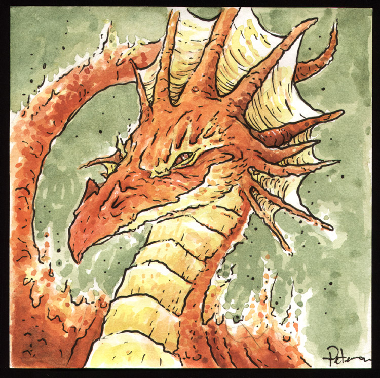
Keeping up with the tradition I mentioned on last week's blog, these Watercolors are redesigns of old characters of mine. First up is Roan a red dragon from a project Jesse Glenn and I started plotting out on my 18th birthday. A while back I posted one of the other dragons from this un-pursued project as a Watercolor Wednesday piece: Loden.

The 2nd watercolor from last week was Cap Transfo, a character I first drew in 8th grade science class. Cap may be the first character I still remember making (and have record of). A little while back, I did a whole blogpost about character design that involved Cap and the project he was associated with (though I also had him & Zubelflex in their own story as buddy cops in the Intergalactic Space Police....you know...the IGSP)


2013 Appearances: 
Fabletown Con: March 22-24
C2E2: April 26-28
Spectrum Live: May 17-19
Heroes Con: June 7-9
Albuquerque Comic Expo June 21-23
San Diego Comic Con: July 17-21
*more 2013 dates coming*

Blog Archive