Wednesday, September 29, 2010

Extinct Print:
I wanted to share a print I did in 2002. This was an experiment I was trying for an exhibit called 'Zoo' in Flint, MI at the Buckham Gallery (which was later renamed and rethemed to just be an 'open call for entries'...but only AFTER I did a 'Zoo' piece). The piece is made up of 18 three inch linoleum block prints which I printed with water based ink on velum mylar. Because of the transparent nature of the mylar, I was able to hand color each mini-print using markers (a hodge podge of Charpak & Prismacolor) Below I arranged the individual mini prints in the same configuration as the original above, but so that you can click on each one for more detail.


Upcoming Appearances:
New York Comic Con (Archaia booth): Oct 8-10
Mid-Ohio Con: Nov. 6-7

Tuesday, September 21, 2010

Inks to Colors:
Last week I was working on a piece I thought it would be nice to share on Ustream. So I set up my camera rig over my lightbox and recorded the inks. Then I scanned the piece and recorded the flatting process of coloring, and pushed on into the night with a third recording where I rendered and finished the piece...almost. In the last steps of the last stage of rendering, Photoshop crashed, and (since I didn't save once because I was thinking about narrating the ustream) I lost the whole thing and had to rescan. Next day, without streaming, I rescanned and recolored the piece. The finished piece is above. The videos* mentioned (including the fatal crash) are below:
*They are each over an hour long, and the sound quality is a bit 'underwater-ish' but per request, I have posted them.


Upcoming Appearances:
West Hollywood Book Fair: Sept. 26
New York Comic Con (Archaia booth): Oct 8-10
Mid-Ohio Con: Nov. 6-7

Tuesday, September 14, 2010

Oz:
Lat week I mentioned Audio Books, and Oz is one of the series I have yet to find a version of where I enjoy the reader. And as much as I'm a fan of the Land of Oz and as much as it inspired me as a kid, I have never read an Oz book from start to finish, which I'd like to fix.

Oz started for me when I was in 2nd grade. The annual tradition of it being shown on television was coming up and classmates of mine were very excited about it. Somehow, we, as 2nd graders, decided we would do a Wizard of Oz play for the school...or at least our class. Our teacher told us "no", but with the work we had already done (some parents, including mine, had started helping us with our costumes.) we were allowed to have 2 mornings to spread our performance over for the 2nd grade classes of Pierce Elementary and their parents. I was the Tin Man, who remains to this day my favorite of the characters.

In High School, I started looking towards doing children's book illustration as a profession. I remember when 'finishing' this drawing (it has no background!?) that I was ready to be hired to do book illustration. Luckily, I never went out looking for work with that attitude. What this piece shows me more than my cocky mindset, is that I was thinking about the work seriously. I had done countless Oz themed drawings between second grade and senior year, but I was making design choices here, thinking about composition, and using a variety of media.

This series of illustrations I did after college (so about 5 years after the other drawing). In college, we were steered away from illustrative subjects and work, and focused more on expression and abstraction. So, for a few years I tried to re-learn what I had been building up to before University. These were to become my portfolio to try and live as an artist. I was also trying to do my definitive versions of the characters, somewhere between paying homage to John R. Neil (my favorite Oz artist) and my own sensibilities. I had planned to do more characters (Ozma, Jack Pumpkinhead, Dorothy, the Patchwork Girl...) but after these 4 I must have moved on to other projects.

More recently, I was asked by Stephen Gettis to do a piece for his Literary themed collection: 'Hey Oscar Wilde, It's Clobberin Time!'. Oz was the 2nd piece I did for him (the first being Wind in the Willows) and I took it back to the origin for me...discovering the Tin Woodsman.


Fan Art: This week's piece may look familiar: "I know I've already submitted this piece before, but I made major changes to it after seeing how much attention you pay to the background features. thanks! -Charlotte Cheng"
No, Thank You Charlotte! I like the idea of improving through revisiting older work!
If you would like your fan art posted here, email your work to ericebon (at) hotmail (dot) com


Upcoming Appearances:
West Hollywood Book Fair: Sept. 26
New York Comic Con (Archaia booth): Oct 8-10
Mid-Ohio Con: Nov. 6-7

Tuesday, September 7, 2010

Listening:
While I love movies and enjoy several TV shows, they are not something I can enjoy while I work. It's too easy to be distracted visually. So I tend to rely on Old Time Radio (OTR), and various audio books to keep me moving through my work. Seems about once a year I post something about OTR (past posts: 1, 2, 3, 4, 5) Mainly I listen via Sirius satellite radio, but I also go to the sites mentioned in the 5th post if I'm in the mood for something specific.

As for Audio Books, I recommend Stephen King's IT read by Stephen Weber and Wind in the Willows read by Terry Jones. But my old fall back series is Harry Potter read by Jim Dale. I have gone through all 7 of them nearly a dozen times, and I still enjoy them very very much. I have been told that the UK versions read by Stephen Fry are better, but I have not heard them. I have enjoyed Fry reading other books, but I worry that Dale's versions are so deeply in my head now, I'd have a hard time with a different reader. In any case, talking about this has given me the chance to share the recently colored version of the Professor Snape commission I did at San Diego. I find that coloring some of these quickly is a nice way to ease into coloring a larger Mouse Guard page (and this one had a very limited palette, so it was all the easier)

And just recently (through a subscription to Audible) I found dramatized versions of the Winnie the Pooh books read by a full cast including Stephen Fry (Pooh) and Judi Dench (Kanga & Narrator). They are delightful. I had forgotten how much I like the style of writing A.A. Milne did with the Pooh stories. It inspired me to do this quick warm up piece where I tried a new coloring/texture technique of overlaying tinted crosshatching (after I decided the inks looked too clean compared with the definitive E. H. Shephered's illustrations.

Fan Art: This week the fan art comes from Derek McLean who sculpted Lieam and Saxon in FIMO. He also shares: "I had made a Kenzie also, but it was defeated by my cat, and shattered on the floor." Sorry to hear how Kenzie met his end, but, Thanks Derek!
If you would like your fan art posted here, email your work to ericebon (at) hotmail (dot) com

Upcoming Appearances:
West Hollywood Book Fair: Sept. 26
New York Comic Con (Archaia booth): Oct 8-10
Mid-Ohio Con: Nov. 6-7

Tuesday, August 31, 2010

This post is the product of me searching for something in an old filing cabinet and finding these unrelated items to share:

Screw-On Head: With this week being the release of the Amazing Screw-On Head and other curious objects Hardcover collection , I found it odd that I stumbled upon the original painting I did back in my watercolor/ink-outline days. I had scans of the painting, but thought the original was long gone (though I have plans for it now that I have found it) As readers of the blog know I'm a big Mignola fan and Screw-On head is one of those gems that got better with every reading and showed that you how other creators were still interested in doing something fresh and unique in comics. I'm very excited to sit down and read the collection which also includes the Eisner Award winning story 'The Magician and the Snake' that Mike co-wrote with his daughter Katie (7 at the time). And an excuse to share a painting I did of a character and creator that renewed my faith in something new & different lasting.

College Comic Strip: Though I never drew a single strip of it, I had an idea for my college newspaper. The premise was two college roommates (Nick & Dave) who need a third roommate to split the rent. Nick goes out to find a new tenant and instead brings home a monkey. He rationalizes that the monkey can take care of the apartment, cook, clean, perhaps even do some of their homework, which will allow the two to pick up more hours at work (which they never do). Another character Mike was a friend who didn't live with the pair (and now a monkey) but might as well have been considering how much time he spent there. Mike was going through an identity crisis and chose to wear masks until he discovered his 'true self' and was ready to face the world (this is why he's wearing a pumpkin in this lineup, but the disguise would change every strip or so). Over the course of the run I planned on the monkey robbing a bank to help with the rent, going to classes for them, and taking pleasure in terrorizing Mike.

D & D Character portraits: When roleplaying, I always enjoyed flawed characters (something the GURPS system taught me was beneficial to fun adventures). While I was trying to break in to doing illustration in 2001 or so, I did these character portraits for a fantasy roleplaying game. The focus I was working on were imperfect characters, not handsome or tidy, but folks missing teeth, with receding hairlines, covered in muck, scarred and homely. They are all rendered in pencil on white copy paper. Like much of the portfolio I took around at that time for work, lack a setting or background. It was fun rediscovering these as well as the above entries...never found what I was originally searching for, but the content for this post made it worthwhile anyhow.

Fan Art: This week the fan art comes from Aaron Hawbaker who did a pencil drawing of the scene from Fall 1152 where Celanawe has reclaimed his axe and Midnight is at a disadvantage.
Thanks Aaron!
If you would like your fan art posted here, email your work to ericebon (at) hotmail (dot) com

Upcoming Appearances:
West Hollywood Book Fair: Sept. 26
New York Comic Con (Archaia booth): Oct 8-10
Mid-Ohio Con: Nov. 6-7

Tuesday, August 24, 2010

FCBD-2010 page 3 Process:

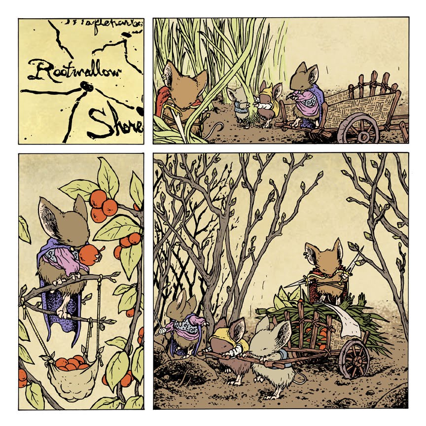
Its been a while since I have done a ustream or shown a process post. This is a start to finish look at the third page of the Free Comic Book Day story from this year.

Writing: The script I typed wasn't anything more than the words that appear in the final page. Other than page 1 being a 'Gwendolyn writing' setup and the end of the story, each page was supposed to simply be a different patrol of mice doing typical spring time work. In this case, harvesting/escorting a harvest of early growth food plants. In addition to showing the main characters from Fall and Winter, I also wanted to showcase other Guardmice (some from Winter and the RPG cover art)

Sketches: I started this page knowing the 1st panel would be a map section showing where the mice were, but the rest of the panels needed to show the work they were doing there. Sela and Cerise (mice based on my sisters) are escorting this harvest, so I worked up several sketches of that. Sometimes sketching this stuff out helps me figure the size/shape of a panel. Other times I know the size, but need to draw the elements separately so I can resize, slide, rotate and tweak them for the final composition. Two sketches are marked with * as being panel layouts I discarded.
Composition: I scanned in my sketchbook work and placed the drawings into the panel grid I chose for this page. I used the lineart for the map from the 1st hardcover to distort for the first panel. The other panels are composites of my various sketches. Sometimes I tint the portions so it's easier to read with the sketchy lines where one mouse or element begins and the other ends. I find the freedom to resize and shift and move parts of the drawing around to really help my compositions for each panel. Because the story was a bit text heavy, I added in the text so I knew where I would place it and that it would all fit.


Inks: I print out the composite layout and tape it to my bristol so that I can ink it on a lightbox. Sometimes I'll work on tighter pencils (which I may or may not have on this one..I don't recall and don't have scans of me working on it midway). Using my sketched lines as a guide, I ink the page with UniBall Vision pens and sometimes a brush. This is the stage where I concern myself with line weights, textures, patterns, and the balance of light and dark.

Rain: With this story happening in the rain, I needed to do a rain overlay. Overlays help so that I can easily isolate all the linework and tint it or make it semi transparent in the final colors. For the graphic here, I simulated that I'm doing the overlay on a white sheet of drawing paper over the final inked bristol board on a light box. This way, I can see the scenes and know where the rain should be, if it needs to be splattering on a surface, or dripping down a mouse's face.

Flatting: This is the stage where I have scanned in the lineart and am now adding color. I'm mostly focusing on areas the colors go, and to a certain extent what my overall palette will be. I want to make sure that I establish that a mouse's fur color is different than their cloak and different from their paw, and the hilt of a sword is different than the blade. Using layers for groupings of colors is how I find it easiest to do this: fur, cloaks, skin, twigs, leaves, sky, etc. (past post on this method)

Rendering: Once my flats are done and established, I can start rendering the pieces and tweaking the final color selections (I may find a mouse looks too red or too green, or too close to the background colors). I use the dodge and burn tools to do the shading and highlights for the forms. Basically, Dodge lightens and Burn darkens any color it goes over, however their are tricks to using it based on the tolerance and settings you use for each tool. I use a textured brush that come standard with Photoshop and set the dodge and burn settings almost as low as they go. (past post on this method)

Holds & Effects: Color holds are the term used for line art that I want to display as a color instead of black ink (past post on the method). here I have added a color hold to the map, Sela's tunic stitching, and nature elements I wanted to push to the background to create depth. The rain art is inverted, tinted, set to blending mode 'overlay' and turned down in opacity. Using dodge and burn, I can render the color holds and the rain to a degree. Otherwise they can look very flat and computer generated sitting on the rendered colors for the rest of the page.
Final: Now that the art is done, it's just a matter of adding the text back in (perhaps shifting it's placement a bit from the original layout) and adding the narration boxes. I lightly rendered the narration boxes using dodge and burn so that just like the rain and holds, they don't look flat and out of place with the rest of the page.


Upcoming Appearances:
Baltimore Comic Con: August 28-29
West Hollywood Book Fair: Sept. 26
New York Comic Con (Archaia booth): Oct 8-10
Mid-Ohio Con: Nov. 6-7

Tuesday, August 17, 2010

5 custom tees:
Back in May, I made a deal with Katie Cook that if I shaved my chin clean, she would make and wear 5 custom Mouse Guard shirts at the San Diego Comic Con. It was way too good of an offer to pass up. Katie made some great shirts: "Mouse Guard Babies" , " Speak Softly and Carry a Big Black Axe", "Team Saxon", "Lieam in the pocket", and the "Trio Hoodie" which is my favorite. Thanks to Katie for outdoing her end of the bargain.

Puppet for the Nieces:
My nieces liked a puppet I had in my studio and wanted to know more about how it was made. So I quickly started building a foam skull and mouthplate so they could see how I started...before I knew it, a visit with the nieces turned into a puppet building workshop. Ironically, the fabric is left over from when the oldest niece, Emma (now 10) was turning 2 and I made an oven-mitt style Cookie Monster for her birthday gift. I reluctantly gave this guy to the nieces when I finished him and told them they had to give him a voice and a name...we then agreed that he could have 3 different voices and names depending on which niece was puppeteering.

Recent Work:
Hope you enjoy.


Fan Art:
Brian Wisniewski sent in this piece. He and I spoke at C2E2 and he had mentioned wanting to do some Mouse Guard fan art, and after my request for resending or sending in new work after I lost some files, Brian came to the rescue.

Upcoming Appearances:
Baltimore Comic Con: August 28-29
West Hollywood Book Fair: Sept. 26
New York Comic Con (Archaia booth): Oct 8-10
Mid-Ohio Con: Nov. 6-7

Tuesday, August 10, 2010

Legends of the Guard Hardcover:
The hardcover collection of Legends of the Guard is in Previews (order code AUG10 0760). This will collect the 4 issues (with the work of Jeremy Bastian, Alex Sheikman, Ted Naifeh, Sean Rubin & Alex Kain, Terry Moore, Gene Ha & Lowell Francis, Katie Cook, Guy Davis, Nate Pride, Jason Shawn Alexander, Craig Rousseau, Kark Kerschl, and Mark Smylie) AND will also feature an epilogue with a legend by Joao Lemos!

Fraggle Rock Cover:
As Announced at Comic Con and shown on Comic Book Resources, I will be providing the cover for Archaia's Fraggle Rock Series 2 Cover #1A! I had a blast working on this cover. I was very pleased I was able to include all three of the 'races' and their size differences into a single cover that still told a story. As fans of the blog know, I'm a big Jim Henson fan as well as a puppetry fan in general. I wasn't familiar enough with Fraggles when I started the cover assignment, so I borrowed the complete DVD series and got myself caught up. Boober is my favorite Fraggle...which isn't a surprise as I seem to be drawn to characters Dave Golez performs.

Watching also made me long for my own Fraggle puppet, so I took a little time off to build myself one. He's still a work in progress, I want to give him some hair and a funny wispy goatee and a fez. His glasses in this photo are simply my glasses, but I plan on having him like a Fraggle version of Dr. Bunsen Honeydew: glasses with no lenses and no visible eyes. Building Gib (My Grandfather's nickname...fitting since I gave the Fraggle one of his famous bow ties) certainly helped me with the cover...AND will help me by posing as a stand in for me for the story I will contribute to an upcoming issue of Fraggle Rock that I will write and draw!


Fan Art:
Turns out I lost a bunch of my fan art files, so while typing this post, I had no pieces to share. After a quick tweet about it, Jonathan Moore came to the rescue and sent this pencil piece in. Great job Jonathan! I like the realistic head and ears.

Due to my shortage, I encourage fans to send fan art to ericebon (at) hotmail (dot) com to be featured here.

Upcoming Appearances:
Baltimore Comic Con: August 28-29
New York Comic Con (Archaia booth): Oct 8-10
Mid-Ohio Con: Nov. 6-7

Blog Archive