Tuesday, March 27, 2012

ECCC: Monsters & Dames 2012 Process

For the last three years the Emerald City Comic Con has been putting together a charity book called Monsters & Dames. Guests of the show are asked to contribute a piece of PG-13 artwork featuring the very open-ended theme "Monsters & Dames". I did a piece for it back in 2009, the last time I attended the show.

I'm headed back to Seattle this year so for my piece I decided to do a genre mash-up. I love good dragon design and after seeing some of Corey Godby's,  and realizing it had been ages since I designed and drew a dragon, I made the Dragon my 'Monster'. Cory includes cool hair on his dragons, and I'd never done that. I also pulled inspiration from the feathers on the gryphon from the Storyteller episode The Luckchild. And the pose of the head was inspired by an upshot drawing Brian Froud did of the Chamberlain from the Dark Crystal

For the 'Dame' I wanted her to be riding on the Dragon's head. I made a rough body pose on my dragon drawing, but wanted to flesh her out on another page of my sketchbook. Like I said, I wanted to mash-up the genres so instead of a fnatasy-type barbarian queen or lady-knight, I went for a WWII inspired military lady. "Perhaps she is part of some fantasy anti-aircraft-dragon-blitzkrieg" I thought to myself. I gave her a curvey bombshell frame and pin-up girl hair to set the idea of the era, but without details to really say one way or the other where or when this is.

I assembled the two sketches in photoshop. Because of the scale (both of the figures in relation to one another AND how large I drew the 'Dame') the 'Dame' lost a great deal of detail. The two figures are tinted so it's easier for me to distinguish them from each other when inking. The yellow and orange borders are there as guides. The yellow edge represents where the page will be trimmed (roughly). The orange represents the area called 'bleed'. When the artwork goes off the edge of the page with no border, bleed is extra artwork that goes beyond where the page is cut, so that if the page isn't trimmed to meet the exact edge of the artwork, there is still some spare and you aren't left with a white sliver of non-artwork exposed.

The layout above was printed at full size and then taped to the back of my bristol board for me to do the inks over a lightbox. I had fun with the textures of the various parts of the dragon: hair, feathers, boney horns & snout, and soft under-belly. My pencils were pretty tight on the dragon, so the real work came in inking in all the undefined hair I had scribbled in on the rough. You will notice there is no background to this image...I debated with a skyline or even search lights & zeppelins...but ultimately decided a murky night sky would set the tone and draw the focus to the Monster & Dame better.

The final color process was a bit different for me. Because this was something other than Mouse Guard and I could afford for it to look different, I colored this with a Cintiq & a Wacom Tablet (Thank you to Katie Cook for the use of both). I was able to do a lot of slow building and painterly effects with the tools that I can't get when I color with a mouse. I still found the process off-putting, and didn't prefer it for flatting the colors. At Katie's house I flatted the majority of the piece and then rendered the sky and a bit of the dragon's skin before it was getting late and time to leave. Katie sent me home with her Wacom tablet to finish the job. At home I completed the rest of the rendering and color adjustment using her loan.

After the convention ECCC usually offers the Monsters & Dames book for purchase online if any are left.

2012 Appearances:
Emerald City: March 30-April 1
C2E2: April 13-15
Boston Comic Con: April 21-22
FCBD: Jetpack Comics: May 5th
Heroes: June 22-24
San Diego Comic Con: July 11-15
Baltimore Comic Con: Sept 8-9
New York Comic Con: Oct 11-14
Detroit Fanfare: Oct 26-28

Tuesday, March 20, 2012

Sadie Papercraft:
Want to have a Sadie papercraft model to go along with your Lieam papercraft?
Here is a new .pdf for you to cut out and assemble.
https://www.mouse-guard.net/papercraft
I'm leaning towards either Saxon or Kenzie as the next papermodel. I'll get around to other characters as well like Celanawe, and Gwendolyn, and Conrad, but they will requite modifications to the template that go beyond editing the papercraft's skin, so those will wait until the Black Axe Hardcover is in the can.

London Super Comic Con Commissions:
Thought I'd share some of the commissioned pieces I did for the London Con a few weeks back.
(all requests of the fans): 
Top L-R: Mice in a tavern sharing drinks and games, Green Lantern Mouse vs. DexStarr, Lieam as the Black Axe riding a Wolf
Bottom L-R: Xena & Gabrielle mice, Fellowship of the Rings mice


2012 Appearances:
Emerald City: March 30-April 1
C2E2: April 13-15
Boston Comic Con: April 21-22
FCBD: Jetpack Comics: May 5th
Heroes: June 22-24
San Diego Comic Con: July 11-15
Baltimore Comic Con: Sept 8-9
New York Comic Con: Oct 11-14
Detroit Fanfare: Oct 26-28

Tuesday, March 13, 2012

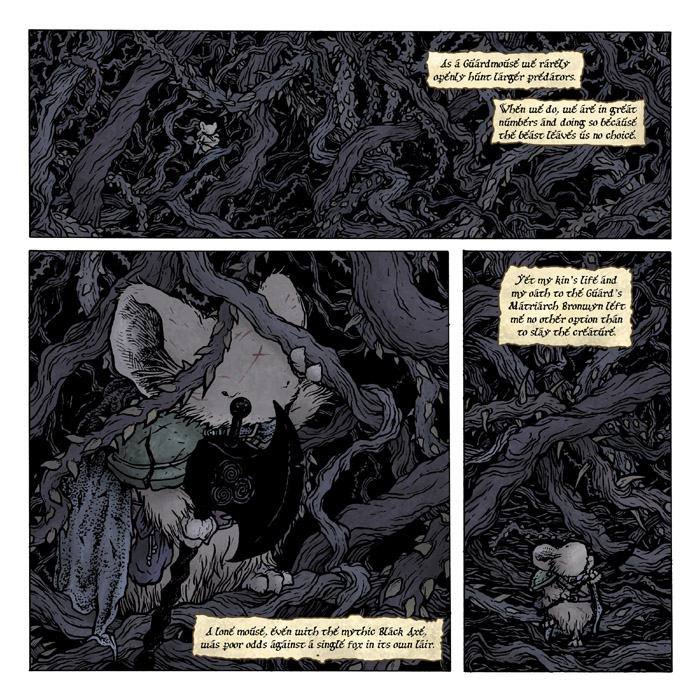
Black Axe 4 Preview:
I've been told by Archaia that this Wednesday (the 14th) is when fans should expect Black Axe #4 on their comic store shelves! Issue 4 has a pinup by Stuff of Legend artist C.P. Wilson!


Here is a preview of the issue followed by the solicitation description of the issue:

Leaving the fate of Em in the weasel king of Ilder’s paws, Celanawe trudges into the briar lair of a murderous fox. The Black Axe, a weapon forged by Farrer and now wielded by his youngest heir, is put to the test so that one lone mouse can slay the red-furred villain which has claimed enough ferret lives to have the king of Ildur afraid to send his own kin after it. The uneven brutal battle has an only more brutal end.


2012 Appearances:
Emerald City: March 30-April 1
C2E2: April 13-15
Boston Comic Con: April 21-22
FCBD: Jetpack Comics: May 5th
Heroes: June 22-24
San Diego Comic Con: July 11-15
Baltimore Comic Con: Sept 8-9
New York Comic Con: Oct 11-14
Detroit Fanfare: Oct 26-28

Tuesday, March 6, 2012

Mythbusters:
Next week I'm going to see the Mythbusters Live show in Detroit! I'm a big fan of the show and for what Adam & Jamie (and Tori, Kari, & Grant) have done to inspire kids to be more interested in science and math. I've made no secret at San Diego that one of my biggest goals is to meet Adam Savage. Anyhow, I'm getting off track from the artwork...I'm a fan, you knew that...time for me to move on. I did this piece a while back, when I had marionettes on the brain from designing the cover and interior story for the Mouse Guard Free Comic Book Day story.

I drew the sketches while hanging out with Nate Pride. We were the only two to show up to an event at my house, so I wrote it off as a lost work night and decided to draw for fun. The pencil sketches are much larger than I normally work each figure is about 12" tall. I looked at pictures of Adam and Jamie to try and capture a carved wooden caricature of them both. I scanned these in and combined them into one smaller piece. I also made edits in photoshop, I altered the scale of their heads as well as the marionette Busters. I also dropped in a stock photo of their logo.

Using a printed version of my photoshoped collage of the corrected doodles and logo photo, I inked the piece on a sheet of 12" x 12" strathmore bristol. The inkwork is all done with Copic MultiLiner pens (mostly using the 0.7 nib). I debated inking in the strings on the piece itself or inking them on an overlay so I could easily establish color holds on them later. I opted to get the stings in the original art, so that if I ever get the chance to give this to them, it will look complete.


The last step was to scan my inks and color them. The largest part of this job as editing in what areas of my inkwork would be a color instead of black. The rest of the work was in getting the subtle colors I wanted for the puppets so they looked like they were painted wooden puppets that have been dented and dinged around a bit. I was already looking forward to the show this weekend, and sharing this piece with you has only made me more excited.

I also think it would be a lot of fun to make these puppets....but that is for another day when Mouse Guard pages aren't calling...

2012 Appearances:
Emerald City: March 30-April 1
C2E2: April 13-15
Boston Comic Con: April 21-22
FCBD: Jetpack Comics: May 5th
Heroes: June 22-24
San Diego Comic Con: July 11-15
Baltimore Comic Con: Sept 8-9
New York Comic Con: Oct 11-14
Detroit Fanfare: Oct 26-28

Tuesday, February 28, 2012

2012 Bookplate


This year I'm starting a tradition of printing a limited signed & numbered bookplate for the year. I debut these at the London Super Comic Con and have them with me for the rest of my 2012 convention schedule. For now I'm limiting these as convention items. At the end of the year, if I have any left, I will offer them online. I'm not trying to punish fans who can't make it to conventions or trying to drive up their post-con ebay value...I just don't want to run out before I finish my 2012 convention circuit. This year's print is a colored version of a relief print (like a woodblock)


I started with a sketch in my sketchbook that I scanned, tweaked, and printed out at the scale I needed it. I also mirrored the image so that when it is carved and printed, it will un-mirror. Using a stick of graphite, I coated the backside of the printed paper. I taped this down to my block (in this case a piece of Speedball Speedy Carve) and traced my lines with a ball point pen. When I removed this sheet of paper, anyplace I had pressed down with a ball point pen transferred the graphite from the back of the paper to the surface of the Speedy Carve.

Unfortunately, I didn't snap a photo of the speedy carve with the graphite transfer, I only got this one before I  started the process. Speedball's website says that you can transfer printed artwork onto the Speedy Carve material using an iron, but I couldn't get that process to work. With the image transferred I used the carving knives shown here to carve away any area I needed to NOT print (ie: white areas). This type of printmaking is called Relief printing because you are carving away an image in relief.: the areas that protrude are the positive shapes (the areas that will print).

Once the image was fully carved, I used a ink stamping pad to ink up the surface of the block. Usually when relief printing with wood or linoleum you need to ink the surface with a thicker ink and a roller called a brayer, but this Speedy Carve is more forgiving like a rubber stamp, so I'm able to use an inking pad and then place the paper on the surface of the block. It took a few tries to pull a good print, There were a few where I hadn't inked the block evenly, and a few others where I moved the paper and got a double registration.


Here is a scan of the straight pulled print. I carved the hatching into the trees in the background to help push them back into the background of the image. All of the simulated stippling was done by carving patches of cross-hatching only leaving little nubs sitting alone like tiny flat-topped desert mesas. For a bookplate though, I wanted the image to be more than a monochromatic relief print though, so I set to coloring it digitally.

Using the scan of the print, I started flatting the areas. I broke the inked lines into different areas (since I wanted the trees, the moon pendant, and the sword & hilt details to be a different color than the rest of the outlines. The colors seen here were chosen to be clashy & ugly on purpose. This way I can easily see if I got any color in the wrong area (ie: did I stay in the lines) The layer menu on the right of the screen-grab shows that not only are the colors differentiating different areas, but I've made separate layers fro them all (all labeled to make life easier).

The last step in getting the image ready for the bookplate was to correct and render all the color areas. I did so as I've discussed in past posts using a textured brush and the dodge (lighten) and burn (darken) tools.

 The bookplate will be limited to 500 copies, all signed, and sold at conventions for $5.


2012 Appearances:
Forbidden Planet London signing: March 1
Comics & Graphics Berlin signing: March 3
Comic Combo Leipzig signing: March 5

Emerald City: March 30-April 1
C2E2: April 13-15
Boston Comic Con: April 21-22
FCBD: Jetpack Comics: May 5th
Heroes: June 22-24
San Diego Comic Con: July 11-15
Baltimore Comic Con: Sept 8-9
New York Comic Con: Oct 11-14
Detroit Fanfare: Oct 26-28

Tuesday, February 21, 2012

Drawing like yourself:


Yesterday on Twitter I posted an image of the first Mouse Guard drawings I ever did back in 1996. I followed that tweet with the statement:

"The artwork moved away from that style...I needed to develop my own work, & not copy the style of someone I admired. When I learned to 'draw like myself' better things happened"

In 2003 I was at a family bbq, and drawing the mice. I did the drawings in ink & fell onto my etching techniques to make grey tones and interesting patterns. Instead of mimicking my favorite artists and illustrators, I was drawing like myself, and building on work & techniques of my own to push the drawing out somewhere new.

These drawings were also part of the very very first Mouse Guard sketchbook that pre-dated my self-published black and white issue of Mouse Guard in 2005. The first time I set up at the Motor City Comic Con was in October of 2004. I was going to be an artist at an artist alley table, with no book and no previous working experience. All I had were pieces of artwork I made as a fan, for fun, and my own concepts and ideas. Using my home printer, I printed out samples of pieces I'd done. Everything from watercolors of superheroes to pencil drawings of fantasy characters, and of course, some Mouse Guard images.

I've posted and talked about these c.2003 Mouse Guard drawings before, but never in the context of them having been printed in a sketchbook. I printed 2 versions of the same book through my home printer. One was 1 character wide and rather tall, the other (after realizing it was a pain to trim every page by hand) was 2 characters wide so that the width matched the paper size. I added some text to the backgrounds of each character (most of the text was a description of the character or their name's meaning). In total I printed between 4 and 7 of them for that convention, and I have none left now.

I mention this sketchbook because a fan came out of the woodwork having recently acquired one and couldn't find any information online about what it was, when it came from, or how many were printed. Now I really hope that me typing this up doesn't lead to a few going up on ebay and other fans getting milked (I posted all the images from that sketchbook here so that no one would have to pay top dollar to see the contents) However, I know I can't stop a free market with driven completist comic book collecting fans. I merely wanted to share a bit of history, that, up to this point, I have never publicly mentioned.

I'd also like to echo what I said in the opening of this post, when I stopped trying to draw like the people I admired, and just used their work to inspire me to do better (instead of doing knock-off attempts at their work) better things happened for me, and these drawings represent that. I'm not done trying to be better and learn about my own process. I review recent work of mine to see what was working and what wasn't so that I can build off of the successes and keep making things better. It's advice I think that works no matter what creative field you are in. Be yourself.


*Edit*

I'd like to supplement this post with a series of tweets from after this entry was originally posted:

Part of 'drawing like yourself' involves closing off influences for a while & relaxing while you draw. Almost like going into zen-autopilot 

It's ok to learn something by copying and emulating, but at some point you have to shut Artist X's book and draw something of your own

Emulating should be about understanding the deeper decisions Artist X is making: why that composition, why that lighting, why that form..etc

You should have a list of influences as long as your arm. If you're targeted on 1 Artist X, your focus is too narrow. Get wider inspiration

Use the 'why' lessons you gained from artist emulations/study & keep them in your back pocket as you ask yourself 'why' about your own work

Use your own decision making process about the 'why' of what goes on your paper to filter all the inspirational ideas/influences/whys

I think young people wanting into comics & illustration try to emulate what those industries already have. no, we want to see something new!

My thoughts on 'drawing like yourself' come from being a former emulator who tried really hard to be someone else (several times) & failing

It took time to 1st overcome the fear of drawing naturally & then more time learning HOW to draw naturally. Give yourself permission & time

**Edit 2** 
While exploring and old file folder, I found a copy of the sketchbook! The cover is a light grey thick stock and the pages are a faux parchment. The original price sticker is still on the cover, and instead of folding paper in half to 'saddle stitch the binding, I just staped the single sided pages together with red staples along the edge. This is going into my personal archive & is not available.


2012 Appearances:
London Super Con: Feb 25-26
Forbidden Planet London signing: March 1
Comics & Graphics Berlin signing: March 3
Comic Combo Leipzig signing: March 5

Emerald City: March 30-April 1
C2E2: April 13-15
Boston Comic Con: April 21-22
FCBD: Jetpack Comics: May 5th
Heroes: June 22-24
San Diego Comic Con: July 11-15
Baltimore Comic Con: Sept 8-9
New York Comic Con: Oct 11-14
Detroit Fanfare: Oct 26-28

Tuesday, February 14, 2012

Hand Inking Fonts
When I need to include text into a page of Mouse Guard (or for other pieces) that isn't dialogue or a sound effect, I ink it in by hand. This text is meant to exist within the world of the story itself, the characters can see it and read it, it's part of their world. I'm often pulled out of comic stories when signs, newspapers, even handwriting is done by the letterer. The font rendering rarely matches the look of the artwork well enough. That isn't to say I don't use computer lettering to help me in this task. With the Mouse Guard illuminated manuscript pages (as well as most any other lettering I ink) I lay out all the text on the computer using one or several fonts.

I then print the text and use a lightbox to trace the rough shapes of the letters. This helps me keep the baseline staright (the invisible line the bottom of the text rides on), the kerning correct (the space between letters), and the leading even (the space between lines of text). That isn't to say that I want to keep those things, straight, correct, and even...I don't even want all the 'o's to match...or any other letter for that matter. I can shift the printed sheet as I need to distort the baseline, kerning, and leading. I can distress each letter as I ink leaving gaps and inconsistencies.

Depending on the scale of the lettering, I can make it less legible and out-of-focus. I can also play with the lettering's texture helping to signify what surface it is on (paper, glass, stone) or what it's written in (ink, paint, or even carved into a surface). Making the text with the same hand, the same pen, and in the same scale as the drawing it will appear in, all factors toward the image looking cohesive and believable. Sure my sound effects and dialogue are computer generated fonts digitally insterted on top of my artwork, but you never see someone's voice coming out of their mouth or see the word 'BOOM' floating in the sky when there is a loud noise...its already abstracted to have those shown as text, so I let them float away from my artwork a bit.

A recent example of this technique I'd like to share was for the Free Comic Book Day hardcover of Archaia's. This wasn't ultimately used, but I was asked to do a few re-designs of the FCBD logo that might tie in with the artwork for the cover. I started by with a few digital fonts, typing up 'FREE COMIC BOOK DAY' and playing with the letter size and spacing. I printed these and using a lighbox I inked them in, sometimes more than once using different inking techniques to simulate paint or ink or embroidery thread.

Here is a scan of both the inked text samples and the 'frames' they would be on top of (some were themed to go with the styles of text, others just designs I thought I could play with). I paired up the text and frames several times over with different combinations sometimes with different color schemes. I narrowed my choices for the logo down to four of these designs, but as I said, ultimately, the new logo was abandoned from the cover and Archaia went with the existing logo.

Fan Art:
The Folks over at the Sindicate (a weekly group sketch blog) dedicated a week to Mouse Guard (the Last week of Dec. 2011). Here I'm sharing the contribution by David Lafuente, but I encourage you to also take peeks at the pieces by James Harren, Ryan Ottley, Coleen Coover, and Jorge F. Muñoz


2012 Appearances: London Super Con: Feb 25-26
Forbidden Planet London signing: March 1
Comics & Graphics Berlin signing: March 3
Comic Combo Leipzig signing: March 5

Emerald City: March 30-April 1
C2E2: April 13-15
Boston Comic Con: April 21-22
FCBD: Jetpack Comics: May 5th
Heroes: June 22-24
San Diego Comic Con: July 11-15
Baltimore Comic Con: Sept 8-9
New York Comic Con: Oct 11-14
Detroit Fanfare: Oct 26-28

Tuesday, February 7, 2012

Page Process:
The last time I wrote a blog post showing my full page process was when I was working on the 2010 FCBD story and before that was this process post about a Winter 1152 page. I thought it was time again to explain my process for any newcomers, but to also show how some of it has changed since those write-ups. I'm using page 11 from Black Axe #3. There are not any spoilers on this page if you haven't read the issue, but if you haven't read it and still don't want to see the page out of context, here is your warning to turn back now.


Script: With Black Axe, I'm writing full scrips before I draw the issue (I've progressed to this point having started with Fall 1152 and no scripting until the issue was completed). I still use an outline for each issue, and I don't write the script for a given issue until I need to start that issue. As before, I make tick marks along side of the outline guessing how many pages I think I'd need to tell that part of the story. The script is written keeping those ticks in mind, knowing where I can be more verbose and where I need to tighten up the dialogue. On this page's script, you can see I've made all sorts of notes on my typed sheet for where the page starts and stops and also what dialogue I think should go in which panels (A,B,C & D). I make these notations in pencil after I've written the script because I don't want to disrupt my flow to think about those breaks when I'm writing the story.

Text Layout: To help me shape the page and figure the panel arrangements I'll place the text into a page template. With my notated script I may know how many panels are on the page, but not know their shape. Placing the text can help me figure how big a panel needs to be or if I can combine text into one panel or break it up into two. Here I've deviated from my script a bit. Instead of having all that text as narration, I've re-worded some of it to be flashback dialogue. With the 'E: shape of this panel arrangement, the three panels on the right will be flashbacks and the first panel will be Em & Luthebon's dialogue that cues the flashback. This also gave me a time to play with font choices. I try and have different species have different fonts for their dialogue to help push the idea that the species all have different sounds, like the text equivalent of accents.

Sketching: I've combined a few pages of sketches into this image, but the idea is the same, if you flipped through my sketchbook. I'll draw the various characters and elements for each panel scatted over several sheets. Often they are not in relation to each other. I'm just thinking about the shapes I'll need to fit each piece into each panel. The visuals I'm working toward here are Panel A: Em making a statement, B-D: various animals being overheard by Ferret hunters. You can see I made a note at the top of the page for which animals I might use to deliver the dialogue in the flashback. I settled on a wild boar, a hedgehog, and some cranes (I wrote 'birds' in my note).

Layout: I don't fuss with the drawings in the sketchbook too much. Sometimes I'll realize I've drawn something too big or small or that the piece is out of proportion with itself. I leave that fixing for once I've scanned these sketches and I'm placing them in the template. I tint the different drawings different colors to help me see where one drawing ends and the next begins. I am able to rotate and re-size any drawing, sometimes flip them left to right, and make any corrections. I'll take some care to re-position the text here too. That way I know it will all fit and not cover any important part of the image.

Inks: I print out a full-sized version of my layout and tape it to the back of the Strathmore 300 series bristol board I use for the final inks. On a lightbox I can ink the page using my layout as a guide. If I haven't drawn something tight enough in the layout, I'll pencil some on the page, but I mainly just tighten up the details ink ink as I go. This saves me a step and worry of erasing. Too often I have smeared ink, lightened ink lines, and even scrunched paper when erasing final art, so the less of it I have to do, the safer for the page. I'm using Copic Multiliner pens (0.7 mainly) for the linework and a brush & ink for the larger fill-in areas.

Flats: In this stage I have scanned my inks and I'm preparing the file for color. The goal is to establish what areas are what colors. I tend to group color areas on different layers in Photoshop: Fur, Cloak 1, Cloak 2, Skin, etc. I have also established the color holds (previous tutorial) at this stage. They may look off at the moment (as well as some of the color choices) but all I'm trying to do is get the various areas established and not focus on the color selections themselves.

Rendering: To get the painterly feeling of Mouse Guard and to add shadows and highlights to the flat colors, I use the Burn/Dodge tools (previous posts about them 1 & 2) In short, Burn darkens whatever the base color is and Dodge will lighten it. I use a brush called 'Drybush' that came standard with Photoshop 7. It's a bit uneven in it's application of either tool and that ads a nice mottling and texture that I like. The entire page, every part, every layer, is rendered, adding the depth to make the characters and settings seems as real as I can.

Final: Once I've completed the rendering on the full page, I make minor color adjustments and add any effects (like the overall lightened tone over the flashback panels). The text all gets tweaked a bit again and the balloons and boxes are placed around them.


2012 Appearances:
London Super Con: Feb 25-26
Forbidden Planet London signing: March 1
Comics & Graphics Berlin signing: March 3
Comic Combo Leipzig signing: March 5

Emerald City: March 30-April 1
C2E2: April 13-15
Boston Comic Con: April 21-22
FCBD: Jetpack Comics: May 5th
Heroes: June 22-24
San Diego Comic Con: July 11-15
Baltimore Comic Con: Sept 8-9
New York Comic Con: Oct 11-14
Detroit Fanfare: Oct 26-28

Blog Archive